ohlcv_chart covers both financial and general-purpose charts, so apps using
fl_chart and candlesticks can consolidate on a single package.
- Replace
fl_chartline, bar, scatter, pie and radar charts withSeriesChart,PieChartandRadarChart. - Replace
candlestickswithKChartWidget.
The tables below map each API to its equivalent, followed by examples of common patterns.
| fl_chart | ohlcv_chart |
|---|---|
FlSpot(x, y) |
SeriesPoint(x, y) |
FlSpot.nullSpot |
SeriesPoint(x, null) — a gap |
spots: [for (i, v) … FlSpot(i, v)] |
LineSeries.values(values) / BarSeries.values(values) |
LineChartData(lineBarsData: [...]) |
SeriesChart(series: [LineSeries(...), ...]) |
BarChartData(barGroups: [...]) |
SeriesChart(series: [BarSeries(...)]) — one BarSeries per rod position in a group |
LineChartBarData |
LineSeries |
|---|---|
color |
color |
gradient |
gradient |
barWidth |
width |
isCurved: false |
curve: LineCurve.linear |
isCurved: true |
curve: LineCurve.smooth |
isCurved + preventCurveOverShooting |
curve: LineCurve.monotone |
isStepLineChart |
curve: LineCurve.step |
dashArray |
dashPattern |
isStrokeCapRound |
roundCap |
dotData: FlDotData(show, getDotPainter) |
dot: SeriesDot(...) or dotBuilder: (index, point) => SeriesDot(...) |
belowBarData: BarAreaData(gradient) |
fill: SeriesFill(gradient: ..., toBaseline: false) |
belowBarData + aboveBarData cut off at cutOffY: 0 |
fill: SeriesFill(gradient: ...) with baseline: 0; the lower half mirrors itself |
| a stroke gradient split at zero | negativeColor |
showingIndicators |
SeriesChartController.show(x) |
isStepLineChart + lineChartStepData.stepDirection |
curve: LineCurve.step + stepPosition |
shadow |
shadow |
betweenBarsData: BetweenBarsData(fromIndex, toIndex) |
betweenFills: [SeriesBetweenFill(from:, to:)] |
errorIndicatorData + FlErrorRange |
SeriesPoint(x, y, yError: SeriesErrorRange(...)) + errorBars |
BarChartRodData |
BarSeries |
|---|---|
toY |
the point's value |
fromY: 0 |
baseline: 0 |
color / per-rod colour |
color + negativeColor, or colorBuilder |
width |
width, or widthFactor with minWidth / maxWidth |
borderRadius rounded away from zero |
radius — always on the end away from the baseline |
backDrawRodData |
trackColor |
gradient |
gradient |
fromY per rod, for a floating bar |
SeriesPoint(x, y, low: ...) |
BarChartRodStackItem |
one BarSeries per layer, sharing a stack |
borderSide |
border |
showingTooltipIndicators on a rod |
labelBuilder for a permanent label |
| fl_chart | SeriesChart |
|---|---|
minX, maxX, minY, maxY |
the same names; leave them null to fit the data |
minX: -0.5, maxX: n - 0.5 for bars |
the default: bars get half a unit either side |
titlesData: FlTitlesData(show: false) |
xAxis: SeriesXAxis.hidden, yAxis: SeriesYAxis.hidden |
bottomTitles: SideTitles(getTitlesWidget, interval, reservedSize) |
xAxis: SeriesXAxis(labels / labelBuilder, interval, height) |
leftTitles: SideTitles(getTitlesWidget, reservedSize) |
yAxis: SeriesYAxis(formatter, width) |
rightTitles |
yAxis: SeriesYAxis(side: SeriesAxisSide.right) |
gridData: FlGridData(show: false) |
grid: SeriesGrid.none |
horizontalInterval |
yAxis: SeriesYAxis(interval: ...), which also places the labels |
verticalInterval, checkToShowVerticalLine |
vertical lines follow the x labels: xAxis.labels, interval or ticks |
getDrawingHorizontalLine: FlLine(color, strokeWidth, dashArray) |
SeriesGrid(color, width, dashPattern) |
borderData: FlBorderData(border: Border.all(...)) |
border: BorderSide(...) |
extraLinesData: HorizontalLine(y, dashArray) |
referenceLines: [SeriesReferenceLine.horizontal(y, dashPattern: ...)] |
VerticalLine |
SeriesReferenceLine.vertical(x) |
rangeAnnotations |
bands: [SeriesBand.horizontal(...)] / SeriesBand.vertical(...) |
clipData: FlClipData.all() |
the default, clipToPlot: true |
duration, curve |
animationDuration, animationCurve; the first build animates too |
rotationQuarterTurns: 1 on a bar chart |
orientation: SeriesOrientation.horizontal |
axisNameWidget: AxisTitle(...) |
xAxis: SeriesXAxis(title: ...), yAxis: SeriesYAxis(title: ...) |
topTitles |
xAxis: SeriesXAxis(side: SeriesXSide.top) |
| fl_chart | ohlcv_chart |
|---|---|
ScatterChart(scatterSpots: [ScatterSpot(x, y, dotPainter: ...)]) |
SeriesChart(series: [ScatterSeries(points: ...)]) with SeriesTouchSnap.nearestPoint |
FlDotCirclePainter, FlDotSquarePainter, FlDotCrossPainter |
SeriesDot(shape: SeriesDotShape.circle / square / diamond / cross) |
PieChart(PieChartData(sections: [PieChartSectionData(value, title, radius)])) |
PieChart(sections: [PieSection(value:, label:, radius:)]) |
centerSpaceRadius, centerSpaceColor |
the same names; centerChild also puts a widget in the hole |
PieChartSectionData.badgeWidget, badgePositionPercentageOffset |
PieSection.badge, badgePosition |
RadarChart(RadarChartData(dataSets: [RadarDataSet(dataEntries: ...)])) |
RadarChart(series: [RadarSeries(values: ...)]) |
getTitle per feature |
features: ['Speed', ...] |
radarShape: RadarShape.circle |
shape: RadarShape.circle |
tickCount, ticksTextStyle |
tickCount, tickStyle with showTicks |
| fl_chart | SeriesChart |
|---|---|
lineTouchData: LineTouchData(enabled: false) |
touch: null |
| default touch (while pressed) | SeriesTouch(trigger: SeriesTouchTrigger.press) — the default |
a GestureDetector with onLongPress… over the chart |
SeriesTouch(trigger: SeriesTouchTrigger.longPress) |
touchCallback + response.lineBarSpots |
onTouch: (details) => …: details.index, details.values |
getTooltipItems → LineTooltipItem |
SeriesTooltip(title: ..., valueFormatter: ...) |
a hand-built tooltip overlay in a Stack |
SeriesTooltip(builder: (context, details) => …) |
getTooltipColor, tooltipBorder, tooltipBorderRadius, tooltipPadding |
backgroundColor, borderColor, borderRadius, padding |
fitInsideHorizontally, fitInsideVertically |
always on |
getTouchedSpotIndicator → TouchedSpotIndicatorData(FlLine, FlDotData) |
SeriesTouch(line: SeriesCrosshairLine(...), markerBuilder: ...) |
| two charts kept in step by hand | one SeriesChartController given to both |
handleBuiltInTouches has no equivalent because touch handling is always built
in. To respond to touch without a tooltip, pass tooltip: null and use
onTouch.
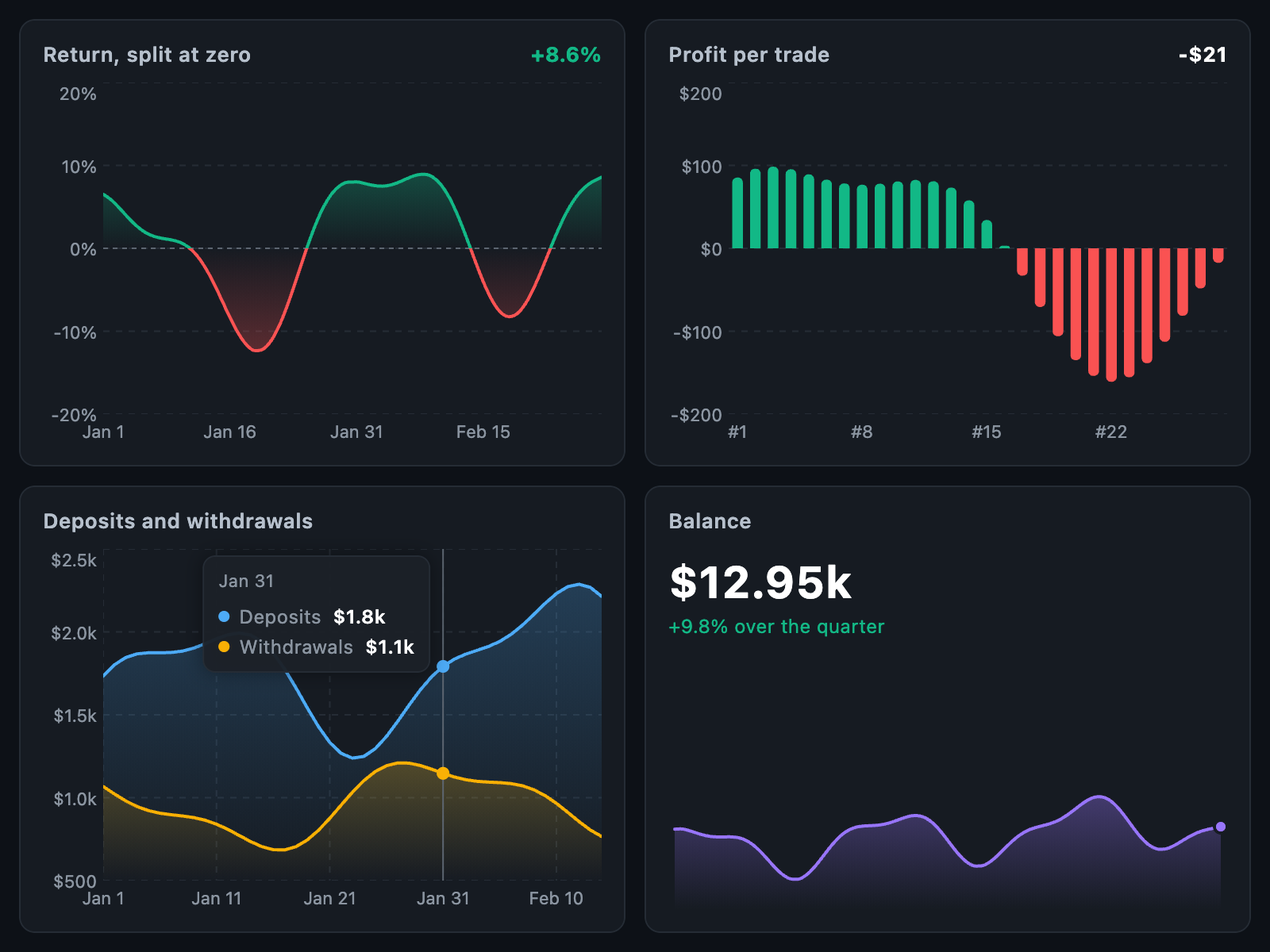
SizedBox(
  height: 58,
  child: SeriesChart(
    series: [
      LineSeries.values(
        balances,
        color: context.secondaryDark,
        width: isTouched ? 2 : 1,
        curve: LineCurve.monotone,
        fill: SeriesFill(gradient: AppGradients.chartPurpleFade(context)),
        dotBuilder: isTouched
            ? (i, _) => SeriesDot(radius: i == touchedIndex ? 3 : 2)
            : null,
      ),
    ],
    xAxis: SeriesXAxis.hidden,
    yAxis: SeriesYAxis.hidden,
    grid: SeriesGrid.none,
    touch: SeriesTouch(
      line: null,
      showMarkers: false,
      tooltip: SeriesTooltip(
        placement: SeriesTooltipPlacement.above,
        backgroundColor: context.backgroundPaper,
        borderRadius: 10,
        padding: const EdgeInsets.symmetric(horizontal: 12, vertical: 8),
        builder: (context, d) => BalanceTooltip(
          value: formatUsd(d.values.first.value),
          date: labels[d.index],
        ),
      ),
    ),
    onTouch: (d) => onTouch(active: d != null, idx: d?.index ?? -1),
  ),
);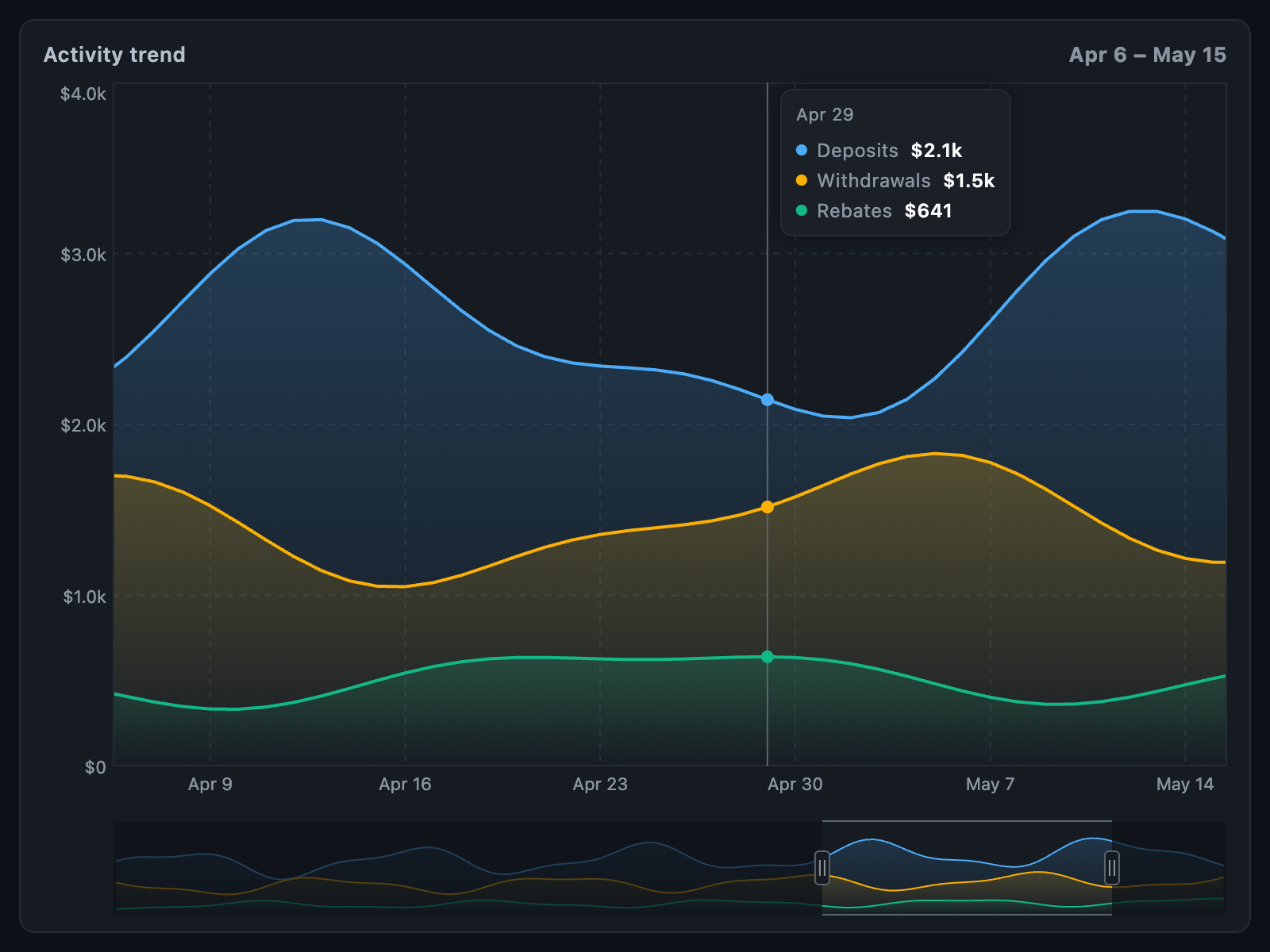
A single SeriesChart and SeriesRangeSelector replace a typical fl_chart
setup of a main LineChart, a separate y-axis LineChart, a long-press overlay
and a range selector built from a third LineChart.
Column(
  mainAxisSize: MainAxisSize.min,
  children: [
    SizedBox(
      height: 220,
      child: SeriesChart(
        series: [
          for (final (i, s) in series.indexed)
            LineSeries.values(
              s.values,
              label: s.label,
              color: seriesColor(context, i),
              fill: SeriesFill.fade(seriesColor(context, i)),
            ),
        ],
        minX: window.start - .5,
        maxX: window.end + .5,
        xAxis: SeriesXAxis(labels: axisLabels, style: axisLabelStyle),
        yAxis: SeriesYAxis(width: 30, formatter: formatUsdAxis, style: axisLabelStyle),
        grid: SeriesGrid(color: context.gray700, dashPattern: const [4, 4]),
        border: BorderSide(color: context.gray700),
        touch: SeriesTouch(
          trigger: SeriesTouchTrigger.longPress,
          tooltip: SeriesTooltip(builder: (context, d) => TrendTooltip(d)),
        ),
        animationDuration: dragging ? Duration.zero : const Duration(milliseconds: 450),
      ),
    ),
    if (count > windowPoints) ...[
      const SizedBox(height: 12),
      Padding(
        padding: const EdgeInsetsDirectional.only(start: 30),
        child: SeriesRangeSelector(
          series: overviewSeries,
          window: window,
          minSpan: 4,
          maskColor: context.backgroundBG.withValues(alpha: .6),
          onChanged: (next) => setState(() => window = next),
        ),
      ),
    ],
  ],
);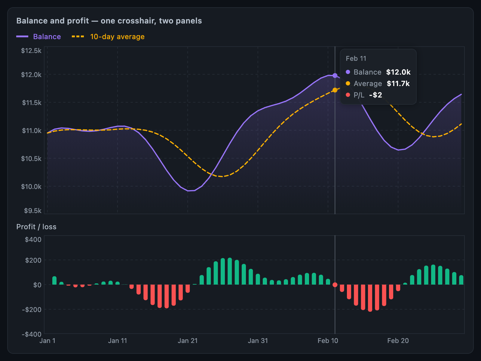
A balance line with a dashed average, above a profit bar chart. A shared
SeriesChartController synchronises the crosshair across both panels.
final crosshair = SeriesChartController();

SeriesChart(
  series: [
    LineSeries.values(balance, color: purple, fill: SeriesFill.fade(purple, opacity: .14)),
    LineSeries.values(average, color: amber, dashPattern: const [6, 4]),
  ],
  xAxis: SeriesXAxis.hidden,
  yAxis: const SeriesYAxis(width: 25),
  xPadding: .5,
  controller: crosshair,
  touch: SeriesTouch(
    trigger: SeriesTouchTrigger.longPress,
    tooltip: SeriesTooltip(
      builder: (context, d) => BalanceTooltip(d, profit: profits[d.index]),
    ),
  ),
);
SeriesChart(
  series: [
    BarSeries.values(profits, color: green, negativeColor: red,
        radius: 3, minWidth: 3.5, maxWidth: 12),
  ],
  xAxis: SeriesXAxis(labels: axisLabels),
  yAxis: const SeriesYAxis(width: 25),
  controller: crosshair,
  touch: const SeriesTouch(trigger: SeriesTouchTrigger.longPress, tooltip: null),
);SeriesChart(
series: [
LineSeries.values(
roi,
color: green,
negativeColor: red,
width: 1.5,
curve: LineCurve.monotone,
fill: SeriesFill.fade(green, negativeColor: red),
),
],
includeZero: true,
xAxis: SeriesXAxis.hidden,
yAxis: SeriesYAxis.hidden,
grid: SeriesGrid.none,
referenceLines: [
SeriesReferenceLine.horizontal(0, color: gray600, dashPattern: const [3, 3]),
],
touch: SeriesTouch(
markerBuilder: (v) => SeriesDot(radius: 3, color: v.color),
tooltip: SeriesTooltip(
placement: SeriesTooltipPlacement.above,
valueFormatter: (v) => formatPercentFixed(v.value),
),
),
animationDuration: const Duration(milliseconds: 300),
);No zeroStop gradient calculation is needed: negativeColor changes the line
colour exactly where it crosses the baseline.
Workarounds that render a flat frame and then update to real values are not
needed. With a non-zero animationDuration, the first build animates from the
baseline automatically (animateOnMount, enabled by default).
| candlesticks | ohlcv_chart |
|---|---|
Candle(date:, open:, high:, low:, close:, volume:) |
KLineEntity.fromCustom(dateTime:, open:, high:, low:, close:, vol:) |
| a list newest first | a list oldest first: reverse it |
| — | DataUtil.calculate(candles) once, before the chart gets them |
Candlesticks(candles: candles) |
KChartWidget(candles, ChartColors()) |
loadingWidget |
candles.isEmpty ? MyLoading() : KChartWidget(...) |
onLoadMoreCandles |
onLoadMore: (atRight) { if (!atRight) loadOlder(); } |
CandlesticksController |
KChartController — zoomIn, zoomOut, scrollToNow, showRange |
CandleSticksStyle |
ChartColors (see below) |
final candles = [
  for (final p in points.reversed)
    KLineEntity.fromCustom(
      dateTime: DateTime.fromMillisecondsSinceEpoch(p.time * 1000),
      open: p.open,
      high: p.high,
      low: p.low,
      close: p.close,
      vol: p.tickVolume.toDouble(),
    ),
];
DataUtil.calculate(candles);

KChartWidget(
  candles,
  ChartColors(
    bgColor: context.backgroundPaper,
    gridColor: context.gray700,
    defaultTextColor: context.textSoft,
    upColor: context.successMain,
    dnColor: context.errorMain,
  ),
  chartTranslations: ChartTranslations(date: l10n.date, open: l10n.open, …),
);
Since 2.5.0, isTrendLine and timeFrame are optional, and watermark accepts
any widget. Pass timeFrame to show a countdown on the current-price tag, and
isTrendLine: true to enable drawing tools.
CandleSticksStyle |
ChartColors |
|---|---|
chartBackgroundColor |
bgColor |
gridLineColor |
gridColor |
axisTextColor |
defaultTextColor |
candleBullColor, candleBearColor |
upColor, dnColor |
volumeBullColor, volumeBearColor |
follow upColor / dnColor |
crosshairLineColor |
hCrossColor, vCrossColor |
crosshairLabelTextColor |
crossTextColor |
ohlcInfoBullColor, ohlcInfoBearColor |
infoWindowUpColor, infoWindowDnColor |
priceIndicatorBullBackgroundColor, …BearBackgroundColor |
nowPriceUpColor, nowPriceDnColor |
priceIndicatorTextColor |
nowPriceTextColor |
loadingIndicatorColor |
your own loading widget |
candlesticks includes built-in zoom buttons. KChartWidget zooms with pinch
and scroll; to add buttons, call KChartController.zoomIn and zoomOut from
your own UI.