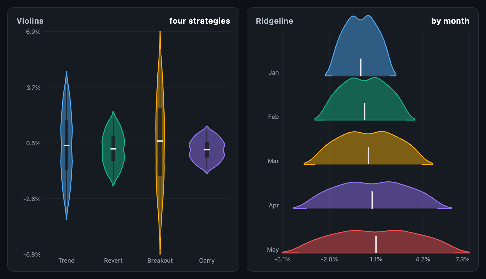
ViolinChart draws the shape of a distribution. A box plot says where the
quartiles are; a violin says what the distribution actually looks like between
them — two strategies with the same median and the same spread can look very
different, and this is the chart that shows it.
ViolinChart(
  series: [
    ViolinSeries(label: 'Trend', samples: trendReturns),
    ViolinSeries(label: 'Mean revert', samples: revertReturns),
  ],
);
The chart fills its constraints. In a box with no height it takes
defaultHeight.
kernelDensity(samples, bandwidth:, points:, cut:) estimates it: a Gaussian
kernel is laid over every sample and the curves are added up. bandwidth is
how wide each kernel is — left out, it is Silverman's rule of thumb, which fits
most distributions without being told anything about them. A wider bandwidth
smooths the shape; a narrower one shows every lump. cut widens the range past
the outermost samples by that many bandwidths, so the tails close rather than
being chopped off.
It returns a DensityCurve with the min and max it covers, one density per
evenly spaced point, and peak. Every shape in a chart is measured against the
tallest peak among them, so their areas stay comparable: a wider violin really
does hold more samples.
Give ViolinSeries.curve to use a shape you worked out yourself, and
ViolinSeries.stats a BoxPlotStats you already have — otherwise both are
taken from samples.
shape |
What it draws |
|---|---|
ViolinShape.violin (default) |
A symmetric shape per series, side by side, values running up the chart |
ViolinShape.ridgeline |
Half a shape per series, stacked down the chart and overlapping, values running across it |
A ridgeline — a joy plot — is the better one for many distributions at once, or
for the same distribution over many months. overlap says how far its rows run
into their neighbours; the shapes are drawn back to front so the stack reads
the way it overlaps.
showBox draws the whiskers and the quartile box from BoxPlotStats inside
each violin, and showMedian marks the median. On a ridgeline there is no
room for a box, so only the whiskers and the median are marked.
See Box plot for how the quartiles and whiskers are worked out.
layOutViolin(series, size:, ...) is the layout on its own, without a widget.
It returns a ViolinLayout with the plotRect, the shared min and max,
and a ViolinSeriesLayout per series holding its bandRect, its closed
outline path, the curve and stats behind it, and where the median, box
and whiskers go. layout.positionOf(value) places a value — down the chart for
violins, across it for a ridgeline — and layout.seriesAt(point) finds the
series under a point, front first. progress grows the shapes out of their
centre line, for a draw-in animation.
onSeriesTap is called with a series when its band is touched or dragged over,
and with null when the touch leaves. The touched shape fills in more solidly,
and a card names it and its median; tooltipBuilder replaces the card.
| Field | Default |
|---|---|
palette |
Six colours, handed out by position |
fillOpacity, outlineWidth |
0.45 and 1.5 |
medianColor, boxColor |
A near-white median over a dark box |
bandPadding, overlap |
0.12 and 0.55 |
showAxis, tickCount, axisFormatter, gridColor |
The value axis |
animationDuration, animationCurve, animateOnMount |
The draw-in |
semanticLabel is what a screen reader announces for the chart.