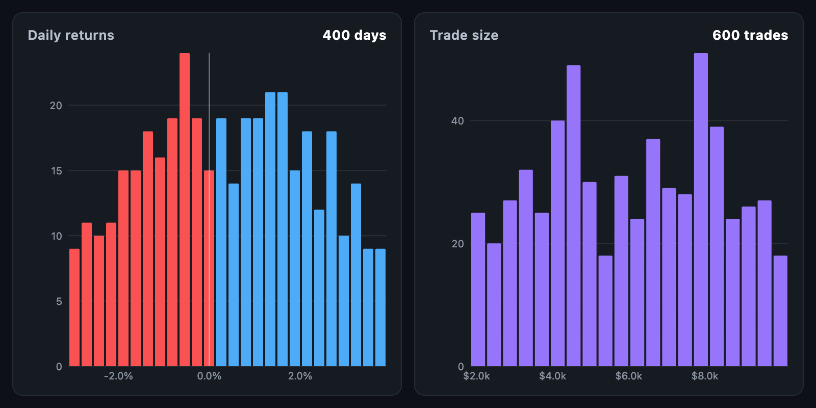
HistogramChart shows how often values fall in each part of their range — the
shape of a distribution. Typical uses include the spread of daily returns, trade
sizes, slippage and time-of-day activity.
HistogramChart(
  bins: histogramBins(dailyReturns, binCount: 24),
  negativeColor: Colors.red,
  referenceLines: const [0],
);
The chart fills its constraints. When the height is unbounded, it uses
defaultHeight.
histogramBins(samples, …) counts raw values into bins of equal width:
| Parameter | Description |
|---|---|
binCount |
How many bins to cut the range into |
binWidth |
The width of one bin; the range grows to hold whole bins |
min, max |
The range to count over; null takes the samples' own range |
With neither binCount nor binWidth, the number of bins is the square root of
the number of samples. Samples outside the range are dropped, values that are
not finite are ignored, and a sample landing exactly on a boundary goes into the
bin above — except at the top, where the last bin includes its own upper edge.
Bins can also be built by hand: HistogramBin(from: …, to: …, count: …), with an
optional color and data. center and width are derived. Bins of unequal
width are drawn at unequal widths, since bars are placed by their range.
| Parameter | Description |
|---|---|
maxCount |
What a full-height bar counts; null takes the largest bin |
barColor |
Colour of a bar without one of its own |
negativeColor |
Colour of a bar whose range lies below zero |
barSpacing |
Pixels taken off each side of a bar |
barRadius |
Rounding of the top corners |
referenceLines |
Values marked with a vertical line — zero, the mean, a target |
referenceColor |
The colour of those lines |
gridColor |
Line ruled across the chart at each count tick |
hoverColor |
Painted behind the column under the pointer |
showValueAxis, showCountAxis |
The two axes |
valueAxisHeight, countAxisWidth |
How much room they take |
tickCount |
About how many ticks per axis |
valueFormatter, countFormatter |
Axis label text |
axisLabelStyle |
Style of an axis label |
padding, backgroundColor |
Space around and behind the chart |
Value labels that would collide are dropped, so a narrow chart stays readable.
layOutHistogram(bins, bounds, maxCount: …) returns the HistogramBar list the
chart paints, and histogramBarAt hit-tests it. Both are public, so a layout can
be computed and tested without a widget.
A touch anywhere in a bin's column selects it, whatever the bar's height.
onTouch reports a HistogramTouchDetails with the bar and its bin, and
null when the pointer leaves.
HistogramChart(
  bins: bins,
  tooltipBuilder: (context, details) => Card(
    child: Padding(
      padding: const EdgeInsets.all(8),
      child: Text('${details.bin.from} … ${details.bin.to}\n'
          '${details.bin.count.toInt()} samples'),
    ),
  ),
);animationDuration grows the bars up from the baseline; animationCurve eases
it and animateOnMount controls whether the first build animates. The chart
animates again whenever bins changes identity.
A box plot over the same samples summarises what the histogram shows in full, and the two read well stacked: the histogram for the shape, the box plot for the quartiles and outliers.