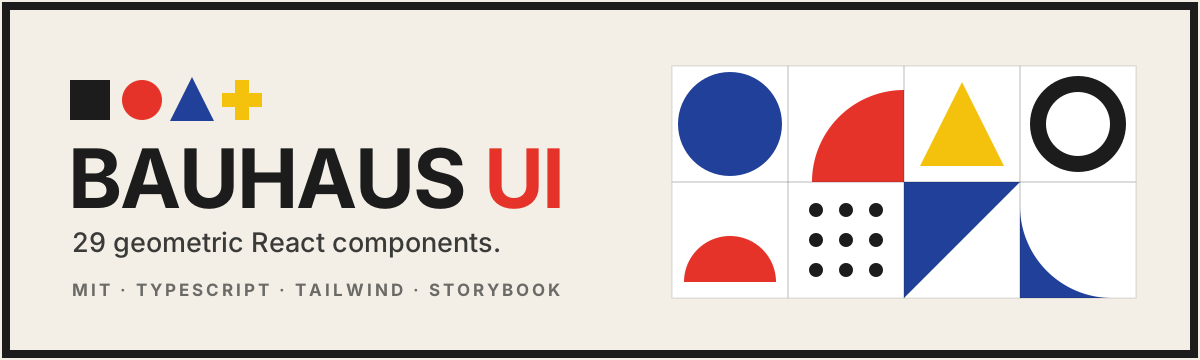
A bold, geometric React component library inspired by the Bauhaus movement: primary colors, hard edges, thick black borders, and a relentless grid. 29 components, fully typed, accessible, themeable, with a built-in dark mode.
Form follows function.


Built with React + TypeScript + Tailwind CSS + Vite + Storybook.
- 29 components spanning signature geometric primitives, forms, feedback, navigation and overlays.
- Bauhaus design system. A disciplined palette (red
#E63329, blue#21409A, yellow#F4C20D, ink#1C1C1C), geometric sans-serif type (Space Grotesk + Archivo), sharp corners and hard offset shadows. - Signature generator.
GeometricPatterntessellates deterministic Bauhaus motif grids for heroes and backdrops. - Dark mode built in. Flip a single
.darkclass on<html>; surfaces and ink invert while the primary triad stays vivid. - Accessible. Roles, ARIA attributes and keyboard support throughout (tabs, accordion, modal, toast).
- Themeable. Every surface token is a CSS variable; primaries are Tailwind colors.
- Tree-shakeable ESM + UMD builds with bundled type declarations.
npm install bauhaus-ui-libraryImport the stylesheet once at your app root:
import 'bauhaus-ui-library/styles.css'The bundled styles.css is self-contained (it includes the design tokens and every utility the
components use), so Tailwind is not required in your app. If you do use Tailwind and want to
author your own bred / bblue markup, copy the token definitions from the Theming section below.
Load the fonts (e.g. in your index.html):
<link
  href="https://fonts.googleapis.com/css2?family=Archivo:wght@400;500;600;700;800&family=Space+Grotesk:wght@400;500;600;700&family=Space+Mono:wght@400;700&display=swap"
  rel="stylesheet"
/>import { Button, Card, CardBody, GeometricPattern, useToast, ToastProvider } from 'bauhaus-ui-library'
function App() {
return (
<ToastProvider>
<Card accent="red">
<GeometricPattern rows={2} cols={6} className="h-24" />
<CardBody>
<Button color="red" rightIcon={<span>→</span>}>
Get started
</Button>
</CardBody>
</Card>
</ToastProvider>
)
}Every component shares a small, predictable API:
color:'red' | 'blue' | 'yellow' | 'ink'size:'sm' | 'md' | 'lg'variantwhere it makes sense:'solid' | 'outline' | 'ghost'
| Group | Components |
|---|---|
| Signature | Shape, ShapeLogo, GeometricPattern |
| Core | Button, Card (+ CardHeader/CardTitle/CardDescription/CardBody/CardFooter) |
| Form | FormField, Input, Textarea, Select, Checkbox, Radio/RadioGroup, Switch, Slider |
| Display & feedback | Badge, Tag, Avatar, Alert, Progress, Spinner, Divider, Tooltip |
| Navigation | Tabs, Accordion, Navbar, Pagination, Breadcrumb |
| Overlay | Modal, Drawer, Toast (ToastProvider + useToast) |
Add the dark class to your root element (the showcase ships a toggle that also
respects prefers-color-scheme and persists the choice):
document.documentElement.classList.toggle('dark')Surfaces (paper, surface) and ink flip; the red / blue / yellow triad stays vivid in
both themes.
Surface and ink tokens are space-separated RGB channels (so Tailwind alpha like bg-ink/10
works). Override them in your own CSS (these are the same variables styles.css already ships):
:root {
  --bui-paper: 250 247 240; /* page background */
  --bui-surface: 255 255 255; /* cards & controls */
  --bui-ink: 28 28 28; /* text, borders, shadows */
}
.dark {
  --bui-paper: 22 20 18;
  --bui-surface: 38 35 31;
  --bui-ink: 243 239 230;
}
For reference, the Tailwind color names the components use are bred, bblue, byellow (each
with -dark / -light / -ink steps), plus paper, surface, ink, and the fixed
coal / chalk neutrals — all backed by the CSS variables above.
npm install         # install dependencies
npm run dev         # run the showcase site (Vite)
npm run storybook   # component explorer
npm run lint        # ESLint
npm run format      # Prettier (write)
npm run typecheck   # tsc --noEmit
npm test            # Vitest (npm run test:watch to watch)
npm run build       # build the showcase
npm run build:lib   # build the publishable library (dist/)
npm run build-storybookThis library is a working translation of Bauhaus principles into UI: form follows function, the grid as the silent organizer, the primary triad, and the canonical shape→color mapping (circle→blue, square→red, triangle→yellow). It fills a gap: while neo-brutalism has several React libraries, no installable Bauhaus component system existed.
Issues and pull requests are welcome. See CONTRIBUTING.md and the Code of Conduct; release notes live in CHANGELOG.md.
MIT — see LICENSE.