

A highly customizable Vue 3 range slider component with real-time WebGL fire trail effects. Inspired by Claude Code's effort slider, featuring smooth snap-to-step animation, dynamic color theming, and GPU-accelerated particle rendering.
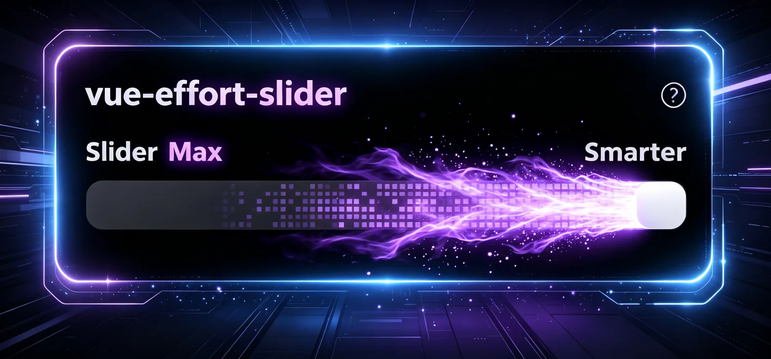

Live config panel — adjust every prop in real time and copy the generated code.

- WebGL2 fire trail — Real-time GPU-rendered flame effect that activates when the slider reaches the threshold
- Snap-to-step animation — Smooth cubic ease-out animation snaps the thumb to the nearest 25% mark
- Fully themeable — 10+ color props to customize every visual element (thumb, trail, track, labels, glow)
- v-model support — Standard Vue two-way binding with
modelValue - Squircle clip paths — Apple-style superellipse clipping for the card and track
- Responsive — Accepts pixel values or CSS strings for width
- Help tooltip — Built-in help icon with teleport-based tooltip
- Lightweight — Zero runtime dependencies, only requires Vue 3 as a peer dependency
npm install vue-effort-slider# 1. Create project
npm create vite@latest my-slider -- --template vue
cd my-slider
npm install vue-effort-sliderModify src/App.vue:
<script setup>
import { ref } from 'vue'
import { EffortSlider } from 'vue-effort-slider'
import 'vue-effort-slider/style.css'

const value = ref(75)
</script>

<template>
  <EffortSlider v-model="value" />
  <p style="color:#71717a;text-align:center;margin-top:16px">Current value: {{ value }}</p>
</template>
# 2. Run
npm run devOpen http://localhost:5173 — the slider with fire trail is live.
// main.js
import { createApp } from 'vue'
import App from './App.vue'
import VueEffortSlider from 'vue-effort-slider'
import 'vue-effort-slider/style.css'

const app = createApp(App)
app.use(VueEffortSlider)
app.mount('#app')<template>
<EffortSlider v-model="value" />
</template>
<script setup>
import { ref } from 'vue'
const value = ref(75)
</script><template>
<EffortSlider v-model="value" label="思考深度" />
</template>
<script setup>
import { ref } from 'vue'
import { EffortSlider } from 'vue-effort-slider'
import 'vue-effort-slider/style.css'
const value = ref(50)
</script>Each module can be imported separately for tree-shaking:
// Full component
import { EffortSlider } from 'vue-effort-slider'
import 'vue-effort-slider/style.css'

// Component only
import { EffortSlider } from 'vue-effort-slider/EffortSlider'

// Import composable individually
import { useSliderState } from 'vue-effort-slider/useSliderState'
import { useWebglFire } from 'vue-effort-slider/useWebglFire'

// Or batch import from composables
import { useSliderState, useWebglFire } from 'vue-effort-slider/composables'

// Shaders only (GLSL source strings)
import { VERT, FRAG_SIM, FRAG_BLUR, FRAG_COMP } from 'vue-effort-slider/shaders'Use useWebglFire to add the fire trail effect to any canvas:
<template>
  <canvas ref="canvasRef" width="400" height="60"
    style="width:400px;height:60px;border-radius:10px;background:#0c0c0c" />
</template>

<script setup>
import { ref } from 'vue'
import { useWebglFire } from 'vue-effort-slider/useWebglFire'

const canvasRef = ref(null)
const sliderValue = ref(100)
const isActive = ref(true)

useWebglFire(canvasRef, sliderValue, isActive, () => '#a857f7')
</script>| Prop | Type | Default | Description |
|---|---|---|---|
modelValue |
Number |
75 |
Current slider value, supports v-model. Range: 0 to 100 |
width |
String | Number |
376 |
Component width. Accepts a number (pixels) or a CSS string (e.g. '100%') |
label |
String |
'Slider' |
Header label text displayed next to the status |
threshold |
Number |
100 |
Value at which the WebGL fire effect activates. Set to 100 to only activate at max |
scaleLabels |
String[] |
['Faster', 'Smarter'] |
Two-element array for left and right endpoint labels below the track |
statusLabels |
Object |
{ level1: 'Minimal', level2: 'Low', level3: 'Medium', level4: 'High', level5: 'Max' } |
Status text for each of the 5 gear levels |
background |
String |
'#000000' |
Card background color (any CSS color value) |
borderRadius |
String | Number |
20 |
Card border radius in pixels |
showHelp |
Boolean |
true |
Whether to display the help icon in the header |
helpText |
String |
'Drag the slider to adjust AI thinking depth' |
Tooltip content shown when the help icon is clicked |
All color props accept any valid CSS color value (hex, rgb, hsl, etc.).
| Prop | Type | Default | Description |
|---|---|---|---|
labelColor |
String |
'#b0b0c7' |
Color of the header label text (e.g. "Effort") |
statusColor |
String |
'#a1a1aa' |
Color of the status text when slider is below threshold |
activeColor |
String |
'#c084fc' |
Color of the status text when slider reaches threshold (with glow effect) |
highlightColor |
String |
'#c084fc' |
Thumb glow color when slider is at or above threshold |
scaleLabelColor |
String |
'#b0b0b8' |
Color of the endpoint labels ("Faster" / "Smarter") |
helpIconColor |
String |
'#a1a1aa' |
Color of the help icon |
trailColor |
String |
'#a857f7' |
Color of the WebGL fire trail effect |
thumbColor |
String |
'#ffffff' |
Color of the draggable slider thumb |
trackColor |
String |
'#0c0c0c' |
Background color of the slider track |
dotColor |
String |
'#494950' |
Color of the 5 decorative dots on the track |
| Event | Payload | Description |
|---|---|---|
update:modelValue |
Number |
Emitted continuously as the slider is dragged. Used by v-model |
change |
Number |
Emitted once when dragging ends, after the snap animation completes. The payload is the final snapped value |
help |
— | Emitted when the help icon is clicked |
<template>
  <EffortSlider v-model="value" />
</template>

<script setup>
import { ref } from 'vue'
import { EffortSlider } from 'vue-effort-slider'
import 'vue-effort-slider/style.css'

const value = ref(50)
</script><template>
<EffortSlider
v-model="depth"
label="思考深度"
:width="400"
:scale-labels="['快速', '精准']"
:status-labels="{
level1: '极简',
level2: '简单',
level3: '一般',
level4: '深入',
level5: '极致'
}"
trail-color="#8b5cf6"
highlight-color="#a78bfa"
active-color="#c084fc"
thumb-color="#ffffff"
track-color="#0a0a0a"
background="#000000"
help-text="拖动滑块调整 AI 思考深度"
/>
</template>
<script setup>
import { ref } from 'vue'
import { EffortSlider } from 'vue-effort-slider'
import 'vue-effort-slider/style.css'
const depth = ref(50)
</script><template>
<EffortSlider
v-model="value"
@change="onValueChanged"
@help="onHelpClicked"
/>
<p>当前值: {{ value }}</p>
</template>
<script setup>
import { ref } from 'vue'
import { EffortSlider } from 'vue-effort-slider'
import 'vue-effort-slider/style.css'
const value = ref(75)
function onValueChanged(val) {
console.log('Slider settled at:', val)
}
function onHelpClicked() {
console.log('Help icon clicked')
}
</script><template>
<!-- Pixel value -->
<EffortSlider v-model="v1" :width="300" />
<!-- CSS string -->
<EffortSlider v-model="v2" width="100%" />
</template>The fire trail effect uses a 4-pass WebGL2 rendering pipeline:
- Simulation pass — Computes flame patterns using cellular noise, decay, sparks, and edge lighting
- Horizontal blur — 7-tap Gaussian blur in the horizontal direction
- Vertical blur — 7-tap Gaussian blur in the vertical direction
- Composite pass — Tone-maps the scene and glow textures into the final output
- Rendering loop uses cached reactive values to avoid Vue dependency tracking overhead
- Automatically stops after 180 idle frames when inactive
- Uses
ResizeObserverfor efficient canvas size management - Canvas uses
opacity: 0instead ofdisplay: noneto prevent Chrome WebGL context休眠
When the user releases the slider, it smoothly animates to the nearest 25% mark using a cubic ease-out curve over 220ms.
- Chrome 90+
- Firefox 90+
- Safari 15+
- Edge 90+
Requires WebGL2 support. All modern desktop and mobile browsers support WebGL2.
- Vue 3.3+
- WebGL2-capable browser
No npm, no build tools needed — just include in your HTML:
<link rel="stylesheet" href="https://cdn.jsdelivr.net/npm/vue-effort-slider@1.2.3/dist/style.css">
<script src="https://unpkg.com/vue@3/dist/vue.global.js"></script>
<script src="https://cdn.jsdelivr.net/npm/vue-effort-slider@1.2.3/dist/vue-effort-slider.umd.js"></script>This project is built on top of 254558/claude-range-slider with enhancements.
| Feature | Original claude-range-slider | This project vue-effort-slider |
|---|---|---|
| Framework | Vanilla JavaScript | Vue 3 component |
| Install | Manual file copy | npm install |
| Binding | Manual event listeners | Standard v-model |
| Fire effect | Basic Canvas | Enhanced WebGL2 4-pass rendering |
| Online config | None | slider.27c.site visual config panel |
| Theming | 3 colors | 10+ color props |
| TypeScript | None | Full type definitions |
- Building with Vue 3 → use this project, works out of the box
- Using another framework / vanilla JS → use the original, wrap it yourself
- Just want to try it out → use this project, up and running in 5 minutes
MIT