A production-ready React component library for creating sophisticated split-pane layouts with draggable tabs. Inspired by industry-leading IDEs like VS Code and LeetCode, it provides a powerful, flexible, and accessible workspace management solution. Built on top of the robust allotment library for smooth, performant pane resizing.
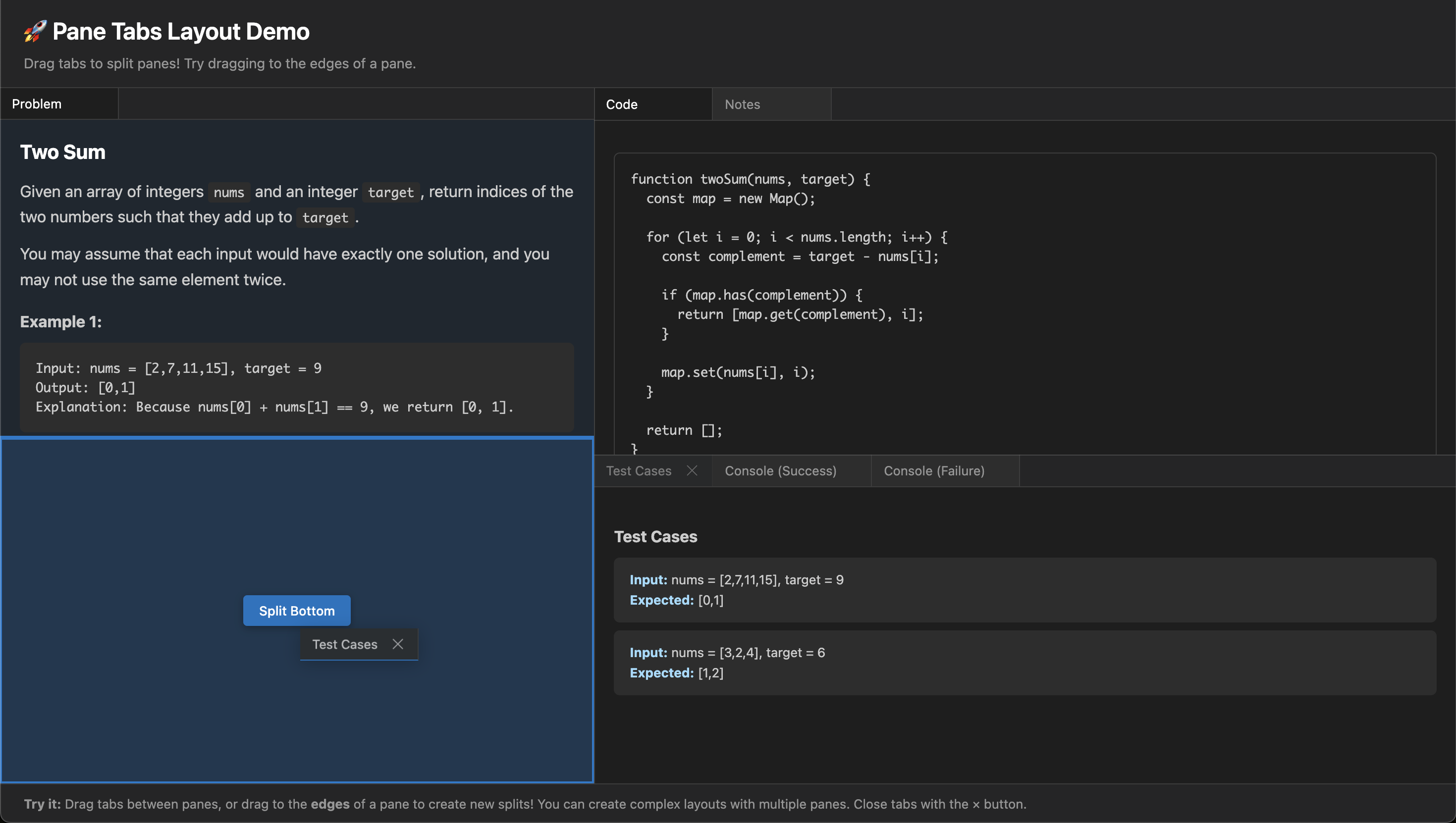
- 🪟 Infinite Split Panes - Create complex nested layouts by dragging tabs to any edge
- 🔄 Intuitive Drag & Drop - Move tabs between panes or split panes by dragging to edges
- 📊 Tree-Based Layout - Recursive layout structure supports unlimited nesting depth
- 🧹 Auto-Cleanup - Empty panes automatically collapse and remove themselves
- 📱 Fully Responsive - Panes intelligently adjust to container size changes
- 💾 Persistent State - Serialize and restore complete layout configurations
- 🎨 Deeply Customizable - Built-in dark & light themes with extensive CSS variables for complete theming control
- ♿ Accessible - Full ARIA support with keyboard navigation
- 🔗 Link Interception - Automatically open matching links as tabs with custom resolver
- 📝 TypeScript First - 100% TypeScript with comprehensive type definitions
- 🚀 Production Ready - Battle-tested with automated testing and strict type checking
- 📌 Tab Pinning - Pin important tabs to the start of the tab bar with visual separation, drag boundaries, and programmatic pin/unpin control — just like VS Code.
- 🔲 Maximize / Restore Panes - Double-click the empty tab bar area or click the maximize/restore button (top-right of tab bar) to toggle a pane between normal and maximized (full viewport) states.
- 🧩 Custom Tab Headers / Toolbars - Three levels of tab header customization: simple
tabExtrabadges, per-panetabBarActionstoolbars, and fullrenderTabcontrol — all without breaking drag-and-drop or pinning.
npm install pane-tabs-layout
# or
yarn add pane-tabs-layout
# or
pnpm add pane-tabs-layoutimport { PaneTabsLayout, TabData, LayoutConfig } from 'pane-tabs-layout';
const tabs: TabData[] = [
{
id: 'editor',
title: 'Editor',
content: <CodeEditor />,
closable: false,
},
{
id: 'console',
title: 'Console',
content: <ConsoleOutput />,
closable: true,
data: { runId: 'run-123', status: 'running' }, // Custom metadata
},
];
const layout: LayoutConfig = {
panes: [
{
id: 'main-pane',
tabs: ['editor'],
activeTab: 'editor',
minSize: 300,
},
{
id: 'bottom-pane',
tabs: ['console'],
activeTab: 'console',
minSize: 150,
},
],
vertical: true,
defaultSizes: [600, 200],
};
function App() {
const [currentLayout, setCurrentLayout] = useState(layout);
return (
<PaneTabsLayout
initialLayout={currentLayout}
initialTabs={tabs}
onLayoutChange={(newLayout) => {
console.log('Layout changed:', newLayout);
setCurrentLayout(newLayout);
// Persist to localStorage, database, etc.
}}
onTabsChange={(newTabs) => {
console.log('Tabs changed:', newTabs);
}}
/>
);
}Unlike traditional split-pane libraries limited to 2 panes, Pane Tabs Layout supports unlimited nested splits. Simply drag a tab to any edge of an existing pane:
- Drag to center → Move tab to existing pane
- Drag to left/right edge → Create horizontal split
- Drag to top/bottom edge → Create vertical split
The layout automatically manages the tree structure, collapsing unnecessary splits when panes are removed.
Pin important tabs to keep them always visible and grouped at the left of the tab bar — just like in VS Code. Pinned tabs cannot be closed via the UI and stay separated from unpinned tabs during drag-and-drop.
const tabs: TabData[] = [
  {
    id: 'editor',
    title: 'Editor',
    content: <CodeEditor />,
    pinned: true, // ← Pinned to the left
  },
  {
    id: 'console',
    title: 'Console',
    content: <ConsoleOutput />,
  },
];

// Programmatically pin/unpin tabs
function MyComponent() {
  const { pinTab, unpinTab } = useLayout();

  return (
    <>
      <button onClick={() => pinTab('main-pane', 'console')}>Pin Console</button>
      <button onClick={() => unpinTab('main-pane', 'editor')}>Unpin Editor</button>
    </>
  );
}
Pinning behavior:
- Right-click any tab to open a context menu with Pin Tab / Unpin Tab (and Close Tab)
- Pinned tabs are always grouped at the start of the tab bar
- A visual separator divides pinned tabs from unpinned tabs
- Pinned tabs show a pin indicator instead of a close button (click the indicator to unpin)
- Drag boundaries are enforced: pinned tabs stay in the pinned zone, unpinned tabs stay in the unpinned zone
- Pin state is persisted via
onTabsChange(thepinnedfield is included inTabData)
Three levels of tab header customization, from simple to full control. All levels are safe with drag-and-drop, pinning, and maximize — the library always controls the outer interactive wrapper.
Add small decorations (badges, status dots, action buttons) after the tab title:
const tabs: TabData[] = [
  {
    id: 'notifications',
    title: 'Notifications',
    content: <NotificationList />,
    tabExtra: <span className="badge">3</span>,
  },
  {
    id: 'editor',
    title: 'main.ts',
    content: <CodeEditor />,
    tabExtra: <span className="modified-dot" />,
  },
];Inject toolbar widgets into the right side of any pane's tab bar, next to the maximize button:
<PaneTabsLayout
  initialLayout={layout}
  initialTabs={tabs}
  tabBarActions={(paneId, pane) => {
    if (paneId === 'editor-pane') {
      return (
        <>
          <button onClick={runCode}>▶ Run</button>
          <button onClick={formatCode}>Format</button>
        </>
      );
    }
    return null; // No extra actions for other panes
  }}
/>Fully customize a tab header's inner content. Receives the current state and the default rendering (defaultTab) for easy composition:
const tabs: TabData[] = [
  {
    id: 'editor',
    title: 'main.ts',
    content: <CodeEditor />,
    renderTab: ({ defaultTab, isActive }) => (
      <div style={{ display: 'flex', flexDirection: 'column' }}>
        {defaultTab}
        {isActive && <span className="tab-subtitle">editing</span>}
      </div>
    ),
  },
];
The outer tab wrapper (drag handlers, click, ARIA attributes, CSS classes) is always managed by the library. renderTab only replaces the inner content, so all interactions remain intact.
Composition with defaultTab: Wrap defaultTab to add decorations while keeping the built-in icon, title, tabExtra, pin/close buttons. Or ignore defaultTab entirely for a fully custom tab header.
Prevent tabs from closing when they have unsaved changes using two levels of callbacks:
Attach a callback directly to a tab for tab-specific close confirmation:
const tabs: TabData[] = [
  {
    id: 'editor',
    title: 'main.ts',
    content: <CodeEditor />,
    onBeforeClose: async () => {
      if (hasUnsavedChanges) {
        const confirmed = await showConfirmDialog('You have unsaved changes. Close anyway?');
        return confirmed; // Return false to prevent closing
      }
      return true; // Allow close
    },
  },
];Use a global handler for consistent app-wide confirmation dialogs:
<PaneTabsLayout
  initialLayout={layout}
  initialTabs={tabs}
  onBeforeCloseTab={async (tabId, paneId, tab) => {
    // Check for dirty state in tab data
    if (tab.data?.isDirty) {
      const confirmed = await showCustomDialog(`Save changes to ${tab.title}?`);
      return confirmed;
    }
    return true; // Allow close
  }}
/>
Execution order:
- Tab-level
onBeforeCloseis called first (if provided) - If it allows close (returns
true), globalonBeforeCloseTabis called (if provided) - Tab only closes if both callbacks allow it (or if neither is provided)
Key behaviors:
- Both callbacks can return
boolean(synchronous) orPromise<boolean>(asynchronous) - Return/prevent close with
falseto stop the tab from closing - If a callback throws an error, the close is prevented (failsafe)
- Works with all close triggers: close button, context menu, and programmatic
closeTab()
Complete example with visual dirty indicator:
const [isDirty, setIsDirty] = useState(false);

const tabs: TabData[] = [
  {
    id: 'editor',
    title: 'main.ts',
    content: <CodeEditor onChange={() => setIsDirty(true)} />,
    // Visual indicator of unsaved changes
    tabExtra: isDirty ? <span className="modified-dot" title="Unsaved changes" /> : null,
    // Confirmation dialog when closing with unsaved changes
    onBeforeClose: async () => {
      if (isDirty) {
        const save = await showConfirmDialog('Save changes before closing?');
        if (save) {
          await saveFile();
          setIsDirty(false);
        }
        return true; // Close after saving (or discard)
      }
      return true; // No changes, allow close
    },
  },
];Attach any serializable data to tabs for dynamic content rendering:
interface ConsoleData {
  runId: string;
  status: 'success' | 'failure' | 'running';
  startedAt: string;
}

const consoleTab: TabData = {
  id: 'console-1',
  title: 'Test Run #1',
  content: <ConsolePanel runId="run-123" status="success" />,
  data: {
    runId: 'run-123',
    status: 'success',
    startedAt: new Date().toISOString(),
  } as ConsoleData,
};

// Access tab data anywhere in your app
const { tabs } = useLayout();
const tabData = tabs.get('console-1')?.data as ConsoleData;The library intelligently manages the layout tree:
- Empty pane removal: When you move all tabs out of a pane, it automatically disappears
- Split collapsing: When a split has only one child, it collapses to avoid unnecessary nesting
- Smart redistribution: Pane sizes are evenly redistributed when panes are added or removed
The root component that manages the entire layout system.
| Prop | Type | Required | Description |
|---|---|---|---|
initialLayout |
LayoutConfig |
✅ | Initial layout configuration |
initialTabs |
TabData[] |
✅ | Array of tab definitions |
onLayoutChange |
(layout: LayoutConfig) => void |
❌ | Called when layout structure changes (splits, pane removal, etc.) |
onTabsChange |
(tabs: TabData[]) => void |
❌ | Called when tabs are added, removed, or reordered |
onOpenLink |
(url: string) => TabData | null |
❌ | Link resolver — return a TabData to open the URL as a tab, or null for default browser behavior |
linkInterception |
'auto' | 'manual' | 'none' |
❌ | Controls how <a> clicks inside content are intercepted (default: 'auto') |
tabBarActions |
(paneId: string, pane: PaneConfig) => ReactNode |
❌ | Render extra toolbar actions in each pane's tab bar (right side, before maximize button) |
onBeforeCloseTab |
(tabId: string, paneId: string, tab: TabData) => boolean | Promise<boolean> |
❌ | Global callback invoked before any tab closes. Return false to prevent closing. |
className |
string |
❌ | Additional CSS class for the container |
style |
React.CSSProperties |
❌ | Inline styles for the container |
Defines a tab's content, behavior, and associated metadata.
interface TabData {
  /** Unique identifier for the tab */
  id: string;
  /** Display title in the tab bar */
  title: string;
  /** Optional icon (ReactNode) */
  icon?: ReactNode;
  /** Content rendered when tab is active */
  content: ReactNode;
  /** Allow closing the tab (default: true) */
  closable?: boolean;
  /** Allow dragging the tab (default: true) */
  draggable?: boolean;
  /** Pin the tab to the start of the tab bar (default: false) */
  pinned?: boolean;
  /** Custom data attached to the tab */
  data?: Record<string, unknown>;
  /** Extra content after the title (badges, status dots, etc.) */
  tabExtra?: ReactNode;
  /** Custom render function for the tab header inner content */
  renderTab?: (props: RenderTabProps) => ReactNode;
  /** Callback invoked before closing the tab. Return false to prevent close. */
  onBeforeClose?: () => boolean | Promise<boolean>;
}Configuration for the entire layout structure.
interface LayoutConfig {
  /** Legacy flat pane configuration (for simple 2-pane layouts) */
  panes?: PaneConfig[];
  /** Tree-based layout structure (for complex nested layouts) */
  root?: LayoutNode;
  /** Initial pane sizes in pixels */
  defaultSizes?: number[];
  /** Legacy: vertical split orientation */
  vertical?: boolean;
  /** Minimum pane size in pixels */
  minSize?: number;
  /** Maximum pane size in pixels */
  maxSize?: number;
}For advanced use cases, you can define layouts as a recursive tree:
interface LayoutNode {
  id: string;
  type: 'pane' | 'split';
  // For split nodes
  direction?: 'horizontal' | 'vertical';
  children?: LayoutNode[];
  sizes?: number[]; // Proportional sizes (sum to 1)
  // For pane nodes
  tabs?: string[];
  activeTab?: string;
  minSize?: number;
  maxSize?: number;
  visible?: boolean;
}Pane Tabs Layout ships with dark (default) and light built-in themes and uses CSS custom properties for complete visual customization.
Activate the light theme by setting data-theme="light" on any ancestor element:
// Light theme
<div data-theme="light">
  <PaneTabsLayout initialLayout={layout} initialTabs={tabs} />
</div>

// Dark theme (default — no attribute needed)
<PaneTabsLayout initialLayout={layout} initialTabs={tabs} />
To follow the user's OS preference automatically:
function App() {
  const prefersDark = window.matchMedia('(prefers-color-scheme: dark)').matches;

  return (
    <div data-theme={prefersDark ? 'dark' : 'light'}>
      <PaneTabsLayout initialLayout={layout} initialTabs={tabs} />
    </div>
  );
}:root {
/* Background Colors */
--ptl-bg-color: #1e1e1e;
--ptl-tab-bar-bg: #252526;
--ptl-tab-bg: #2d2d2d;
--ptl-tab-hover-bg: #2a2d2e;
--ptl-tab-active-bg: #1e1e1e;
/* Text Colors */
--ptl-text-color: #cccccc;
--ptl-tab-text: #969696;
--ptl-tab-hover-text: #cccccc;
--ptl-tab-active-text: #ffffff;
/* Borders */
--ptl-border-color: #3c3c3c;
--ptl-tab-active-border: #007acc;
/* Drag & Drop */
--ptl-drag-over-bg: rgba(0, 122, 204, 0.1);
--ptl-drop-indicator-color: #007acc;
--ptl-drop-zone-bg: rgba(0, 122, 204, 0.2);
--ptl-drop-zone-border: #007acc;
--ptl-drop-zone-label-bg: rgba(0, 122, 204, 0.9);
/* Close Button */
--ptl-close-hover-bg: #c75450;
--ptl-close-hover-text: #ffffff;
/* Scrollbar */
--ptl-scrollbar-thumb: #424242;
/* Content */
--ptl-content-padding: 0;
--ptl-empty-state-color: #6e6e6e;
/* Pinned Tabs */
--ptl-tab-pinned-indicator: #007acc;
--ptl-pin-separator-color: #3c3c3c;
/* Tab Bar Actions */
--ptl-tab-bar-actions-gap: 2px;
}The light theme above is included in the library's stylesheet — setting data-theme="light" on an ancestor is all you need. To create a fully custom theme, override any --ptl-* variable on your own selector:
/* Example: custom brand theme */
[data-theme="brand"] {
  --ptl-bg-color: #faf9f7;
  --ptl-tab-bar-bg: #edecea;
  --ptl-tab-active-border: #e05d00;
  /* ... override as many or as few variables as needed */
}Pane Tabs Layout can intercept <a> clicks inside tab content and open matching URLs as new tabs — no changes needed to your content components. You provide a resolver function that decides which URLs become tabs.
import { PaneTabsLayout, type TabData } from 'pane-tabs-layout';

function App() {
  // You have full control over matching. Return TabData to open as a tab, null to ignore.
  const handleOpenLink = useCallback((url: string): TabData | null => {
    // Handle /problem/{id} links
    const problemMatch = url.match(/\/problem\/(\w+)$/);
    if (problemMatch) {
      const problemId = problemMatch[1];
      return {
        id: `problem-${problemId}`,
        title: `Problem ${problemId}`,
        content: <ProblemView id={problemId} />,
        closable: true,
        data: { problemId },
      };
    }
    // Not handled — browser navigates normally
    return null;
  }, []);

  return (
    <PaneTabsLayout
      initialLayout={layout}
      initialTabs={tabs}
      onOpenLink={handleOpenLink}
    />
  );
}
Now any <a href="https://example.com/problem/123"> inside your tab content automatically opens a "Problem 123" tab instead of navigating.
- Event Delegation — A single click handler on each pane's content area catches all
<a>clicks via bubbling. - Your Resolver Runs — The clicked link's
hrefis passed to youronOpenLinkcallback. - Tab Created or Activated — If you return a
TabData, the library either creates a new tab or activates an existing one with the sameid(built-in deduplication). - Or Ignored — If you return
null,preventDefaultis not called and the browser handles the click normally.
Control the behavior with the linkInterception prop:
| Mode | Behavior |
|---|---|
'auto' (default) |
All <a> clicks inside pane content are intercepted and resolved via onOpenLink |
'manual' |
Only the <PaneLink> component and programmatic openLink() calls trigger resolution |
'none' |
No link interception at all |
Add data-ptl-external to any <a> to skip interception, even in 'auto' mode:
<a href="https://google.com" data-ptl-external>Opens normally</a>For explicit, opt-in link handling (useful in 'manual' mode or when targeting a specific pane):
import { PaneLink } from 'pane-tabs-layout';

const MyContent = () => (
  <div>
    {/* Uses onOpenLink resolver, opens tab in the specified pane */}
    <PaneLink href="/problem/456" paneId="right-pane">Problem 456</PaneLink>

    {/* Works like a normal <a> if onOpenLink returns null */}
    <PaneLink href="https://external.com">External</PaneLink>
  </div>
);Use openLink() from the useLayout hook to open links from code:
import { useLayout } from 'pane-tabs-layout';

function Toolbar() {
  const { openLink } = useLayout();

  return (
    <button onClick={() => openLink('https://example.com/problem/42', 'left-pane')}>
      Open Problem 42
    </button>
  );
}Access the layout context for programmatic control:
import { useLayout } from 'pane-tabs-layout';

function MyComponent() {
  const {
    tabs,           // Map of all tabs
    panes,          // Map of all panes
    rootNode,       // Root layout node
    moveTab,        // Move tab between panes
    splitPane,      // Programmatically split a pane
    activateTab,    // Set active tab
    closeTab,       // Close a tab
    addTab,         // Add new tab to pane
    removePane,     // Remove a pane
    maximizePane,   // Toggle pane maximize/restore
    openLink,       // Open a URL as a tab (uses onOpenLink resolver)
    pinTab,         // Pin a tab to the start of the tab bar
    unpinTab,       // Unpin a tab
  } = useLayout();

// Example: Toggle pane maximize
  const handleMaximize = (paneId: string) => {
    maximizePane(paneId);
  };

  // Example: Add a new tab programmatically
  const handleAddTab = () => {
    addTab('left-pane', {
      id: 'new-tab',
      title: 'New Tab',
      content: <NewContent />,
    });
  };

  return <button onClick={handleAddTab}>Add Tab</button>;
}Save and restore user layouts:
function App() {
  const [layout, setLayout] = useState(() => {
    // Restore from localStorage
    const saved = localStorage.getItem('app-layout');
    return saved ? JSON.parse(saved) : defaultLayout;
  });

  const handleLayoutChange = useCallback((newLayout) => {
    setLayout(newLayout);
    // Persist to localStorage
    localStorage.setItem('app-layout', JSON.stringify(newLayout));
  }, []);

  return (
    <PaneTabsLayout
      initialLayout={layout}
      initialTabs={tabs}
      onLayoutChange={handleLayoutChange}
    />
  );
}# Install dependencies
npm install
# Run tests
npm test
# Build library
npm run build
# Type checking
npm run type-check
# Development mode with watch
npm run devpane-tabs-layout/
├── src/
│ ├── PaneTabsLayout.tsx # Main layout component with recursive rendering
│ ├── Pane.tsx # Individual pane with drop zone detection & link interception
│ ├── Tab.tsx # Tab component with drag support
│ ├── PaneLink.tsx # Explicit link component for tab-aware navigation
│ ├── LayoutContext.tsx # React context with tree management & openLink
│ ├── types.ts # Complete TypeScript definitions
│ ├── styles.css # Production-ready styles
│ └── index.ts # Public API exports
├── example/ # Full-featured demo application
├── dist/ # Built library files
└── package.json
See CONTRIBUTING.md for details on setting up the development environment and how to contribute.
ISC © umakantv