
Terminal-inspired split-flap display card for Home Assistant dashboards.
Built for Lovelace, HACS, transit dashboards, kiosk displays and high-contrast information views.


Latest recommended version:
v0.1.0-beta.16
Status: Beta editor/display validation build
What changed: adds frame controls, decorative screw logic, split-flap layer modes, font preset previews,HH:mm:ssclock default, Arlanda Express theme polish and improved upper-flap motion.
Read release notes →
Status: Beta —
v0.1.0-beta.16
Split-Flap Card is currently in beta. The configuration API may still evolve before v1.0.0, but the project is suitable for broader testing through HACS.
v0.1.0-beta.16 is a release-blocker validation build focused on editor usability, visual display depth, frame controls and clock/font defaults before a future stable v0.1.0 release.
v0.1.0-beta.15 was a metadata and version sync correction after the beta 14 security hotfix. Earlier beta metadata hotfixes are superseded by the latest beta release.
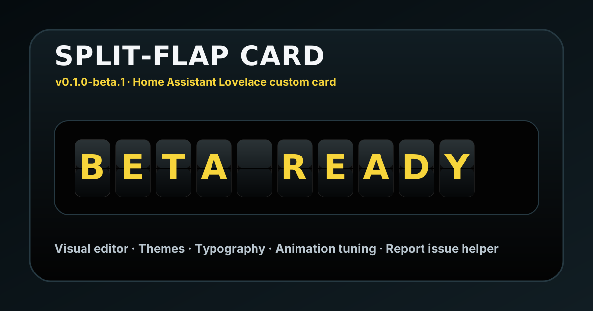
Split-Flap Card is a Home Assistant Lovelace custom card that renders static text, entity states, entity attributes and a browser-based clock as a mechanical split-flap display.
The visual direction is inspired by mechanical transit displays, airport signage, railway information boards and high-contrast wayfinding systems.
- Static text mode.
- Entity state mode.
- Entity attribute mode.
- Browser clock mode.
- Self-contained HACS-loaded root file.
- Direct registration of
custom:split-flap-card. - Direct registration of the visual editor.
- HACS metadata configured with
content_in_root: true. - HACS metadata configured with
hide_default_branch: true. - Visual editor for common options.
- Advanced styling section in the editor.
- Mechanical split-flap rendering.
- Swedish charset support with
Å,Ä,Ö. - Nordic charset support.
- Western European charset support.
- Weather charset support with
°. - Extended charset preset.
- Custom charset support.
- Configurable colors.
- Configurable segment size.
- Configurable font family, size and weight.
- Configurable display frame.
- Configurable decorative screws.
- Configurable split-flap layer depth.
- Font preset preview in the visual editor.
- Built-in themes:
mechanical_goldkiosk_goldclassic_airportarlanda_expressterminal_ambermonochromehome_assistant_bluesweden_delight/ revised Arlanda Express slot
- HACS-compatible dashboard plugin structure.
Beta 16 adds and validates:
- display frame controls
- decorative screw logic
- flat / raised / recessed split-flap layer modes
- font preset previews
- clearer custom font guidance
HH:mm:ssclock default- default text restoration when switching back to Text source
- Arlanda Express inspired theme styling
- improved upper-flap motion timing
- clearer inset and frame separation for dashboards where the card background previously filled too much of the visible area
The visual editor exposes the most important configuration fields while keeping the editor layout stable:
- Content
- Appearance
- Motion
- Advanced styling
- Manual / Support / Report issue links
- Preview
Beta 16 adds display frame controls, decorative screws, split-flap layer/depth options and font preset preview directly in the editor.
Larger experimental additions such as a full Saved Looks system, additional animation modes and major source refactoring are deferred until they can be added without breaking the working editor layout.
- Open HACS.
- Open Custom repositories.
- Add this repository:
https://github.com/ph13t0n/ha-split-flap-card
- Select category:
Dashboard
- Click Add.
- Install Split-Flap Card.
- Refresh your browser.
Expected HACS resource:
url: /hacsfiles/ha-split-flap-card/ha-split-flap-card.js
type: moduleCopy ha-split-flap-card.js to your Home Assistant www folder and add it as a dashboard resource:
url: /local/ha-split-flap-card.js
type: module
For manual testing after updates, change the cache query:
url: /local/ha-split-flap-card.js?v=0.1.0-beta.16
type: moduleFor beta validation only:
https://cdn.jsdelivr.net/gh/ph13t0n/ha-split-flap-card@beta16/ha-split-flap-card.js
After a GitHub release is published, the tagged CDN URL will be:
https://cdn.jsdelivr.net/gh/ph13t0n/ha-split-flap-card@v0.1.0-beta.16/ha-split-flap-card.js
type: custom:split-flap-card
source: text
text: CENTRAL STATION
segments: 16
theme: mechanical_goldtype: custom:split-flap-card
source: text
text: SPLIT-FLAP CARD
segments: 16
theme: mechanical_goldtype: custom:split-flap-card
source: text
text: NÄSSJÖ CENTRAL
language: sv
charset: sv
segments: 14
theme: kiosk_goldtype: custom:split-flap-card
source: entity
entity: input_text.split_flap_message
language: sv
charset: sv
segments: 16
theme: classic_airporttype: custom:split-flap-card
source: entity
entity: weather.home
attribute: temperature
charset: weather
segments: 6
theme: terminal_ambertype: custom:split-flap-card
source: clock
clock_format: HH:mm:ss
segments: 8
theme: mechanical_goldtype: custom:split-flap-card
source: text
text: ARLANDA EXPRESS
segments_mode: auto
theme: arlanda_express
frame_style: classic
decorative_screws: true
display_depth: recessed| Option | Type | Default | Description |
|---|---|---|---|
source |
string | inferred | text, entity, or clock |
text |
string | SPLIT-FLAP |
Static text to display |
entity |
string | — | Entity state to display |
attribute |
string | — | Entity attribute to display |
clock_format |
string | HH:mm:ss |
Clock format using HH, H, hh, h, mm, ss, A |
clock_tick_interval |
number | 1000 |
Clock update interval in milliseconds |
segments_mode |
string | auto |
auto follows output length, manual uses fixed segment count |
segments |
number | 16 |
Number of displayed segments when manual mode is used |
language |
string | sv |
Language hint |
charset |
string | sv |
en, sv, nordic, western, weather, weather_sv, extended, custom |
custom_charset |
string | — | Custom charset when using charset: custom |
text_transform |
string | uppercase |
uppercase, lowercase, or none |
pad_character |
string | space | Character used to pad empty manual segments |
pad_mode |
string | end |
start or end padding |
theme |
string | mechanical_gold |
Built-in theme |
frame_style |
string | classic |
none, classic, or heavy |
decorative_screws |
boolean | true |
Decorative screws, automatically disabled when frame_style: none |
display_depth |
string | raised |
flat, raised, or recessed |
card_background |
string | #030303 |
Card background color |
frame_background |
string | #050505 |
Display frame background color |
segment_background |
string | theme | Segment background color |
segment_background_top |
string | theme | Top flap background color |
segment_background_bottom |
string | theme | Bottom flap background color |
segment_separator_color |
string | theme | Split line color |
segment_border_color |
string | theme | Segment border color |
text_color |
string | theme | Text color |
font_family |
string | theme | CSS font-family. Custom values go in Advanced styling → Font family. |
font_size |
number | 60 |
Text size in pixels |
font_weight |
number/string | theme | Text weight |
letter_spacing |
number | -1 |
Letter spacing adjustment |
letter_vertical_offset |
number | -9 |
Vertical letter offset inside the flap |
segment_width |
number | 48 |
Segment width in pixels |
segment_height |
number | 78 |
Segment height in pixels |
segment_gap |
number | 6 |
Gap between segments in pixels |
segment_radius |
number | 7 |
Segment corner radius in pixels |
align |
string | center |
left, center, or right |
v0.1.0-beta.16 prioritizes release-blocking editor and display polish before a future stable v0.1.0.
Next planned work after Beta 16 validation:
- Validate Beta 16 in Home Assistant.
- Fix direct regressions only.
- Prepare a stable
v0.1.0release candidate when the card is visually and functionally stable. - Keep larger Saved Looks work, source refactoring and additional animation modes for later beta releases.
Use GitHub Issues for bug reports, feature requests and support questions.
When reporting an issue, include:
- Home Assistant version.
- Browser or app.
- Card version.
- Your card YAML.
- A screenshot, if visual rendering is part of the issue.
Avoid sharing screenshots or YAML containing private entity names, tokens, addresses or private URLs.
This is a hobby project built while learning more about Home Assistant, smart homes, code, and dashboards.
If you find it useful and want to support continued development, you can leave a small tip on Ko-fi:

This is a frontend-only dashboard card.
It does not:
- Store credentials.
- Require Home Assistant long-lived access tokens.
- Modify Home Assistant configuration.
- Create entities or services.
- Submit issue reports automatically.
Security rule for future code:
- Dynamic text should use
textContent. - HTML templates should contain static/safe markup only.
- Config/entity/user values must not be inserted raw into
innerHTML.
Avoid sharing screenshots or YAML containing private entity names, tokens, addresses or private URLs.
This project is licensed under the MIT License.
Copyright © 2026 Per Lif Arvidsson (ph13t0n).
See LICENSE for details.
This project is open source under the MIT License.
Commercial support, custom development, branding, theme adaptation and implementation assistance may be offered separately by agreement.
For business inquiries, contact hej@lifarvidsson.se with the subject line Business inquiry.