Build HTML slide decks with a frontend harness, so the deck can survive real iteration.
A single-file HTML deck is fine for a quick draft. It gets painful when the deck grows, when one slide needs careful tuning, or when a CSS, animation, or layout change quietly breaks another page. This skill is built for that later phase.
The main advantage is not just prettier slides. The harness treats the deck as a small, testable web app: scenes are addressable, interactions are isolated, screenshots are repeatable, and the final deck can ship as a live site, a PDF, or both.
🖥️ Try the live Vercel Workbench: dynamic style preset preview. It is the fastest way to see the motion, density, and visual range before reading the full catalog.
✨ Recommended: copy the current page link to your agent and say: Please install this for me.
npx skills add patrick-fu/frontend-harness-slides -gUpdate later:
npx skills update -gMost slide generators can produce an attractive first version. The harder part
is keeping a larger deck stable after feedback. frontend-harness-slides puts a
small engineering frame around the deck:
- stable scene and beat addresses, so any frame can be opened directly;
- a registry, so tooling can enumerate the deck without scraping visible text;
- a fixed-ratio stage, so slide content stays inside the canvas;
- frozen mode, so screenshots and visual checks are repeatable;
- event-isolated interactions, so clicks, drags, inputs, and tooltips do not leak into global navigation;
- meaningful tests and smoke checks, so missing content, overflow, runtime errors, and navigation leaks are caught before handoff.
Visual style still matters. The difference is that the style sits on top of a deck structure that is designed to be edited, tested, deployed, and exported.
- Speaker-led talks that need motion, pacing, and interactive beats.
- Product walkthroughs, teaching decks, and technical explainers.
- High-control slide work where later edits should not quietly damage other pages.
- Decks that need both a local preview and a real delivery path, such as online deployment or PDF export.
For a tiny one-off static slide, a single HTML file is usually enough. This skill is for decks where design quality, iteration, and verification matter.
For visual slide work, model taste matters. I usually recommend starting with Gemini for stronger frontend aesthetics, then Claude. GPT 5.5 can work too, and this skill includes guidance that helps it produce better visual results, but in my own trials it still tends to need more direction than Gemini.
- Plan: align on content, audience, presentation format, style direction, technology, delivery target, and whether the user wants style previews first.
- Design: choose a coherent style system, then vary layouts, motion, and interaction patterns across scenes.
- Build: create stable slide scenes with keyboard navigation, interactive elements, repeatable previews, and tests that protect future edits.
- Verify and ship: run meaningful layout and interaction checks, inspect screenshots, preview locally, then deploy online, export PDF, or do both.
The style system is designed to stay coherent without forcing every page into the same template. A deck can keep one visual language while changing layouts, beats, motion, and interaction patterns from scene to scene.
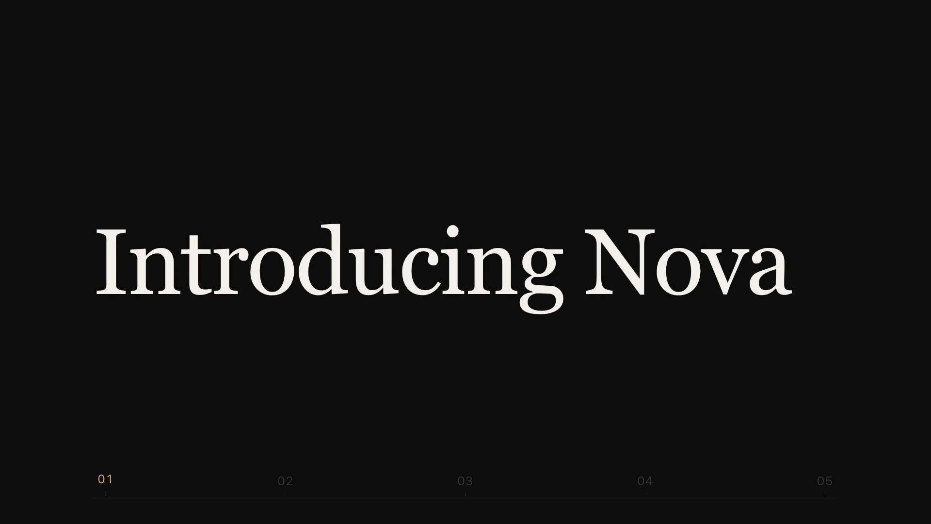
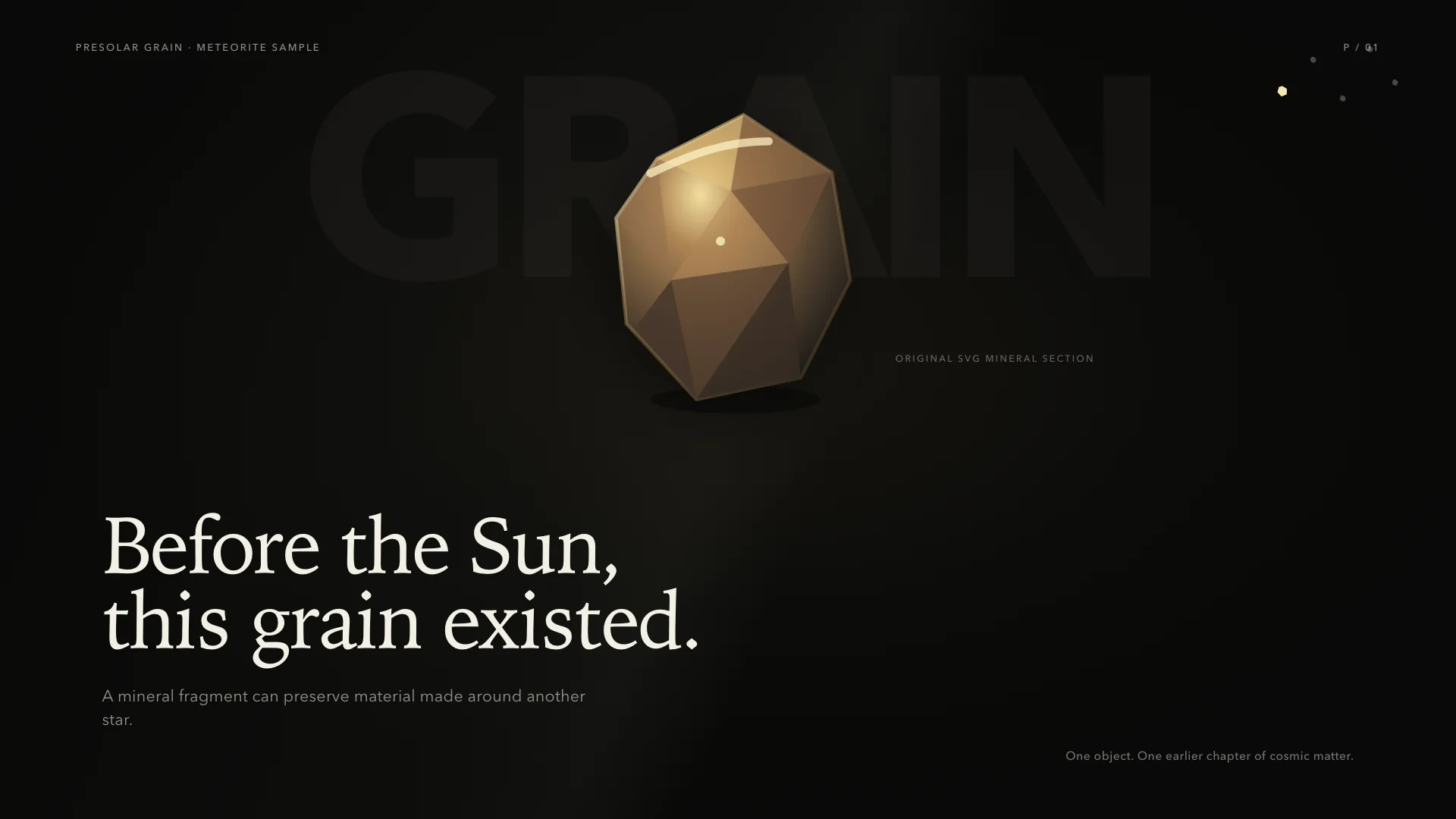
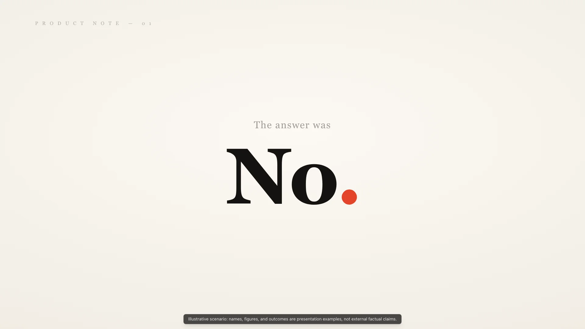
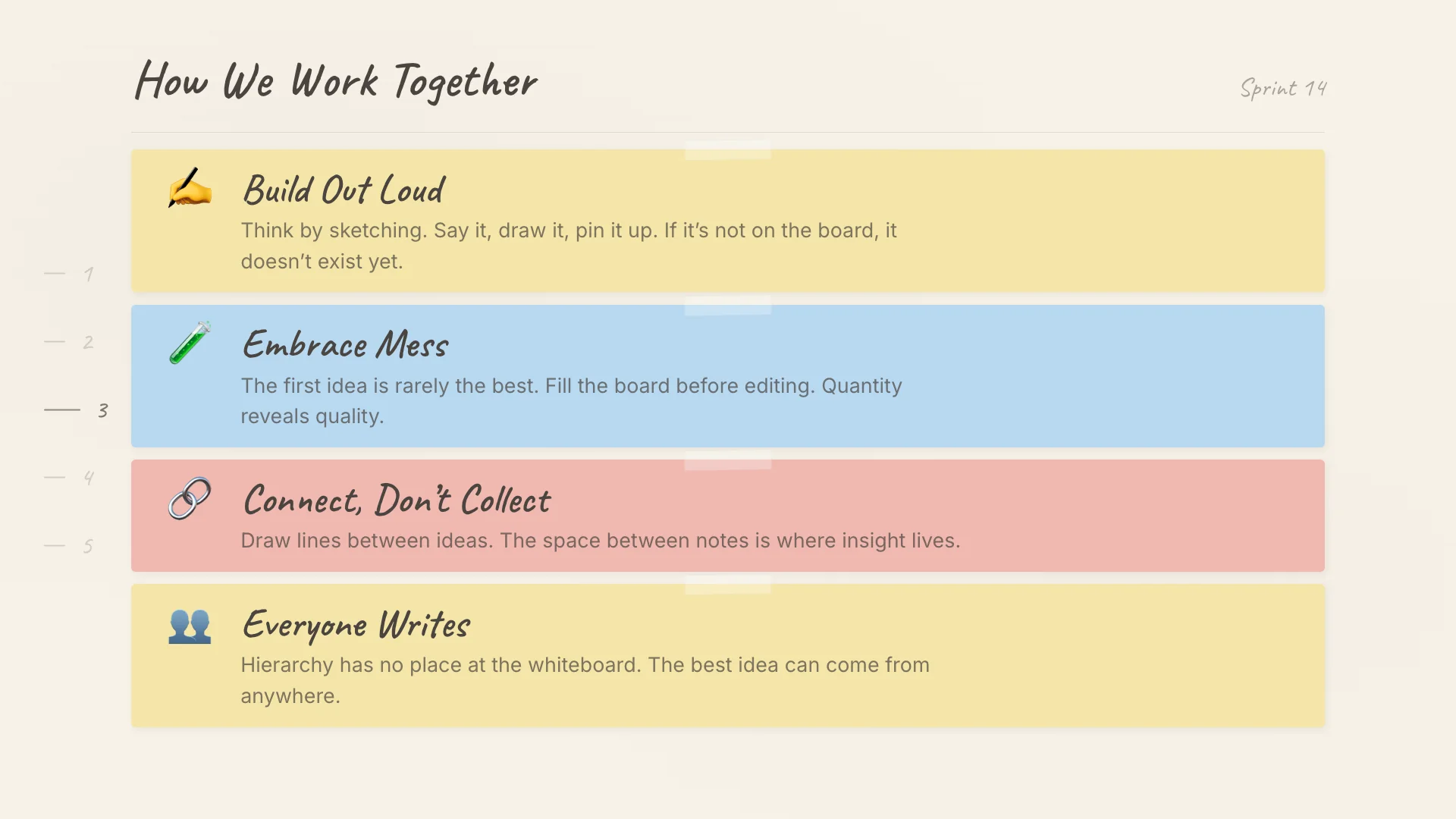
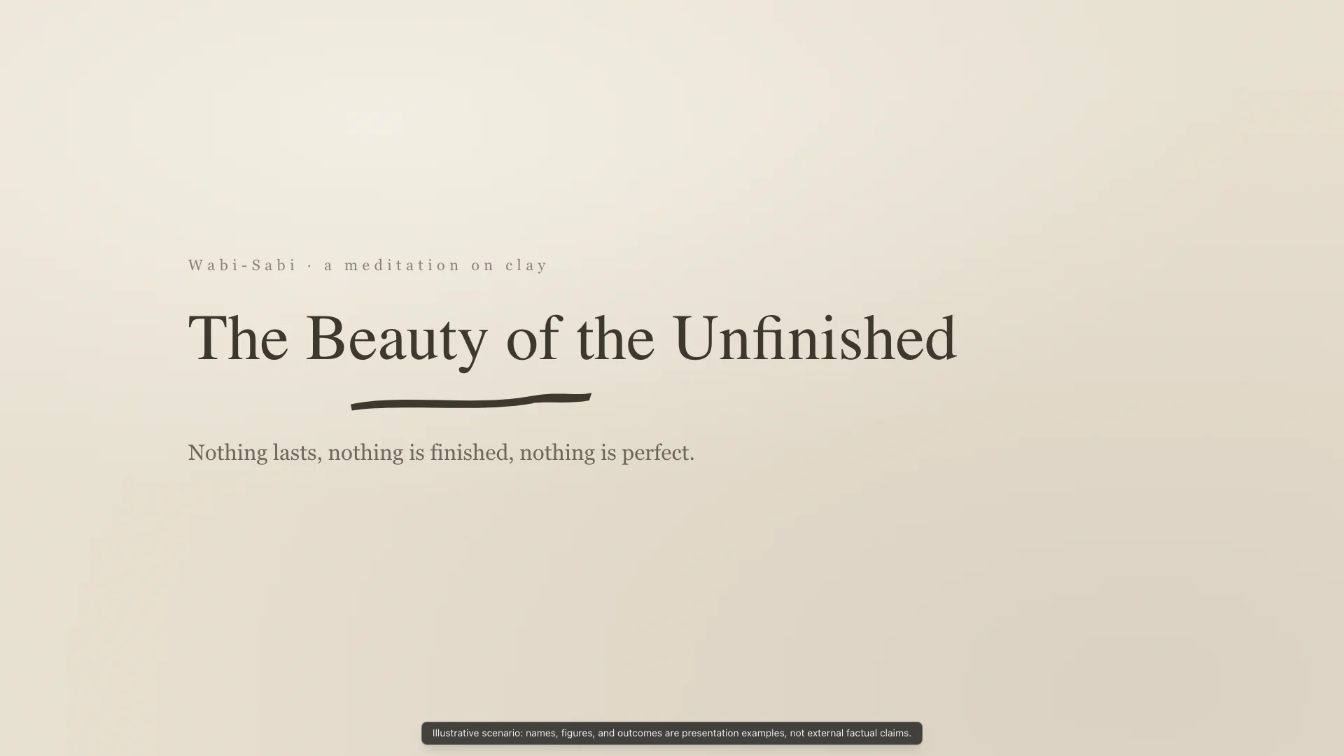
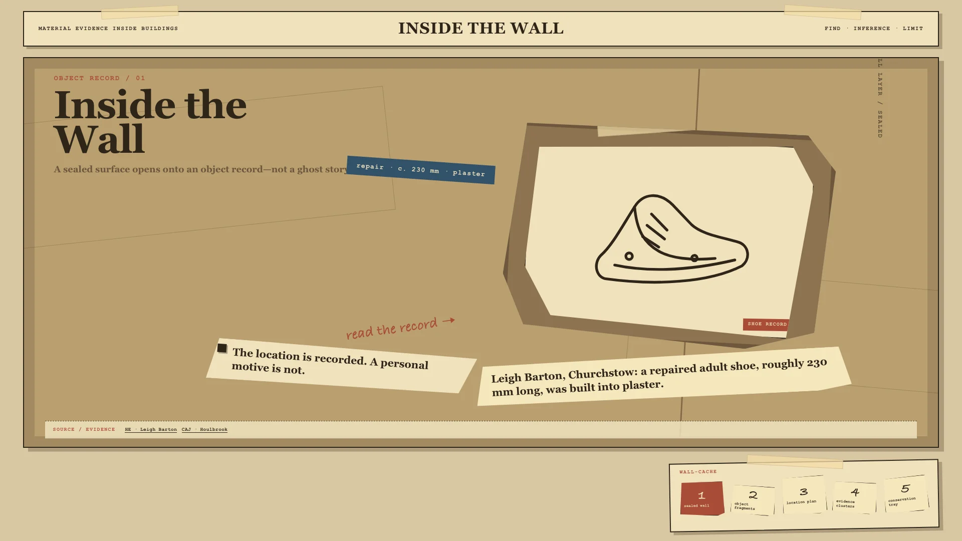
The gallery below shows Workbench-backed preset styles across six visual families: Minimal Keynote, Balanced Hybrid, Editorial & Print, Craft & Cultural Traditions, Contemporary Digital, and Text Report. Each showcased style compares Hero Final Frames from Doubao-Seed-Evolving, GPT 5.6 Sol, and Claude Opus 4.8, in that left-to-right order.
Premium, focused, and sparse. Uses extreme whitespace, a single central object, and dramatic type scale for opening claims or product reveals.
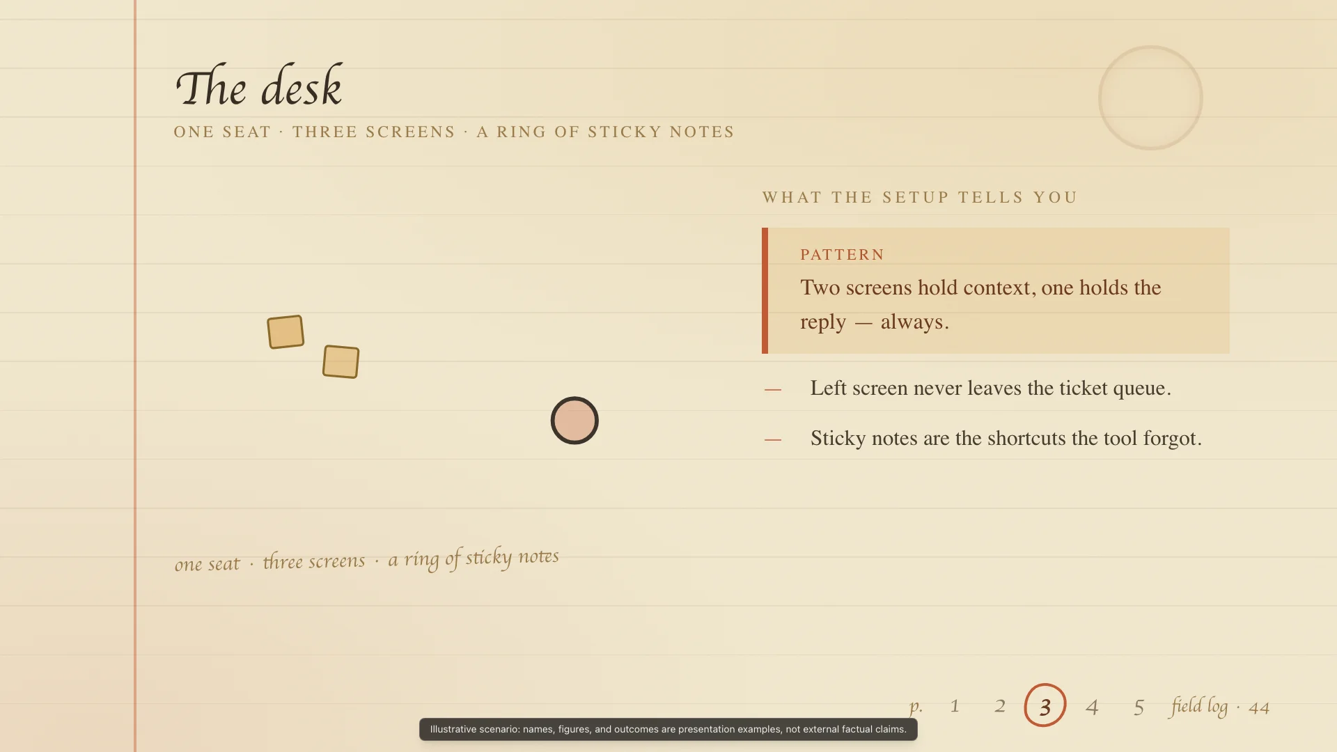
Warm, approachable, and human-in-the-loop. Uses sticky notes, tape, emoji actors, and small interactive details.
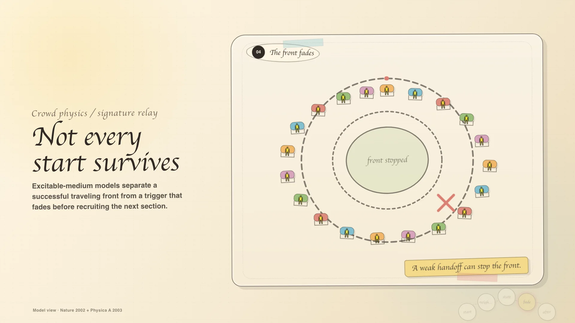
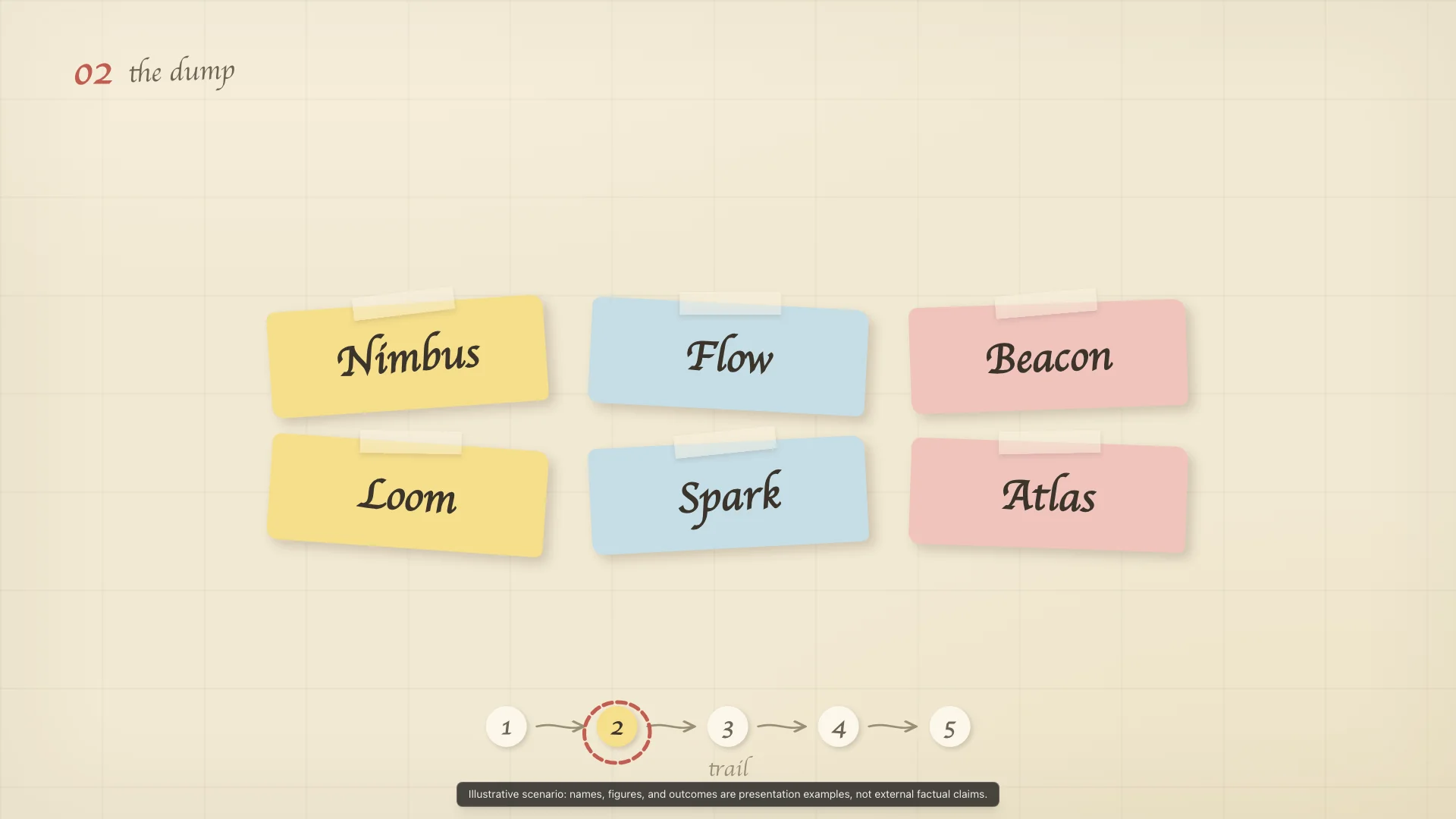
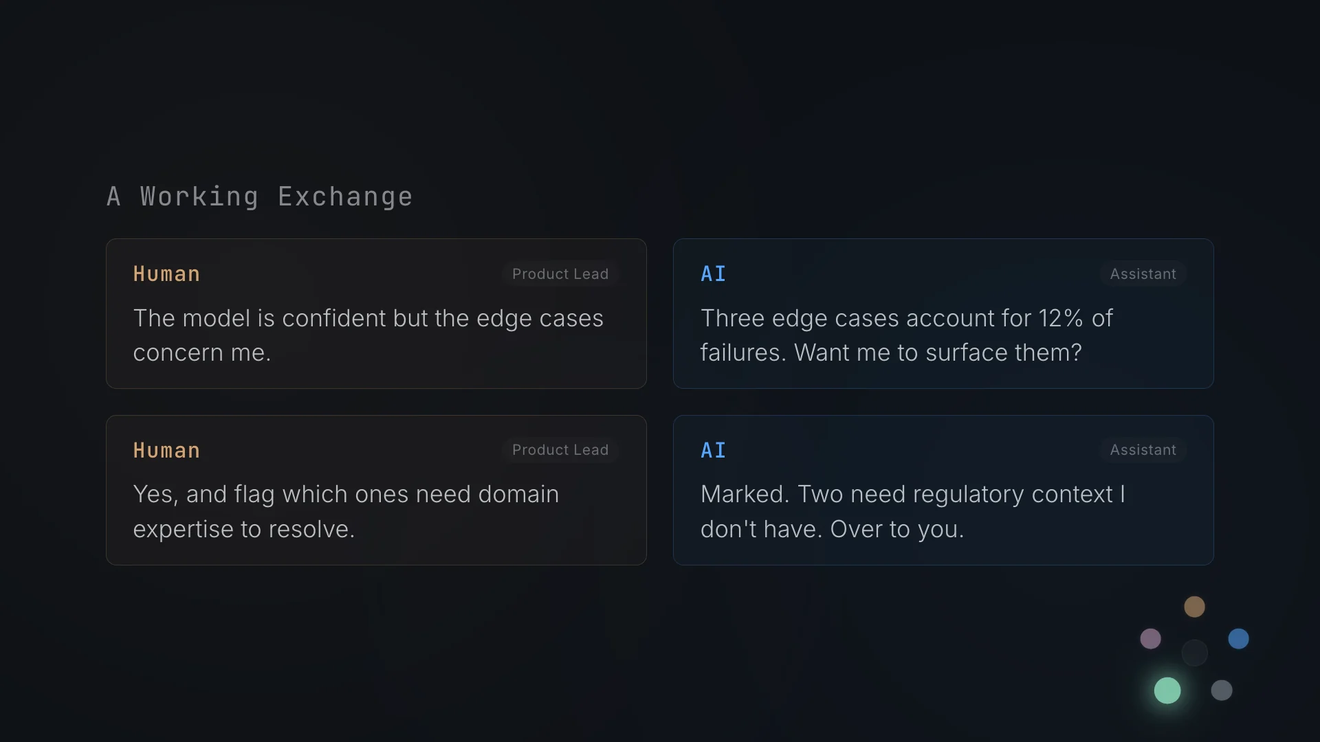
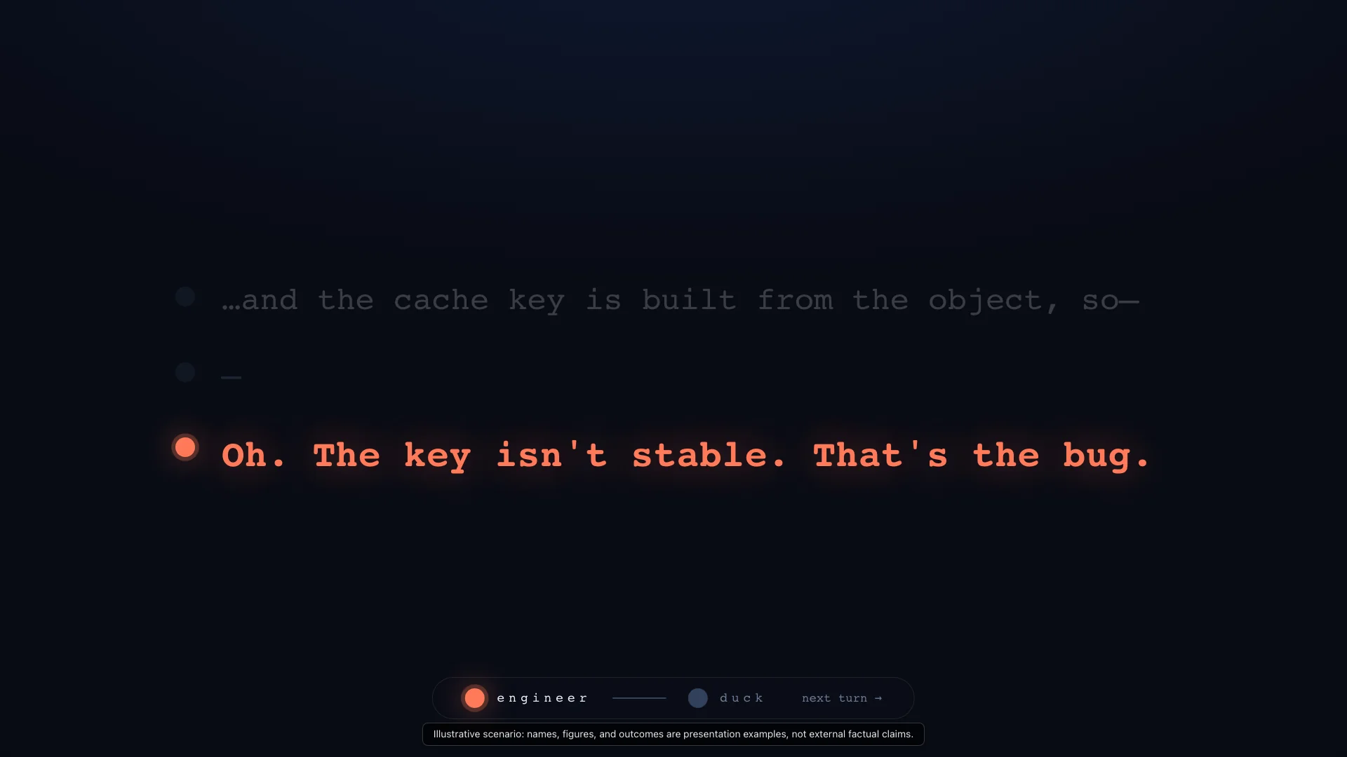
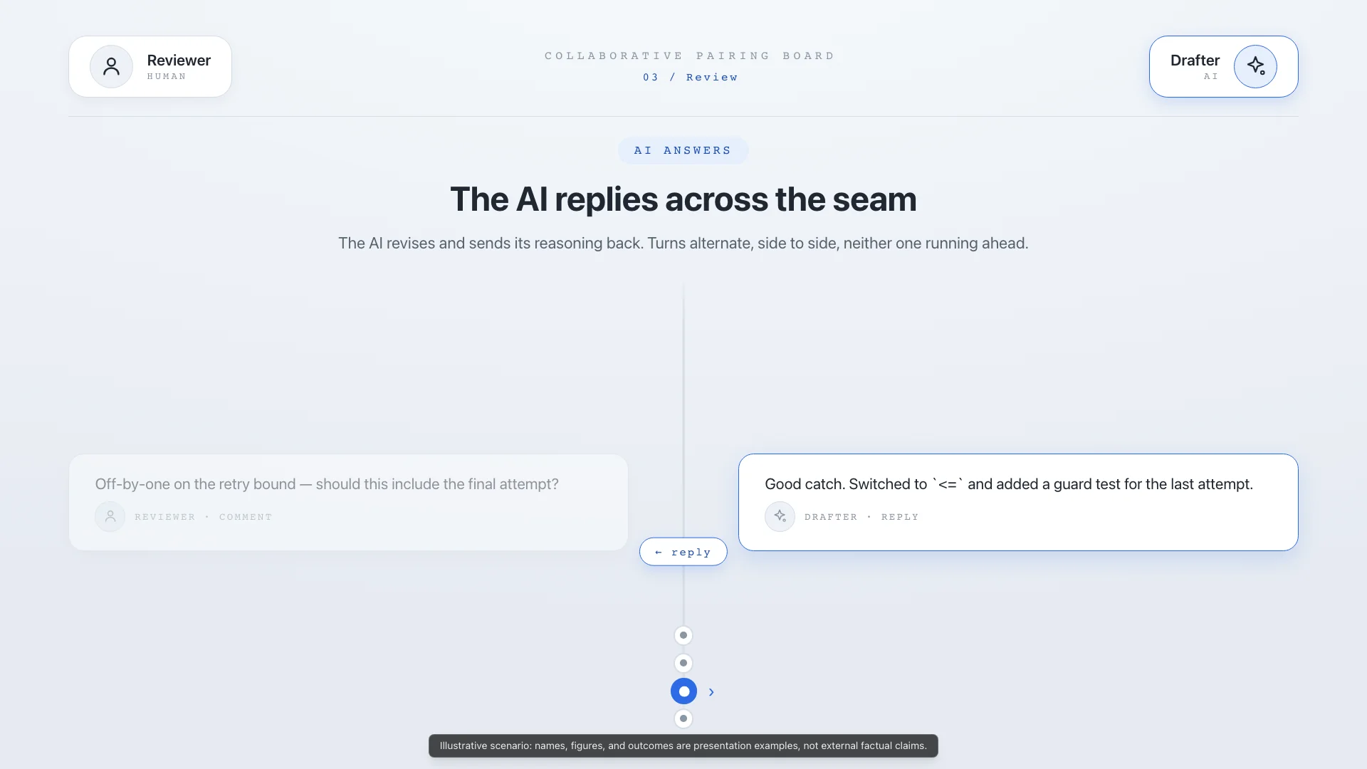
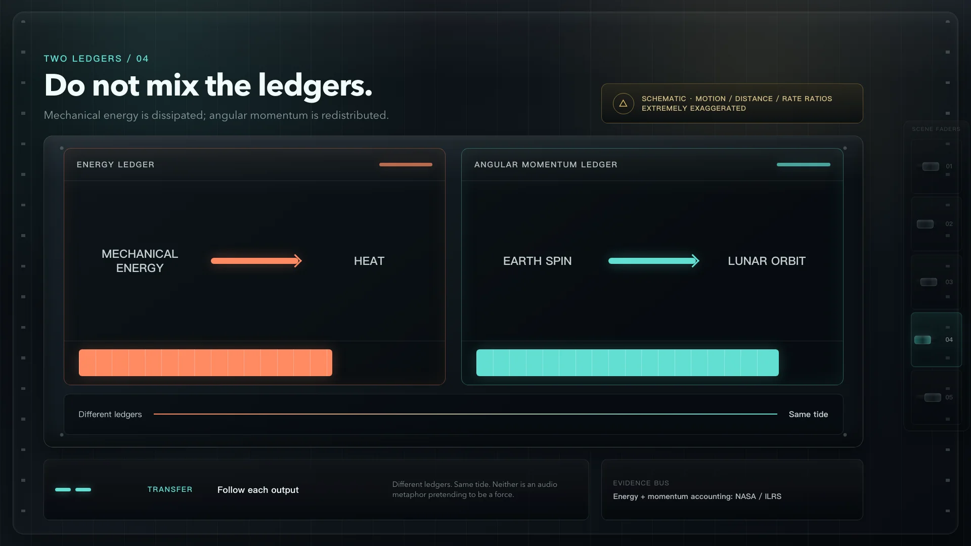
Dialog-focused and theatrical. Stages two roles, systems, or speakers through dark console surfaces and visible turn-taking.
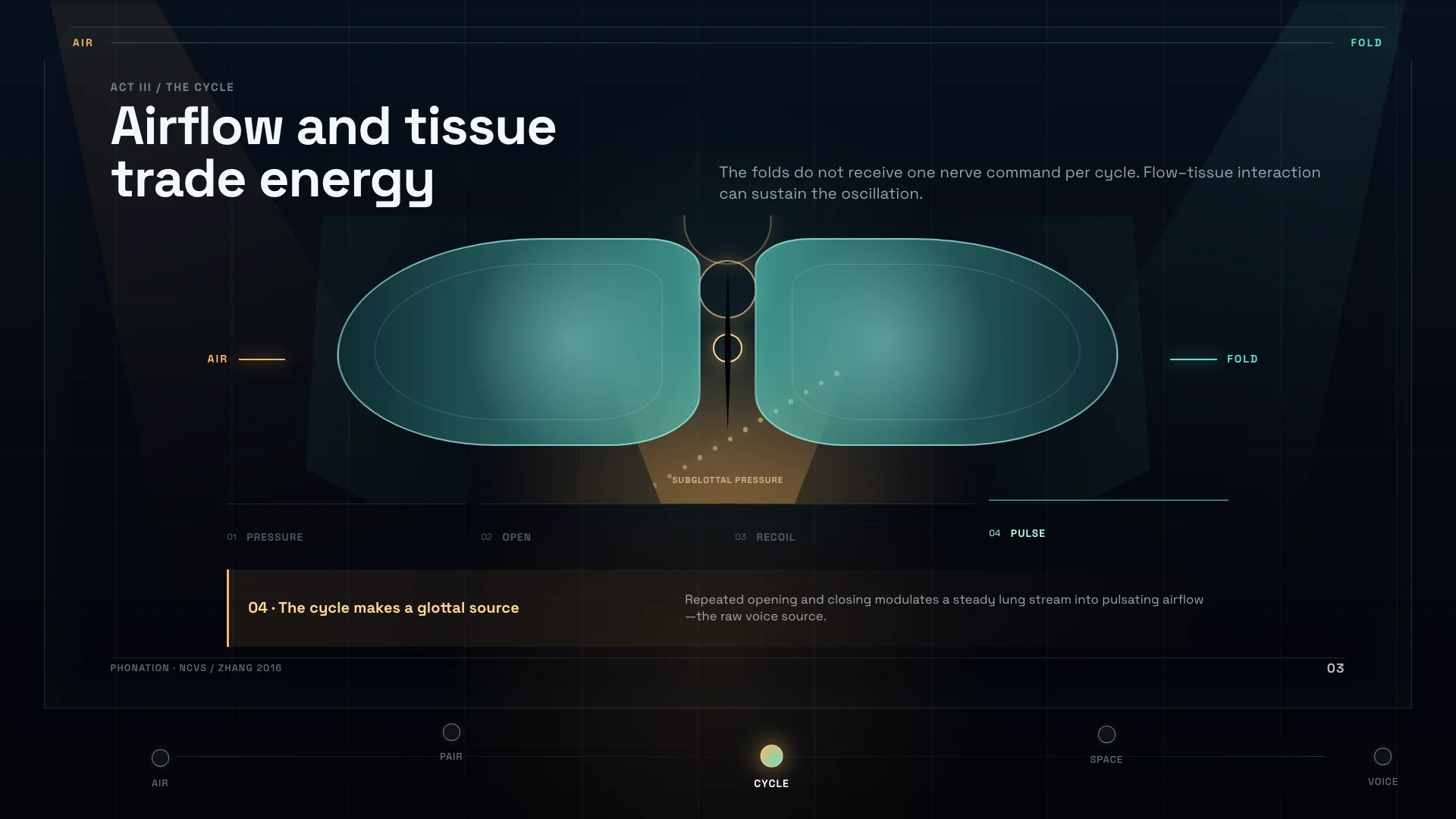
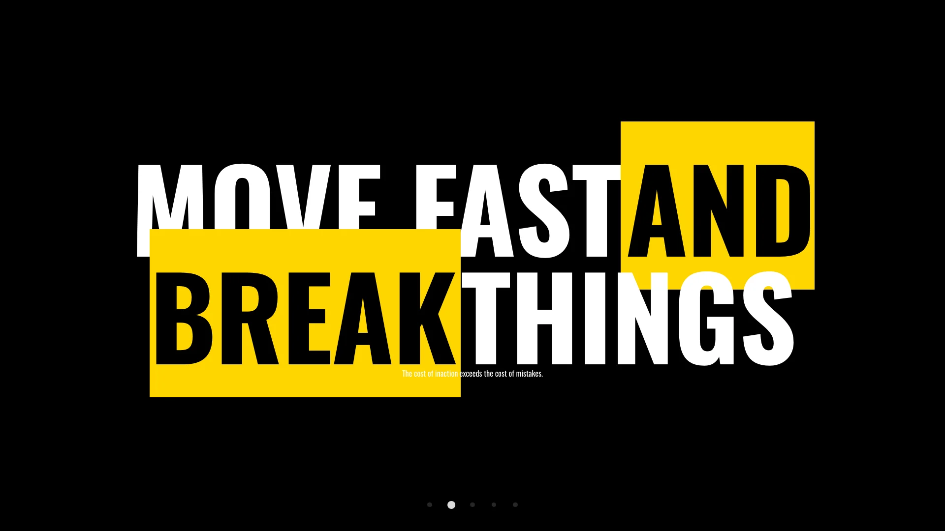
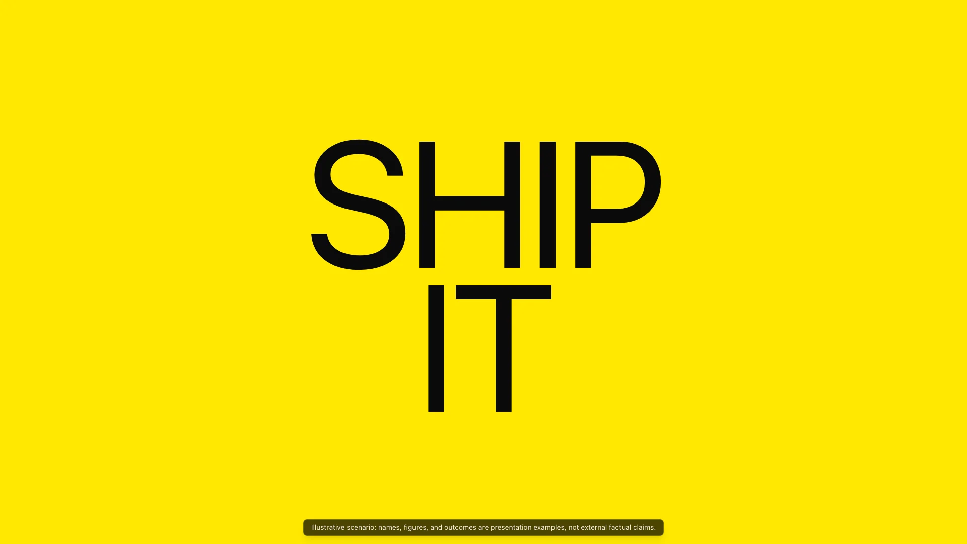
Bold, poster-like, and high-energy. Built for memorable section beats, contrastive claims, and typographic punchlines.
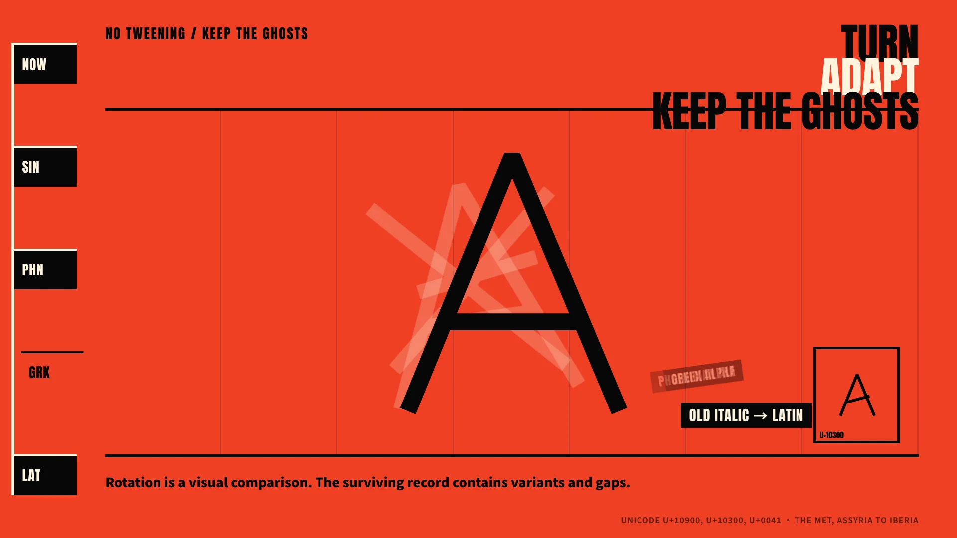
Tactile and metaphor-led. Turns abstract preparation, planning, or toolkit ideas into physical objects and organized compartments.
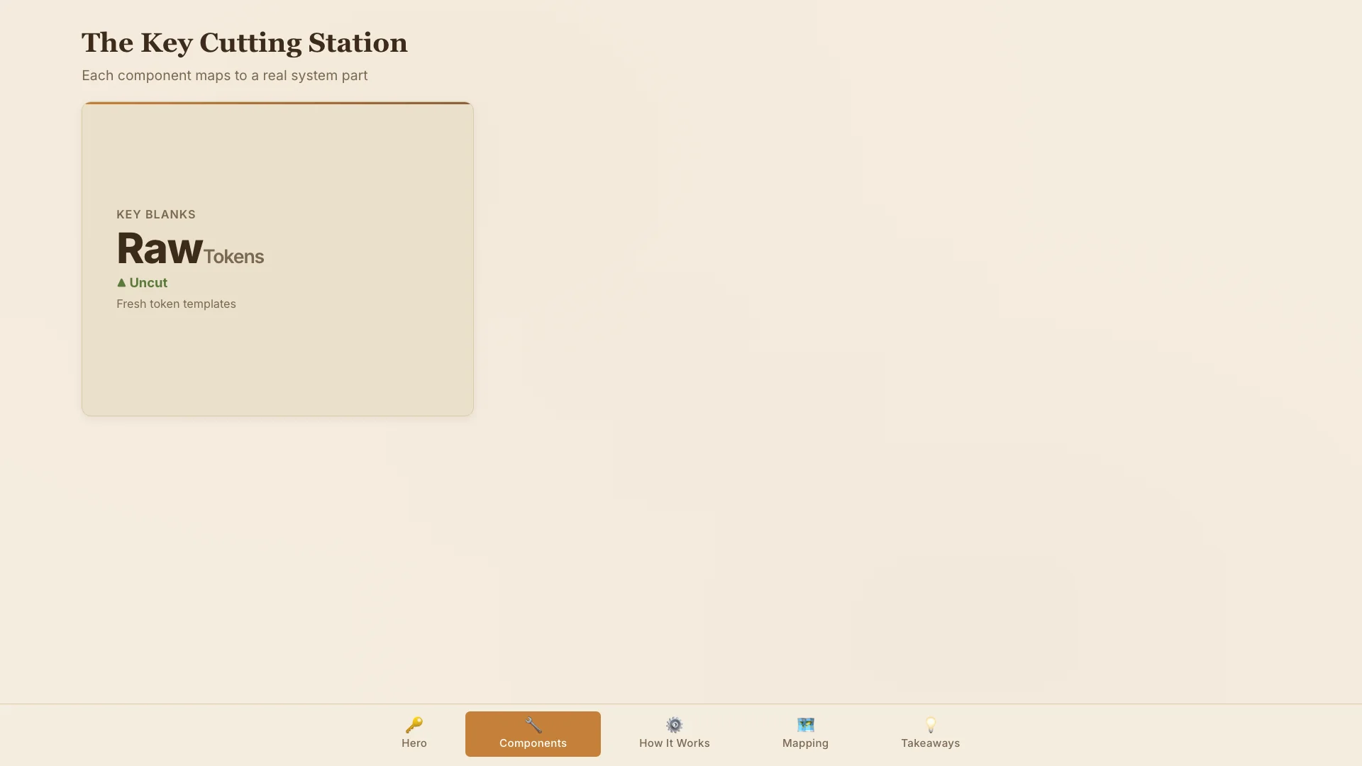
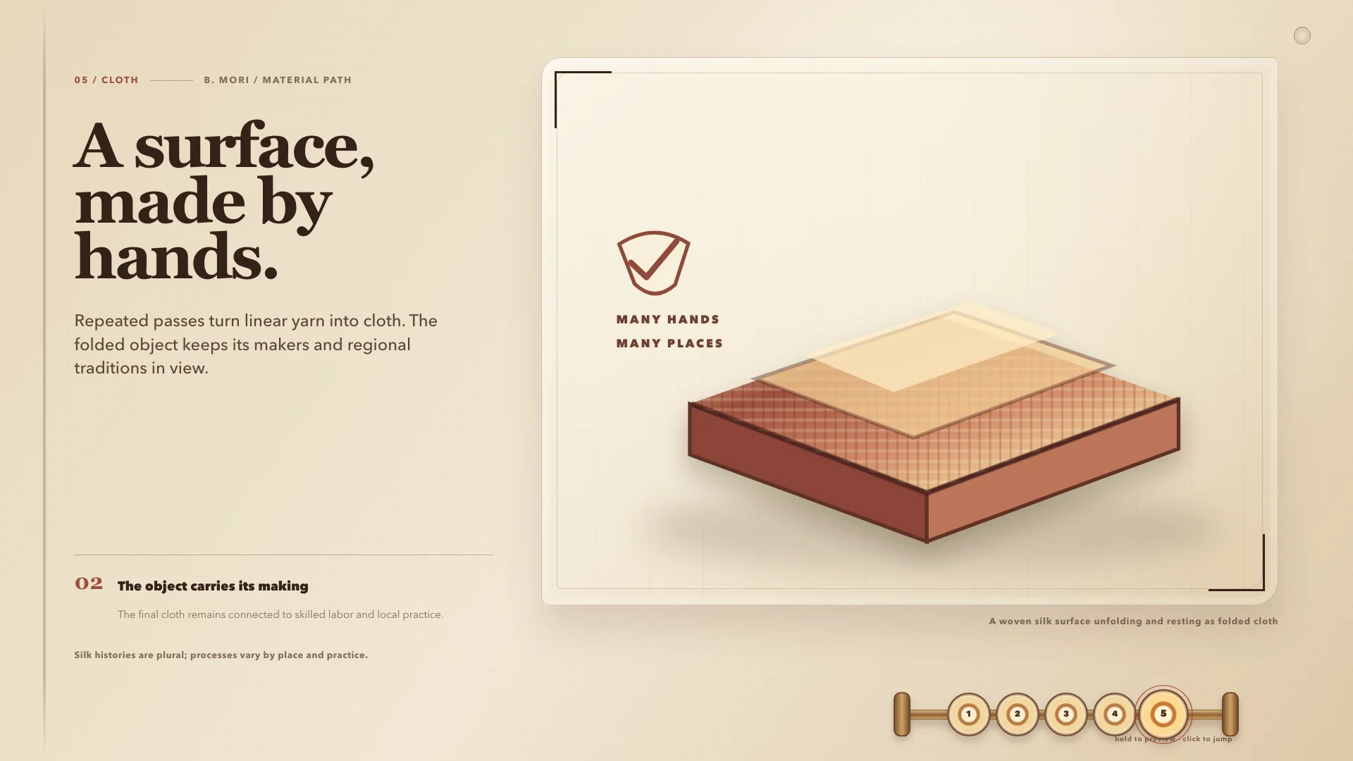
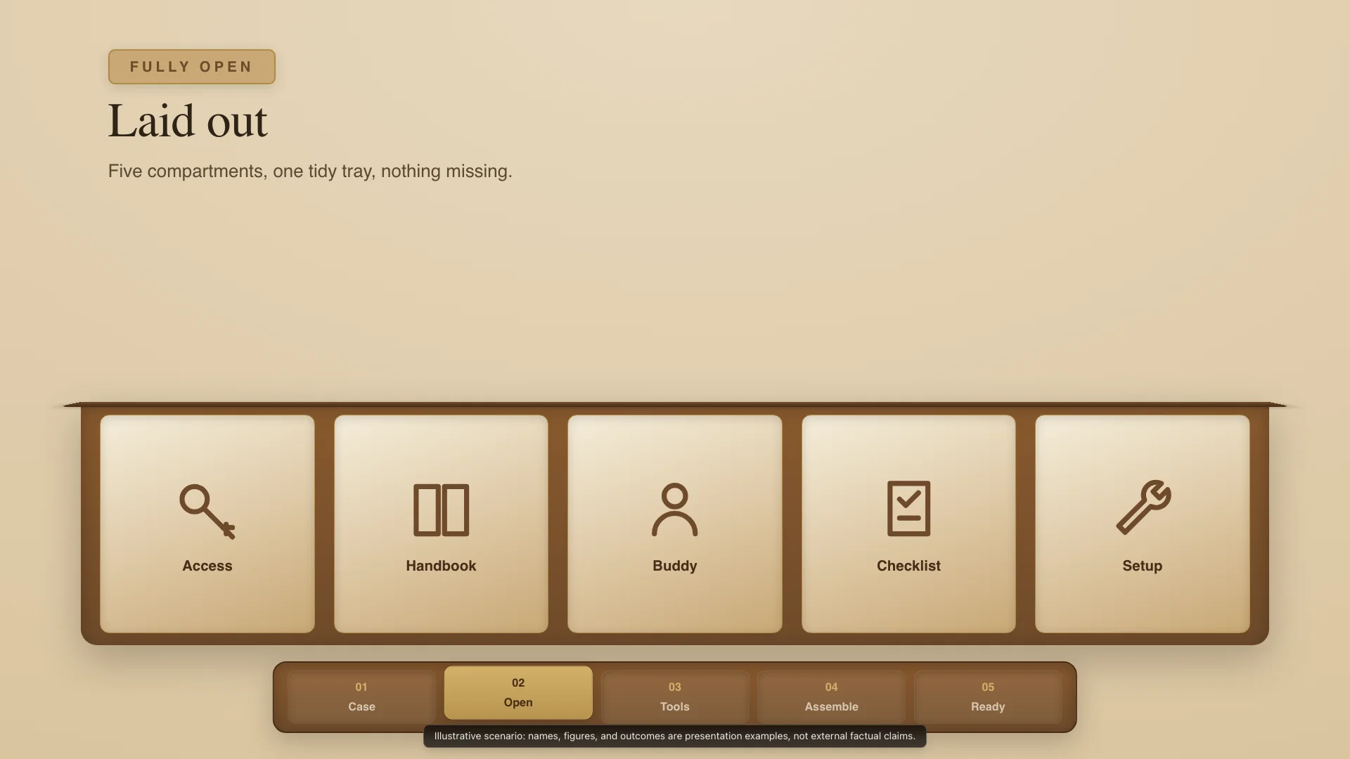
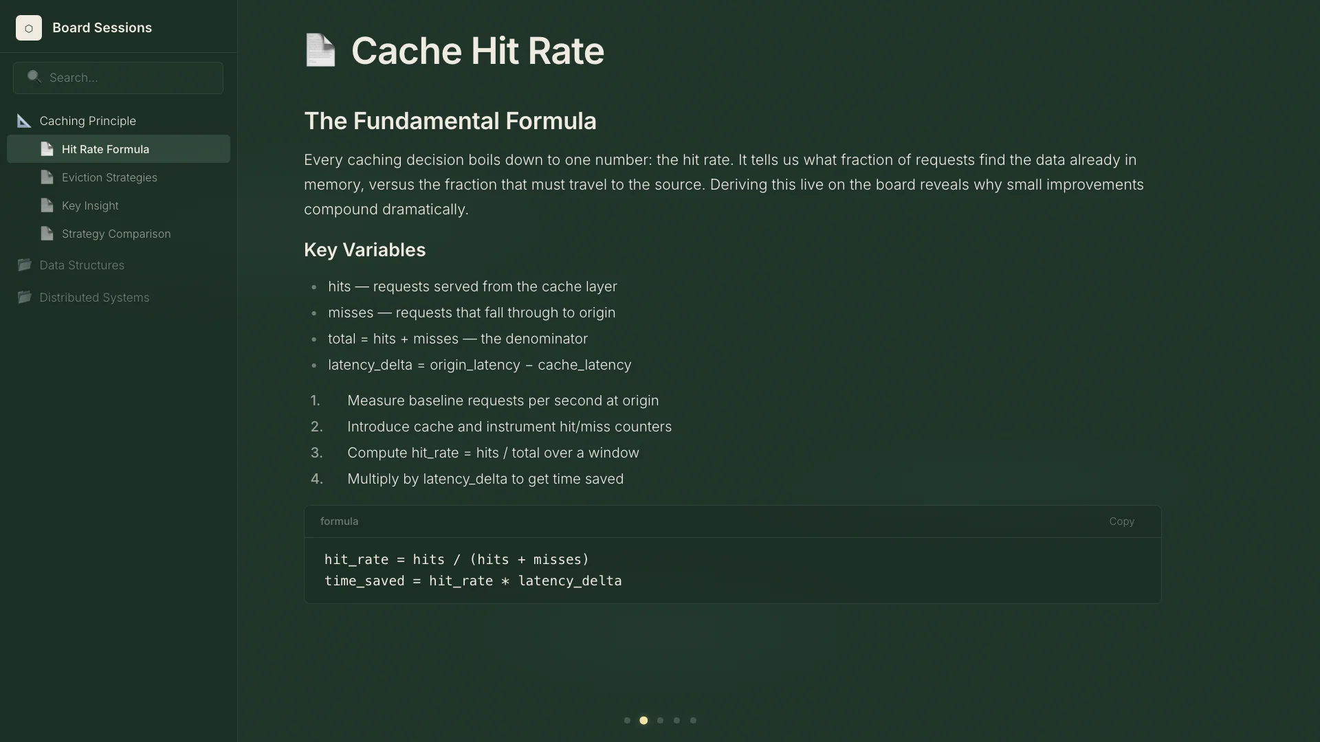
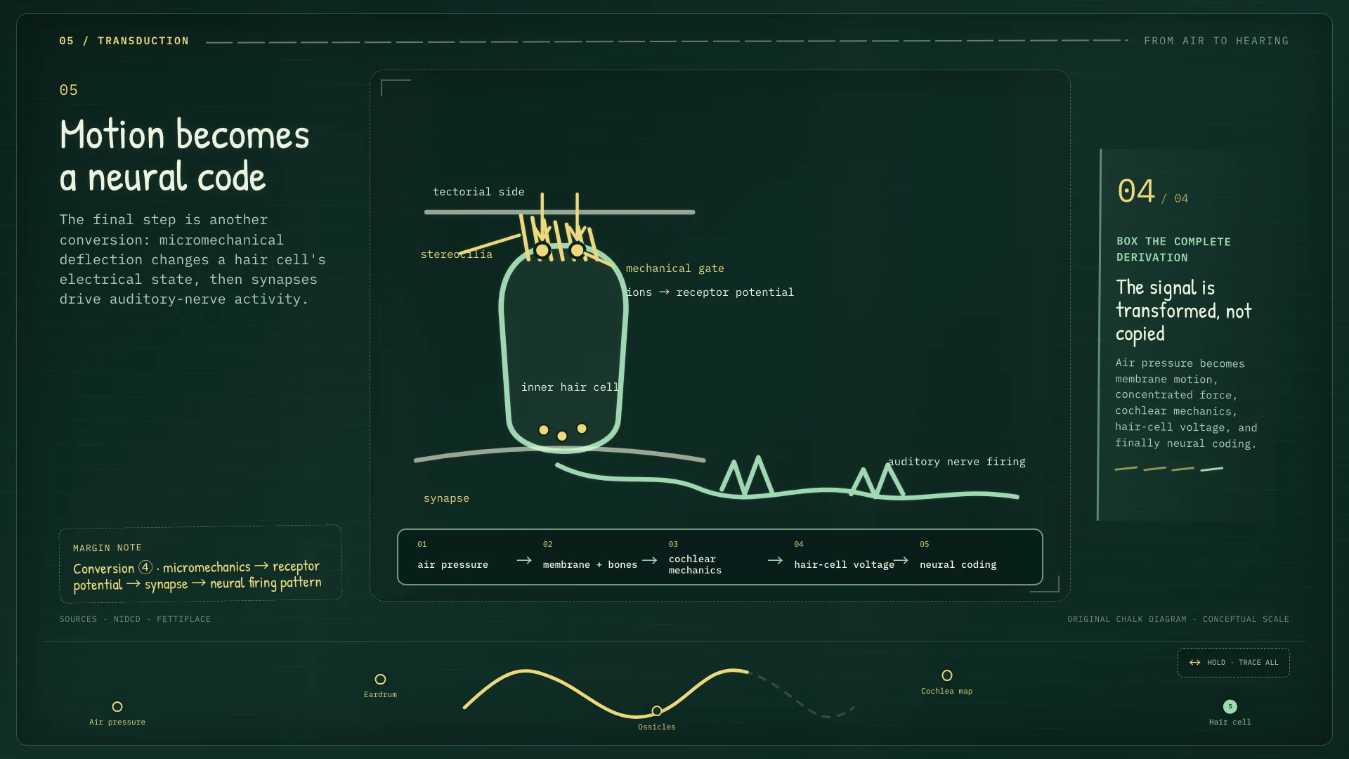
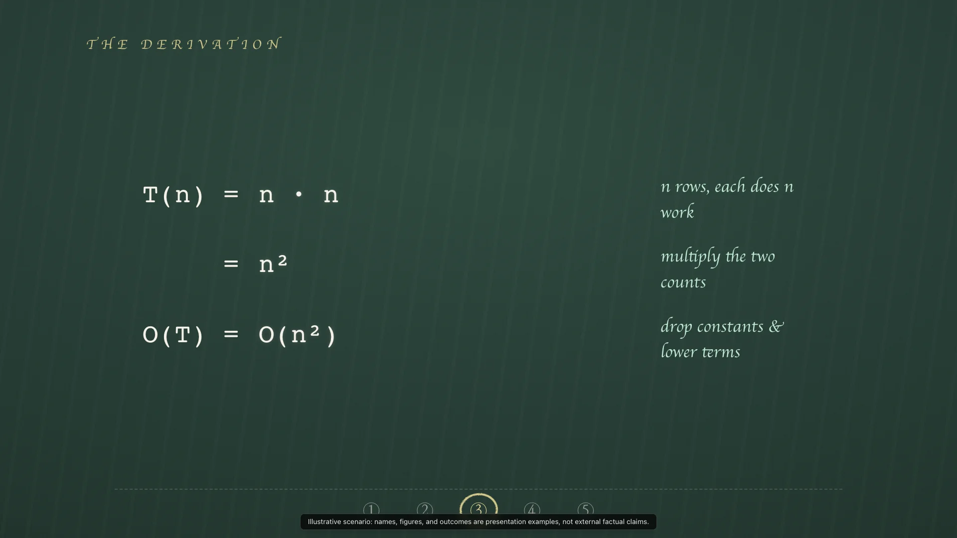
Handmade, educational, and reasoning-first. Uses chalk-drawn lines and formulas on a deep green board.
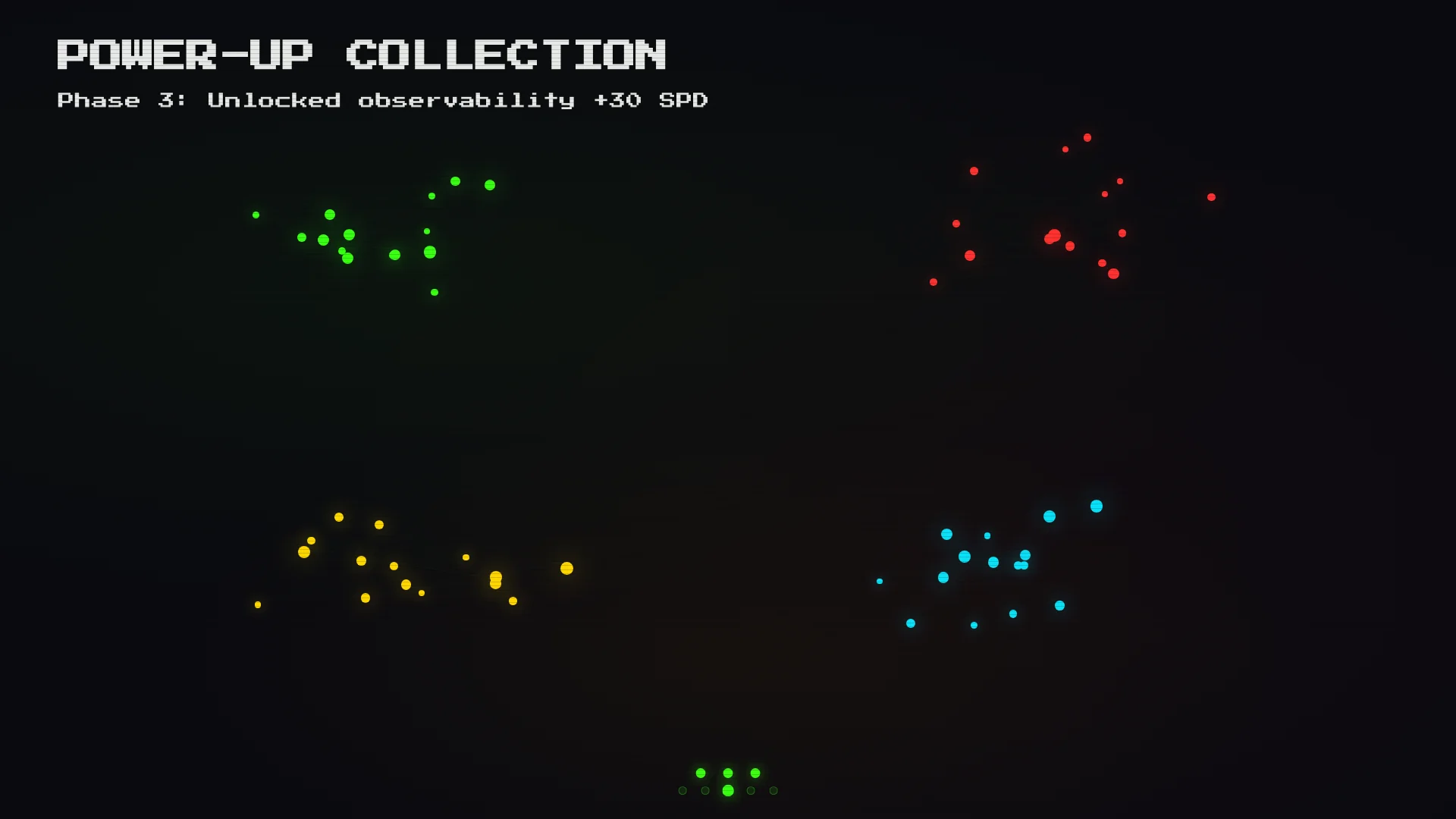
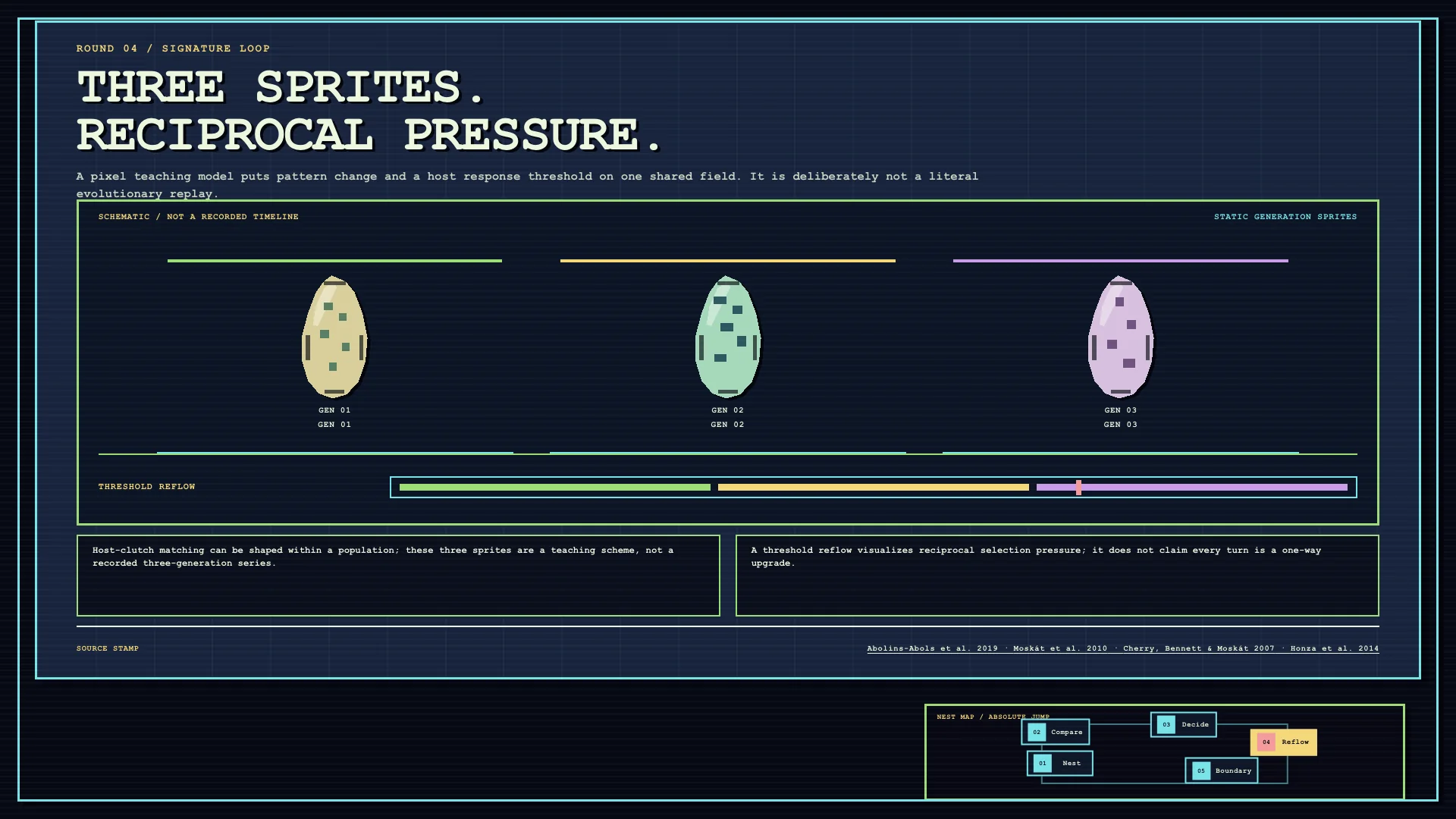
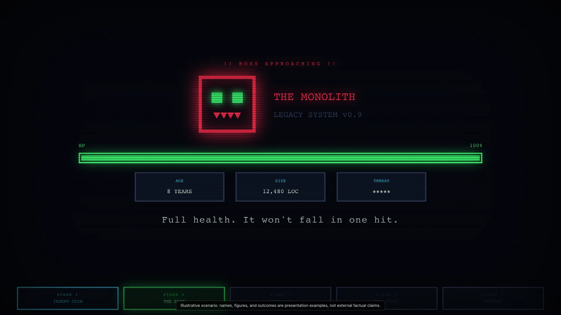
Retro, playful, and risk-aware. Frames technical difficulty as a boss fight, using HP bars, inventory panels, and pixel UI.
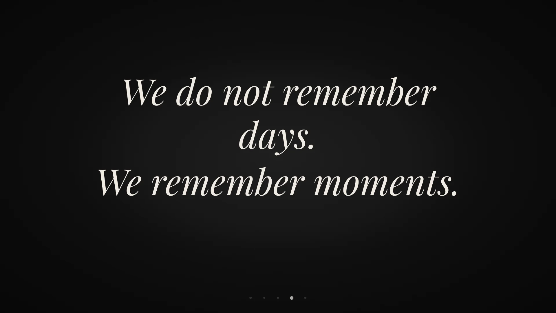
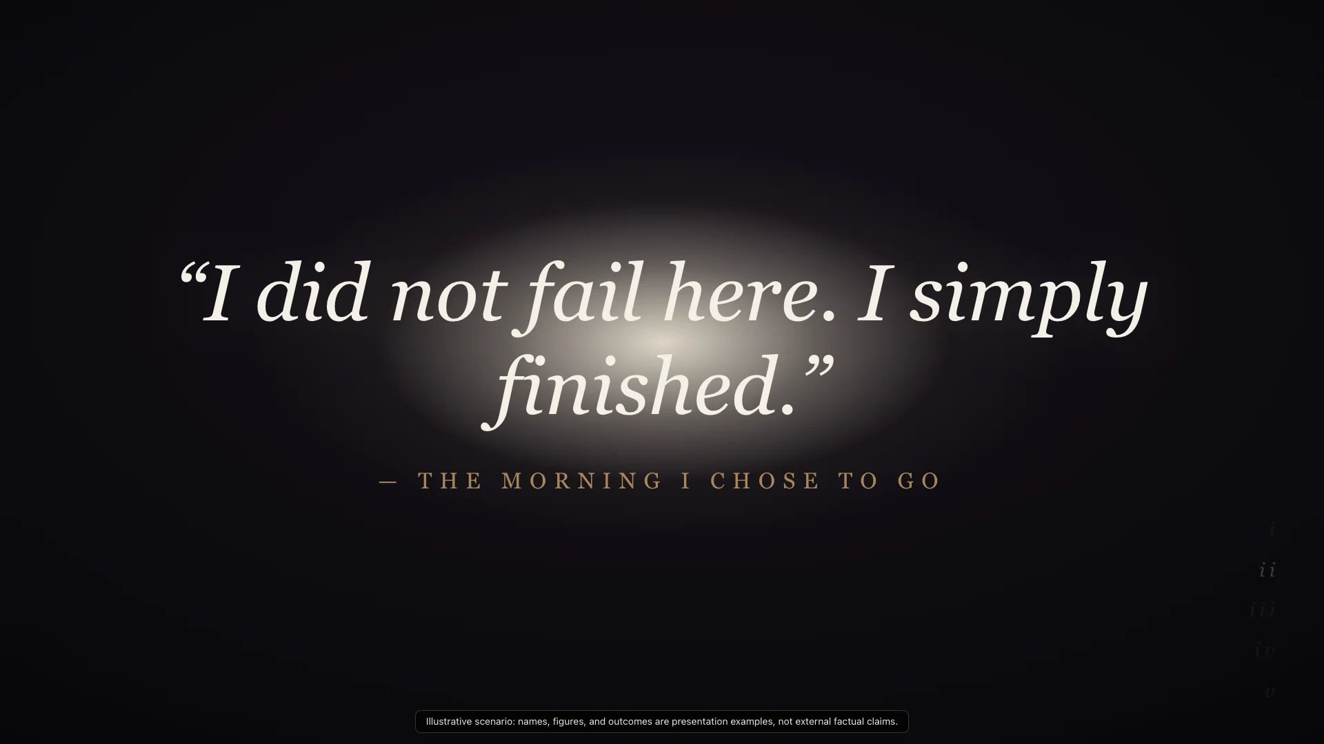
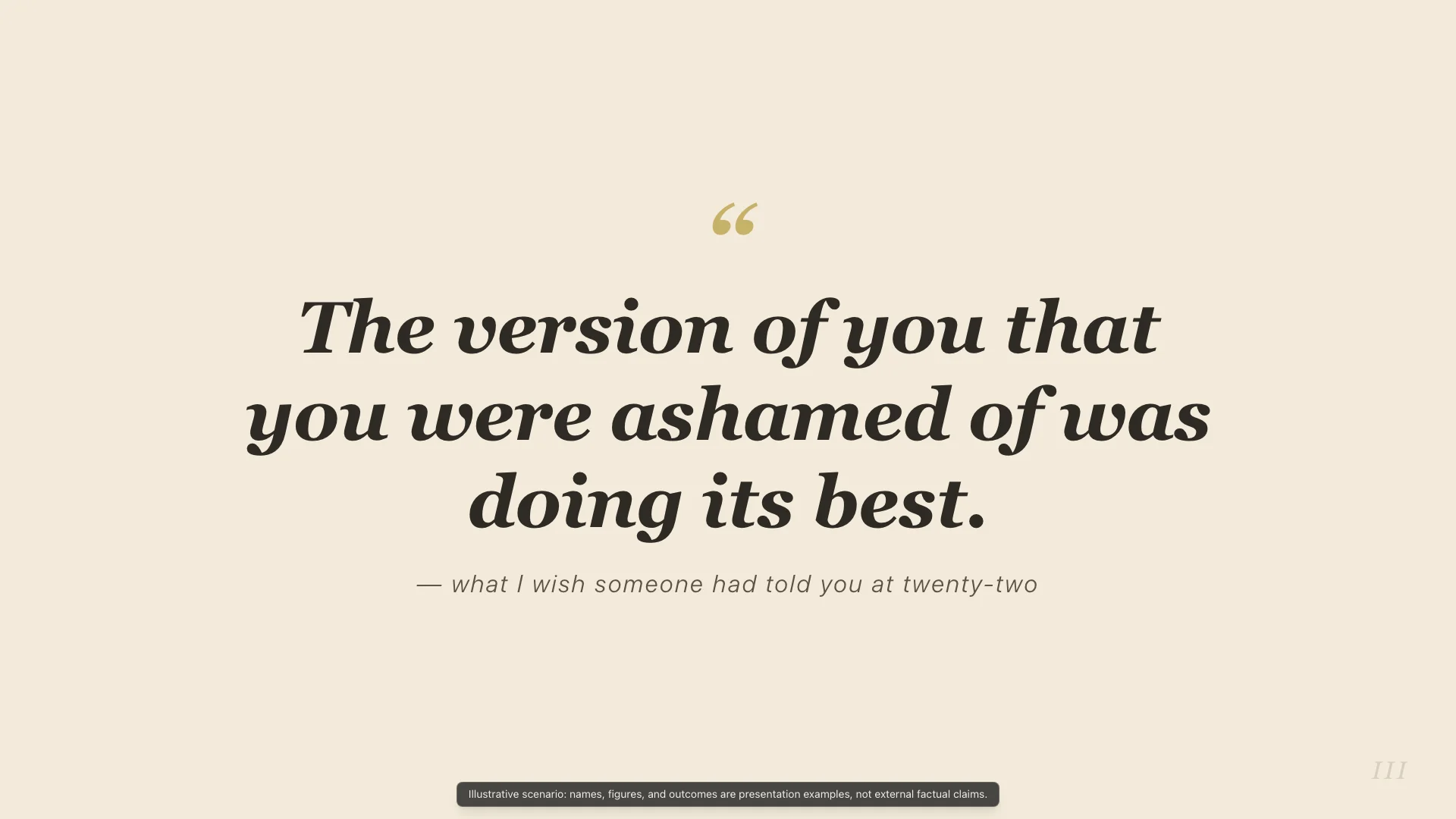
Dramatic and reflective. Uses stage darkness, radial light, and large quote typography for pauses, closings, and core philosophy.
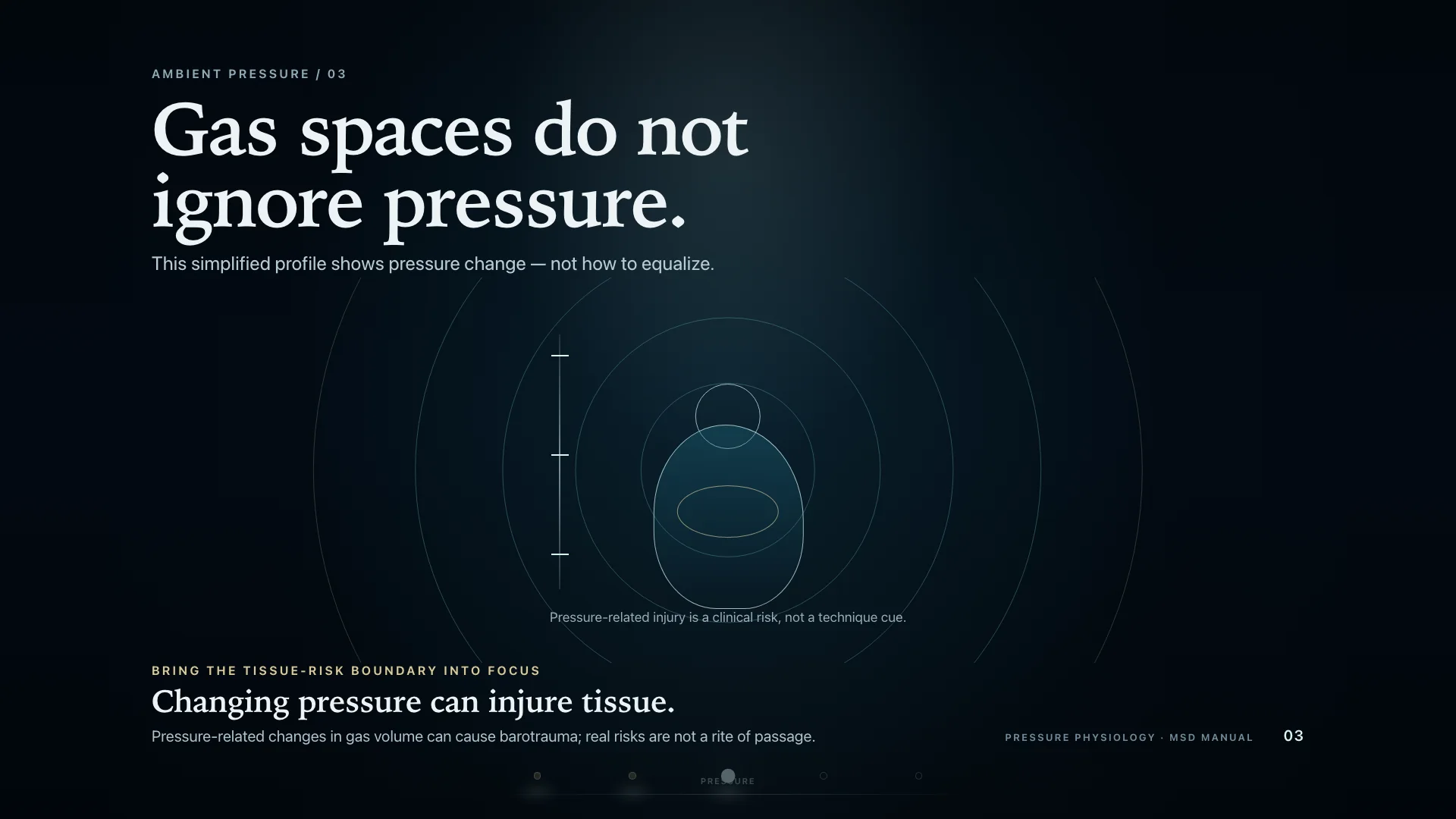
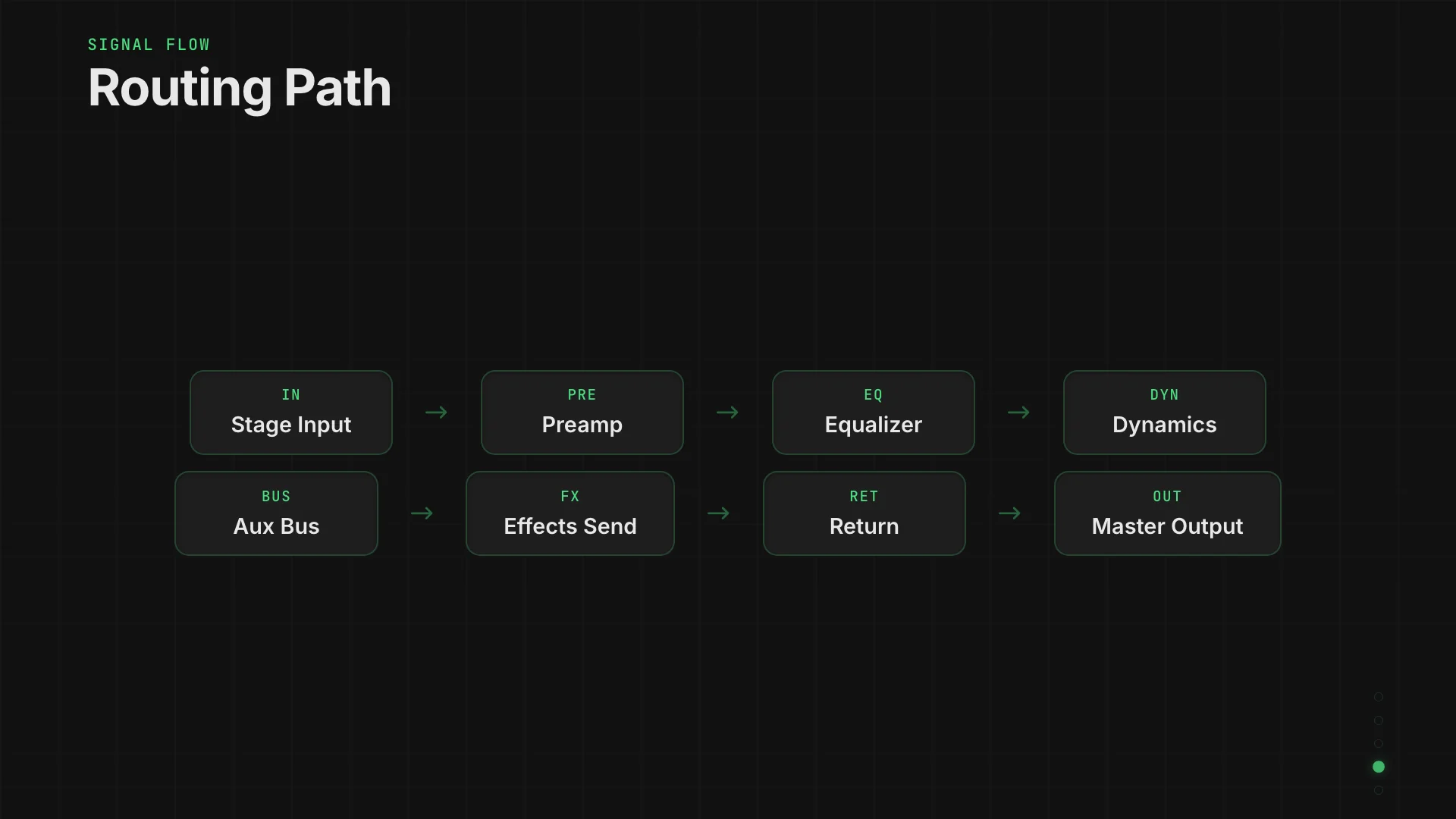
Technical and precise. Shows data, signals, or decisions moving through routed nodes and structured pipeline stages.
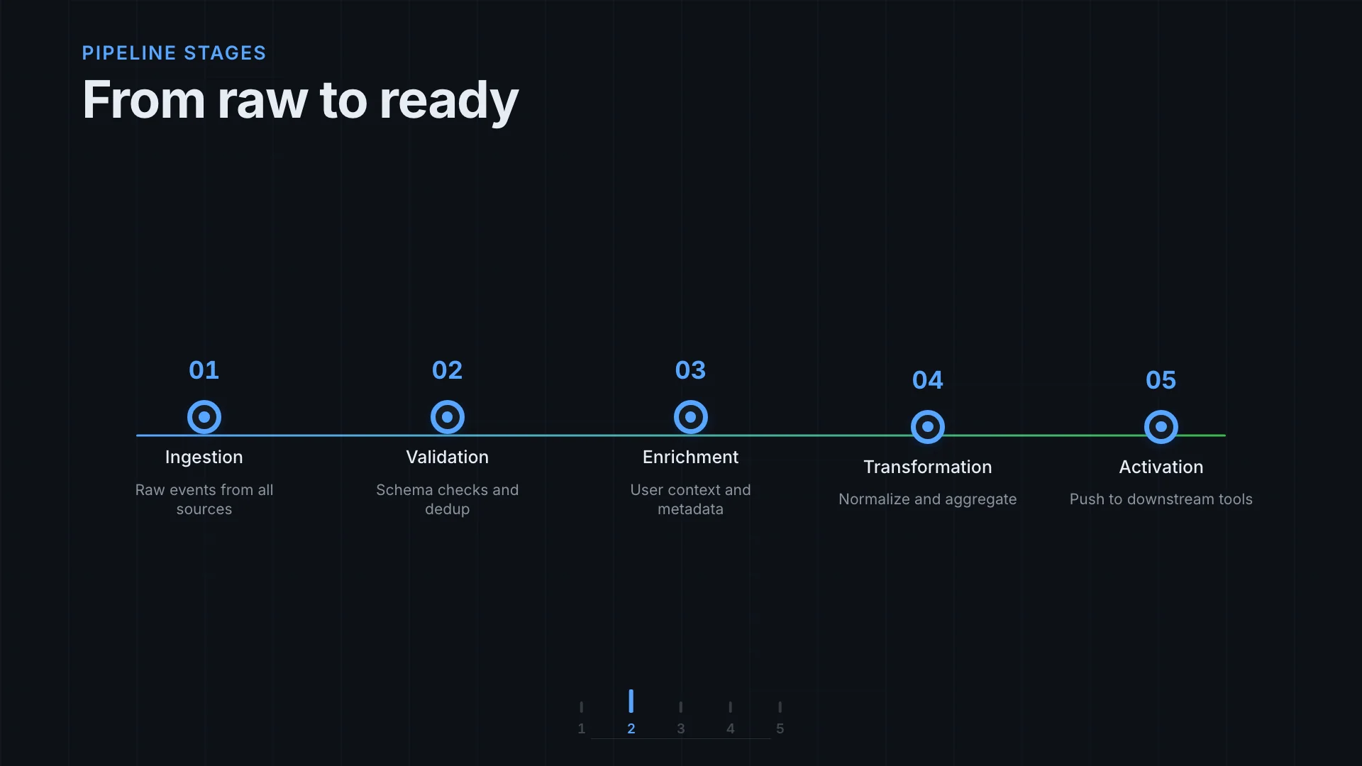
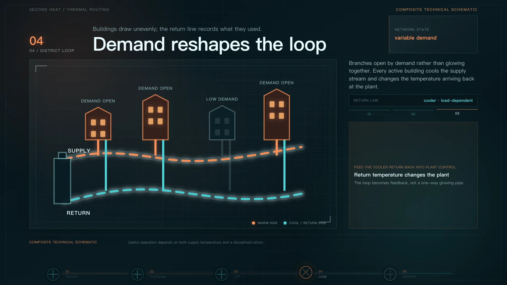
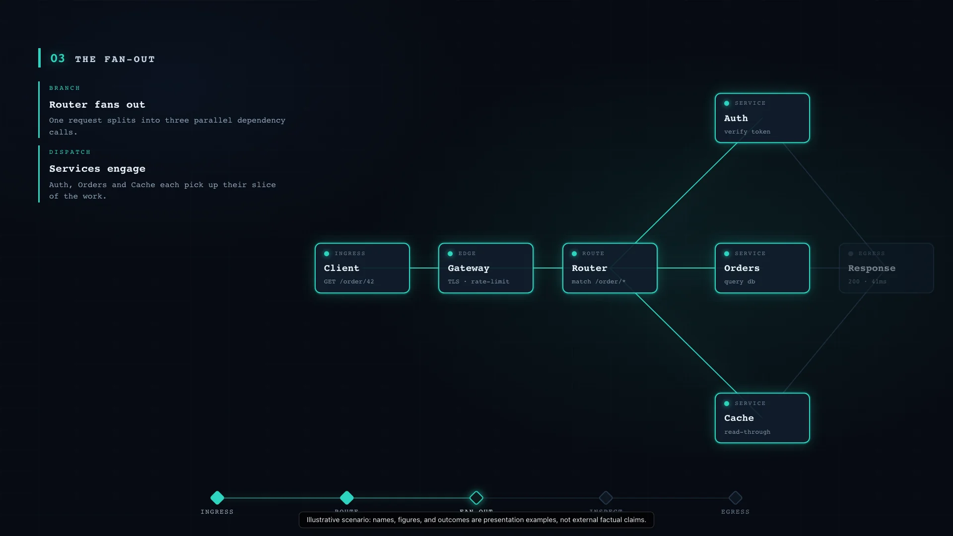
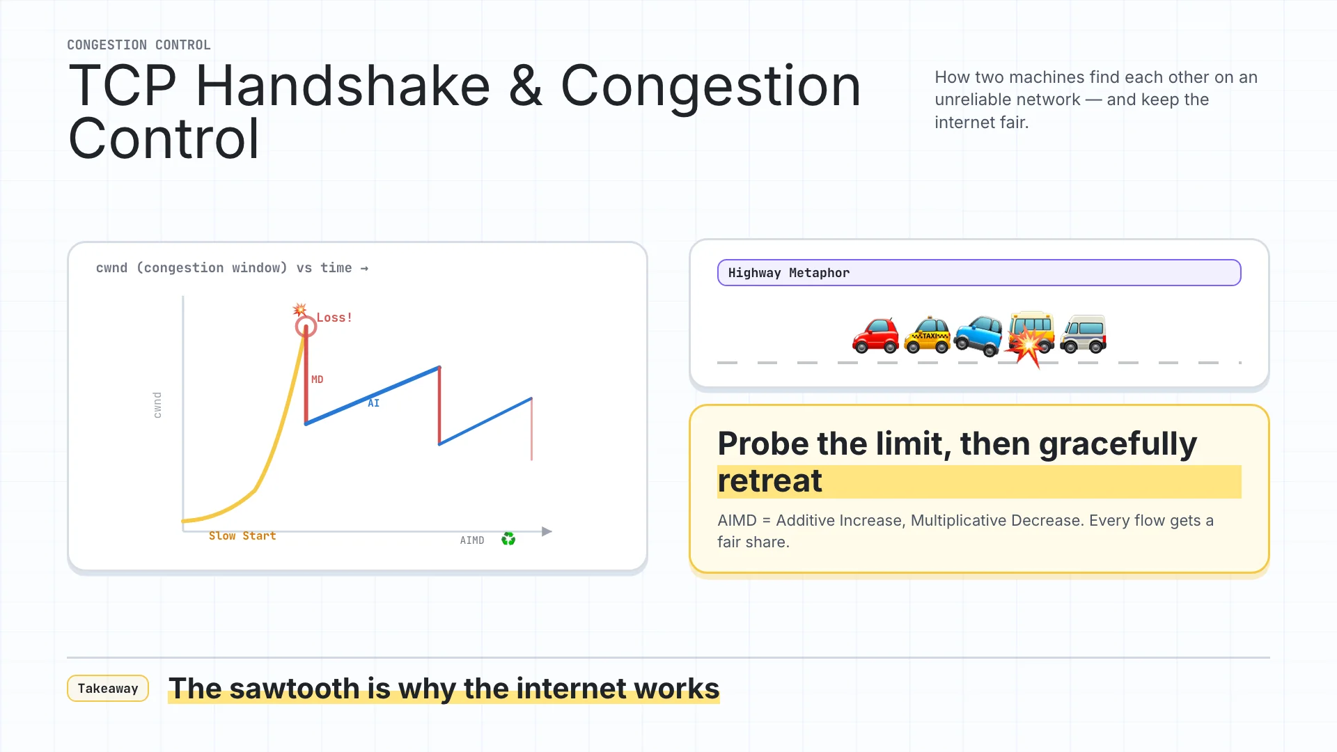
Clear, engineering-led, and diagrammatic. Uses a clean white canvas for beat-driven technical explanation.
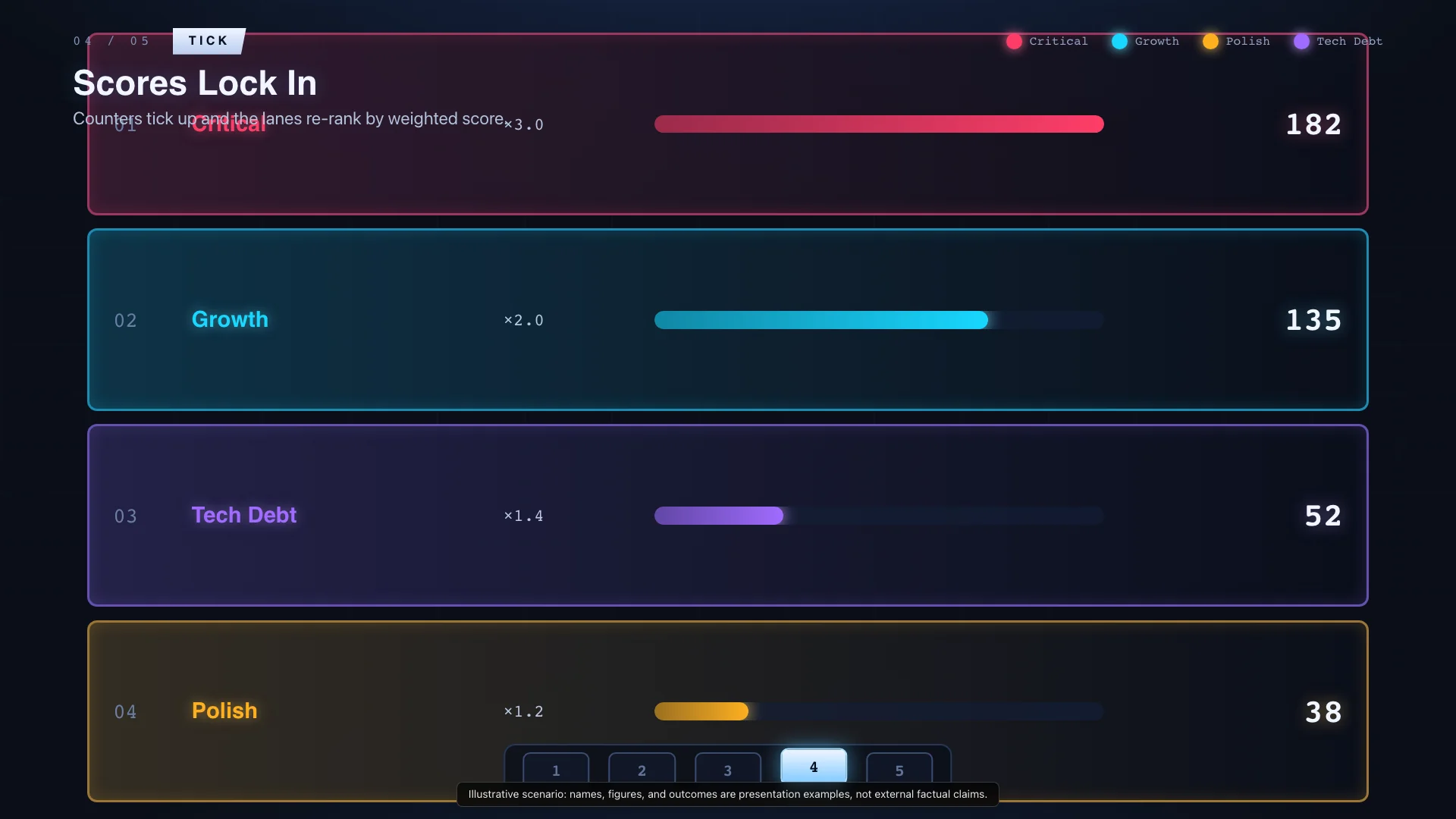
Energetic and evaluative. Turns filtering, scoring, and prioritization into lanes, pins, score markers, and active funnel paths.
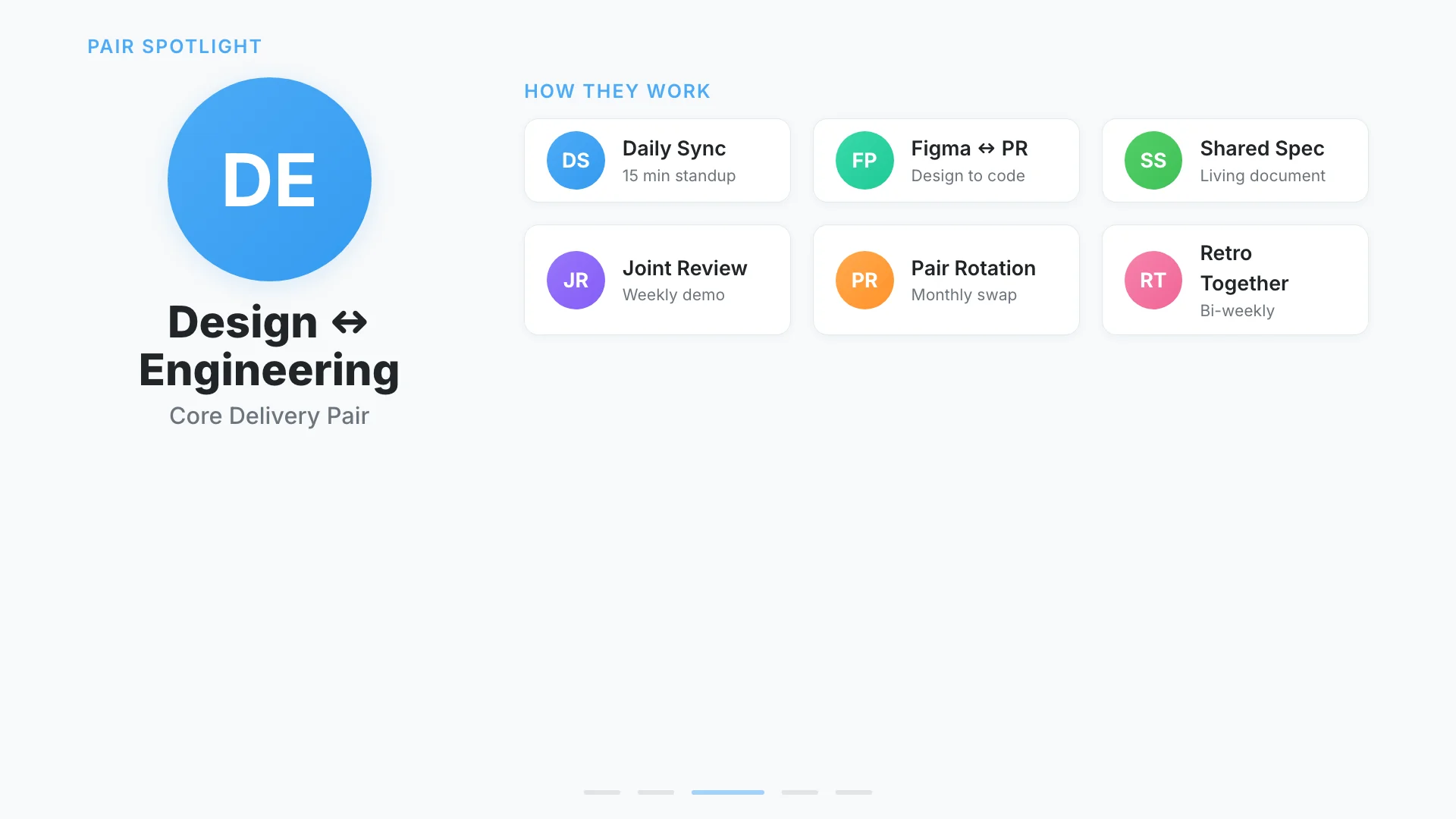
Clean and cooperative. Uses paired columns, role boundaries, and sync points to explain collaboration between people, teams, or systems.
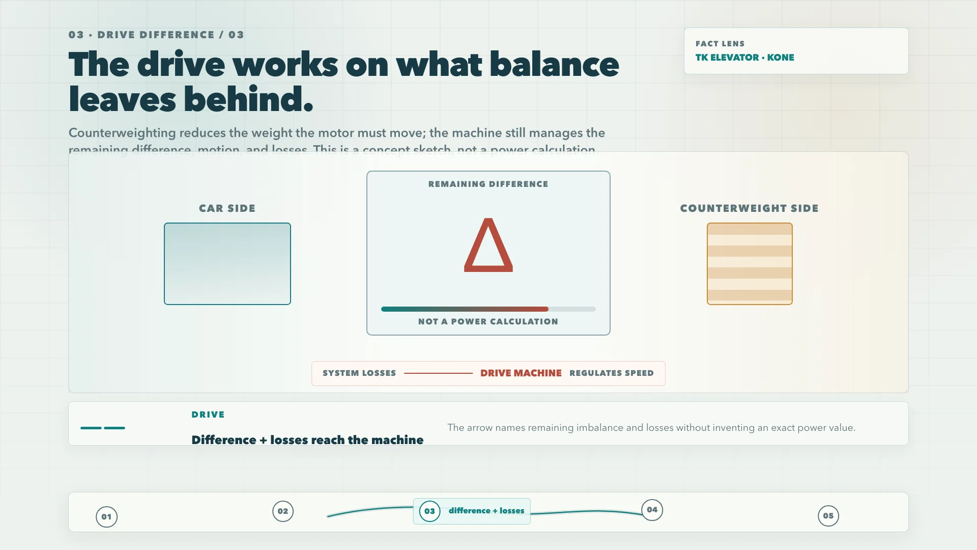
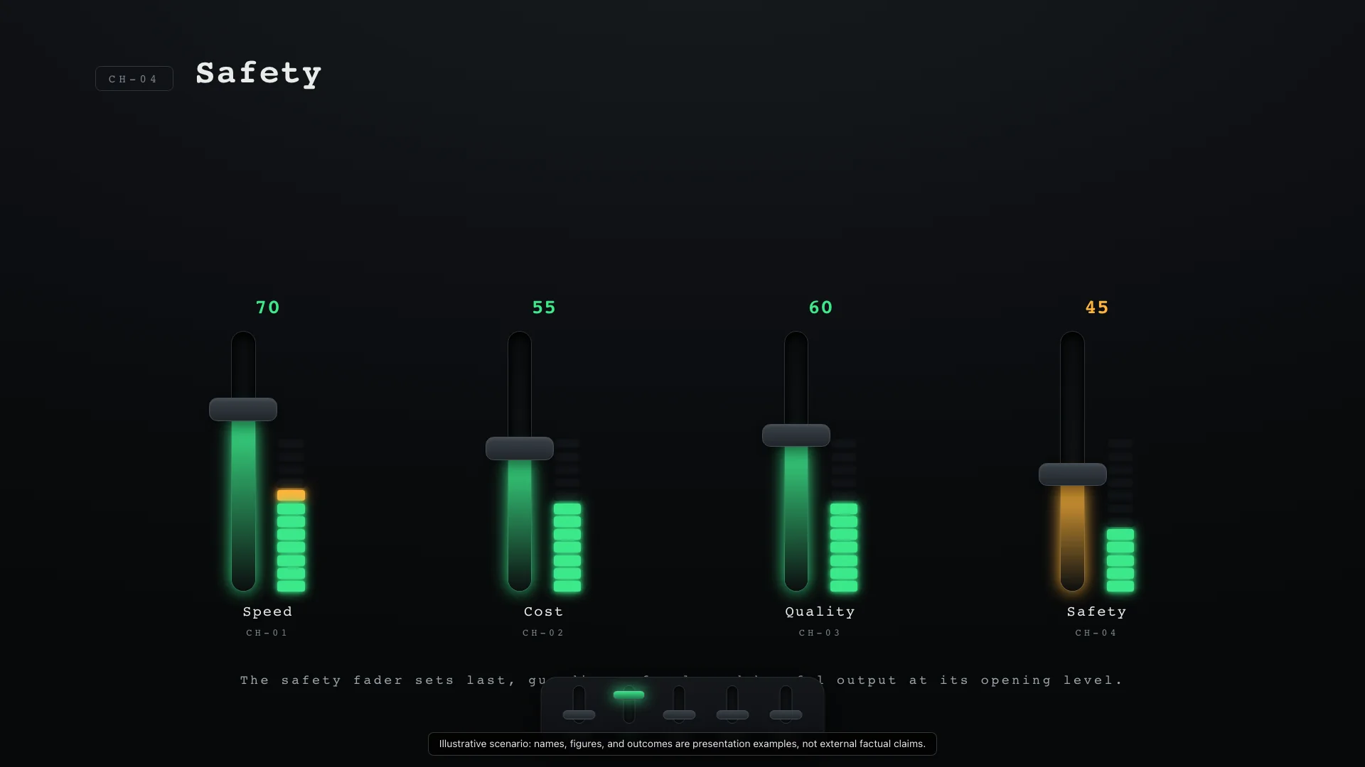
Professional and tactile. Represents parameter tuning, noise filtering, and trade-off balancing through faders, knobs, and level meters.
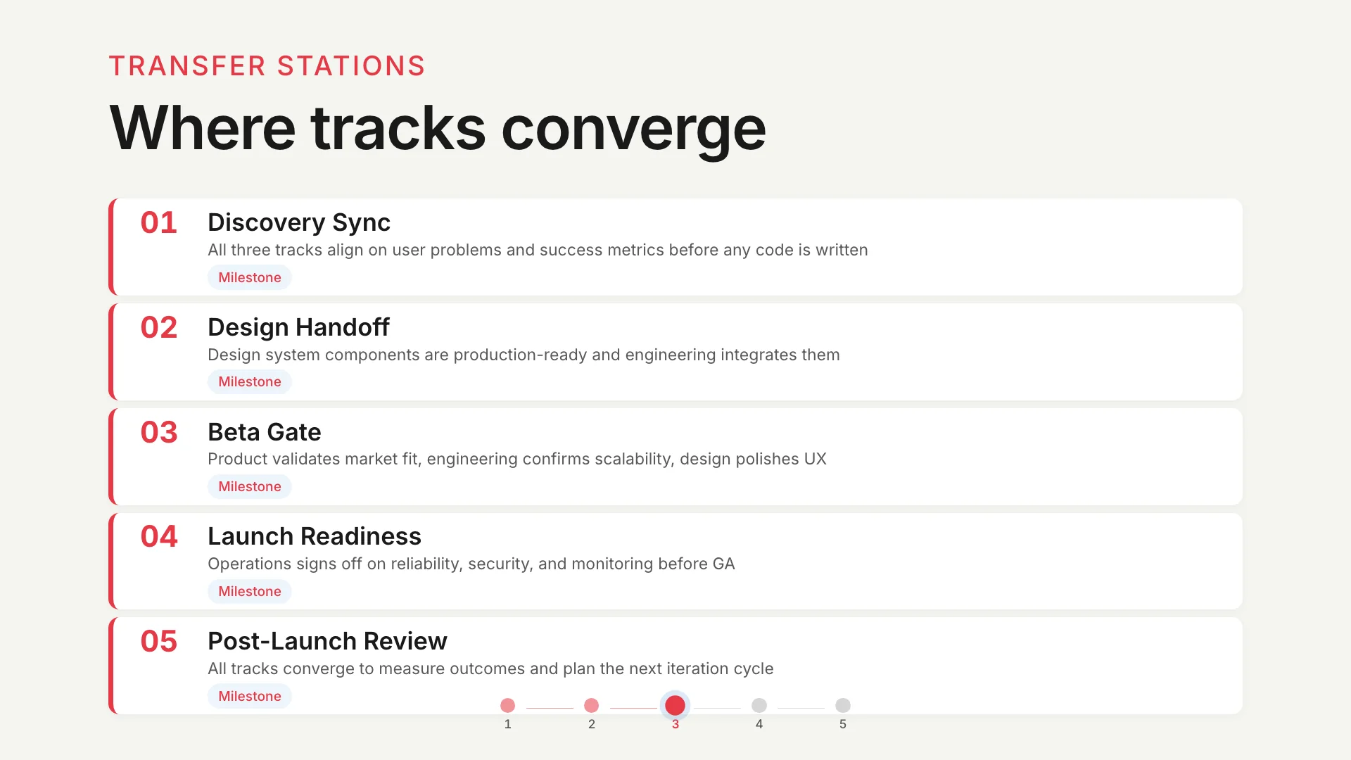
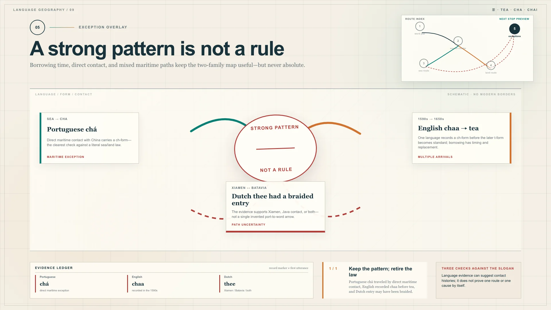
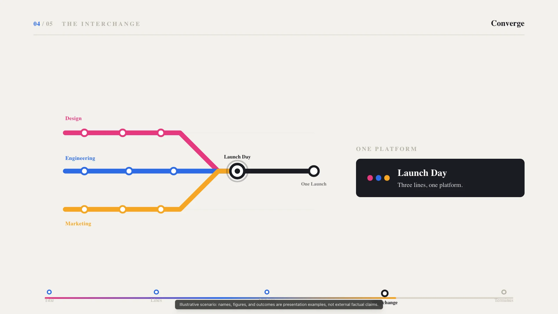
Systematic and structured. Represents converging workflows as subway lines and transfer stations.
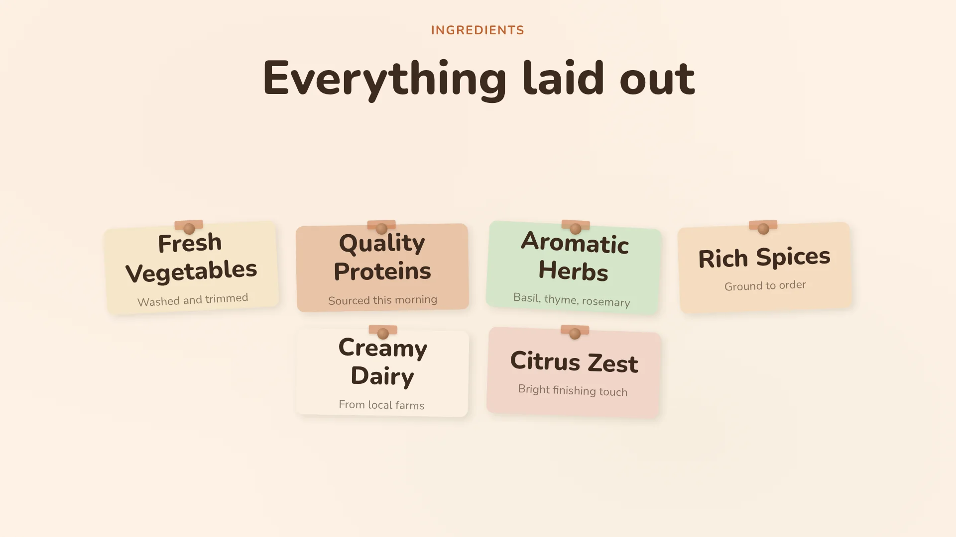
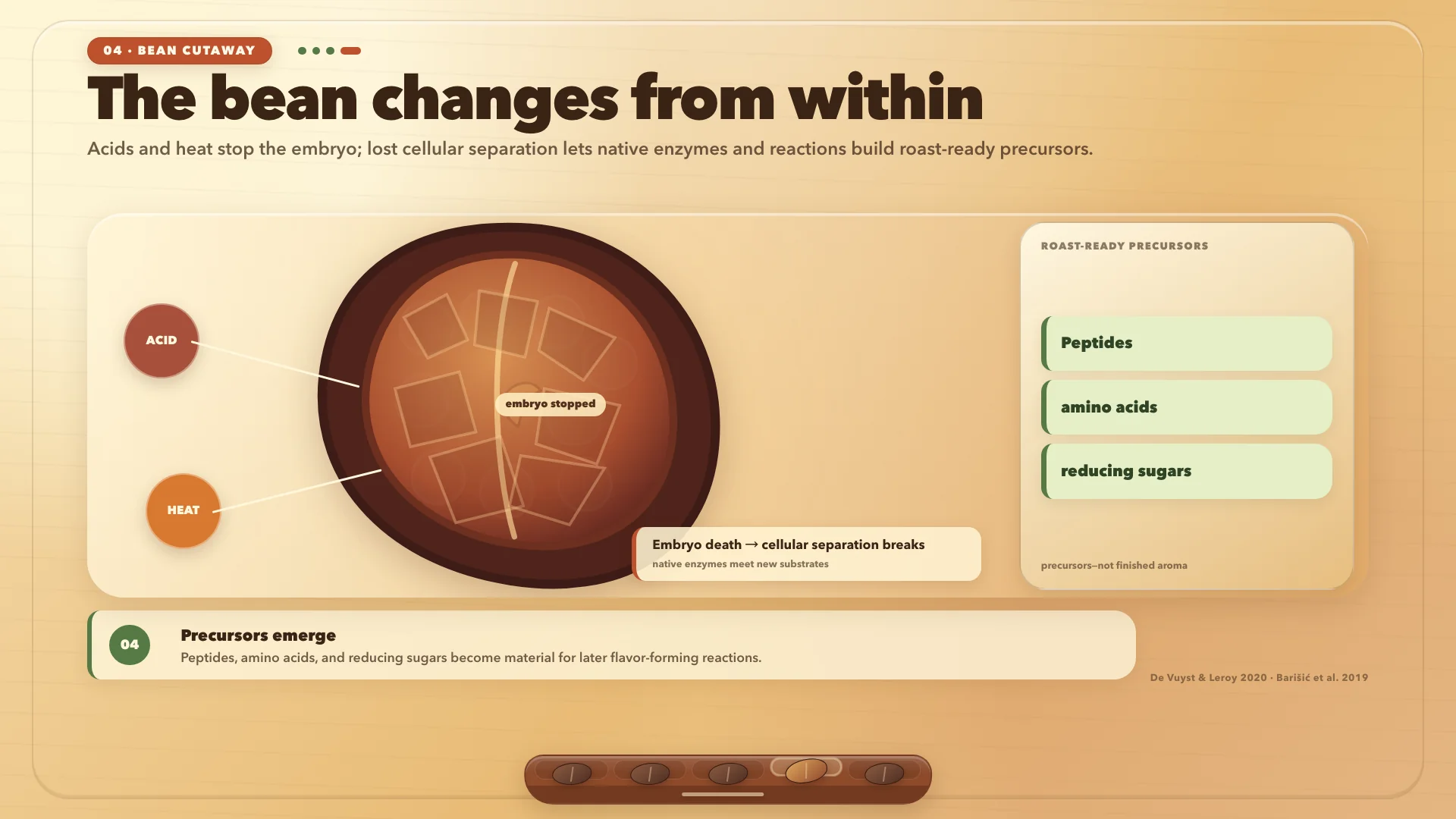
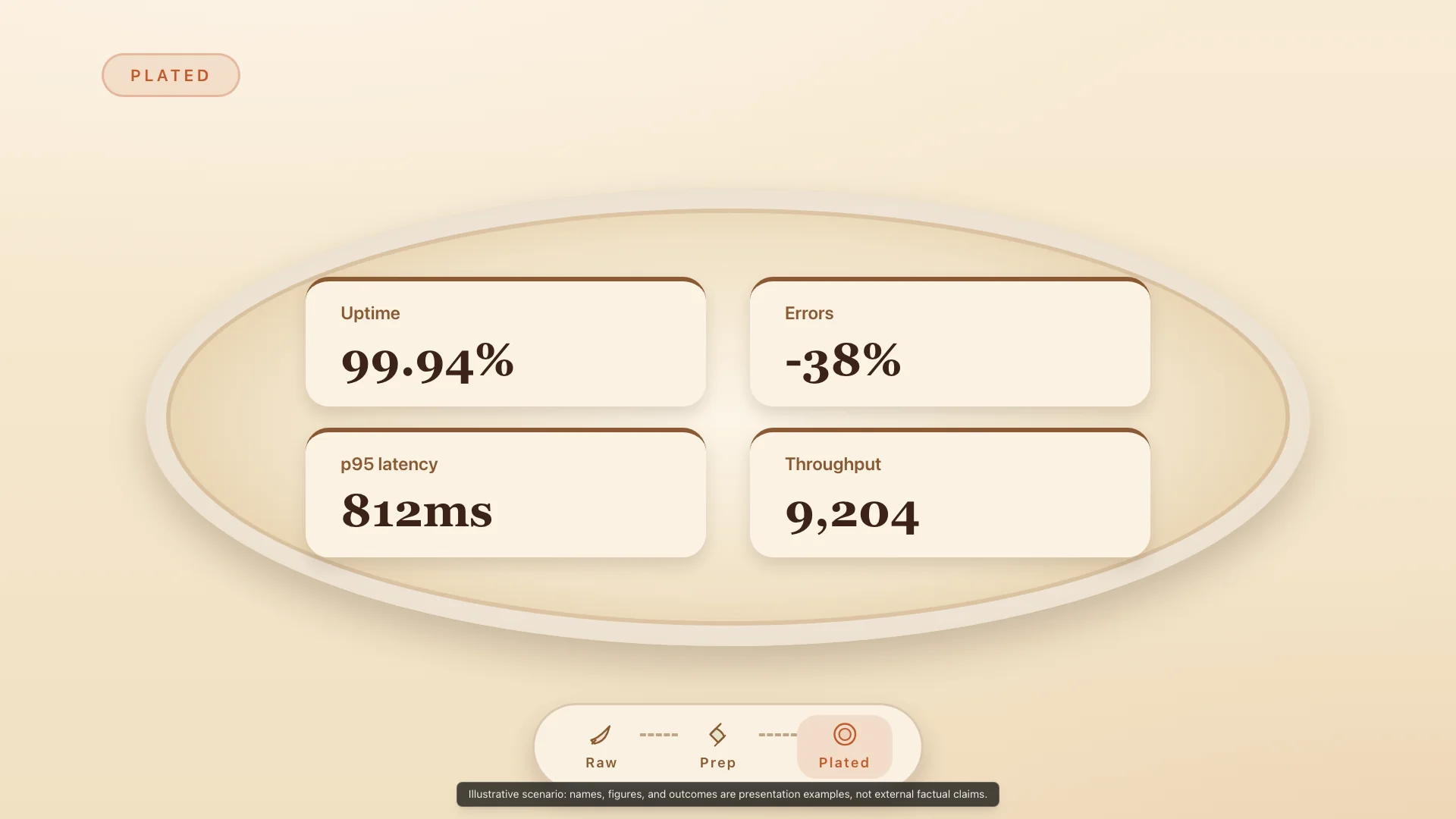
Warm and concrete. Turns raw-to-clean transformation into prep boards, trimmed ingredients, recipe steps, and plated outputs.
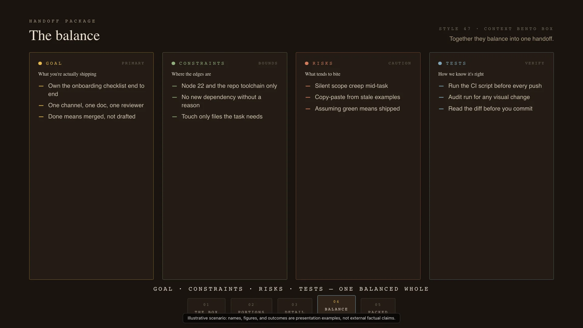
Compact and organized. Uses compartment grids and layered boxes for handoffs, multi-category overviews, and context packaging.
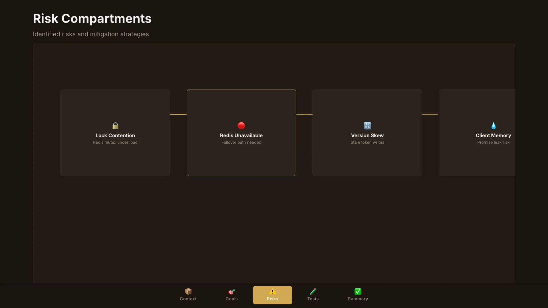
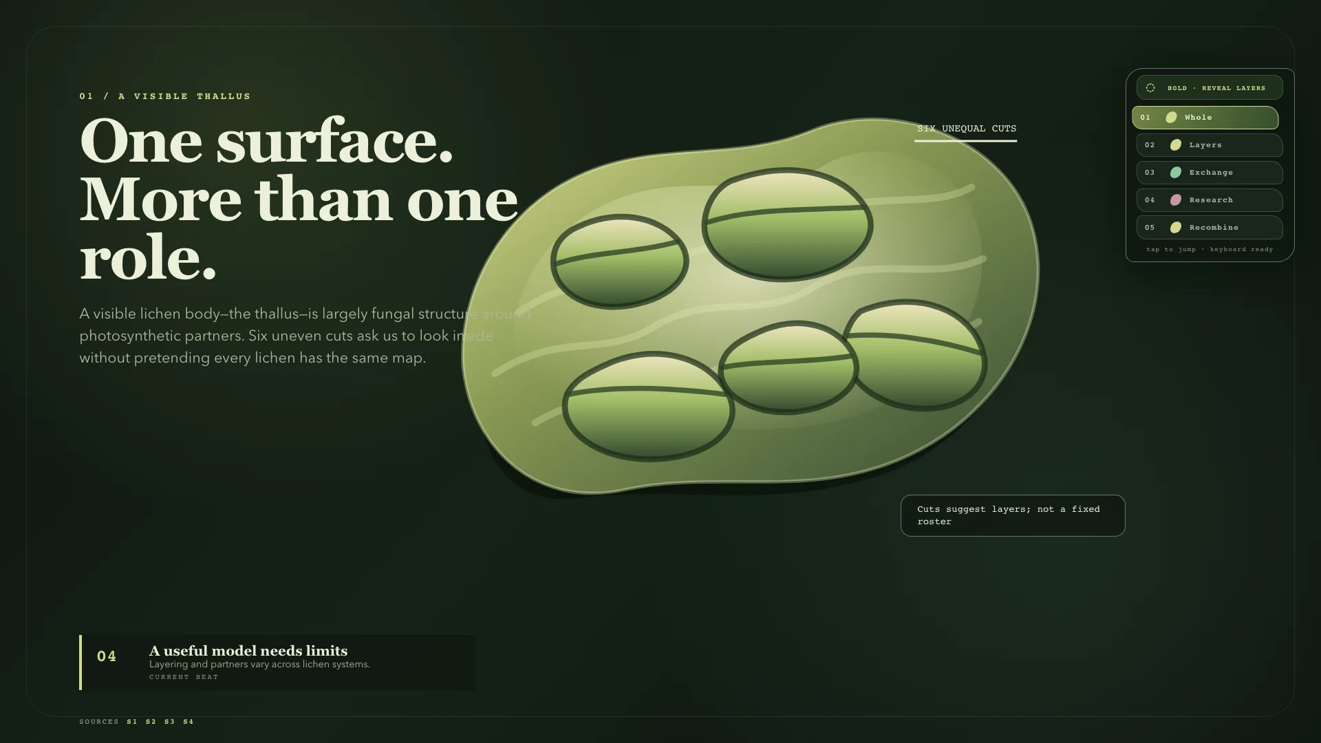
Developer-native and diagnostic. Uses neon status badges, terminal surfaces, and actionable boards.
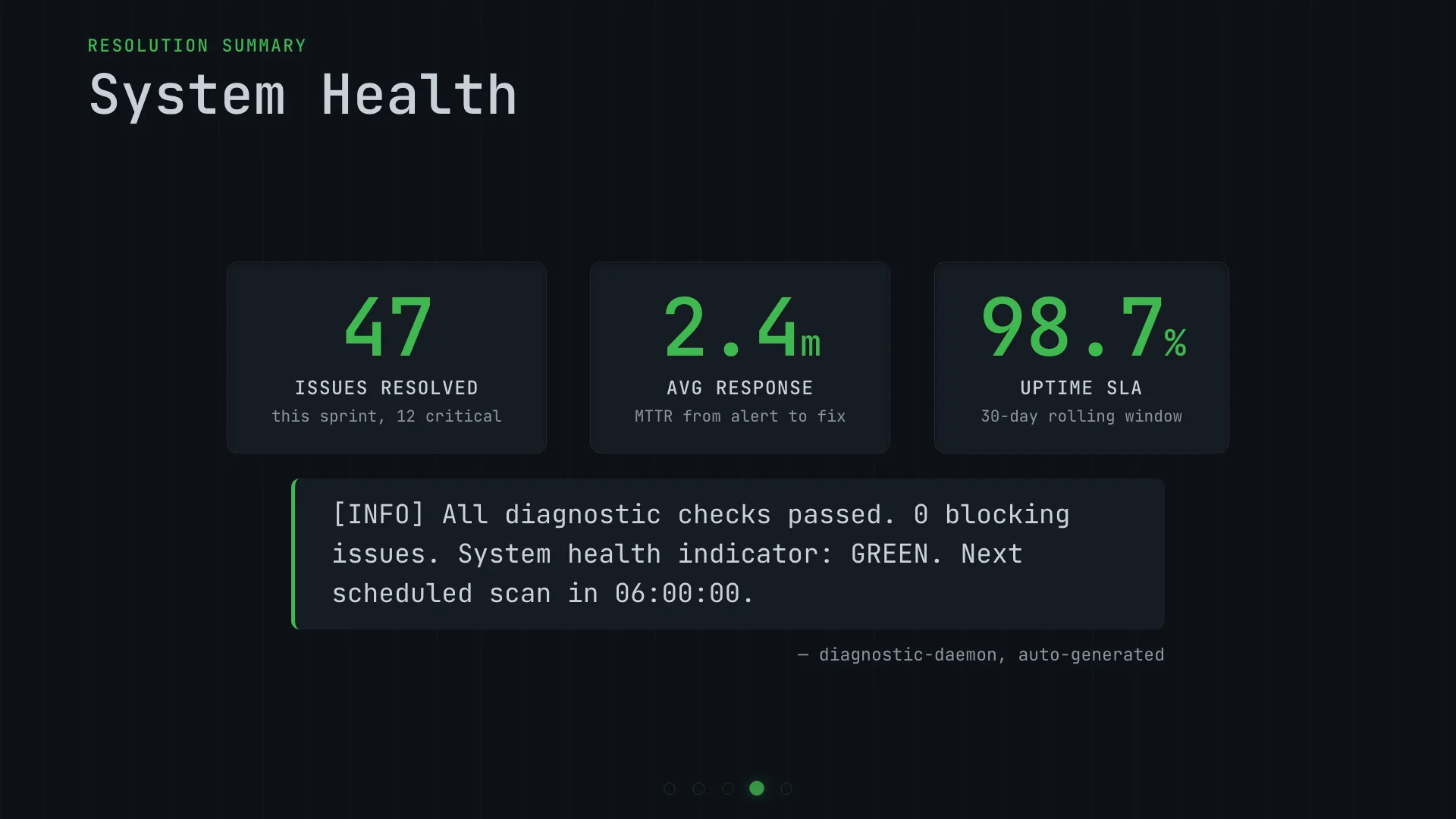
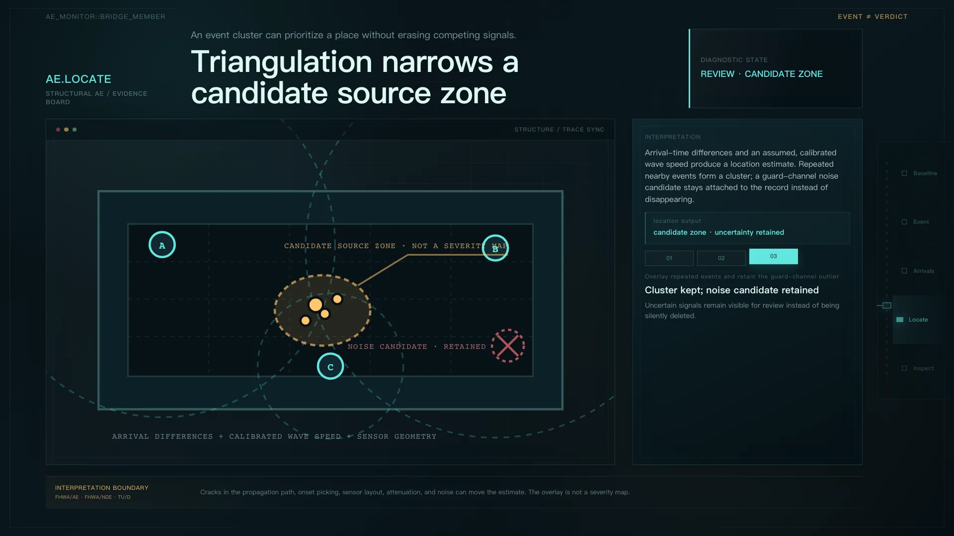
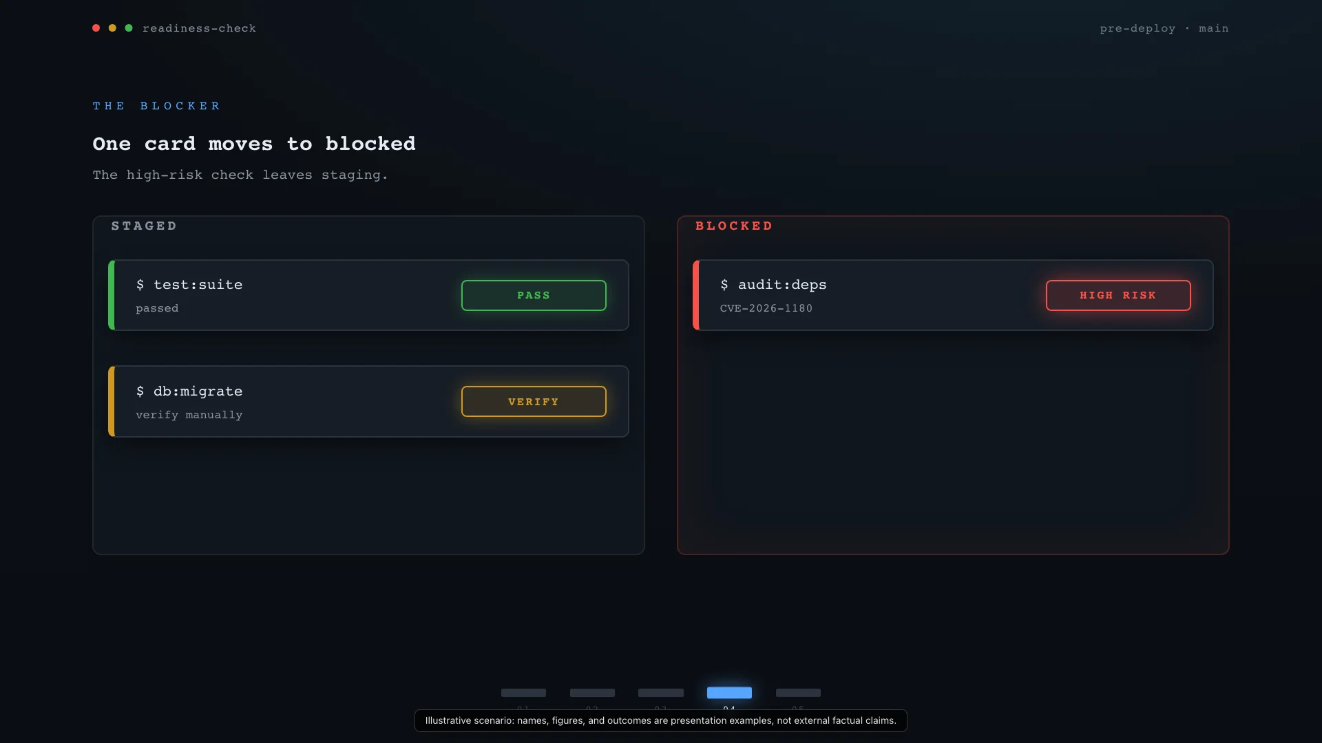
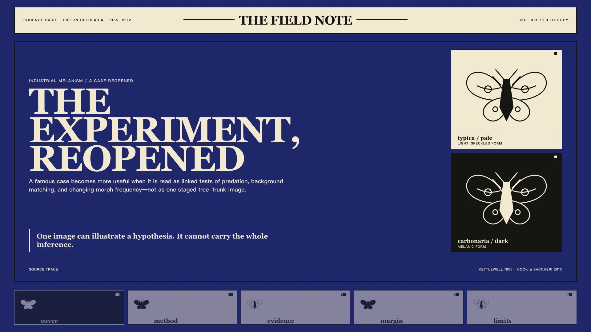
Styles drawn from editorial design, publication layout, and print typography traditions.
Newsstand cover confidence with a saturated ink field and an enormous fashion serif demanding attention.
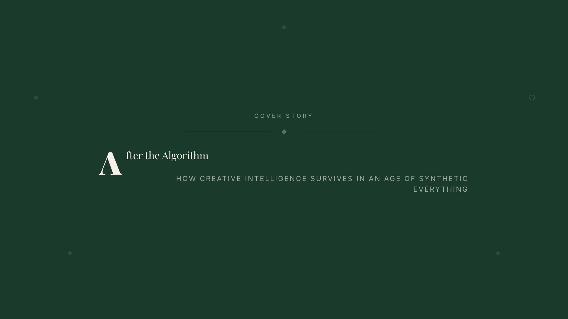
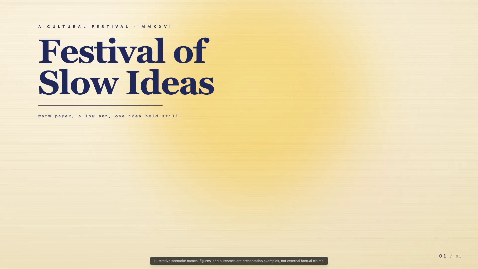
Exhibition poster warmth on warm parchment with a slow solar glow and one enormous serif statement.
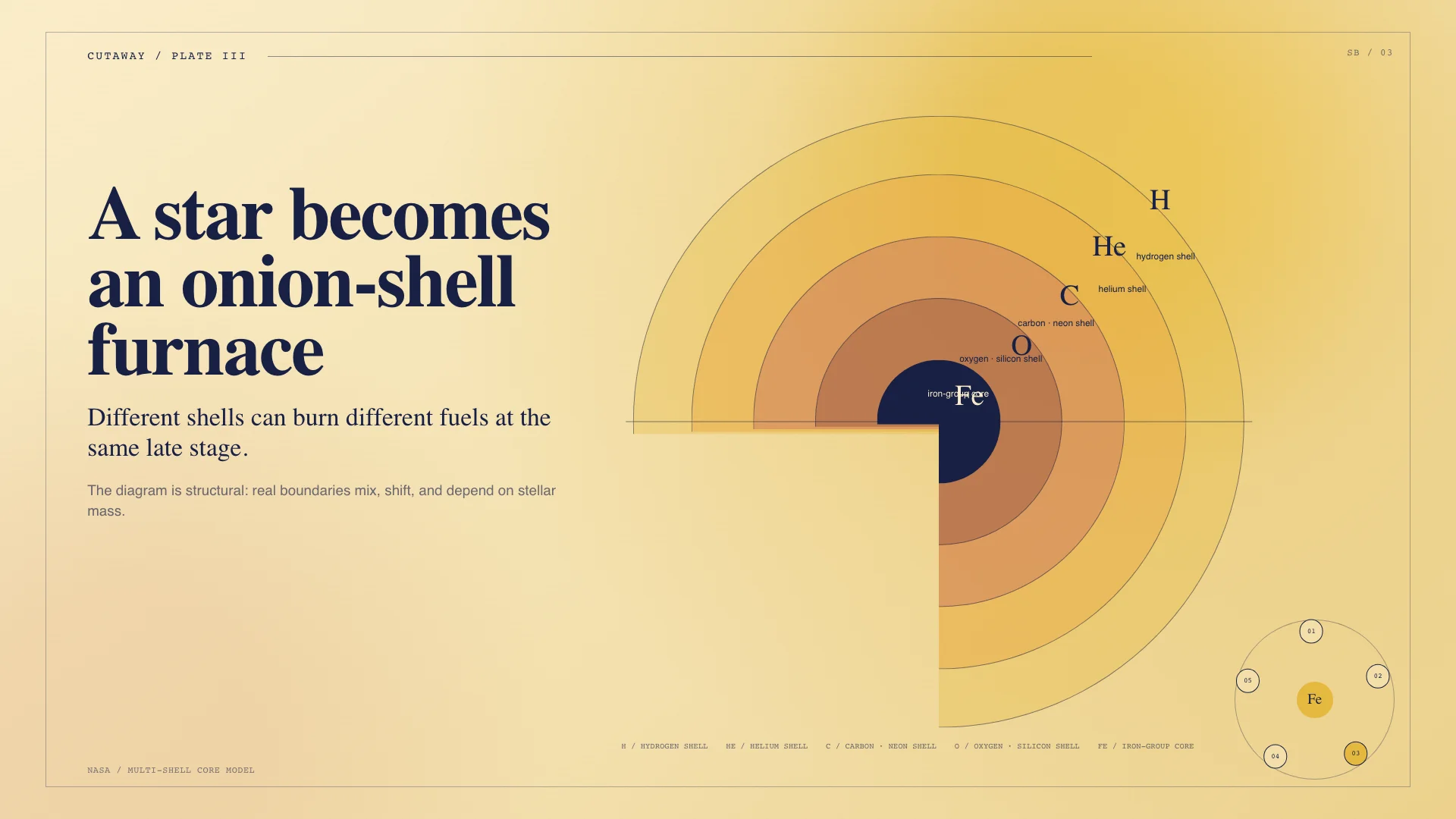
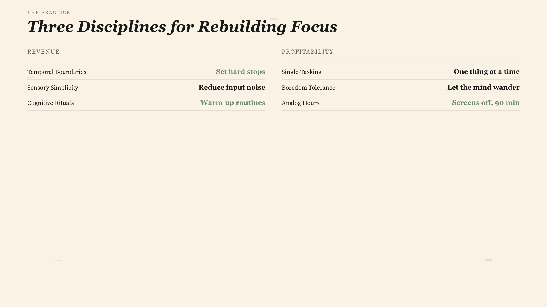
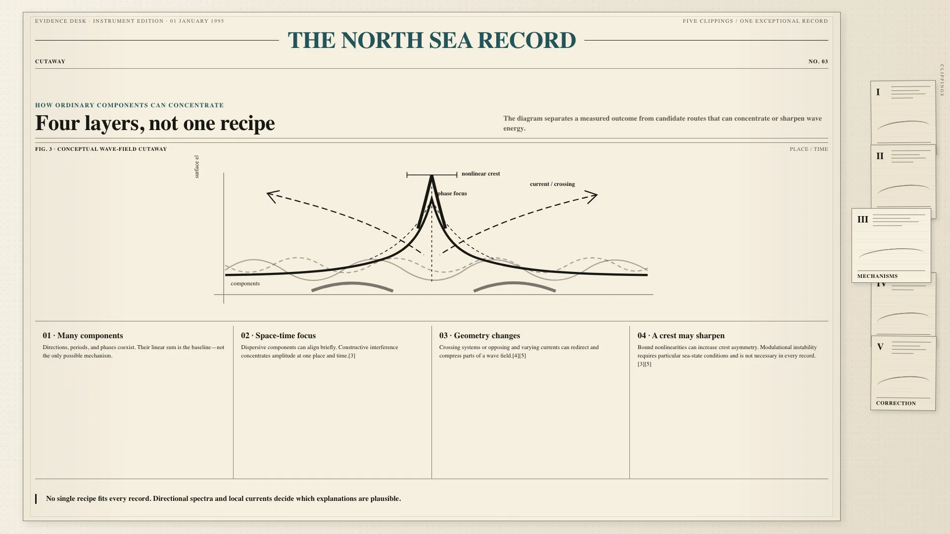
Magazine feature spread with cream paper, serif display, and pull-quote rhythm for narrative reading.
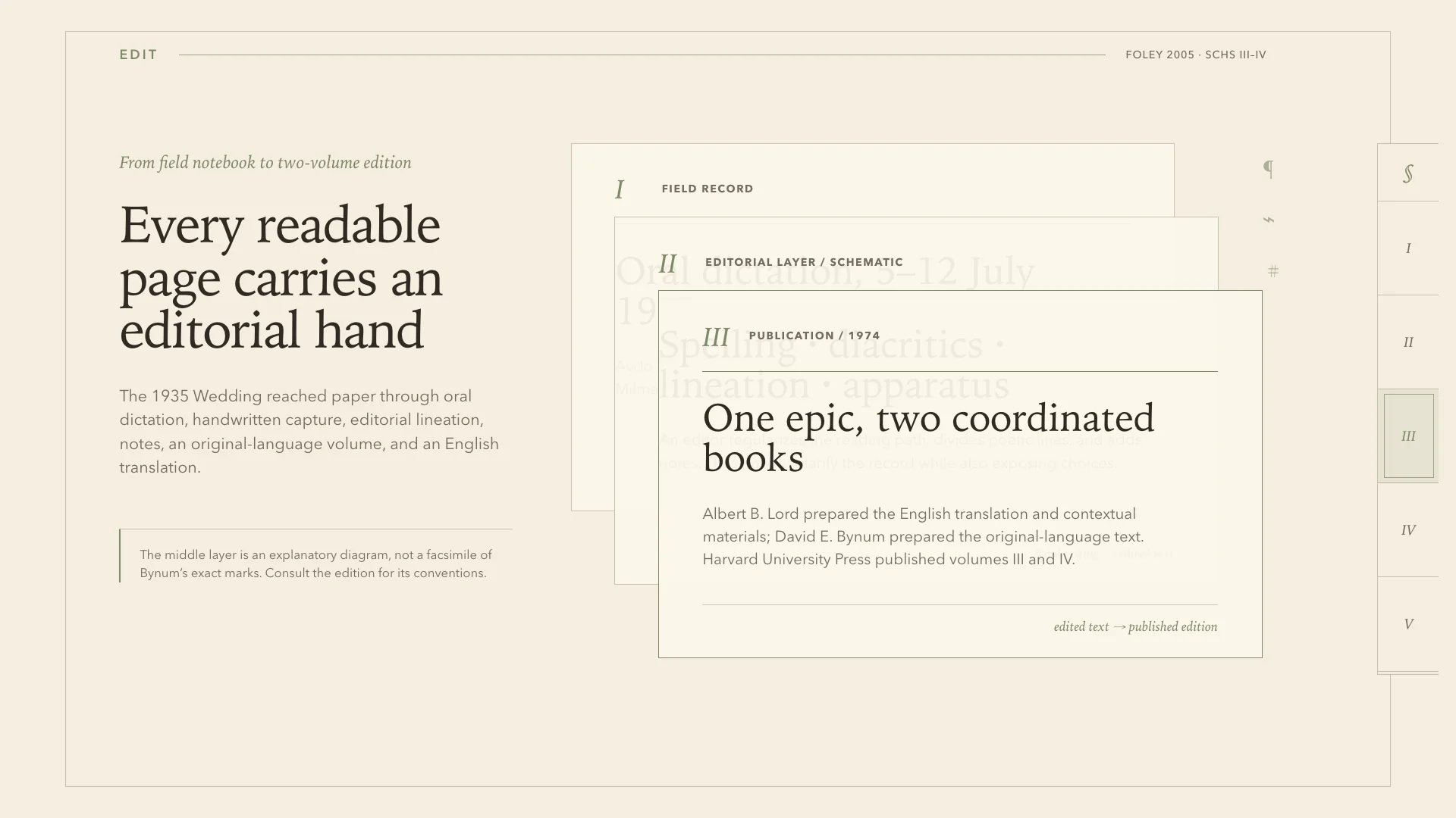
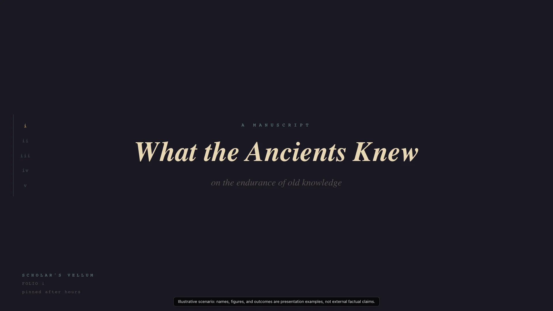
Classical manuscript on aged parchment with marginalia and serif authority for deep-dive intellectual content.
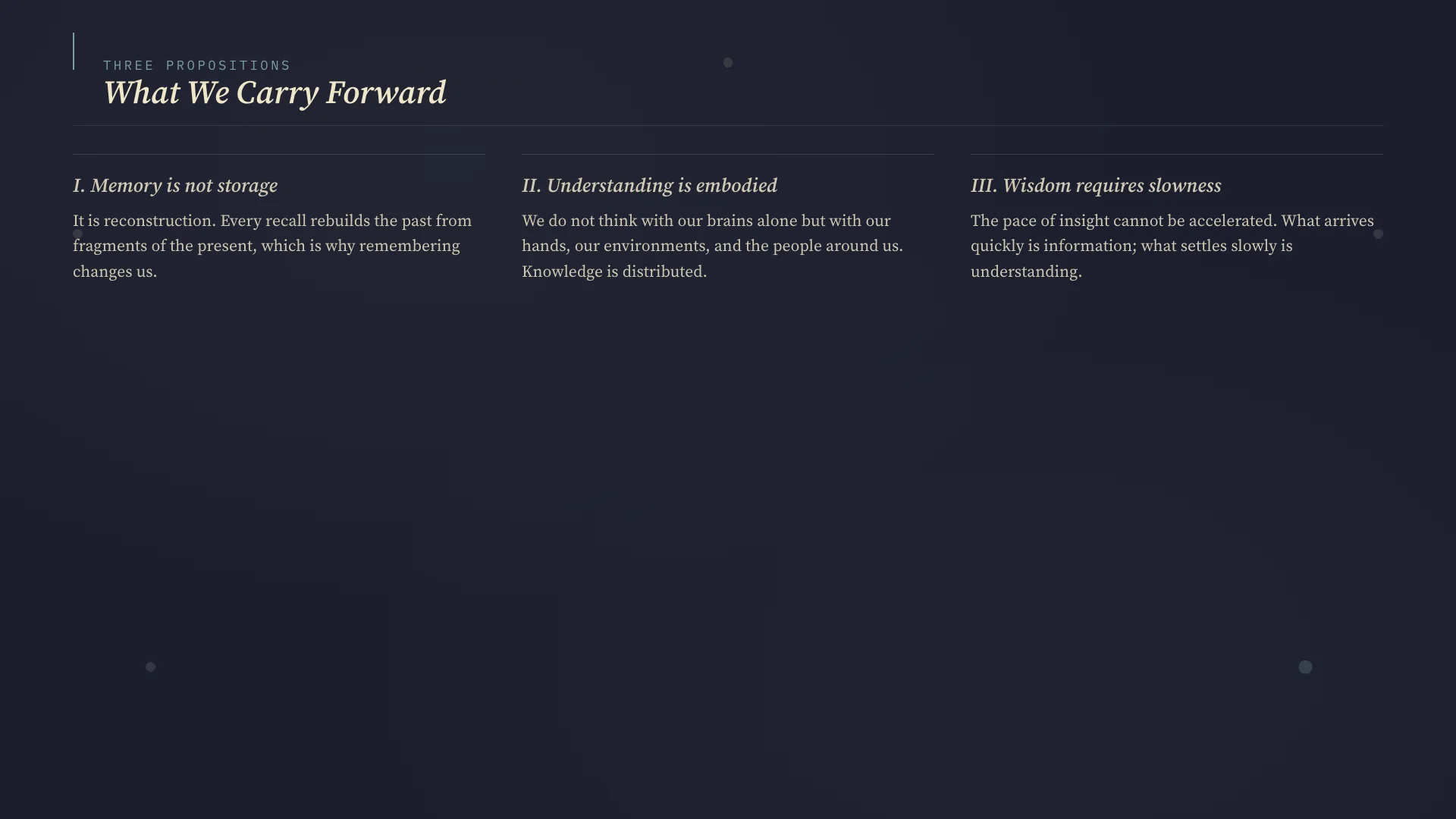
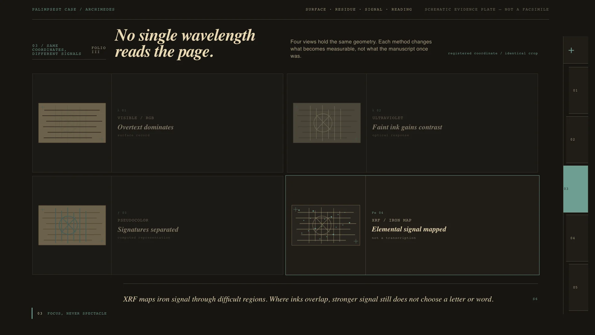
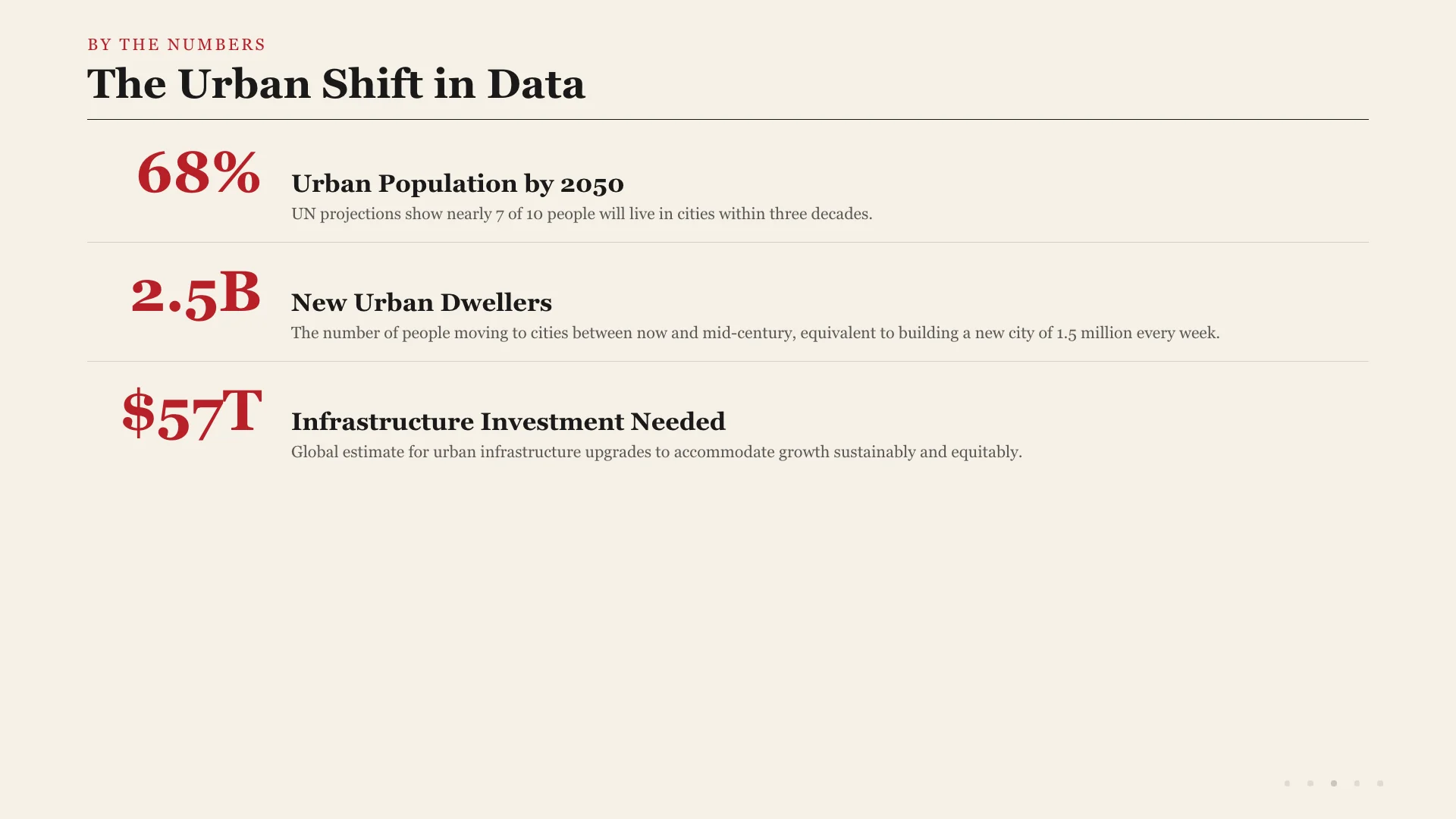
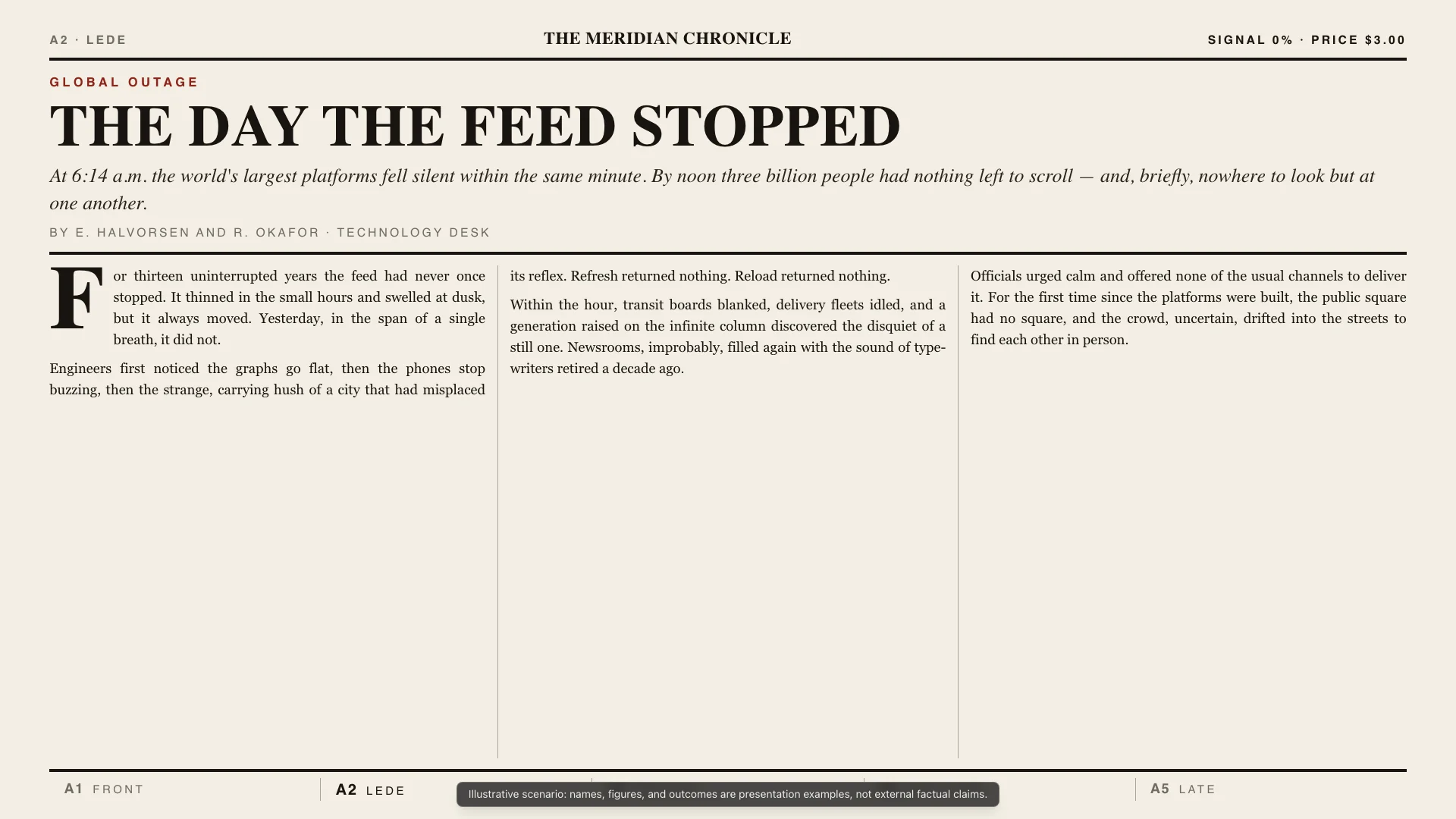
Newspaper front page with multi-column layout and headline hierarchy for packed information delivery.
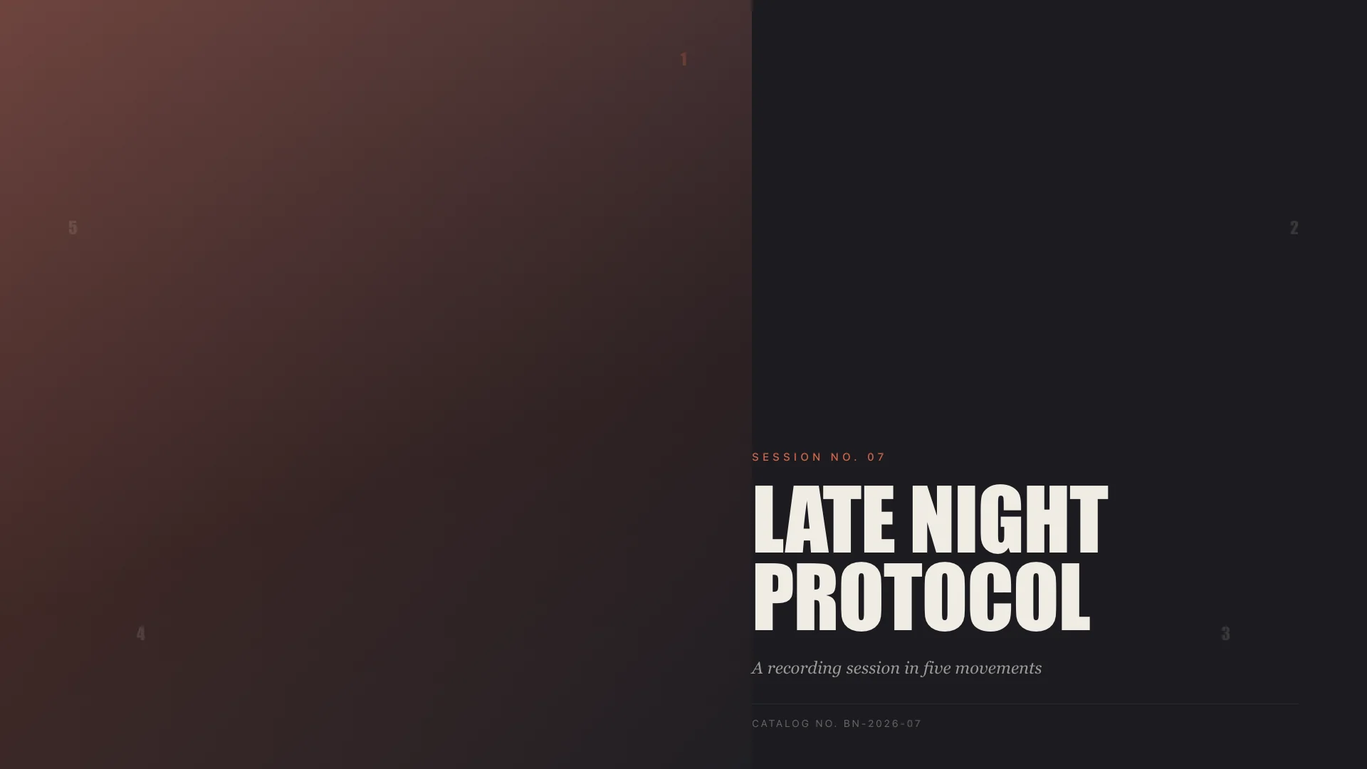
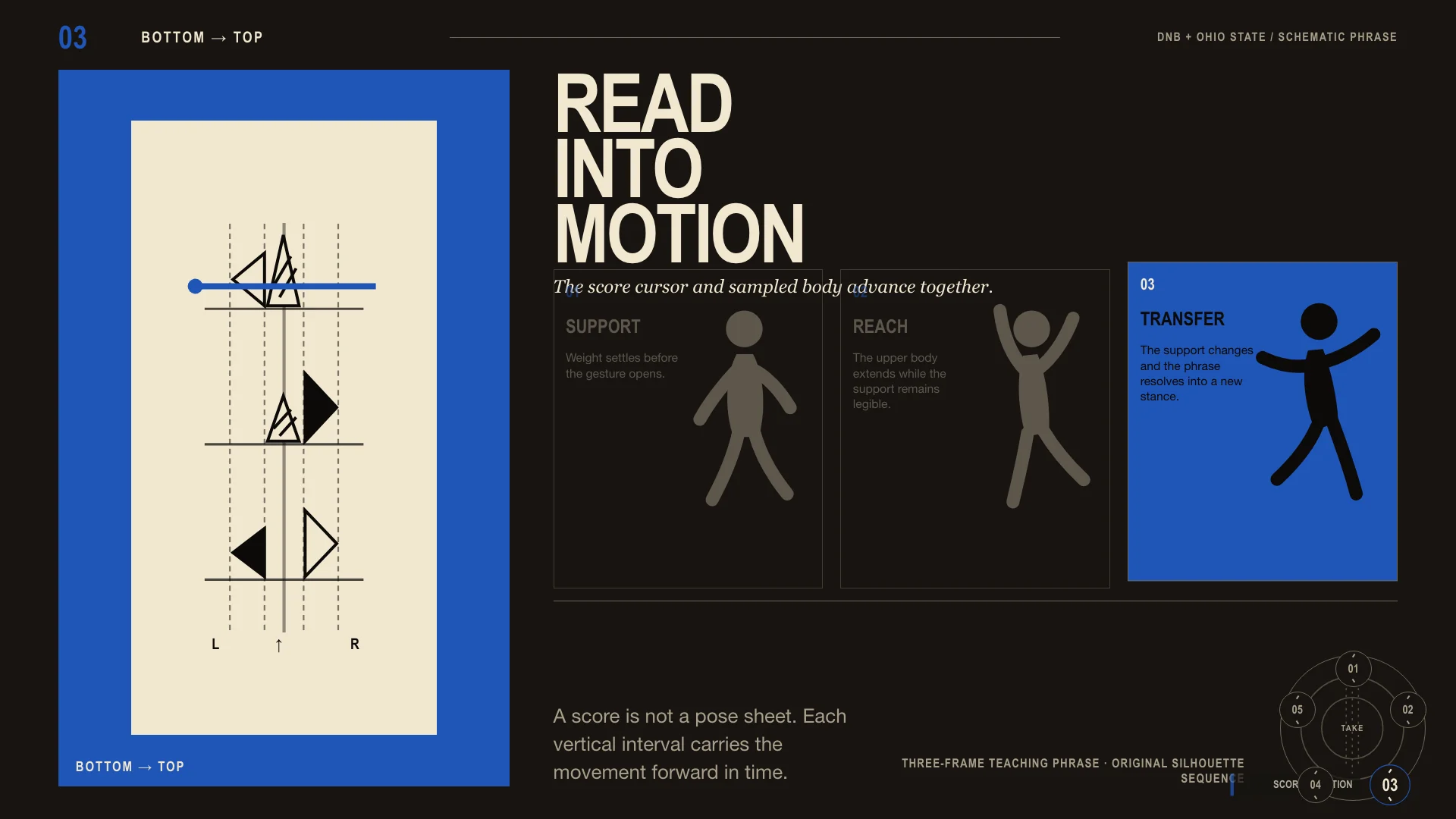
Blue Note LP sleeve with a duotone photo and enormous condensed gothic type — cool, disciplined, workmanlike.
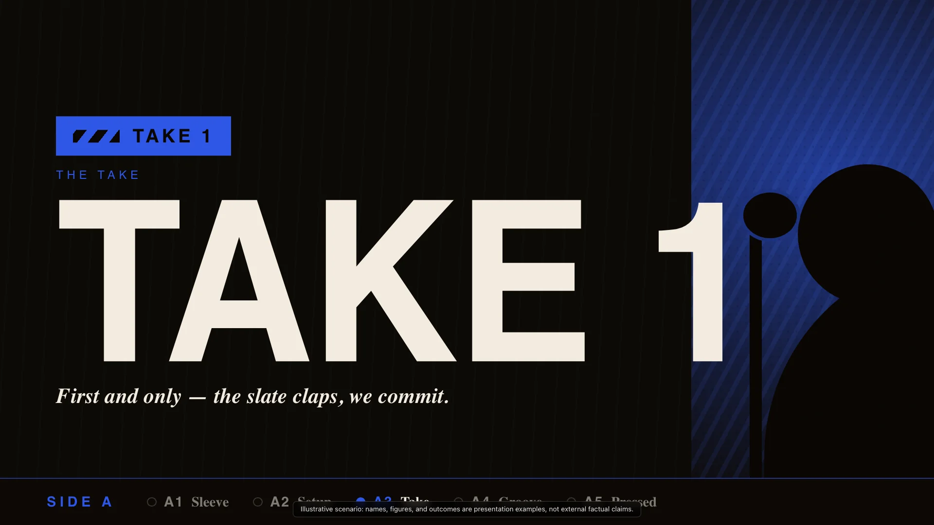
Styles rooted in craft techniques, cultural visual traditions, and physical media.
Scientific botanical illustration with fine ink lines and Latin annotation for natural-world framing.
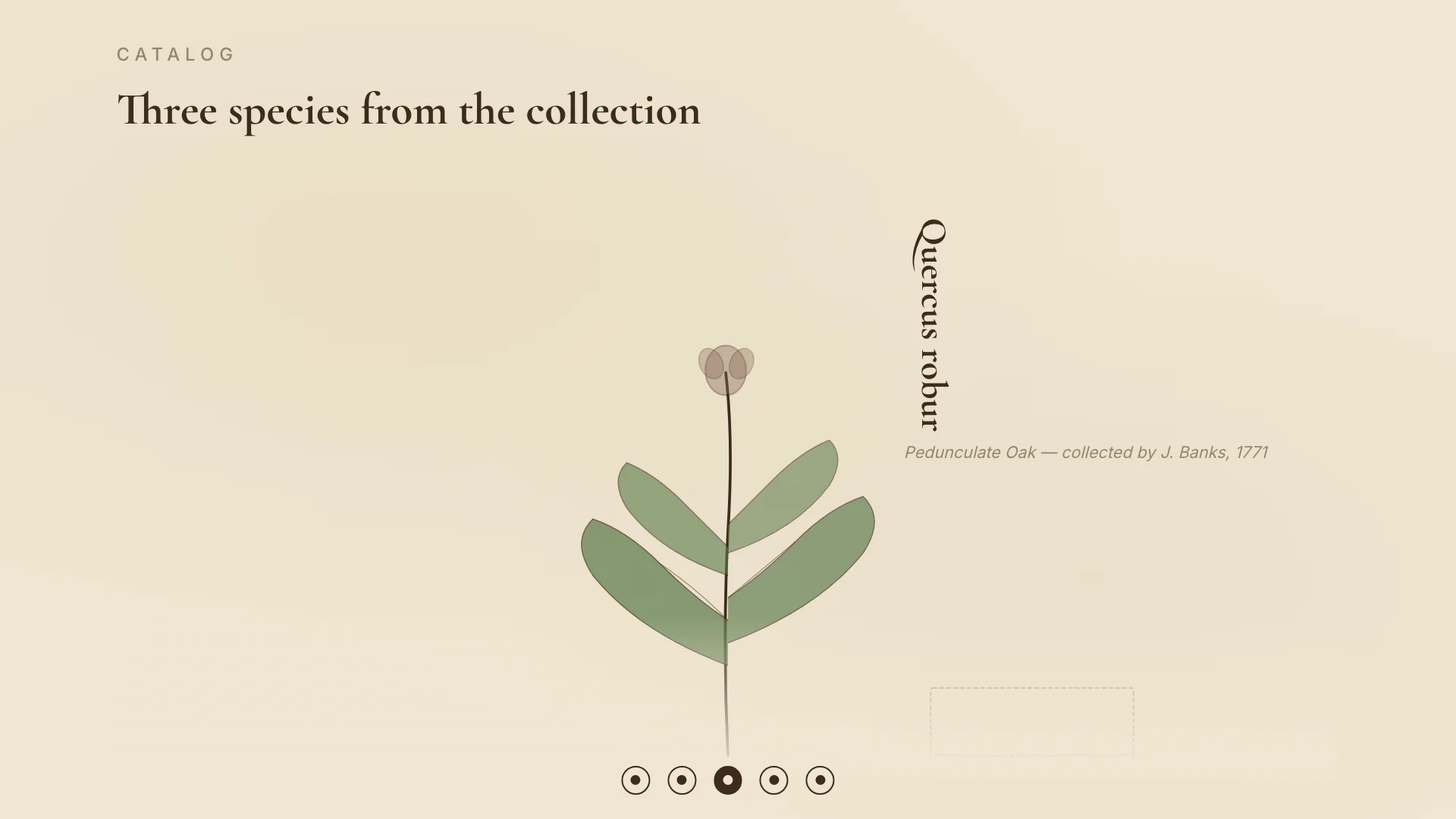
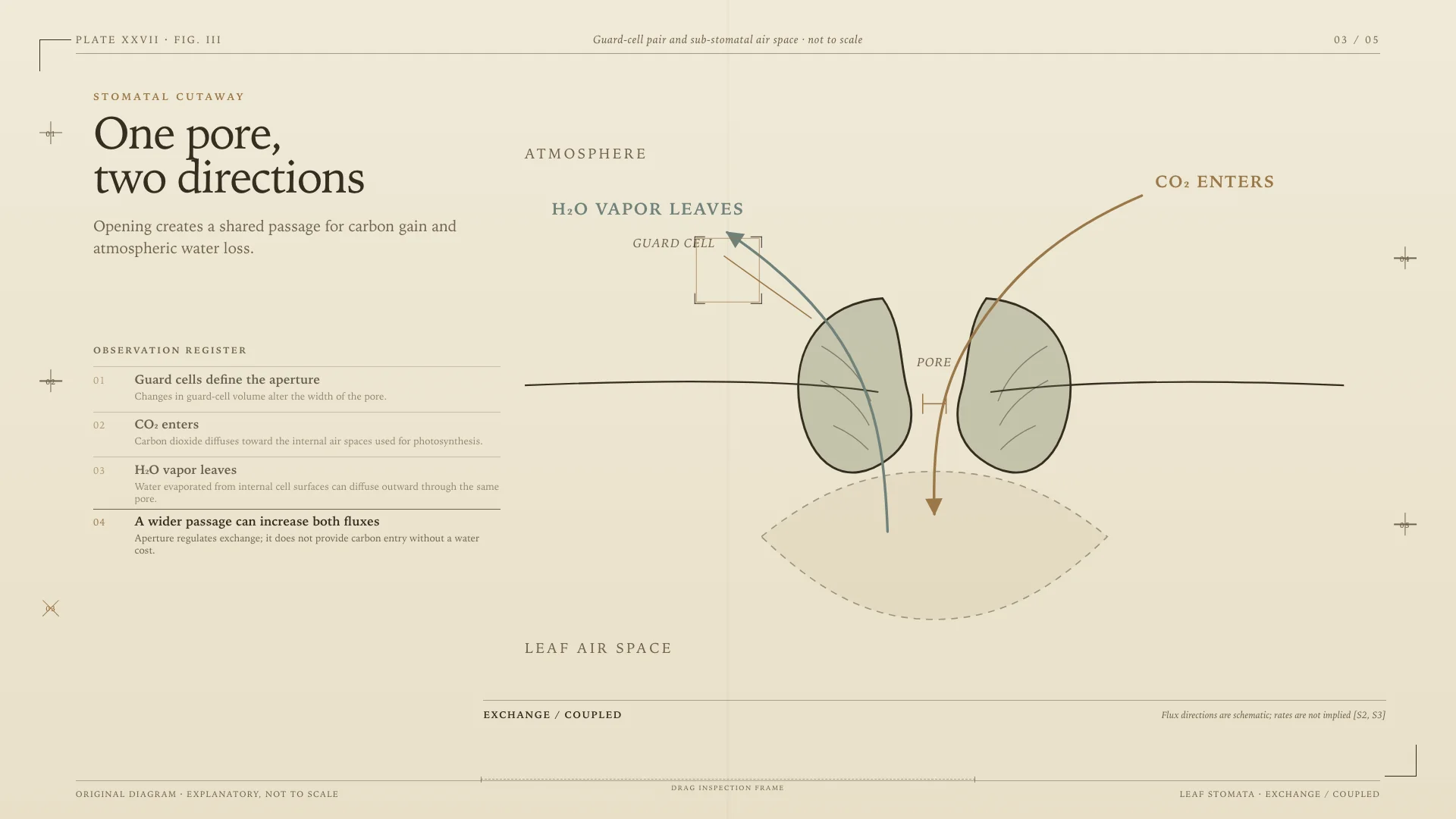
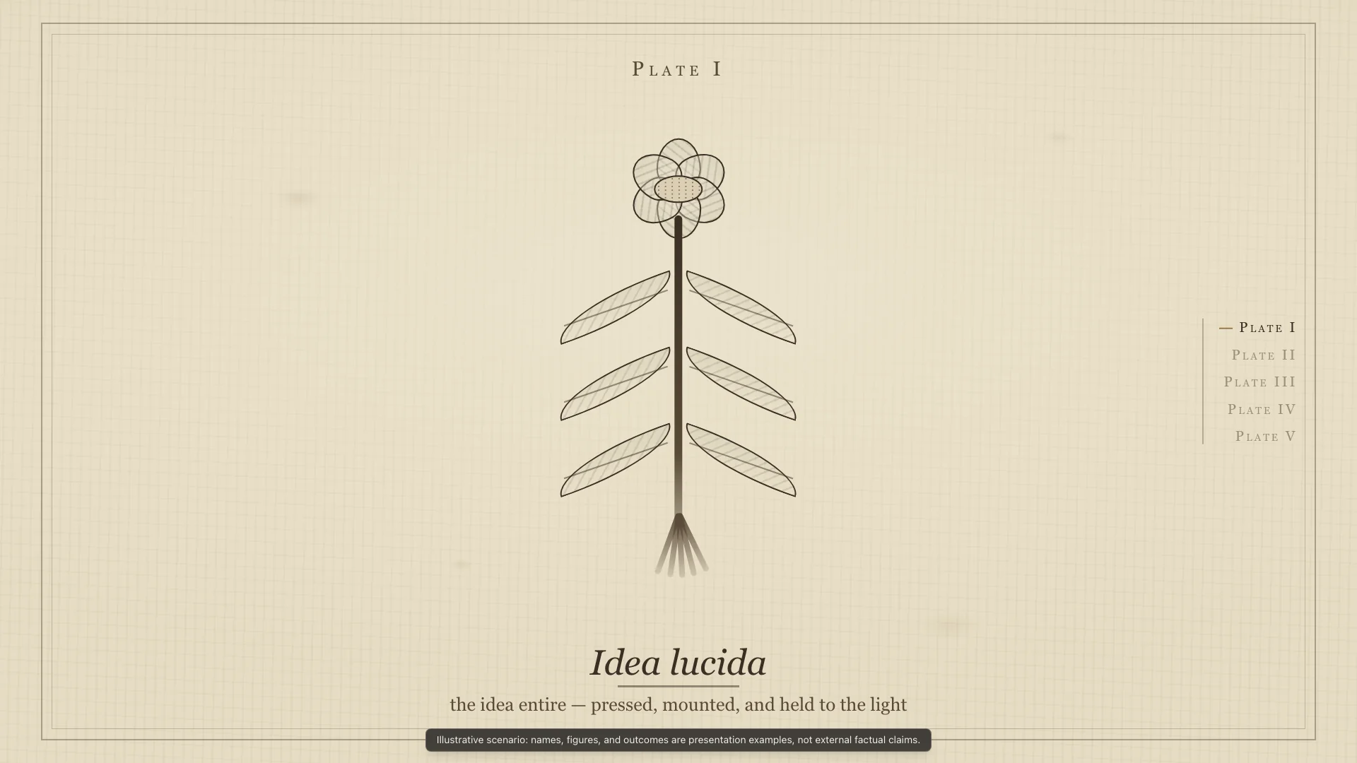
Japanese ukiyo-e woodblock with floating world composition and sumi-e textures for contemplative visual storytelling.
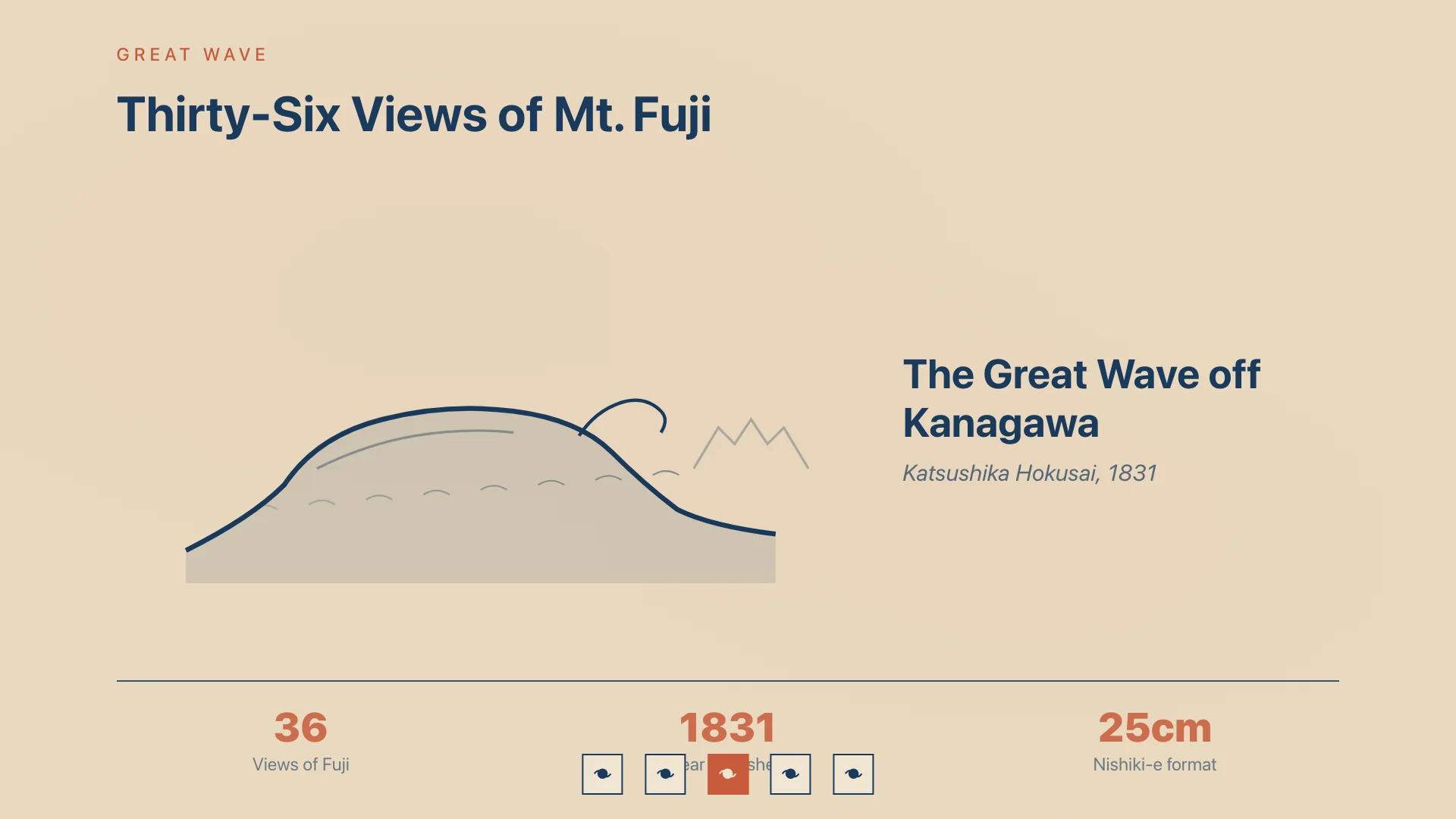
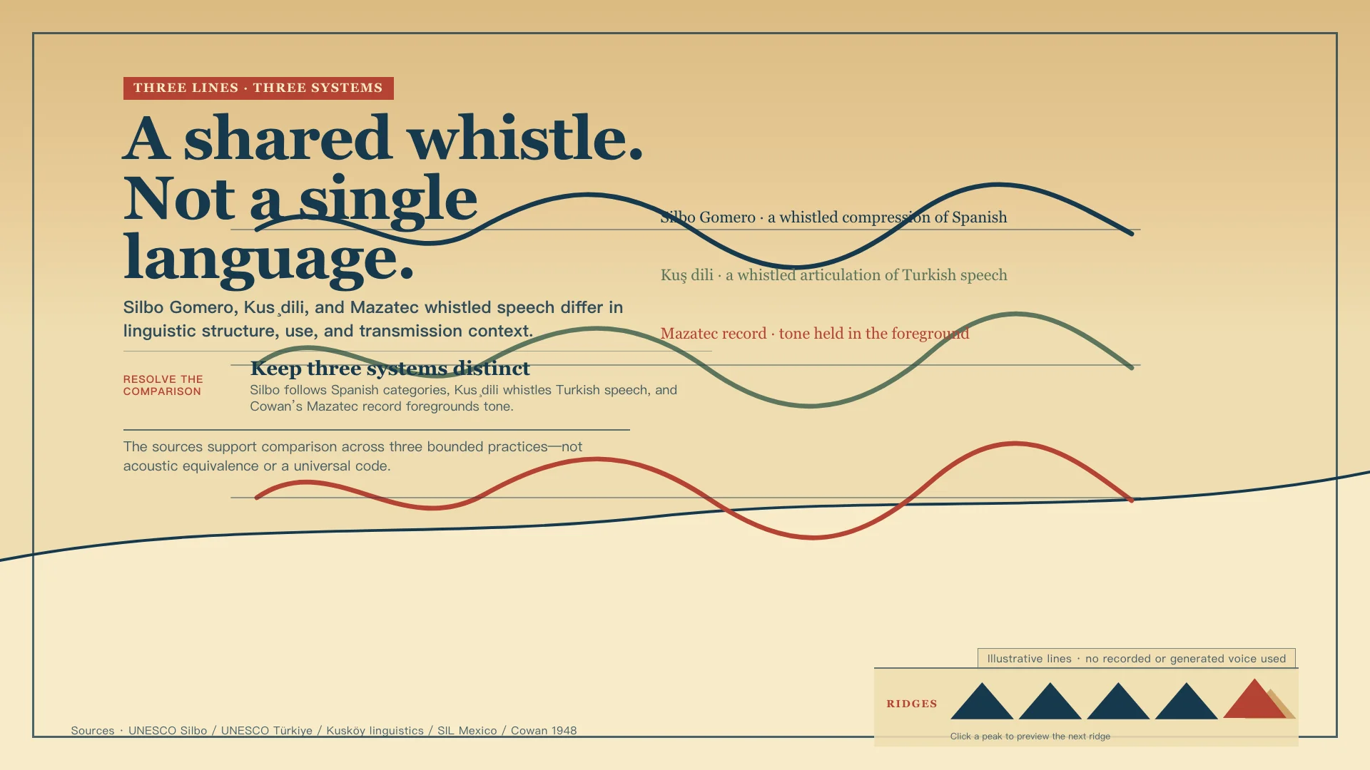
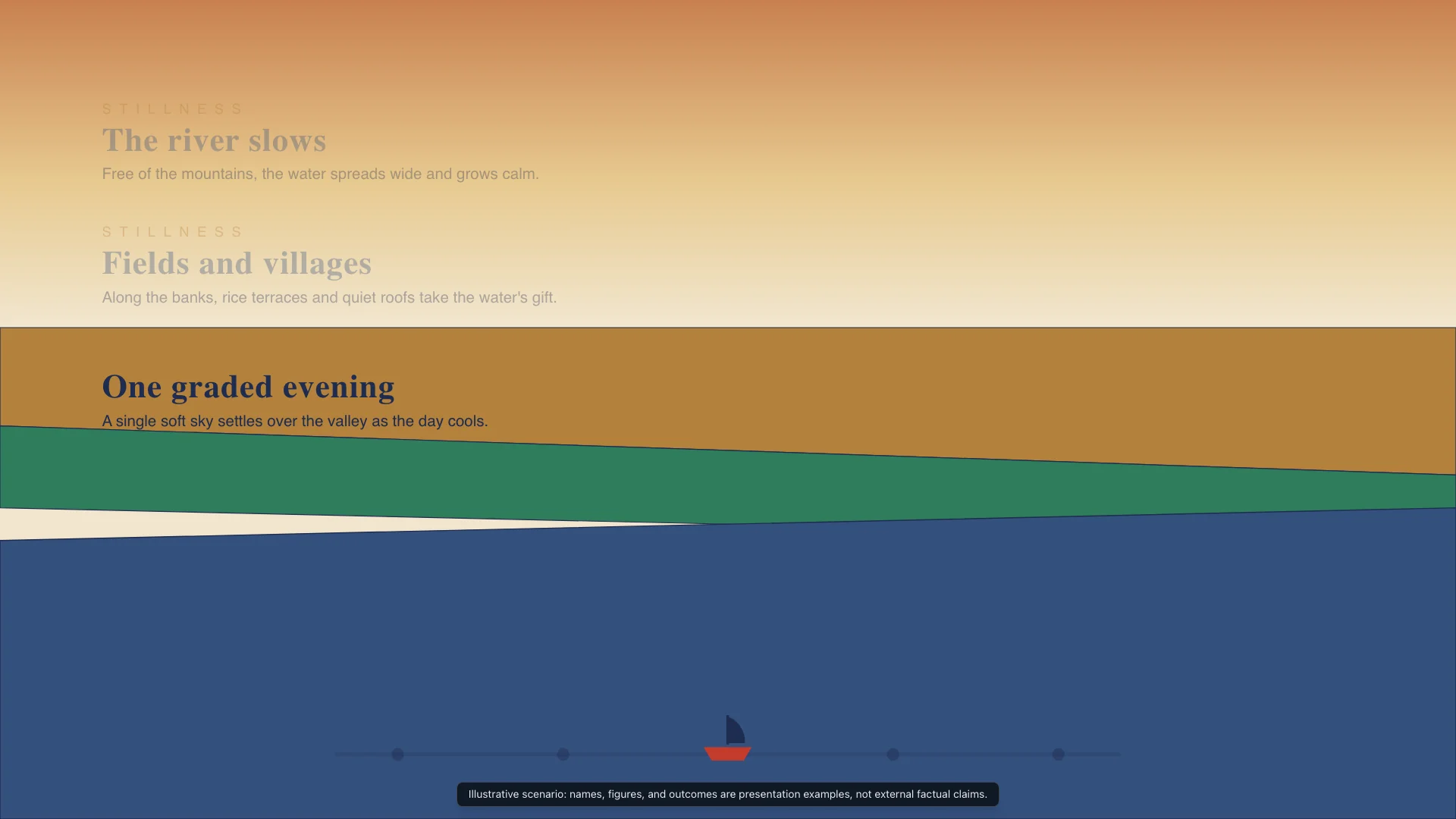
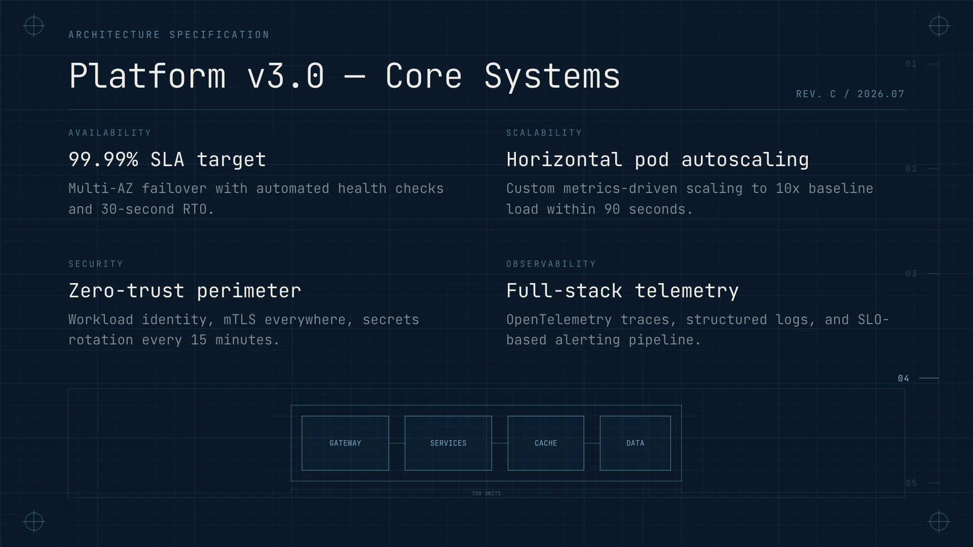
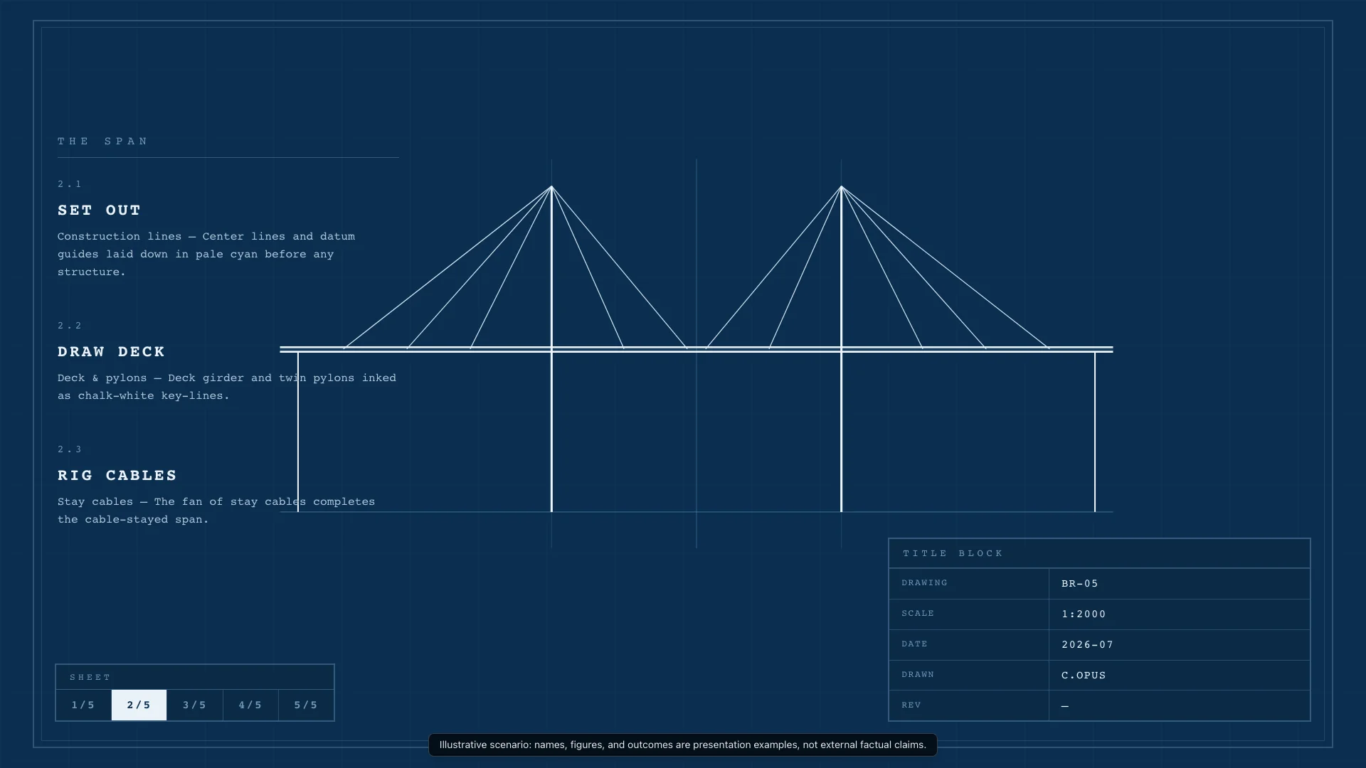
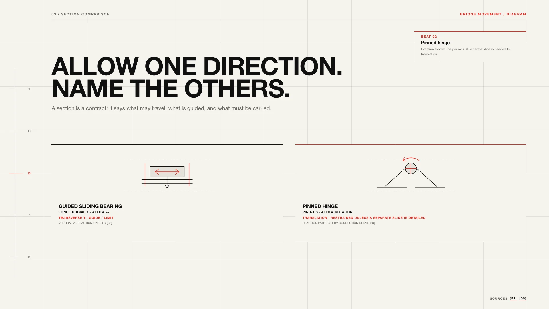
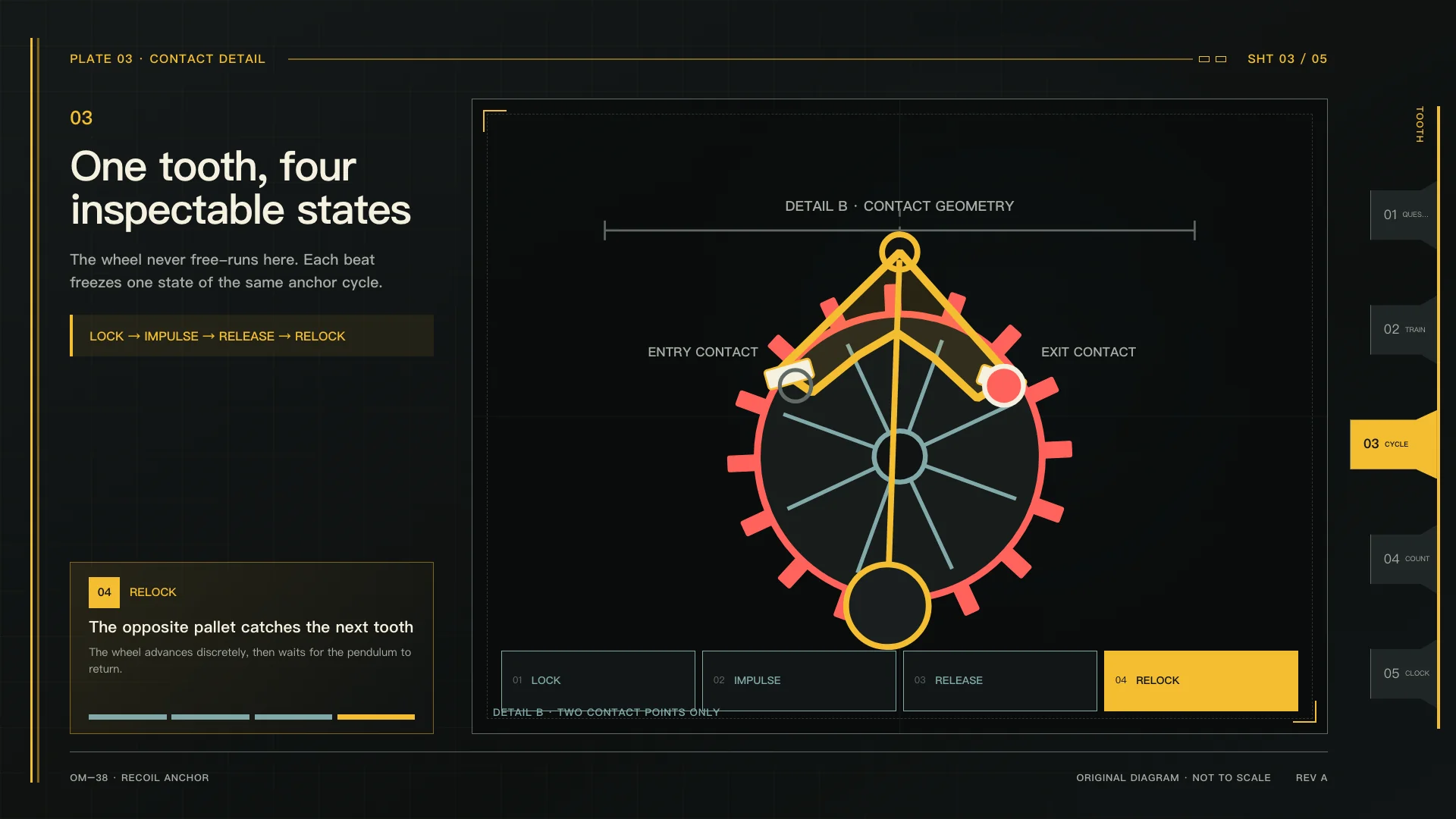
Blueprint drafting with cyanotype tones and technical linework for system architecture and engineering diagrams.
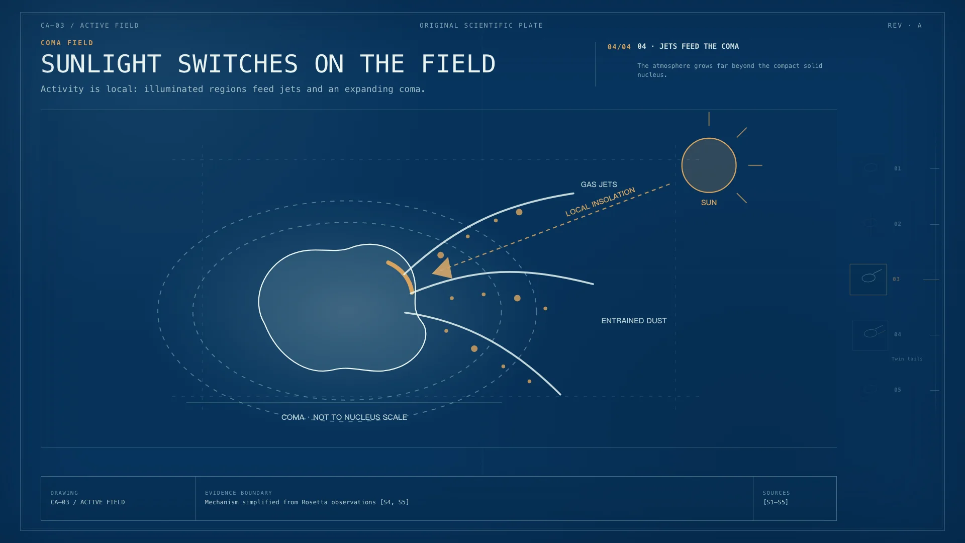
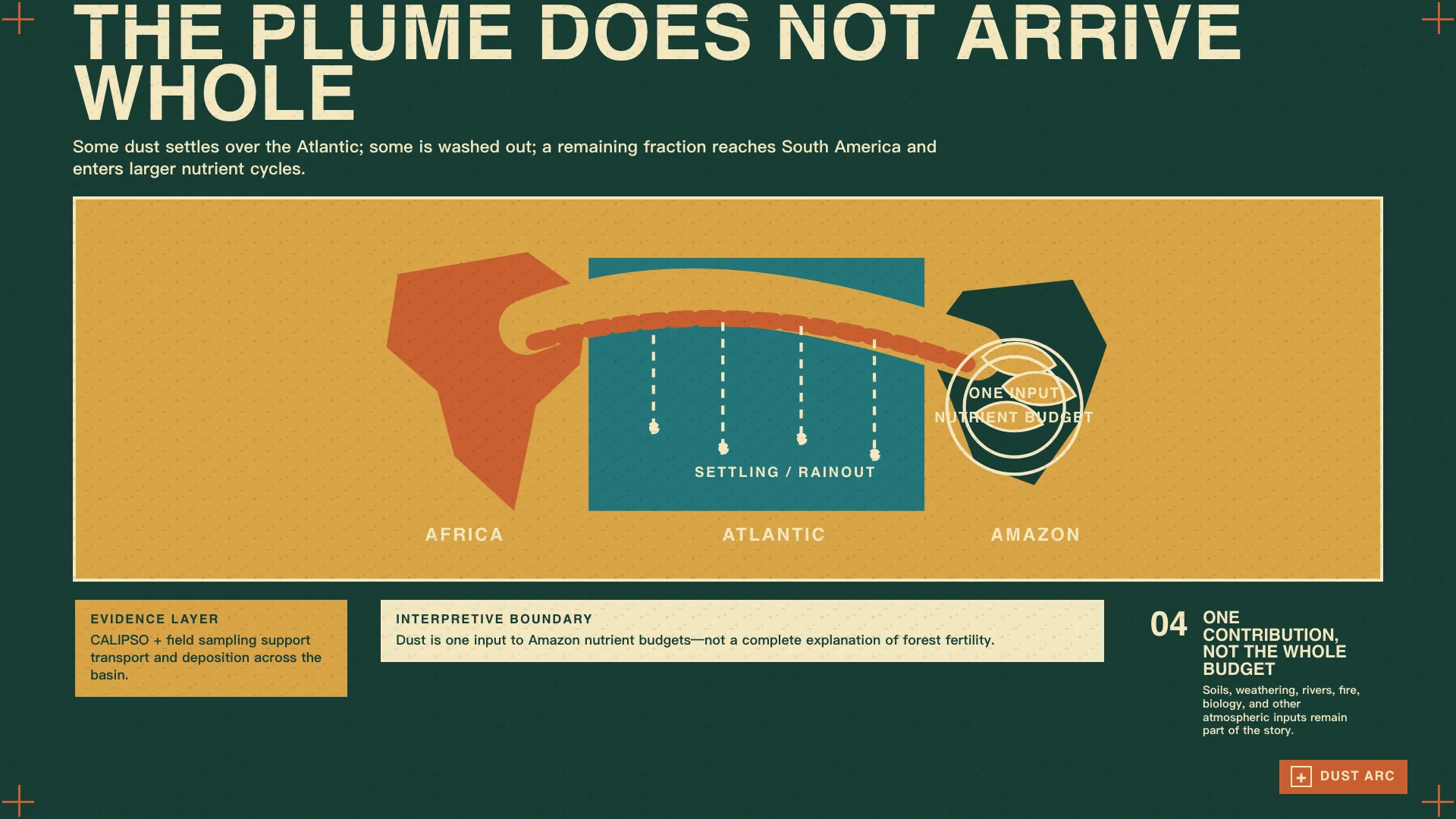
Field journal screenprint with stamped layers and map coordinates for exploration and discovery narratives.
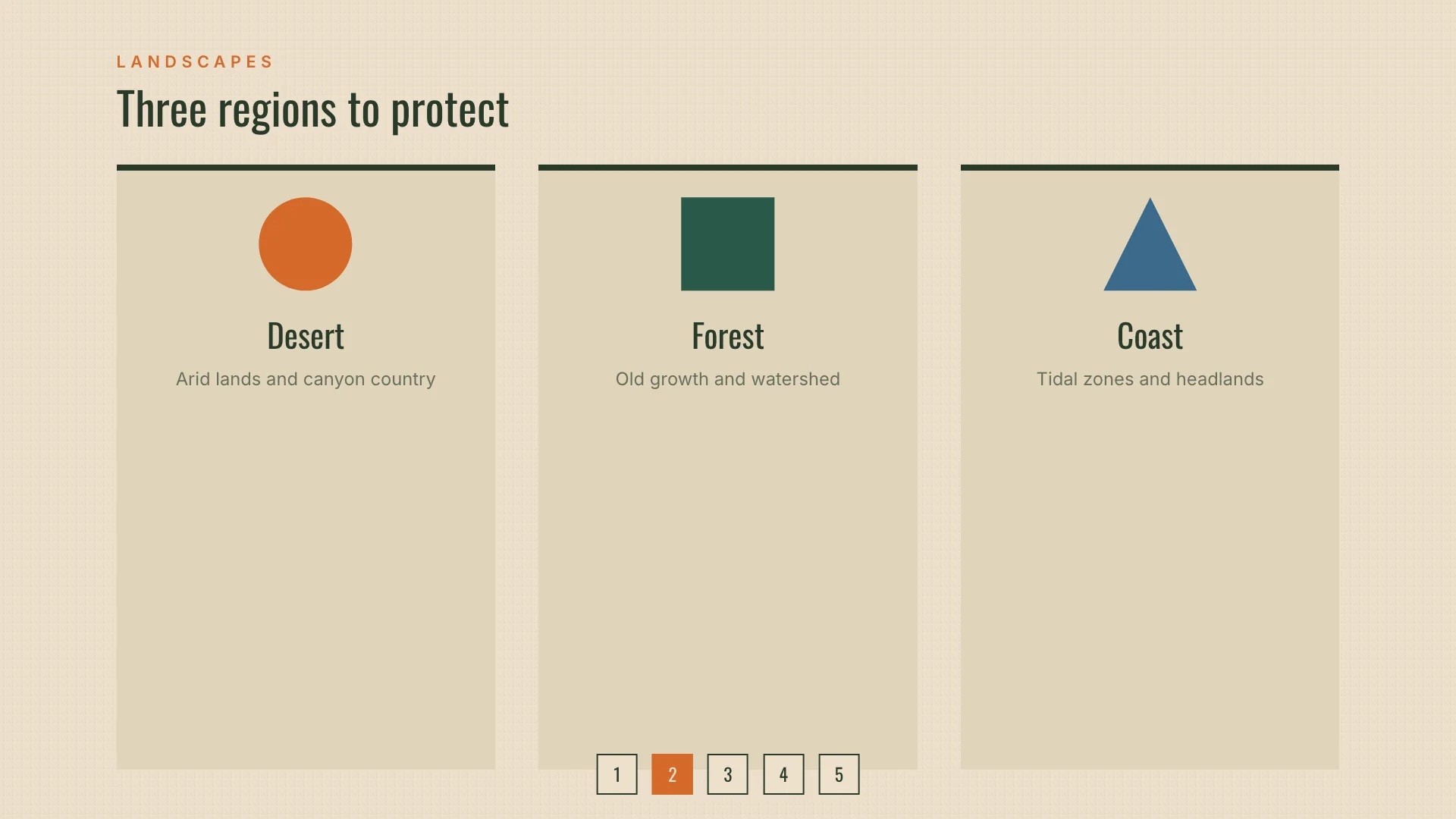
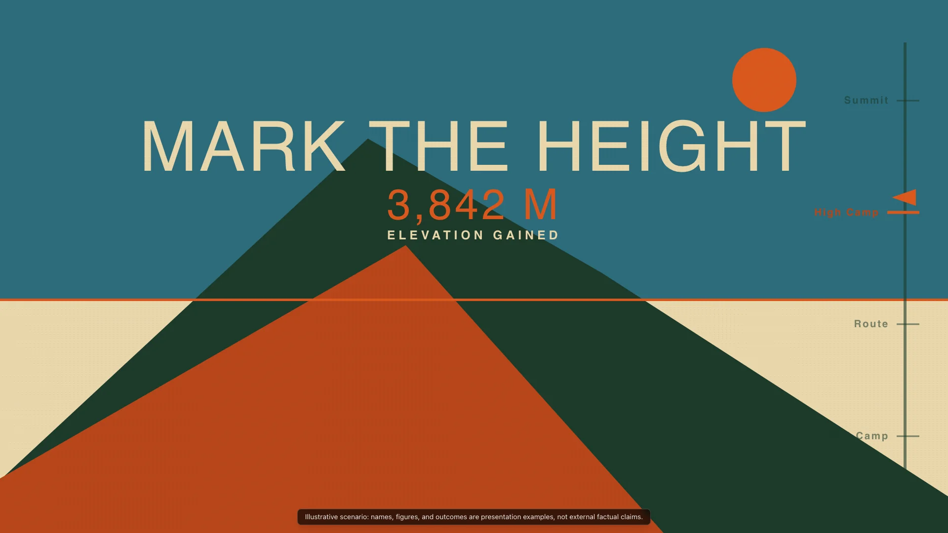
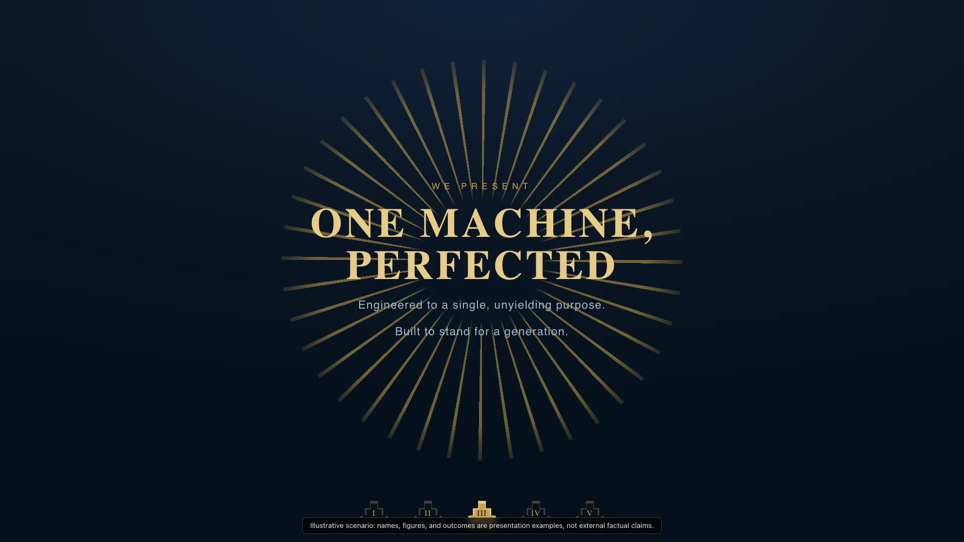
Art Deco machine age with geometric patterns and stepped forms for grand visions and ambitious roadmaps.
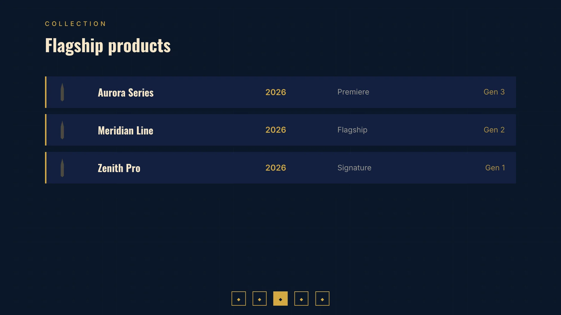
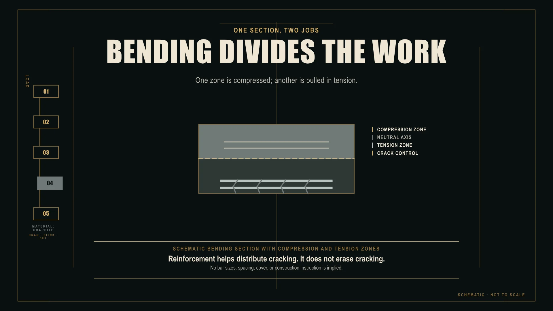
Hand-formed ceramic with wabi-sabi irregularity and matte glaze surfaces for craft and natural product framing.
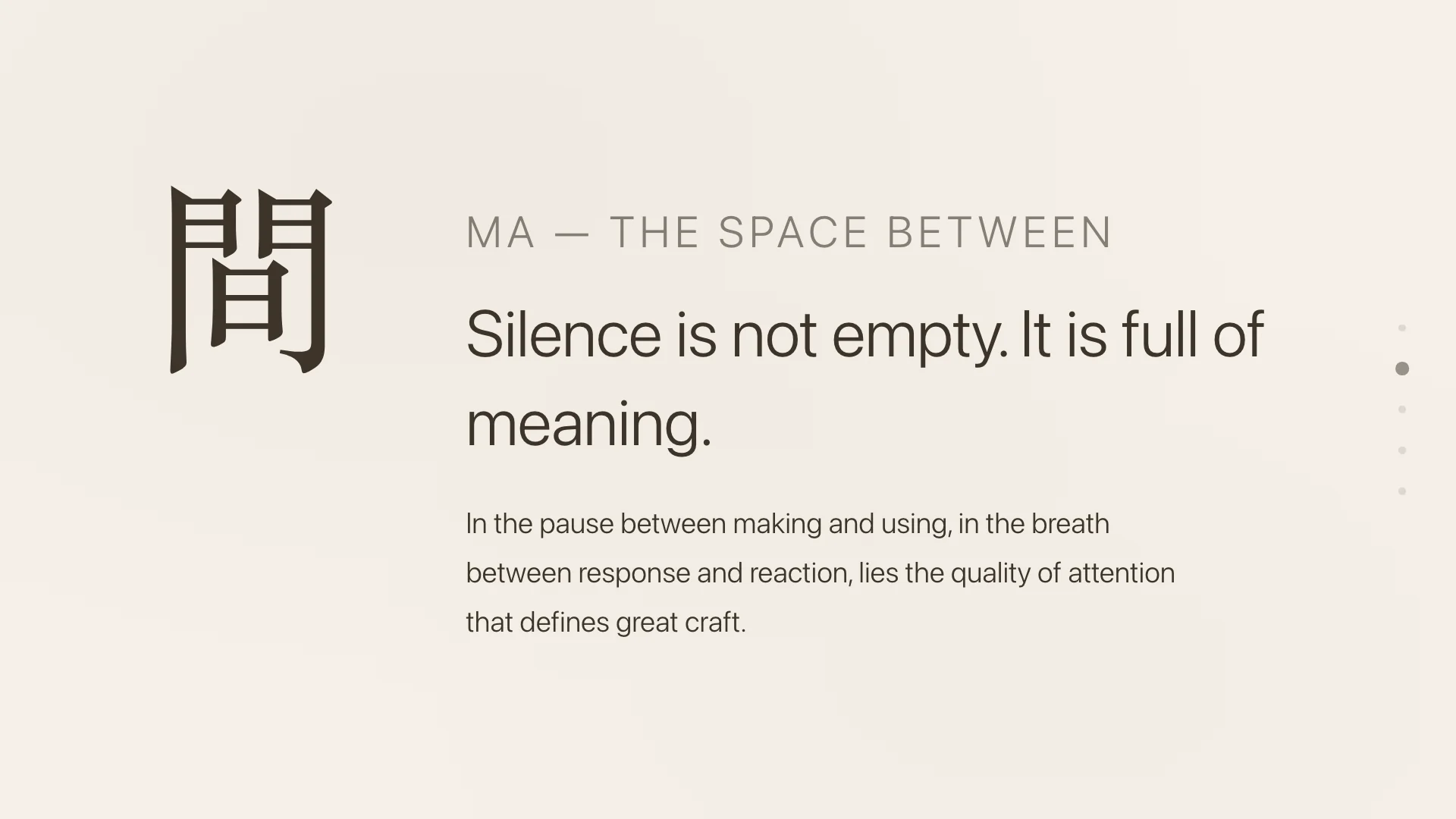
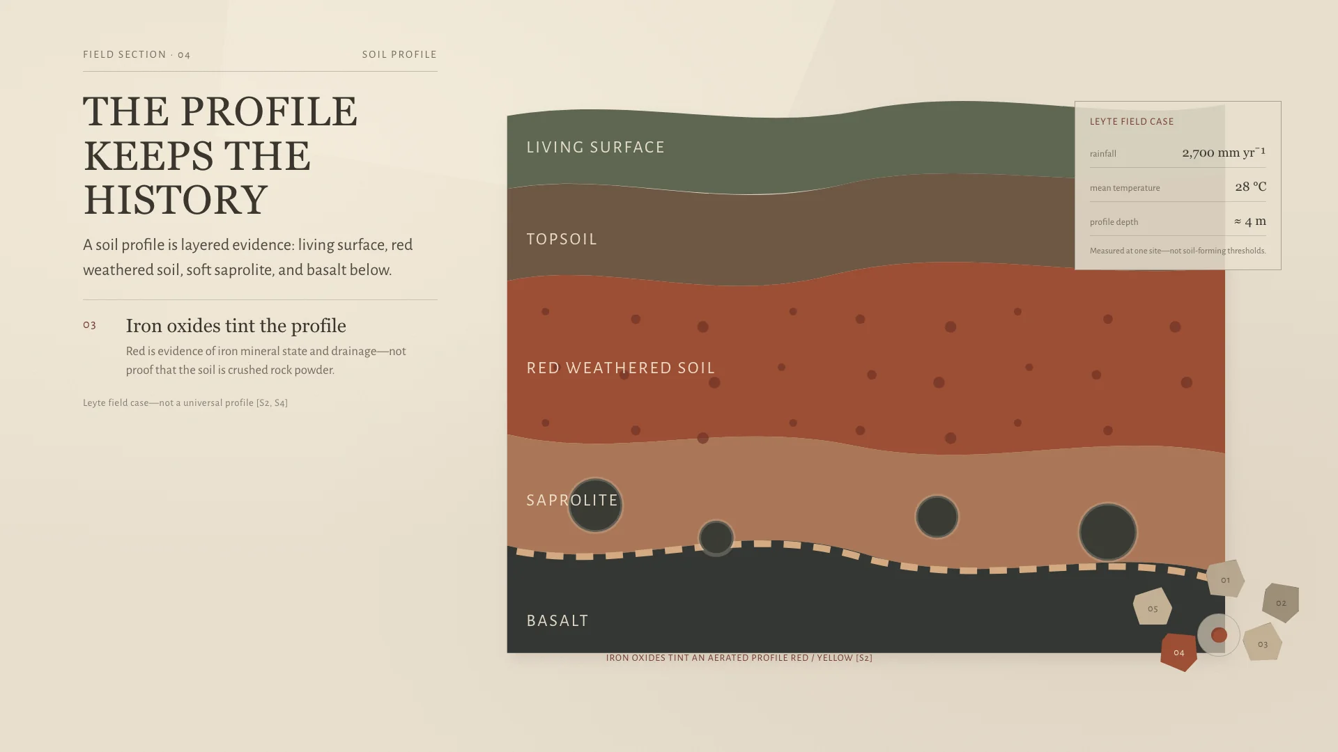
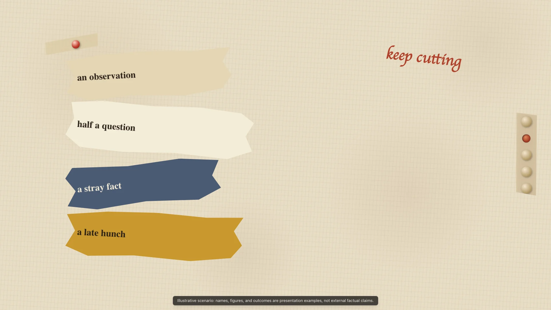
Hand-cut paper collage with torn edges and mixed textures for creative process and idea assembly.

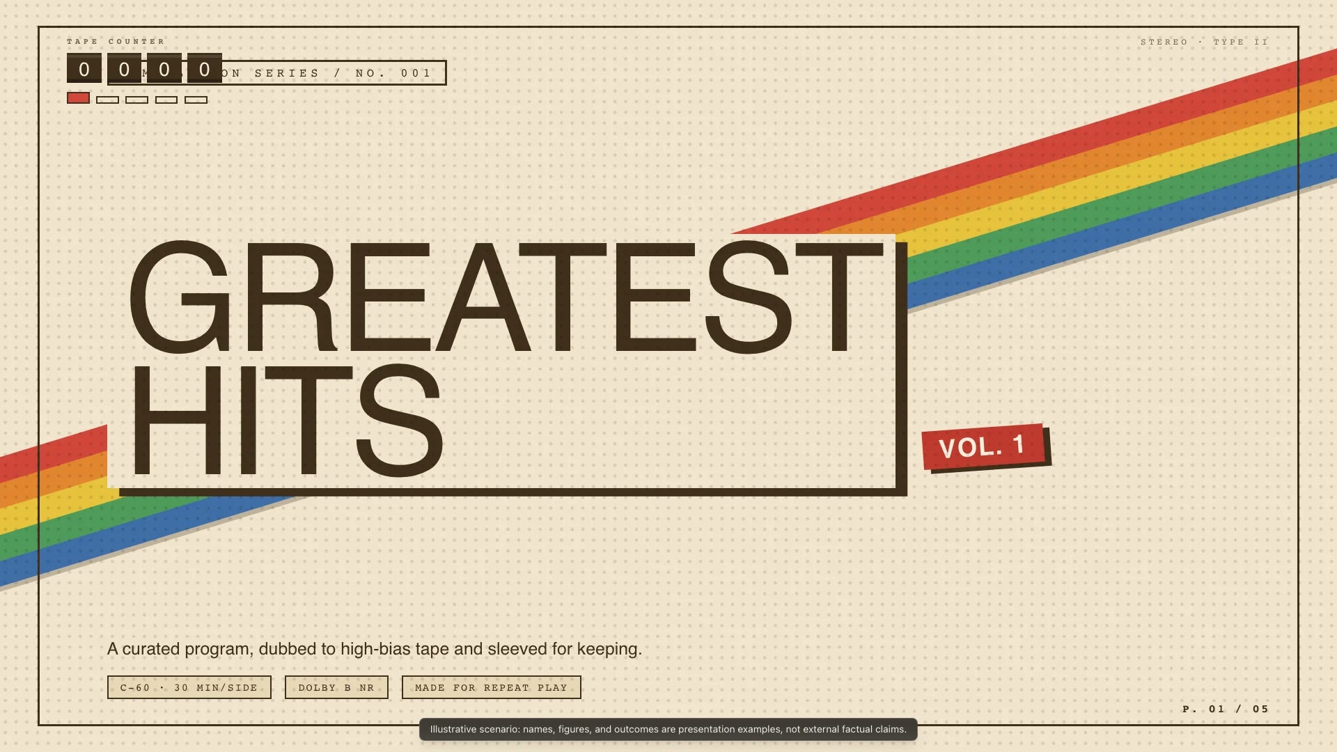
Cassette tape J-card design with 80s-90s graphic energy and mixtape layout for music and nostalgia content.
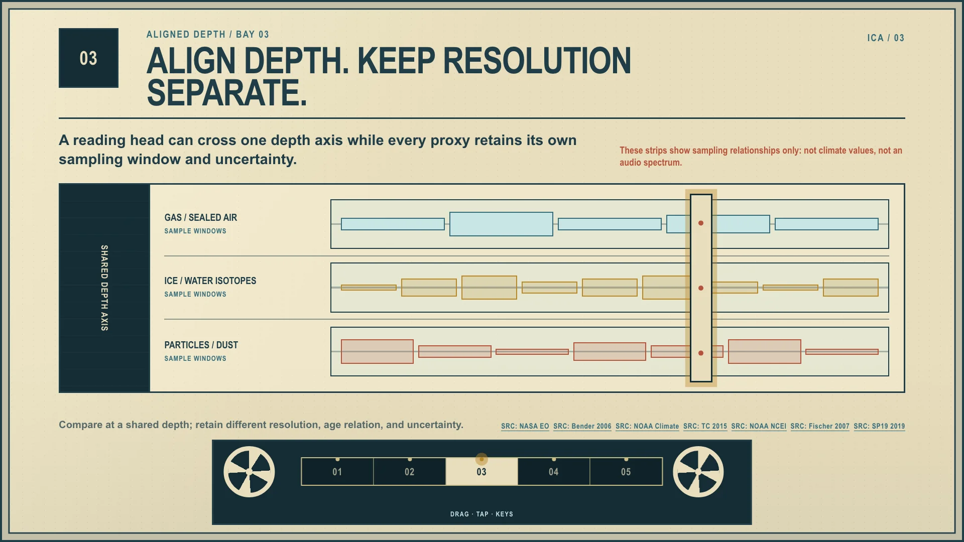
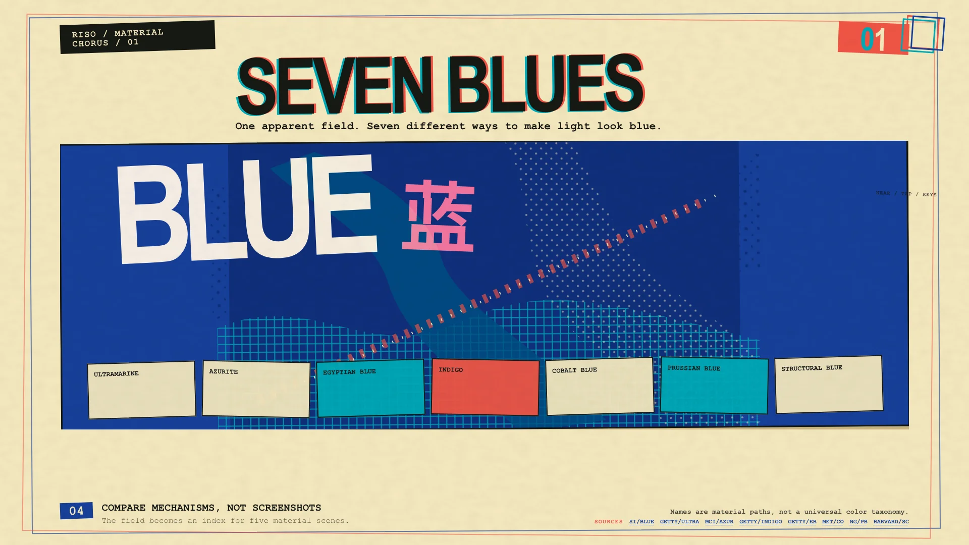
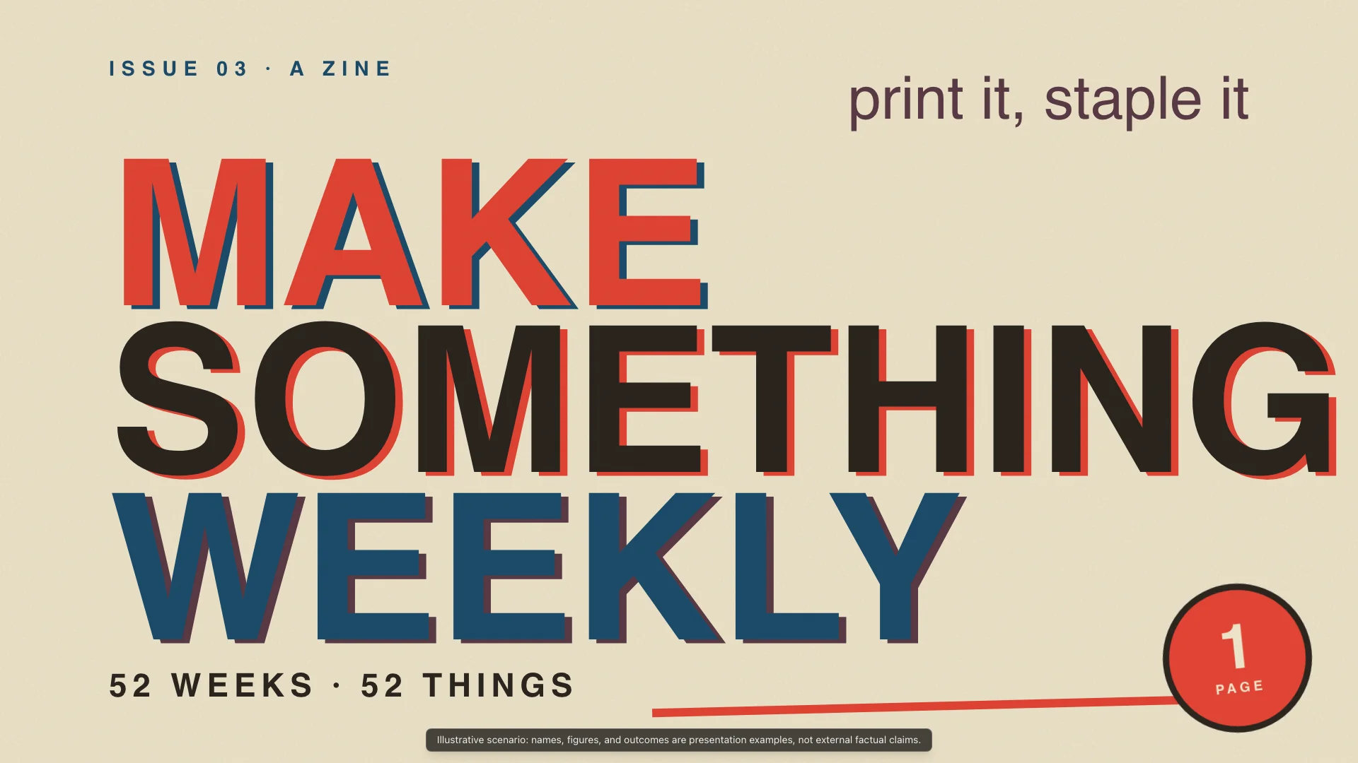
Risograph zine with limited palette, handmade collage density, and DIY rebellious character.
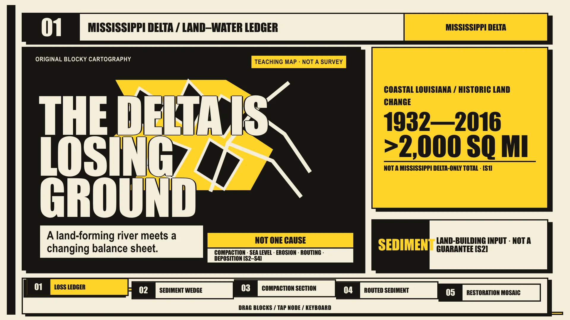
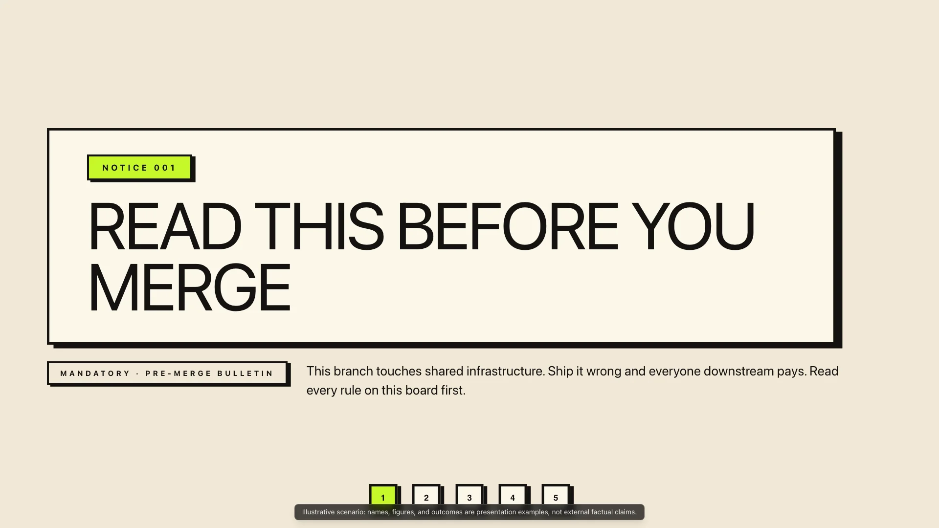
Protest poster energy with thick black borders, hard offset shadows, and one high-voltage accent.
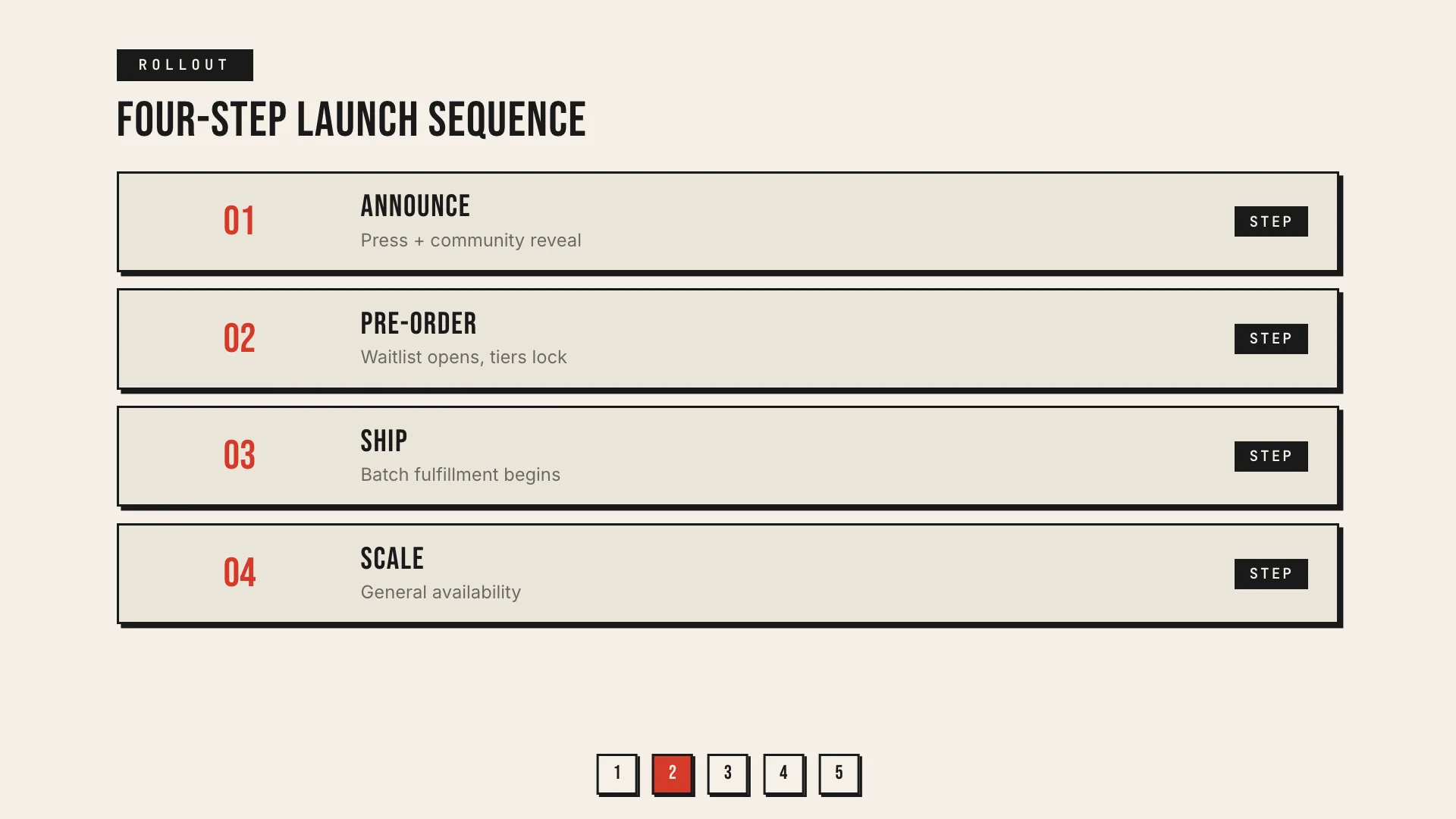
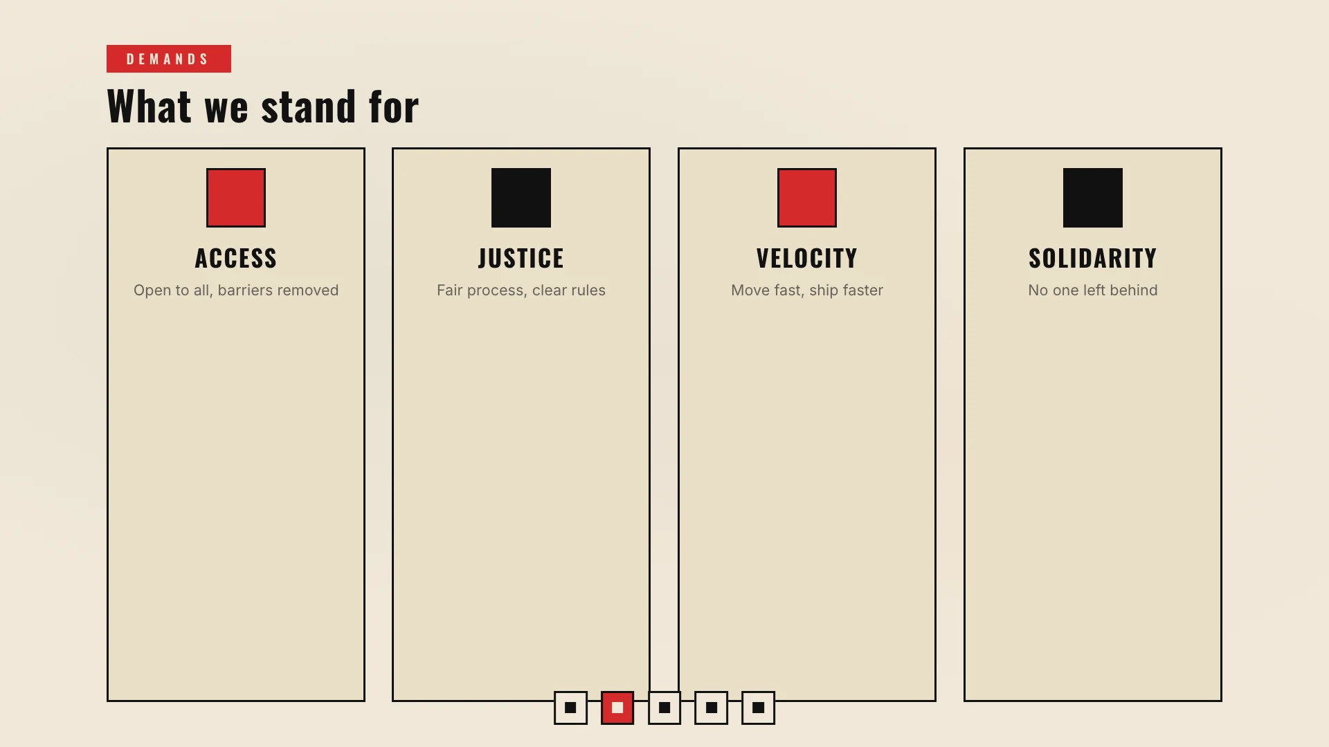
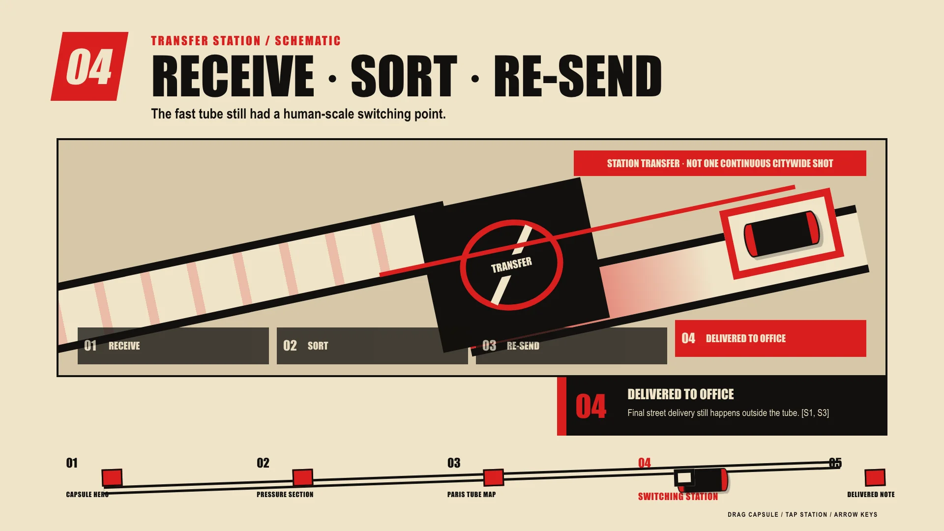
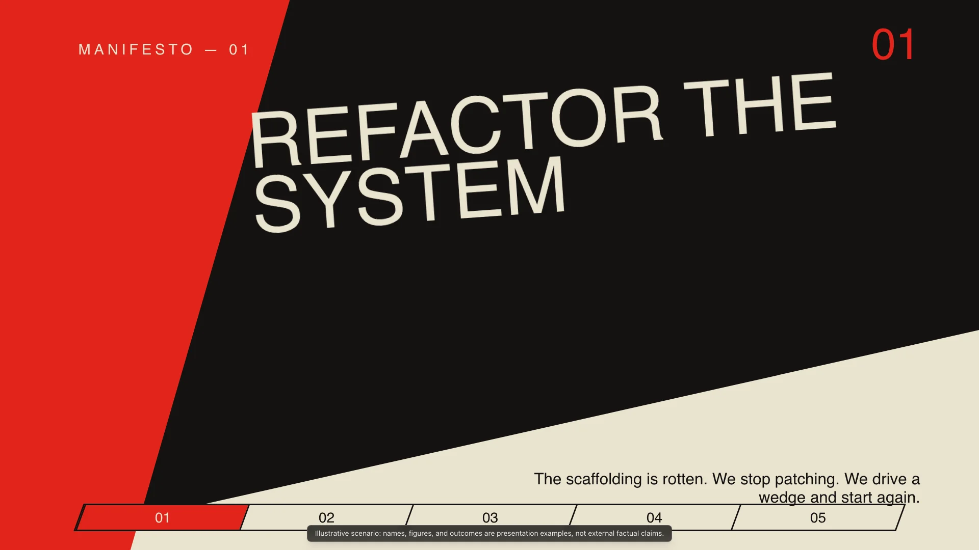
Constructivist political poster with red wedge geometry and diagonal dynamism for call-to-action.
Modern digital-first styles drawing from current UI trends and platform aesthetics.
Organic mid-century calm with natural wood tones and gentle curves for sustainability and natural product stories.
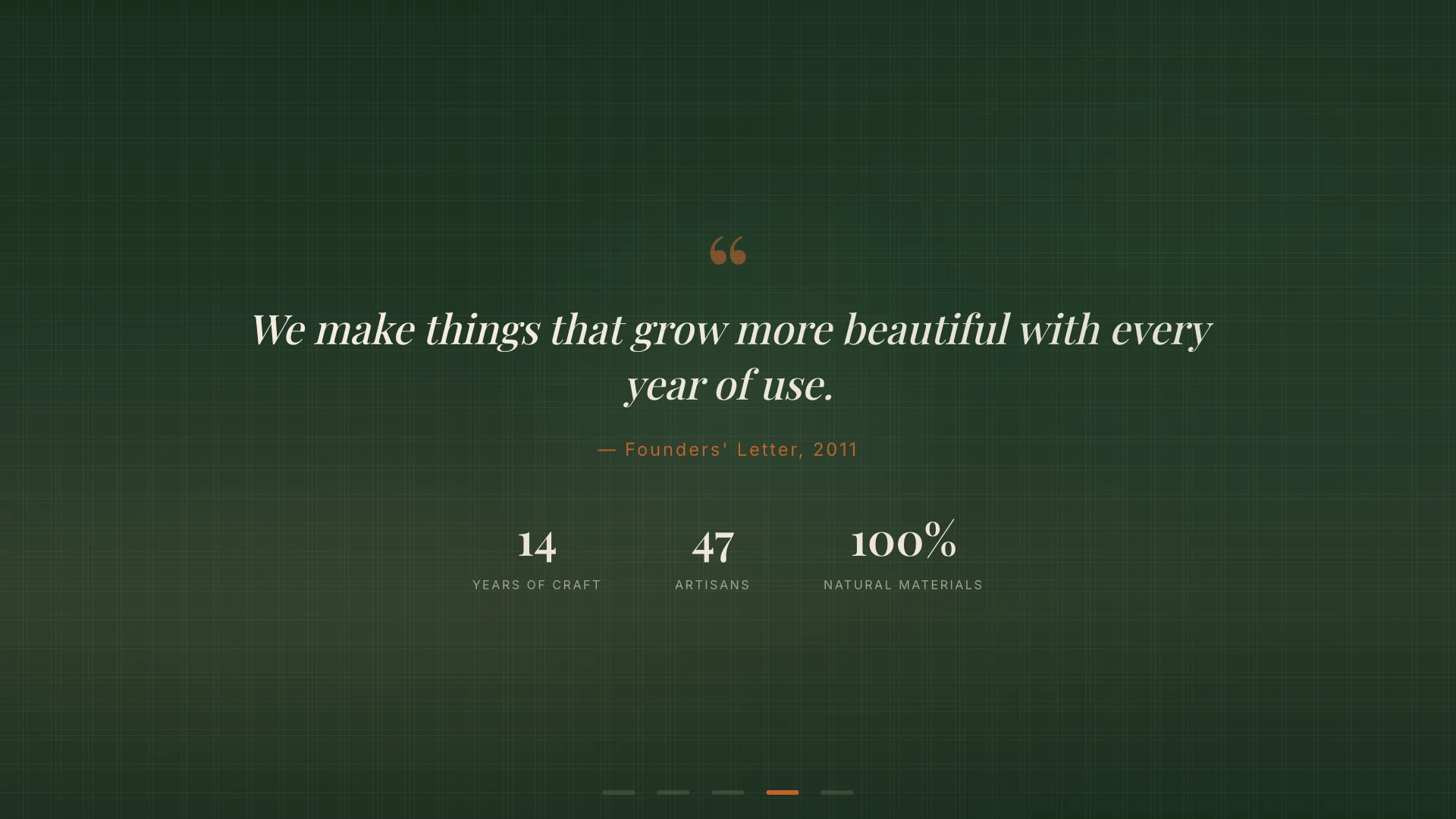
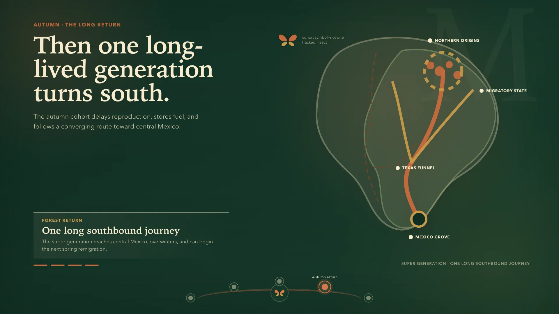
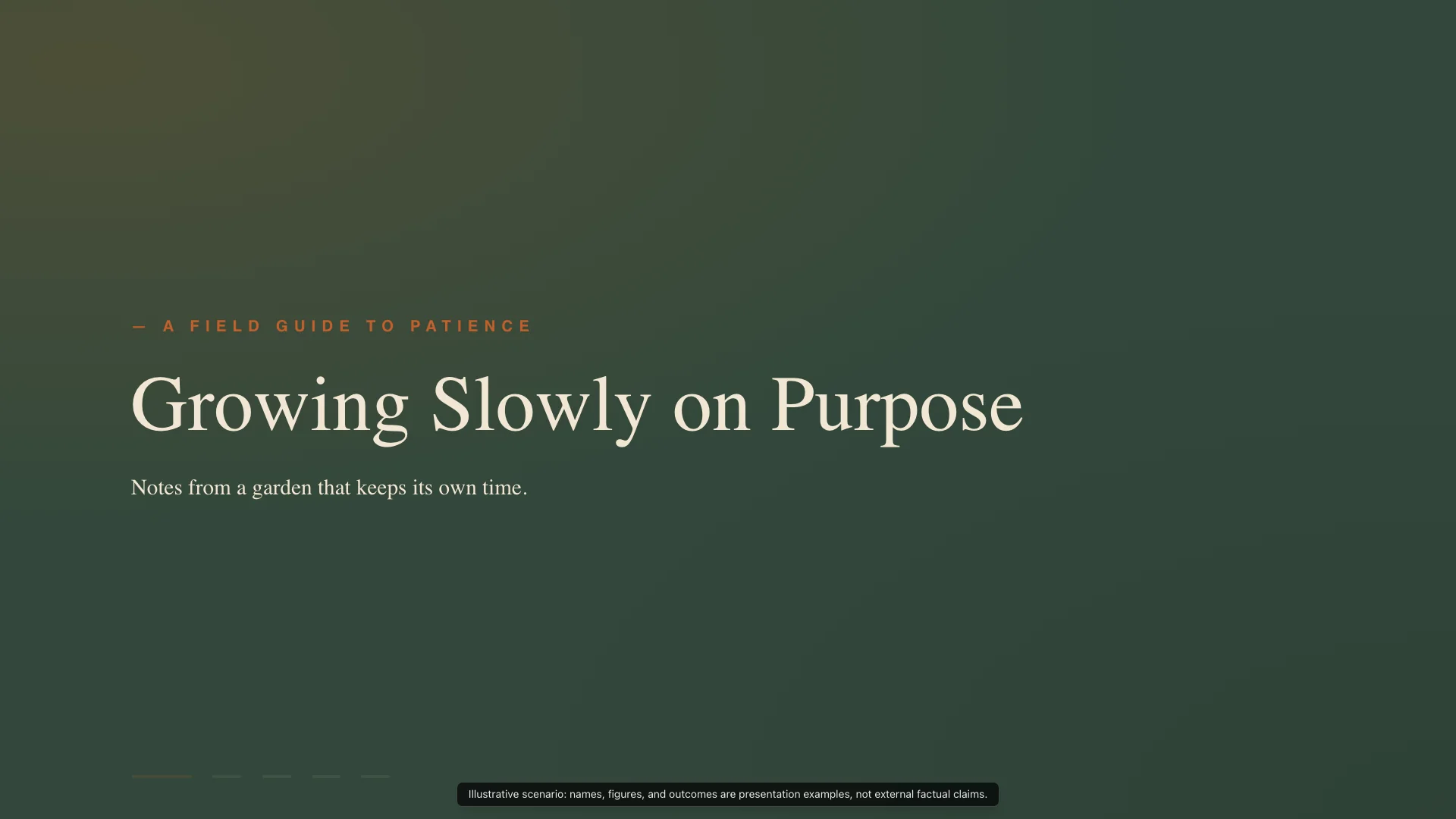
Dark cocktail lounge luxury with deep jewel tones and gold accents for premium positioning and evening framing.
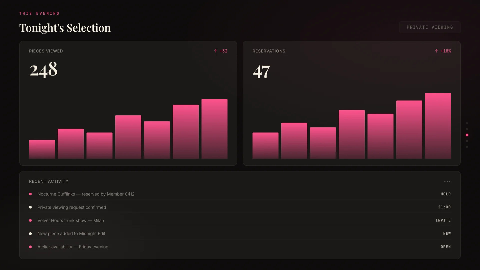
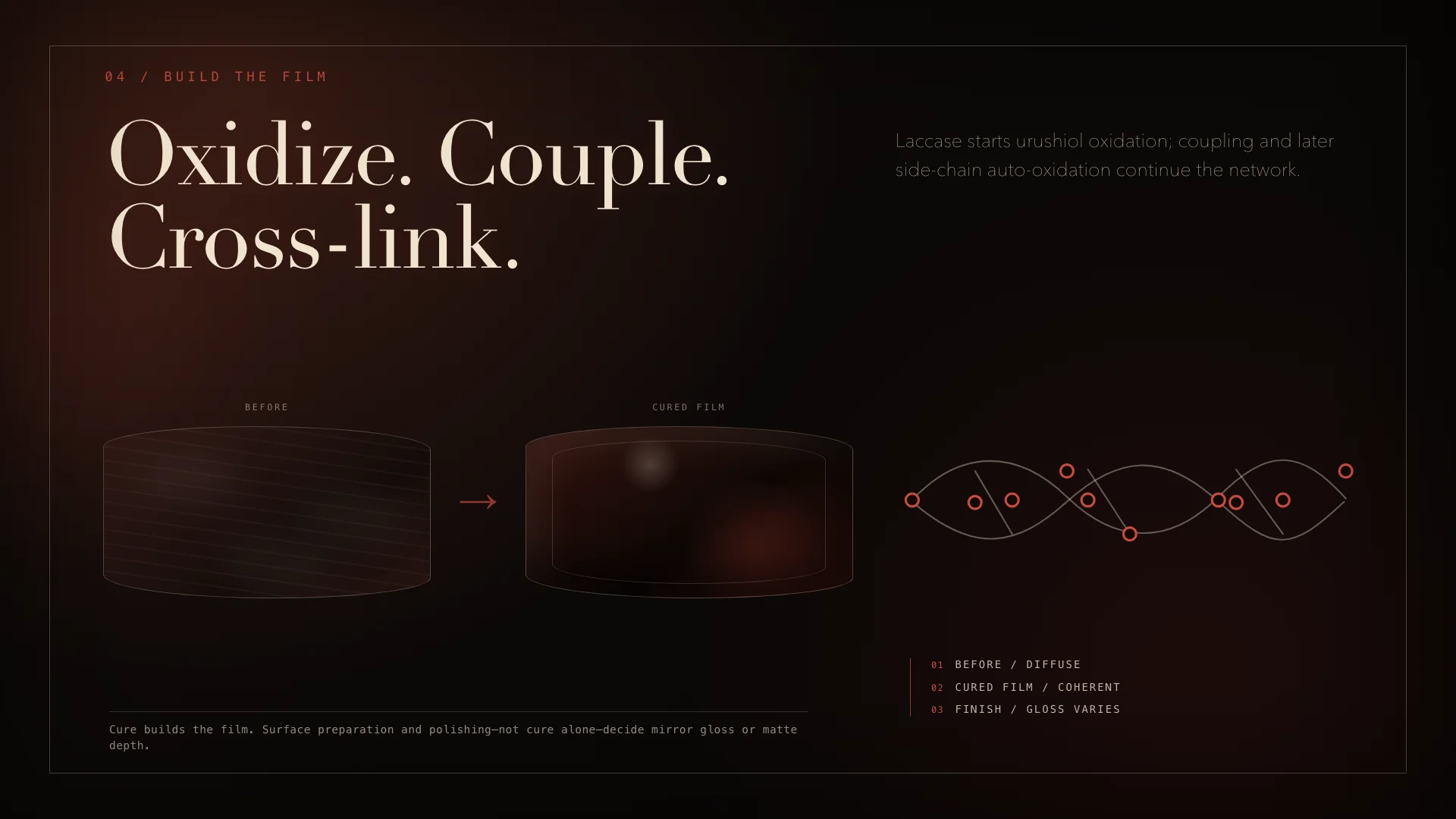
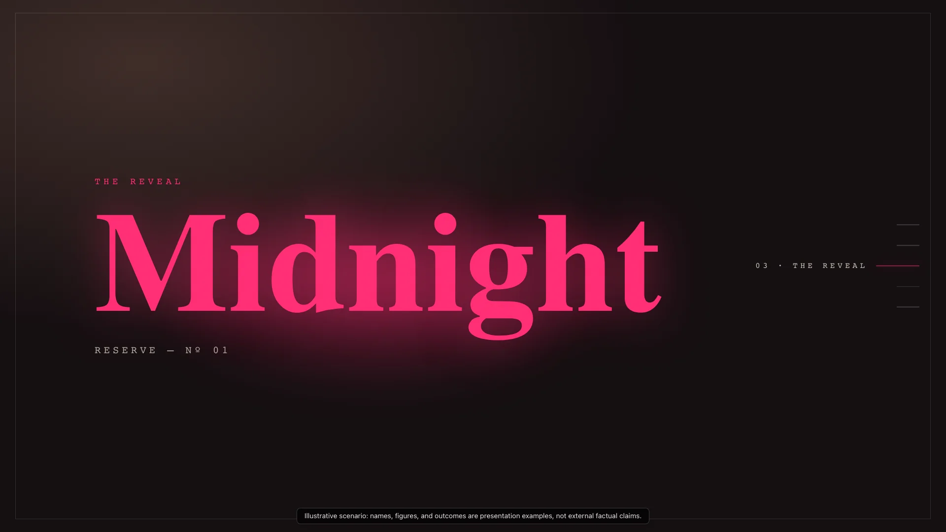
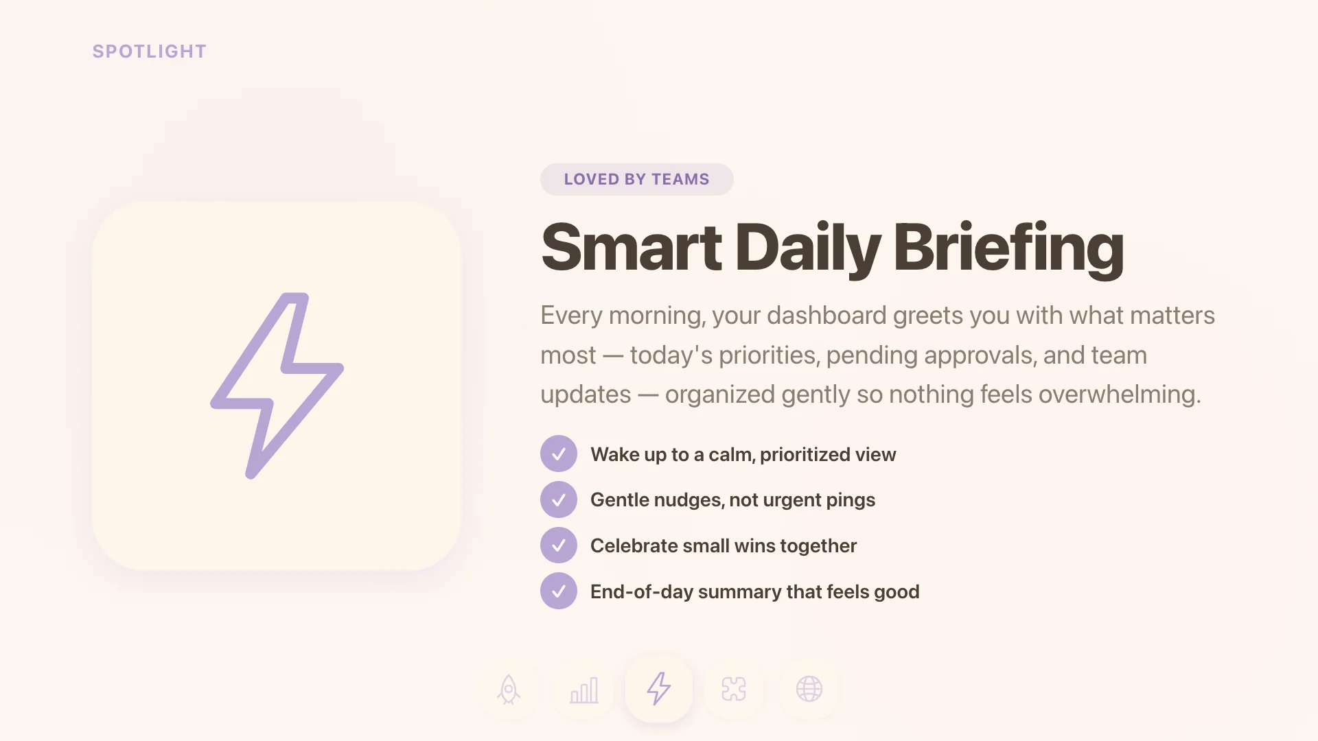
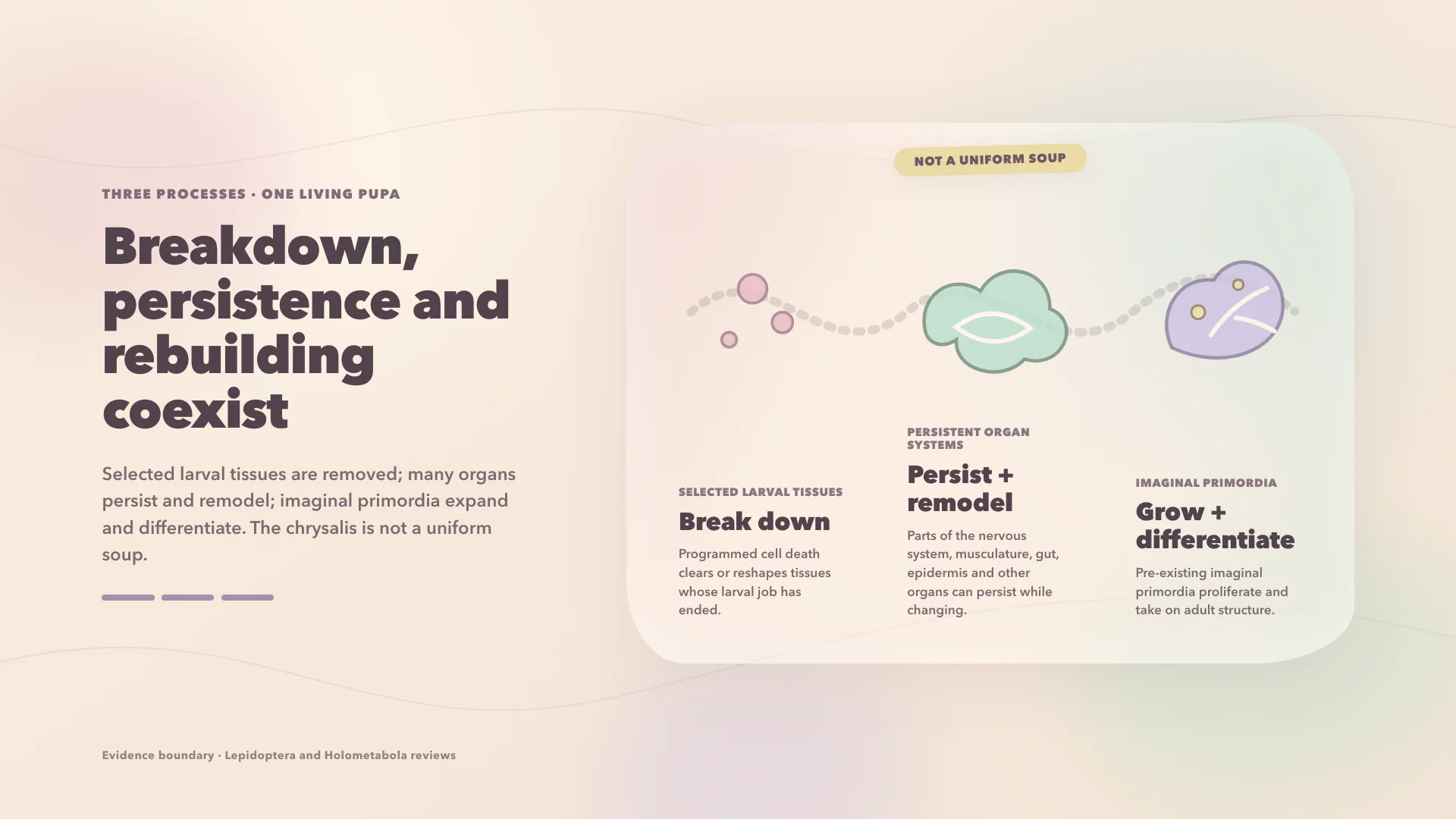
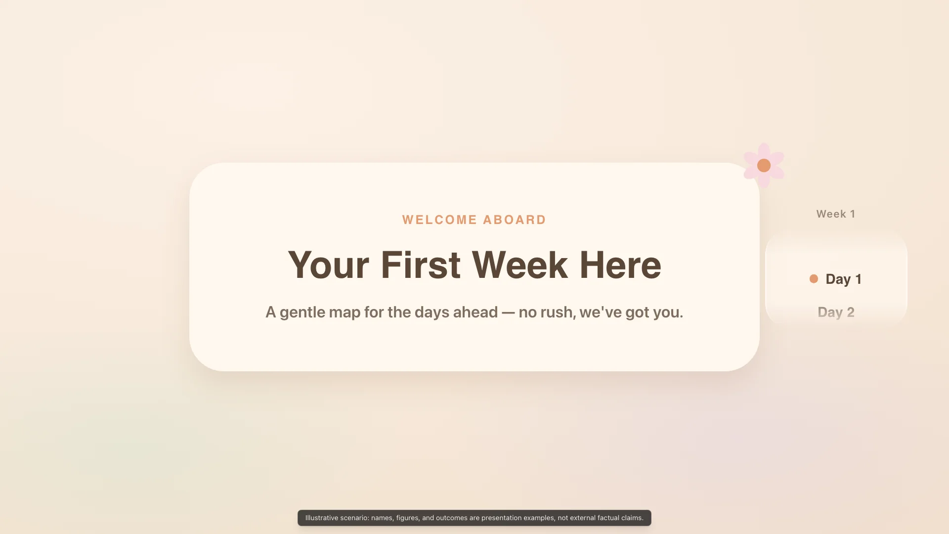
Approachable pastel warmth with rounded pill geometry and gentle spring motion for onboarding and community decks.
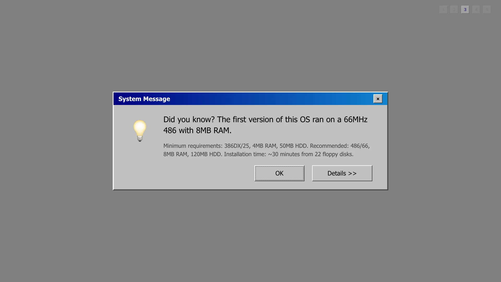
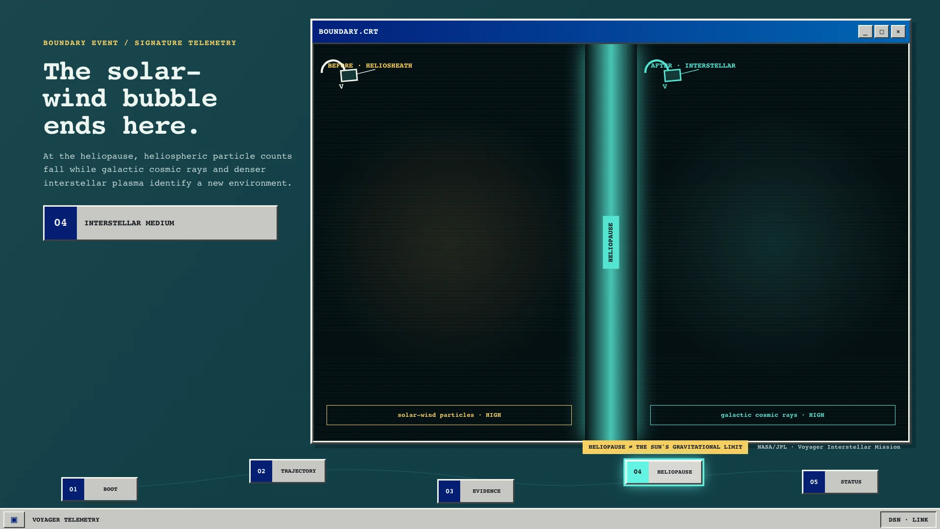
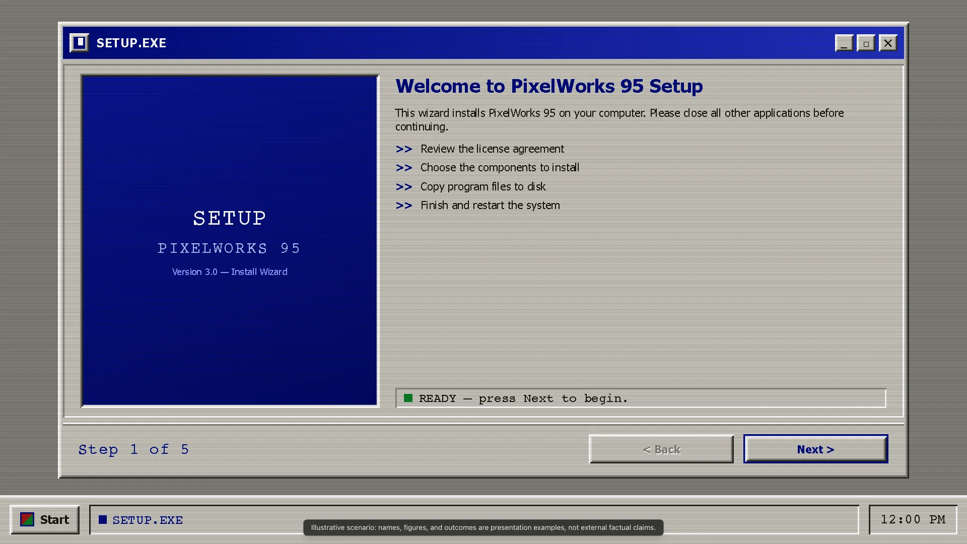
Windows 3.1/95 nostalgia with beveled chrome and system gray palette for developer tooling and retro-tech vibes.
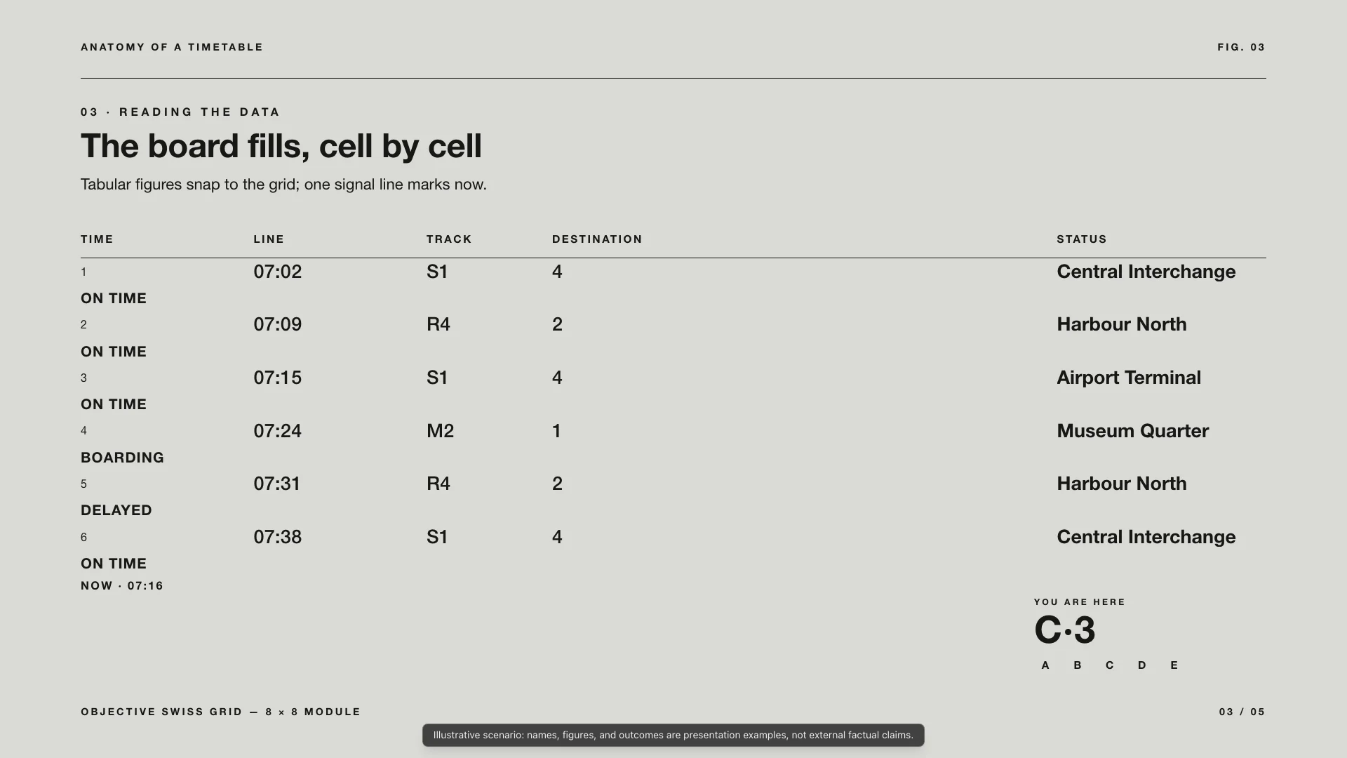
Swiss International Style with rigid grid structure and sans-serif clarity for data-heavy reports and analytical frameworks.
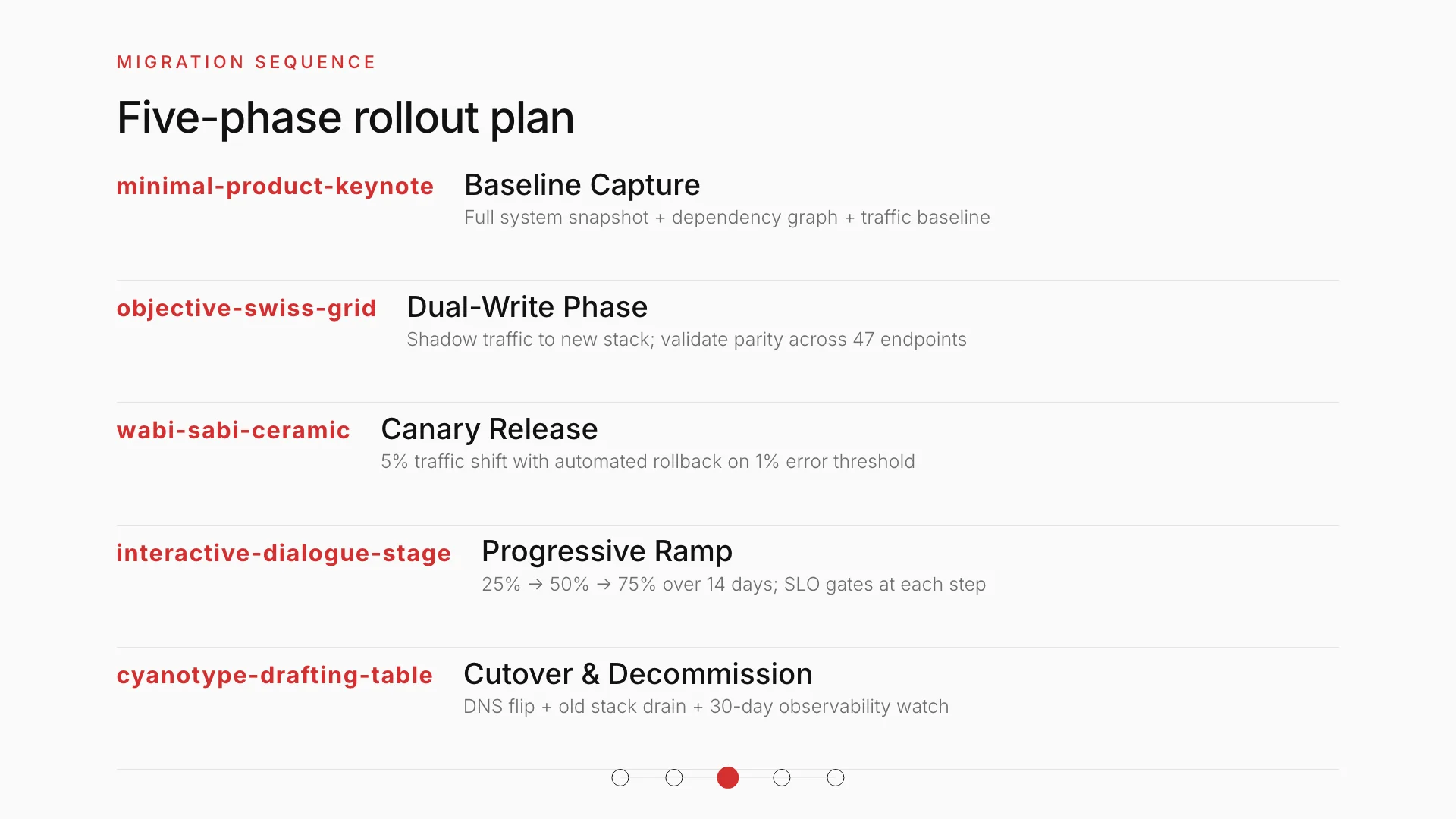
Apple design language with frosted glass depth and spatial layering for premium tech and Apple-platform content.
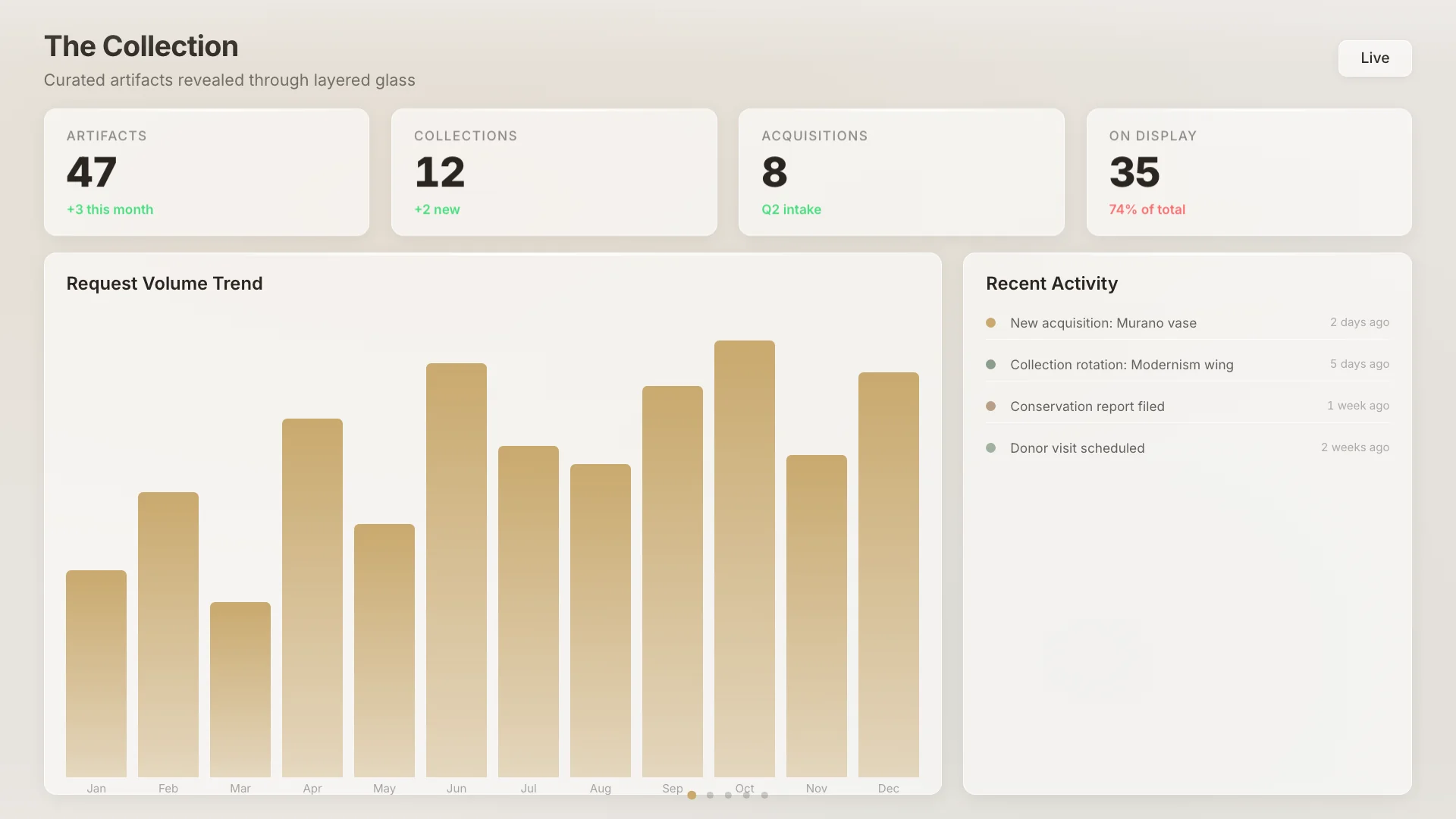
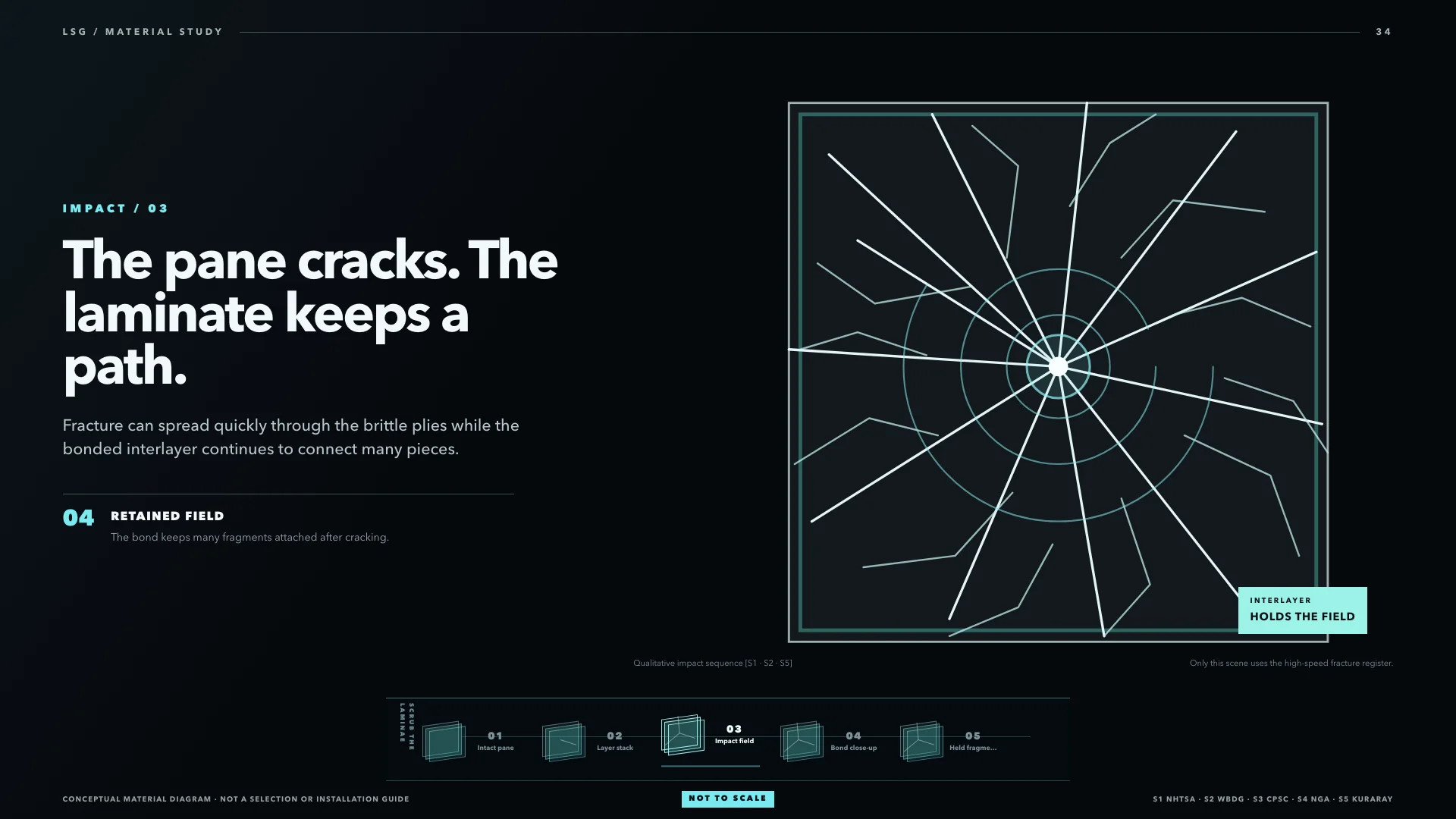
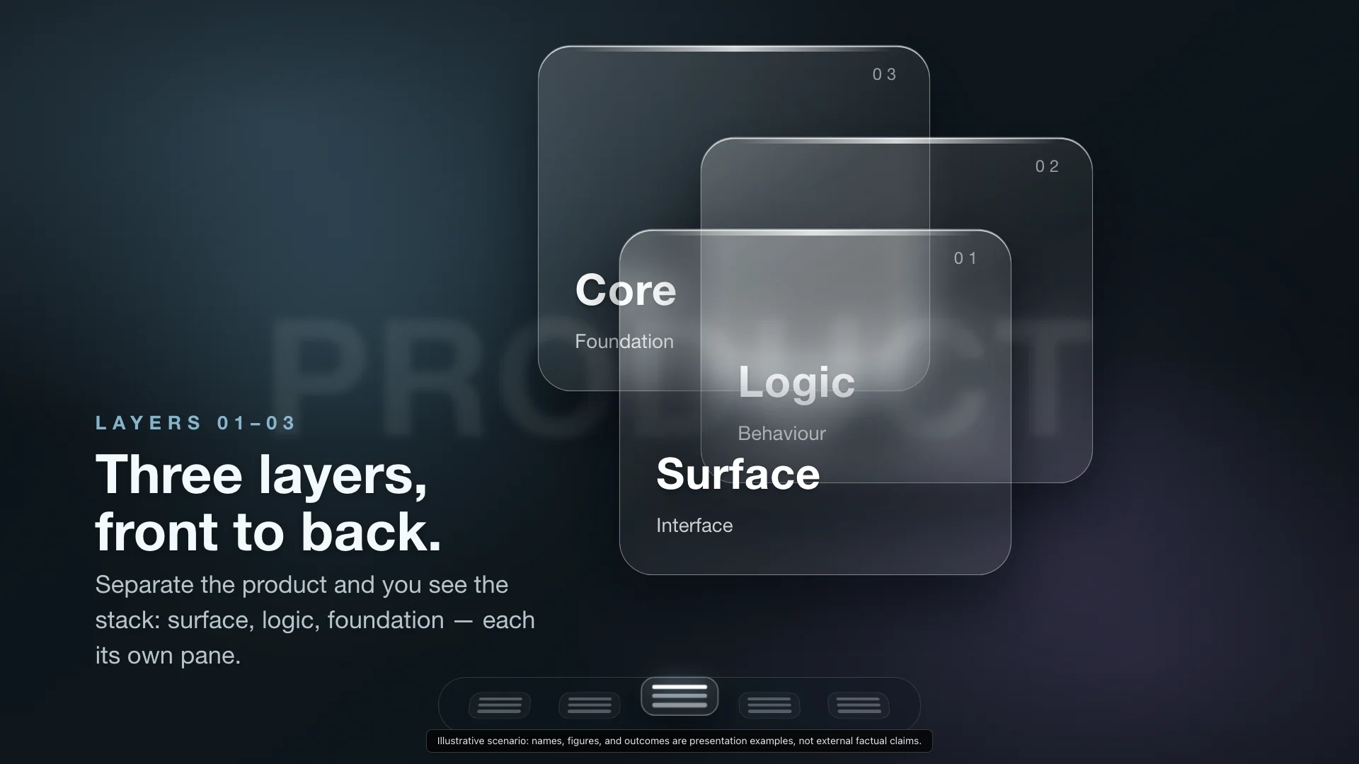
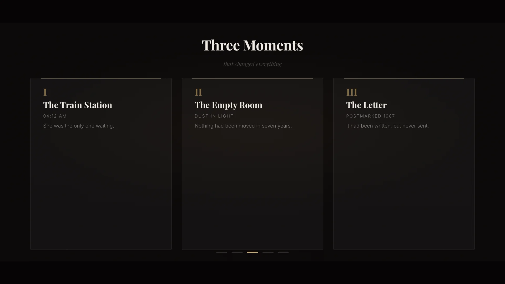
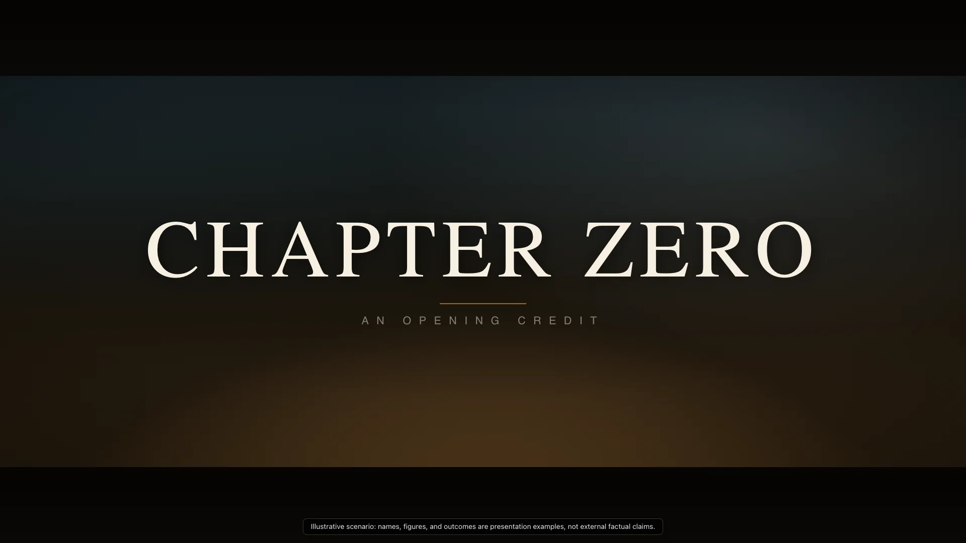
Cinematic letterbox title card with film typography and atmospheric stillness for opening titles and grand reveals.
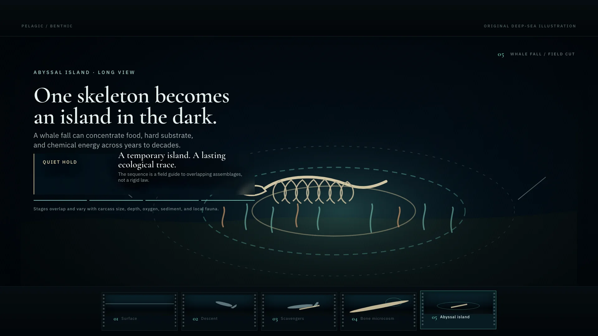
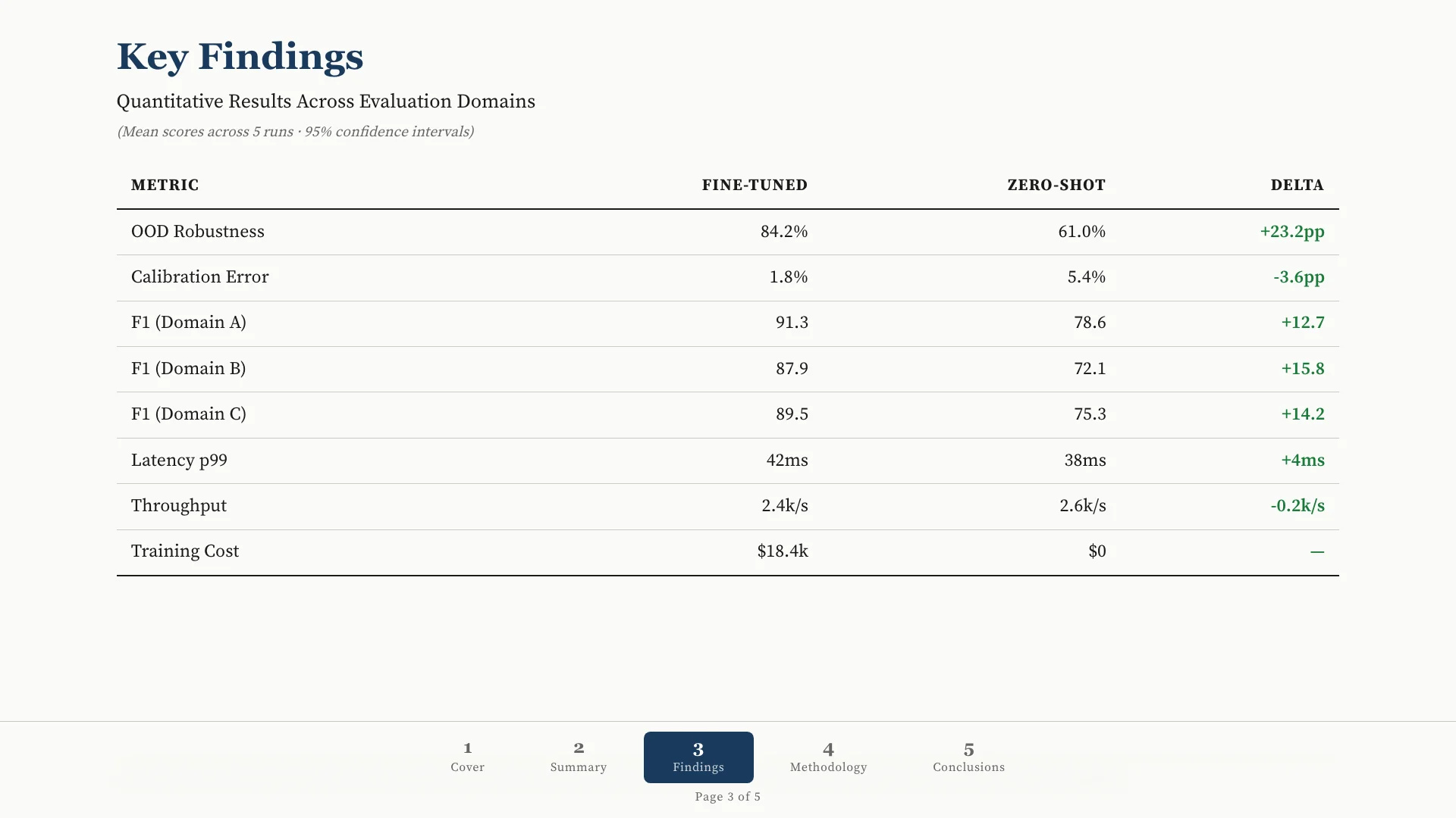
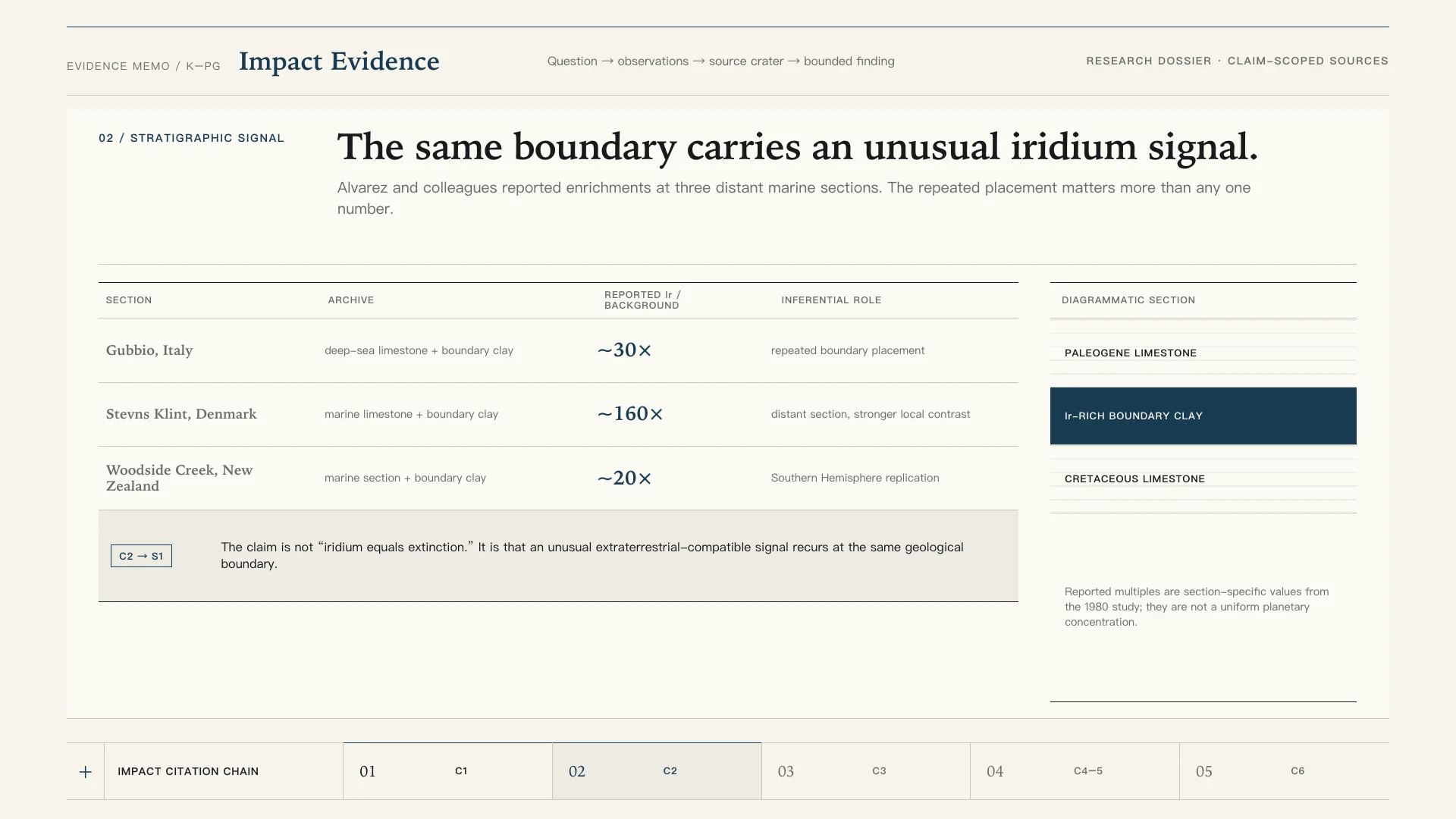
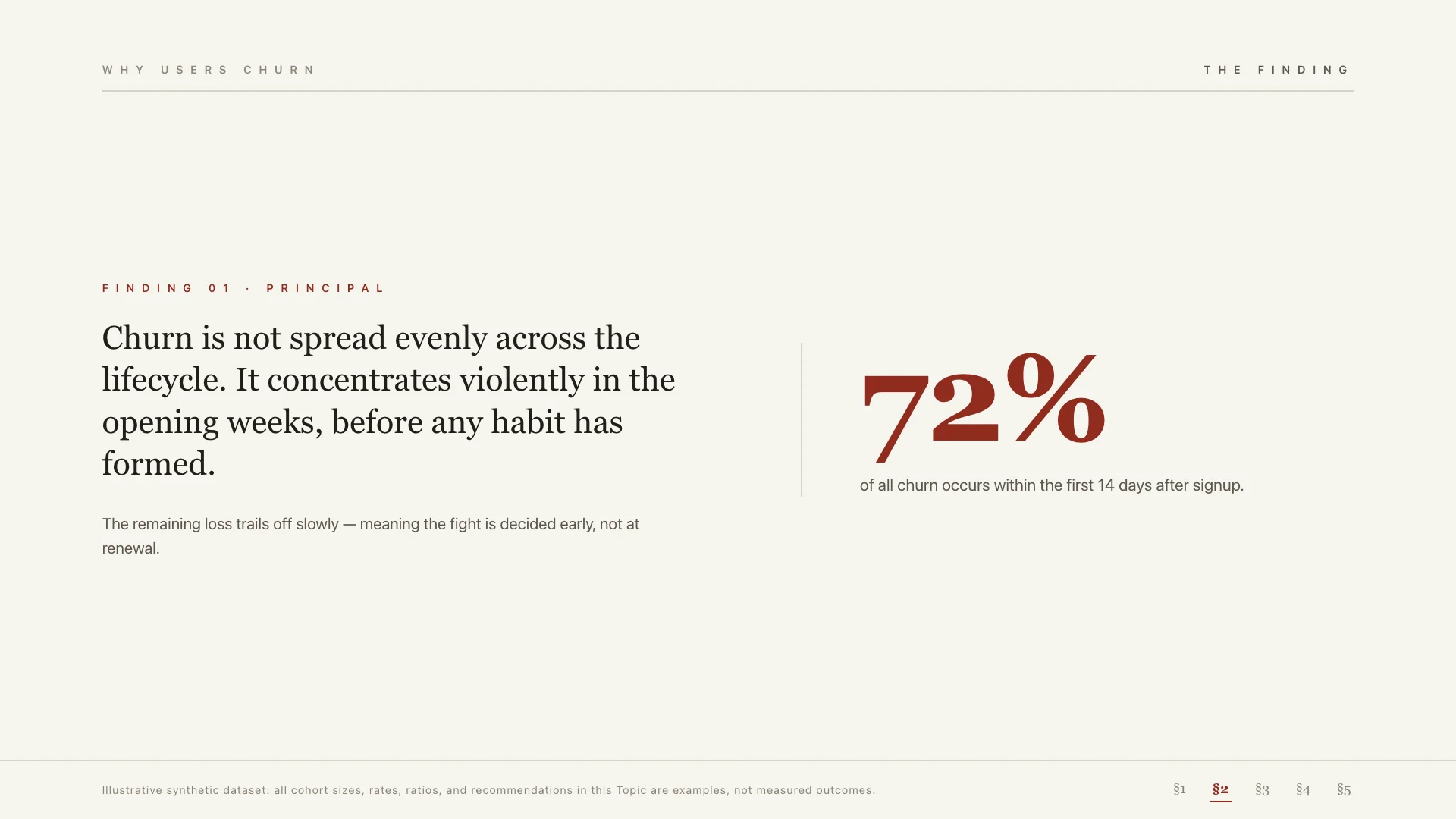
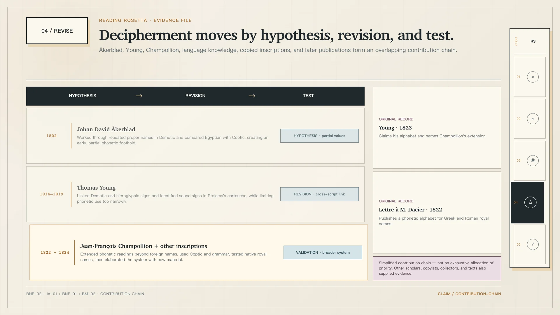
Calm and authoritative. Uses memo structure, restrained rules, serif hierarchy, and evidence blocks for credible reading-first decks.
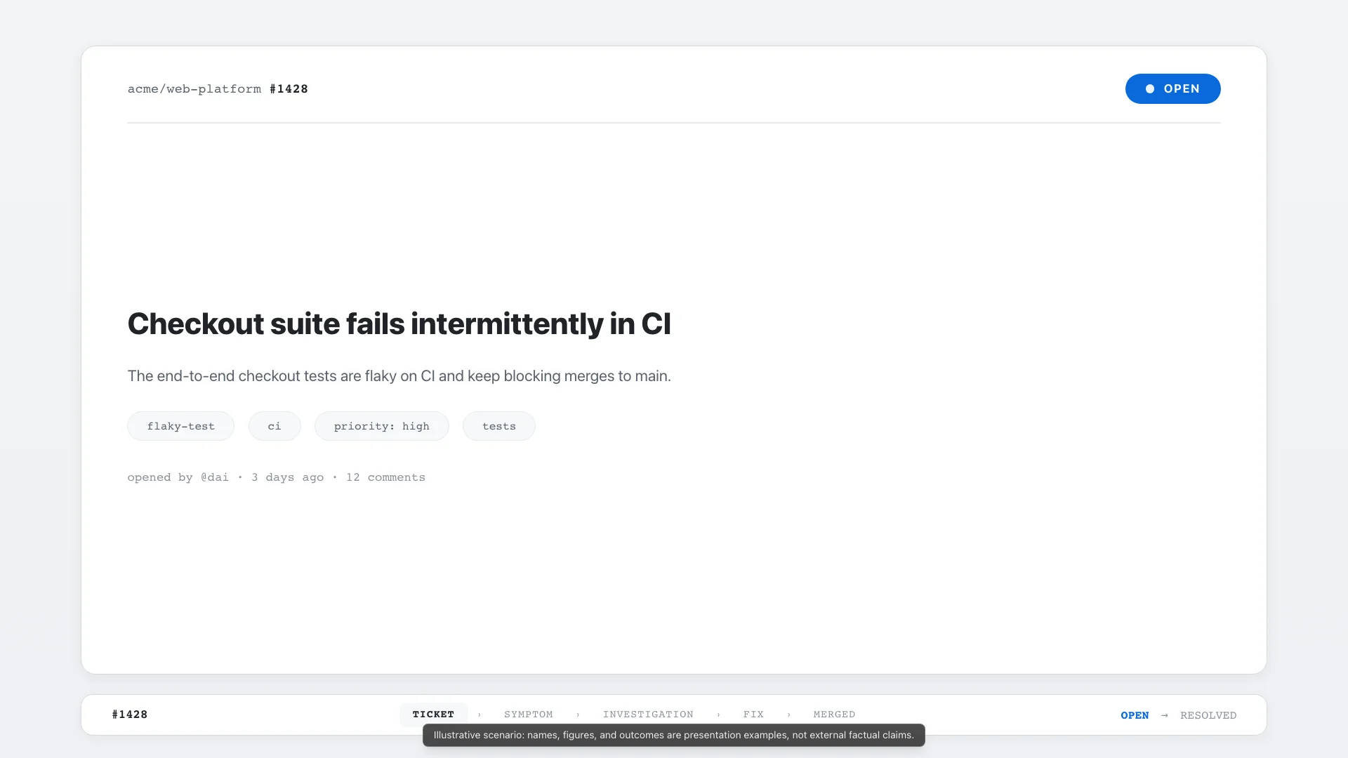
Clean, structured, and action-oriented. Inspired by modern issue trackers and code review tools.
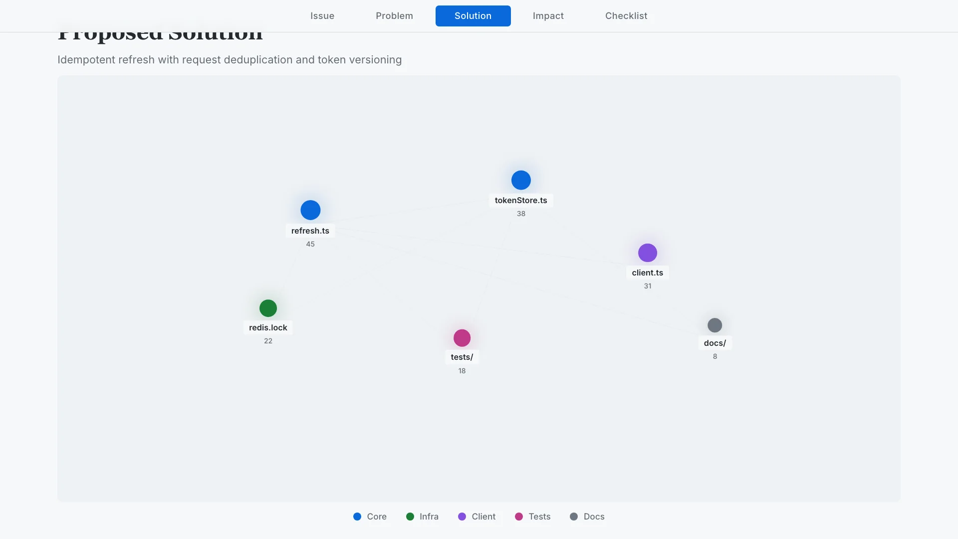
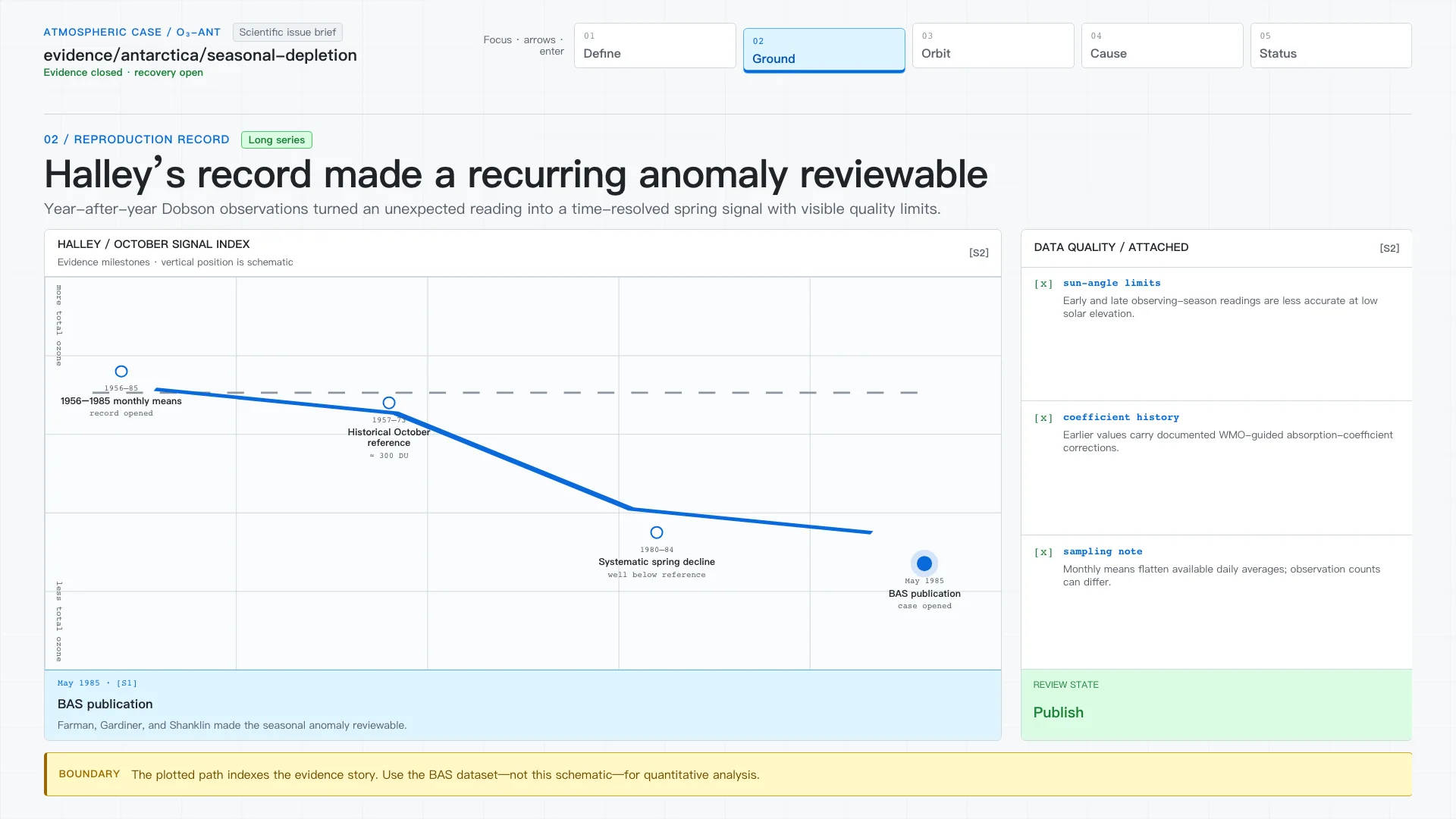
Rigorous and architectural. Frames context, decision, trade-offs, and verification in an ADR-like document rhythm.
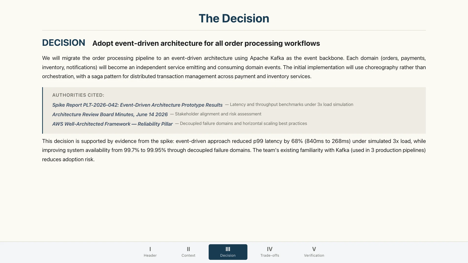
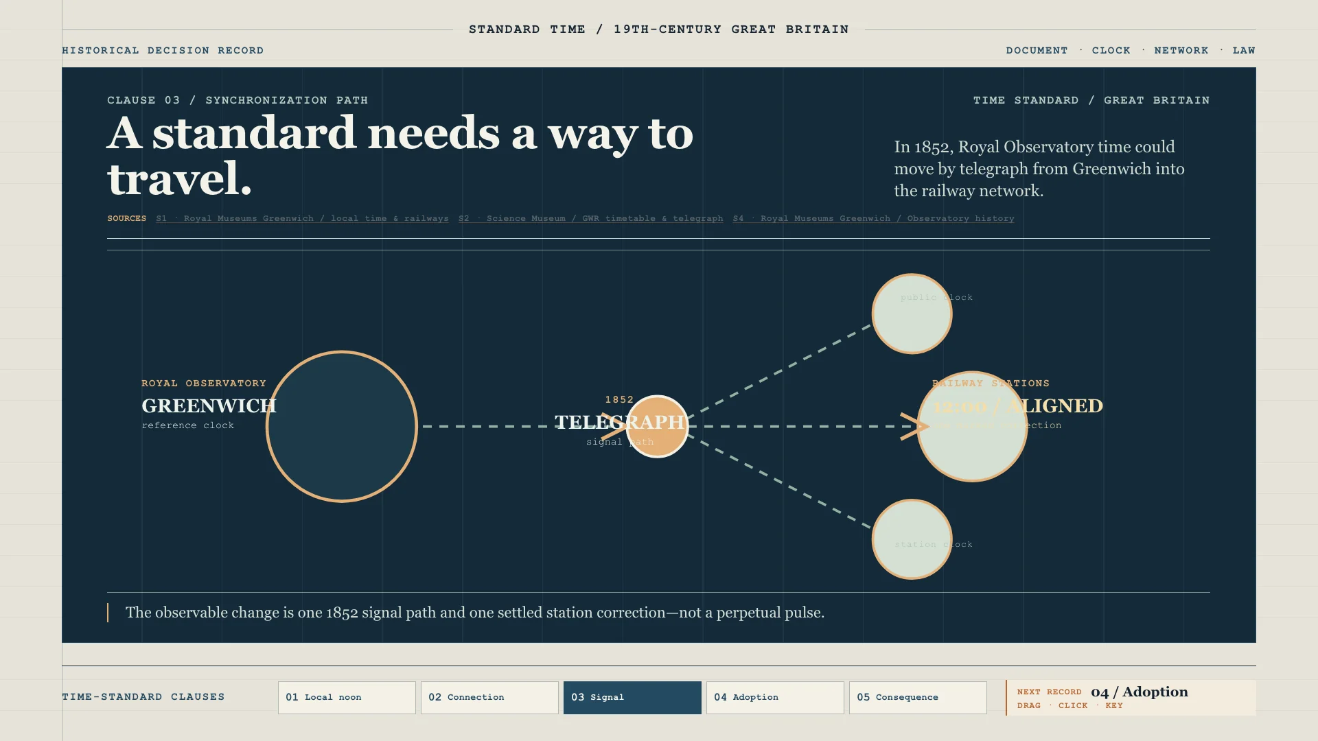
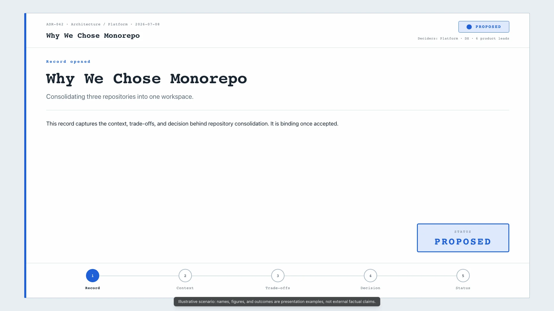
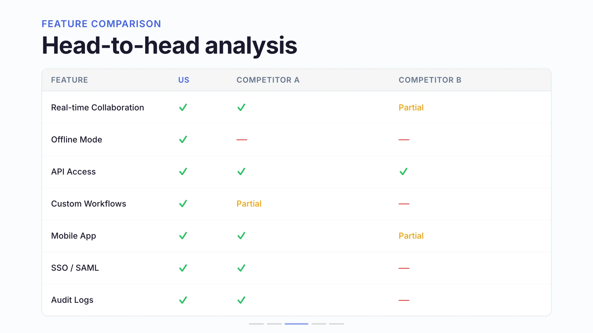
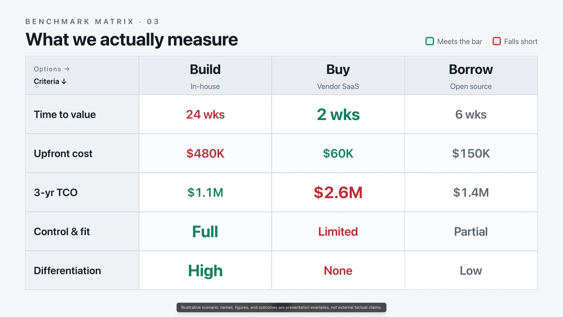
Analytical and comparative. Prioritizes structured evidence, criteria, metrics, and table-like comparison surfaces.
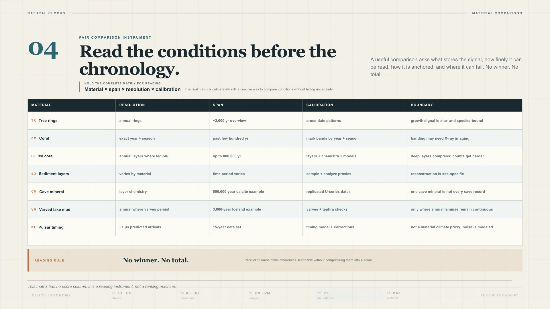
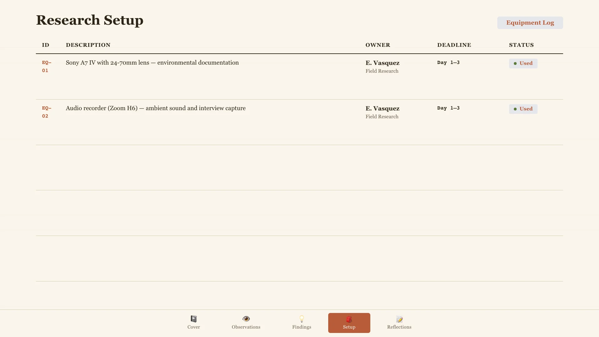
Tactile and observational. Uses ledger paper, charcoal ink, and card grids.
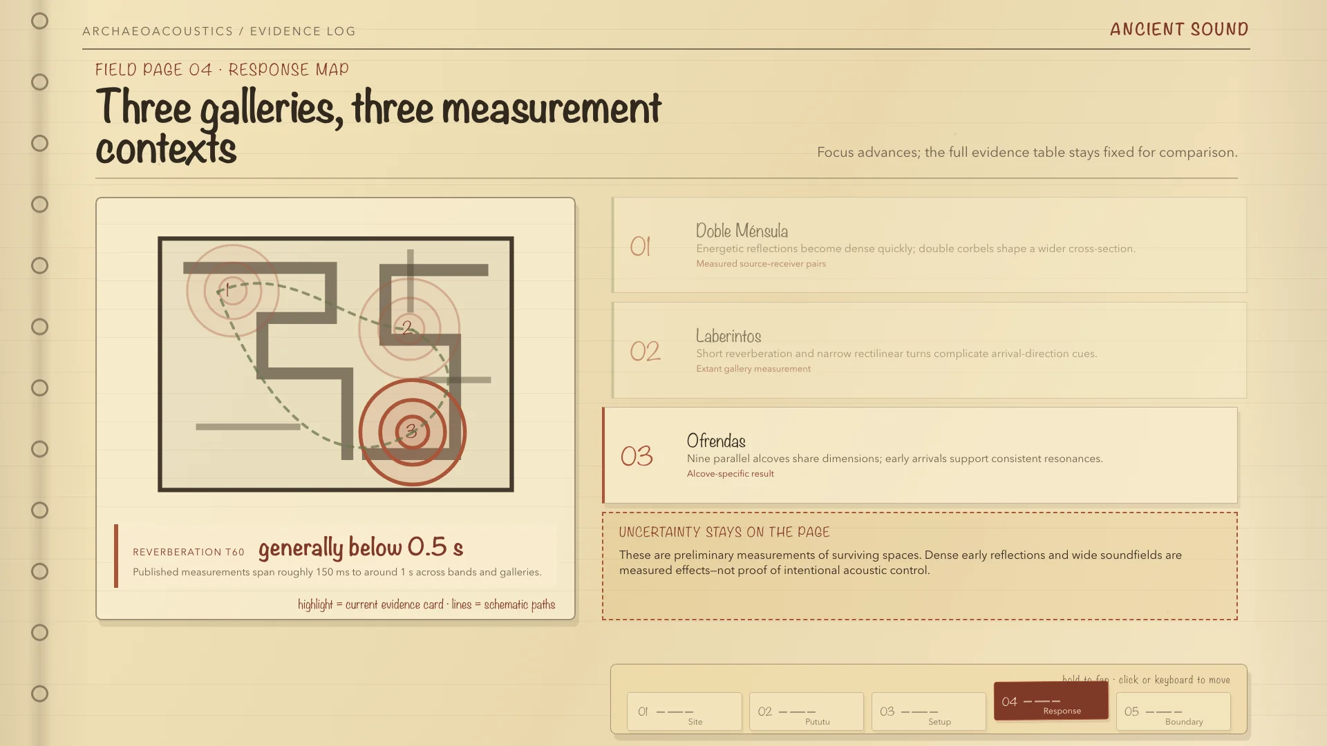
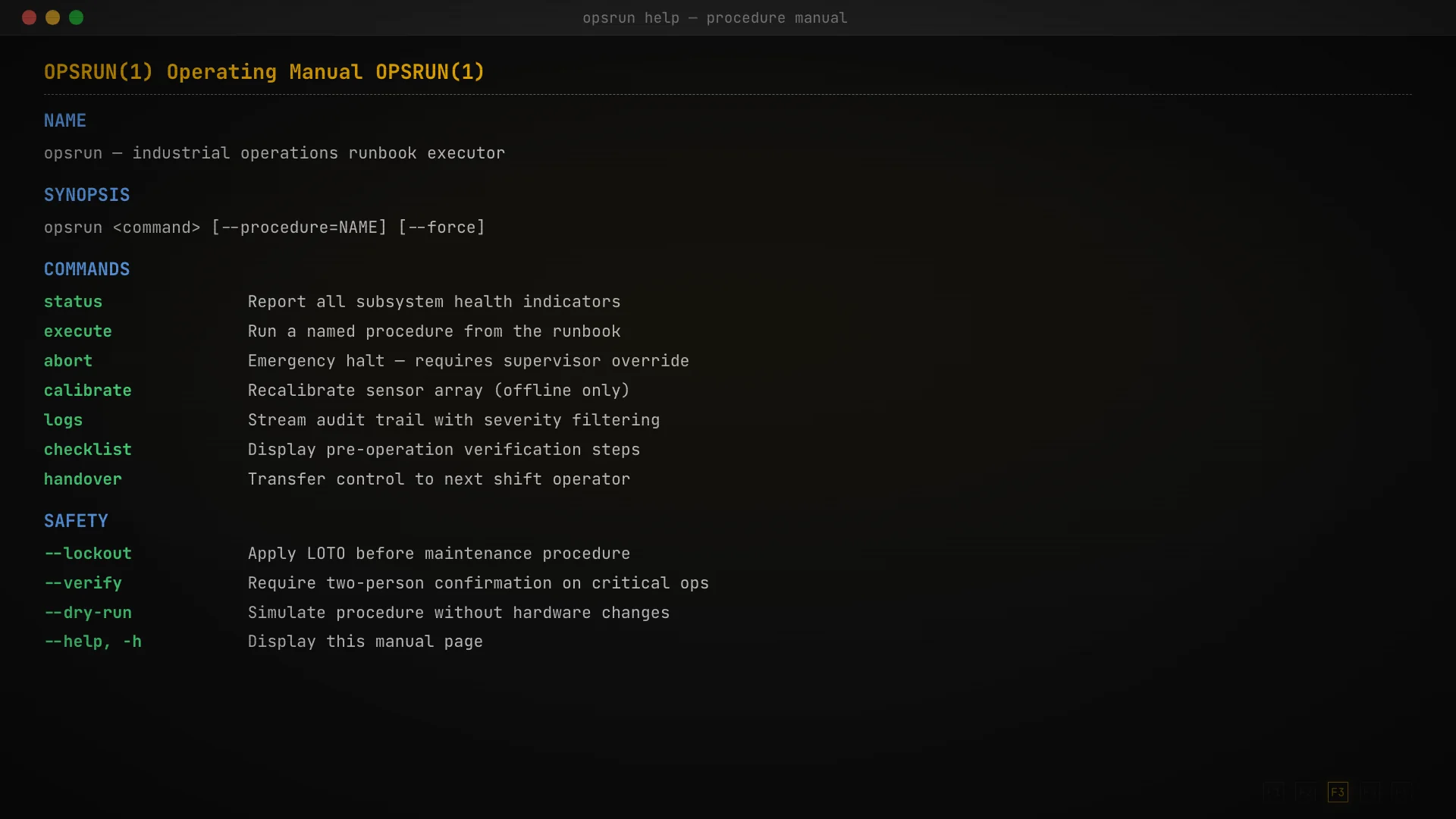
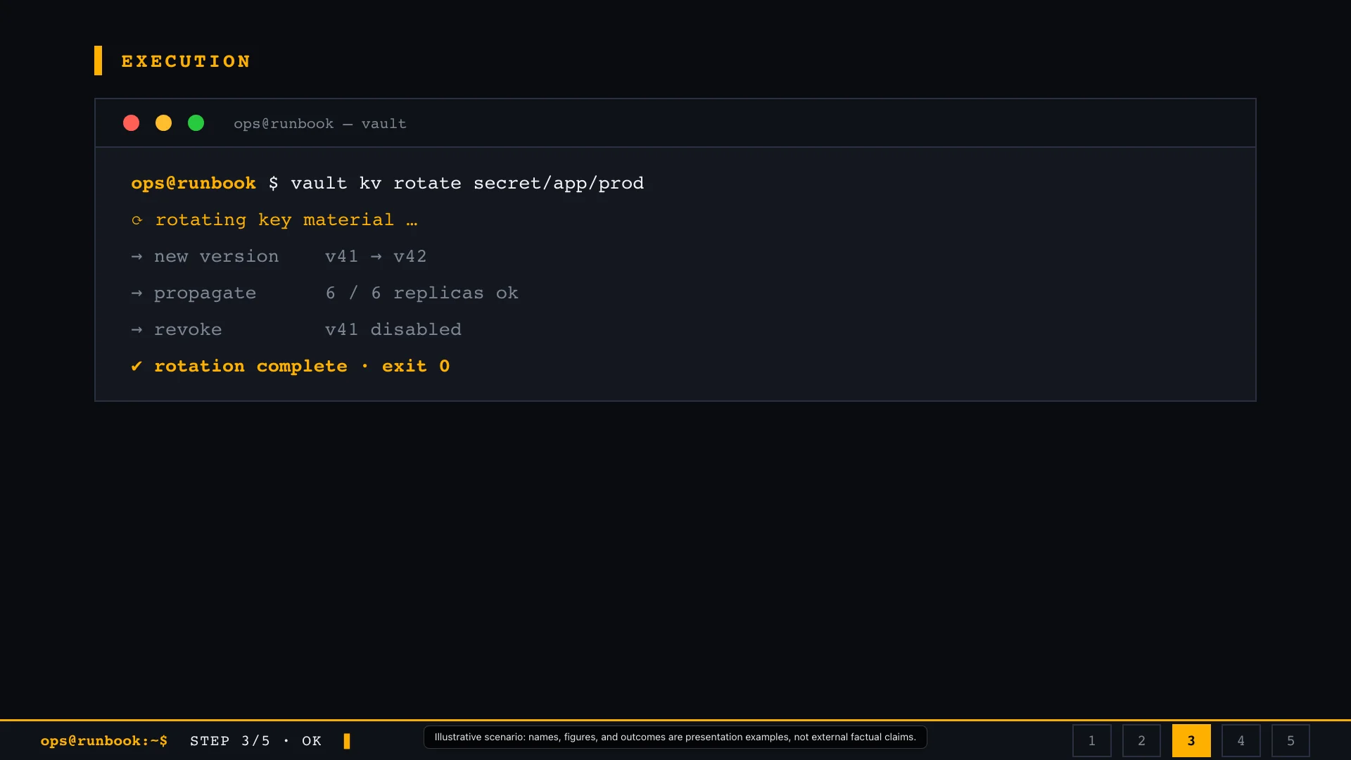
Procedural and high-contrast. Uses industrial runbook cues, terminal blocks, and step execution for repeatable operating habits.
Trustworthy and practical. Uses ledger lines, compact rows, and visible checks for acceptance criteria and final readiness.
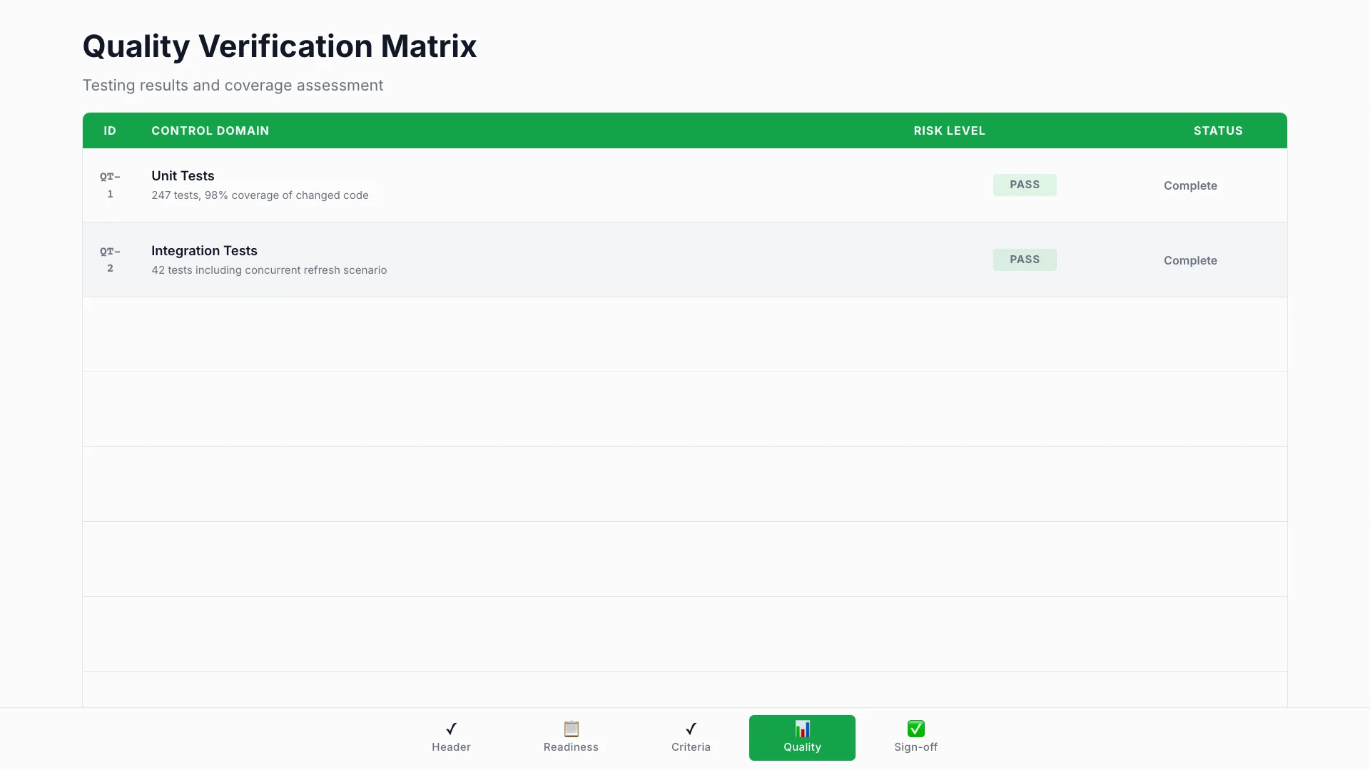
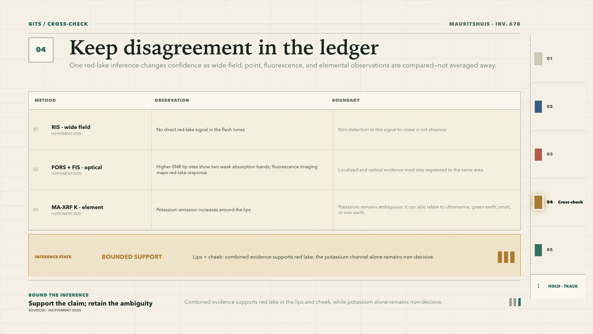
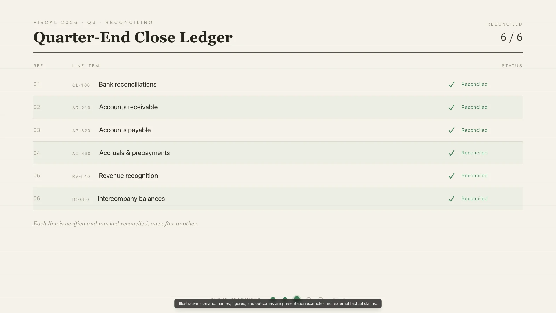
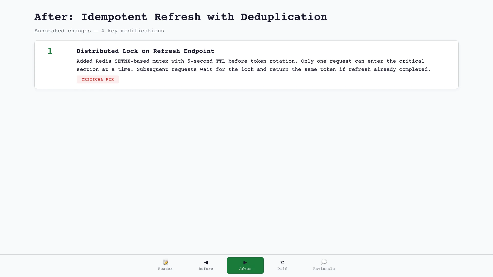
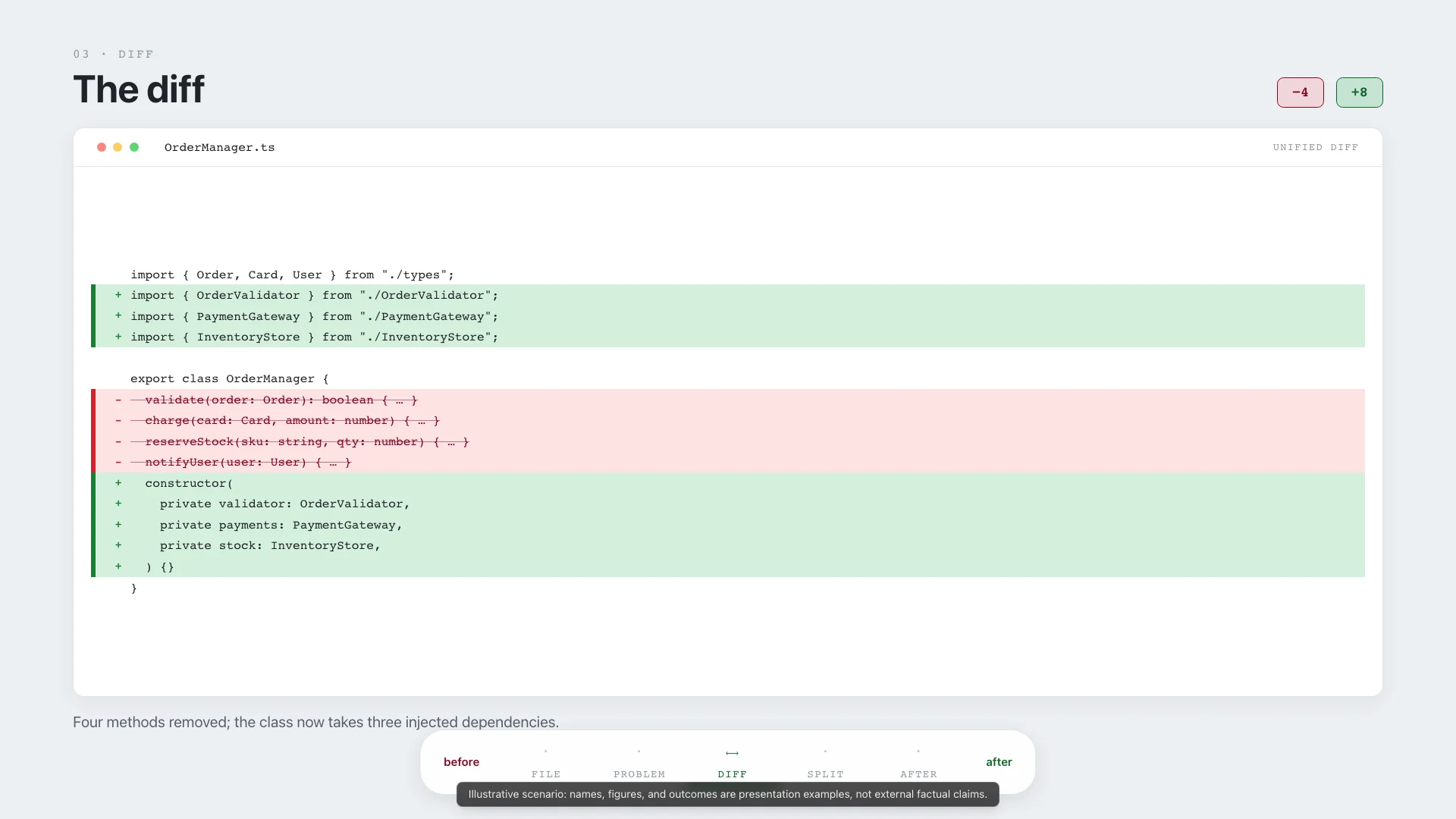
Reviewable and transformation-focused. Shows before/after changes, annotations, and evidence directly in source-like surfaces.
Browse my curated collection of practical agent skills: Awesome Skills.