


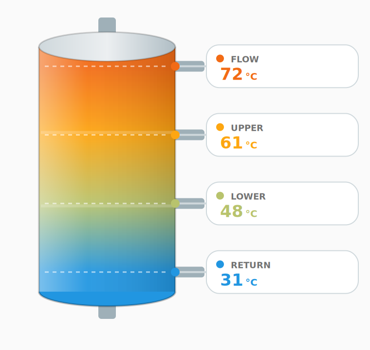
A custom Home Assistant Lovelace card that visually represents a buffer tank / hot-water cylinder (a "puffer") used for heating and domestic hot water. It shows up to four temperatures at different heights and colors the tank according to the real thermal stratification.
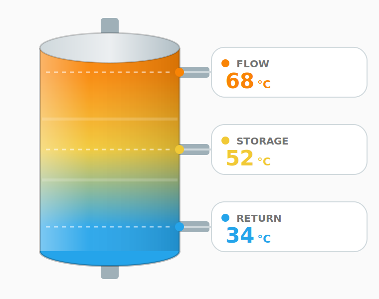
- Shows 1 to 4 temperatures; with fewer than four values they are spread evenly over the tank height.
- Color-coded stratification: each level is colored from blue (cold) to red
(hot), based on configurable
min/maxtemperatures. - Customizable labels, with sensible localized defaults.
- Two layouts:
normal(full tank) andcompact(mini tank + value list). - Option to hide labels and show values only.
- Optional icon next to the title, or replacing it entirely.
- Optional history chart below or above the tank, with selectable period (2 h – 48 h), smooth area or line style, and per-sensor visibility.
- Click any value to open the entity's more-info dialog.
- Built-in graphical editor — no YAML required.
- Multilingual UI (English / Italian, more welcome) following Home Assistant's language.
- Adapts to Home Assistant themes.

- Open HACS → top-right menu → Custom repositories.
- Add
https://github.com/naked-head/puffer-cardwith category Dashboard. - Search for Puffer Card, install it, and reload.
- The Lovelace resource is registered automatically.
- Copy the
dist/content so thatpuffer-card.jsand thetranslations/folder stay together, e.g./config/www/puffer-card/:/config/www/puffer-card/ ├── puffer-card.js └── translations/ ├── index.json ├── en.json └── it.json - Go to Settings → Dashboards → ⋮ → Resources → Add resource:
- URL:
/local/puffer-card/puffer-card.js - Type: JavaScript Module
- URL:
- Reload the page.
Keep the folder structure intact: the card loads its translation files relative to its own URL. The Lit framework is loaded from a CDN on first run and then cached by the browser.
Add a card to your dashboard, search for Puffer Card, and use the visual editor — or configure it in YAML:
type: custom:puffer-card
name: Heating buffer
icon: mdi:propane-tank-outline   # optional
icon_mode: beside                # "beside" or "replace"
layout: normal           # "normal" or "compact"
show_labels: true        # set to false to show values only
min_temp: 20            # temperature mapped to the cold color
max_temp: 80            # temperature mapped to the hot color
top:
  entity: sensor.buffer_top
  label: Flow
middle:
  entity: sensor.buffer_middle
  label: Storage
extra:
  entity: sensor.buffer_extra
  label: Extra
bottom:
  entity: sensor.buffer_bottom
  label: Return
show_chart: true        # optional history chart
chart_position: below   # "below" or "above"
chart_hours: 24         # 2, 6, 12, 24 or 48
chart_style: area       # "area" or "line"
chart_sensors:          # which positions to include in the chart
  - top
  - middle
  - extra
  - bottom
To show fewer than four values, simply omit the positions you don't need
(for example only top and bottom). The displayed values are then
distributed evenly over the tank. With all four positions configured, the
tank grows slightly taller and badge text shrinks a little so nothing
overlaps — layouts with 1 to 3 sensors are unaffected.
| Option | Type | Default | Description |
|---|---|---|---|
type |
string | – | custom:puffer-card (required) |
name |
string | localized | Card title; leave empty to hide it |
icon |
string | – | Optional icon (e.g. mdi:propane-tank-outline) |
icon_mode |
string | beside |
beside the title or replace it |
layout |
string | normal |
normal (full tank) or compact (mini tank + list) |
show_labels |
boolean | true |
Show or hide the labels next to each value |
min_temp |
number | 20 |
Temperature mapped to the cold color |
max_temp |
number | 80 |
Temperature mapped to the hot color |
top / middle / extra / bottom |
object | – | A measuring point: { entity, label } |
*.entity |
string | – | Temperature entity (sensor, number or input_number) |
*.label |
string | localized | Label shown next to the value |
unit |
string | from entity / °C |
Force the unit of measurement |
show_chart |
boolean | false |
Show the history chart |
chart_position |
string | below |
below or above the tank |
chart_hours |
number | 24 |
History period: 2, 6, 12, 24 or 48 |
chart_style |
string | area |
area (filled) or line |
chart_sensors |
list | all | Positions to include: top, middle, extra, bottom |
The full tank with value badges on the side.
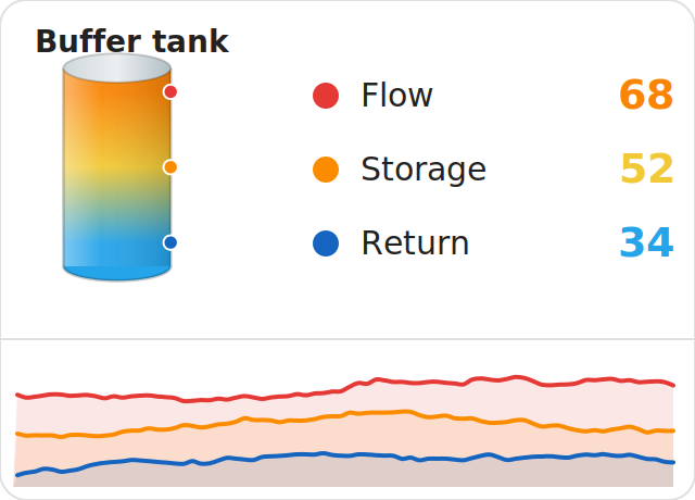
A small tank next to a compact list of values — ideal for dense dashboards.
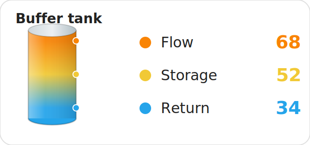
Values only (labels hidden)
With show_labels: false the labels are removed. In the compact layout the
values move next to the tank.
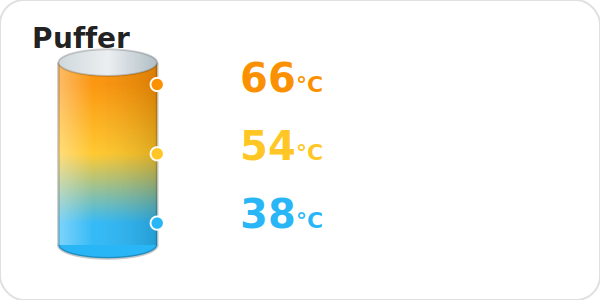
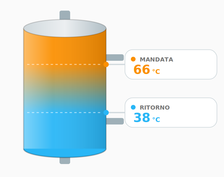
When you configure fewer than four values, they are evenly distributed over the tank height instead of staying at the extremes.
With all four positions configured, the tank is taller and badge text is a bit smaller so the four values stay comfortably spaced; side pipes follow the number of configured sensors instead of a fixed pair.
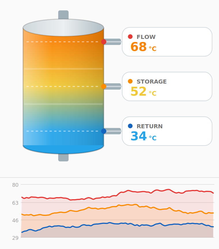
When show_chart: true a history chart is rendered below (or above) the tank,
fetching data from the HA History API. Curves are smoothed (Catmull-Rom
interpolation), similar to other popular history-graph cards. Each sensor is
drawn in a fixed color (red, orange, blue) that doubles as the legend.
When the chart is active and more than one sensor is shown, the colored dots on the tank and in the compact list switch to the same fixed colors, linking the live reading to the corresponding chart line.
The UI language follows Home Assistant's own language setting, with English as the fallback when a translation is missing or a language isn't available at all.
Translations live under dist/translations/: one JSON file per language,
plus an index.json manifest listing which languages are shipped.
dist/translations/
├── index.json   # { "en": "English", "it": "Italiano" }
├── en.json      # reference language — every key must exist here
└── it.json
To contribute a new language, no code changes are needed:
- Copy
en.jsonto<code>.json(use the language's IETF tag, e.g.de.jsonfor German) and translate the values — keep the keys as-is. - Add an entry to
index.json:"de": "Deutsch". - Run
node scripts/check-translations.jsto confirm every key fromen.jsonis present (missing keys don't break anything — they silently fall back to English — but the script helps catch typos and gaps before opening a PR). The same check runs automatically in CI. - Open a pull request.
Each temperature is mapped to a color between min_temp (blue) and max_temp
(red), passing through cyan, amber and orange. Tune min_temp / max_temp to
match your system so the colors are meaningful for your typical operating range.
MIT — see LICENSE
Built with the assistance of Claude by Anthropic.