A modern React tooltip library that renders tooltips via a portal — keeping them outside your component tree so they always appear on top. This is a React 18 compatible fork of the original react-portal-tooltip by Romain Berger.




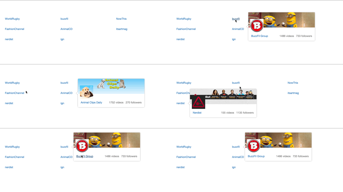
👉 react-portal-tooltip-upgraded.vercel.app
Includes position, arrow, custom style, StatefulToolTip, useHover, and rich card tooltip demos — all running in Next.js 15+.
The original library was built for React 15/16. This fork fully modernises it for React 18:
ReactDOM.renderreplaced withcreateRootfromreact-dom/clientcomponentWillReceivePropsreplaced withcomponentDidUpdate— fully Strict Mode compatibleReactDOM.unmountComponentAtNodereplaced withroot.unmount()- TypeScript support — hand-crafted
.d.tstype definitions with full JSDoc - SSR safe — all
document/windowaccess guarded for Next.js and Remix useHoverfixed for React 18 — resolved concurrent rendering race condition that caused tooltips to close prematurely- Peer dependencies support
react@^18.2.0 || ^19.0.0andreact-dom@^18.2.0 || ^19.0.0 - Dev dependencies bumped to current Babel 7 and Mocha 10
- Maintained full backwards compatibility with the original API
npm install react-portal-tooltip-upgradedyarn add react-portal-tooltip-upgradedprop-types is a required peer dependency — install it if you don't already have it:
npm install prop-typesimport React, { useState } from 'react'
import ToolTip from 'react-portal-tooltip-upgraded'
function MyComponent() {
const [isActive, setIsActive] = useState(false)
return (
<div>
<button
id="my-button"
onMouseEnter={() => setIsActive(true)}
onMouseLeave={() => setIsActive(false)}
>
Hover me
</button>
<ToolTip active={isActive} position="bottom" arrow="center" parent="#my-button">
<p>Tooltip content here</p>
</ToolTip>
</div>
)
}import React from 'react'
import ToolTip from 'react-portal-tooltip-upgraded'
class MyComponent extends React.Component {
state = { isTooltipActive: false }
showTooltip = () => this.setState({ isTooltipActive: true })
hideTooltip = () => this.setState({ isTooltipActive: false })
render() {
return (
<div>
<p id="text" onMouseEnter={this.showTooltip} onMouseLeave={this.hideTooltip}>
Hover over me
</p>
<ToolTip active={this.state.isTooltipActive} position="top" arrow="center" parent="#text">
<div>
<p>This is the tooltip content</p>
</div>
</ToolTip>
</div>
)
}
}If you only need hover behaviour, use StatefulToolTip to avoid managing state yourself:
import { StatefulToolTip } from 'react-portal-tooltip-upgraded'

function MyComponent() {
  return (
    <StatefulToolTip
      parent={<span>Hover me to display the tooltip</span>}
      position="top"
      arrow="center"
    >
      <p>Tooltip content here</p>
    </StatefulToolTip>
  )
}
StatefulToolTip accepts all the same props as ToolTip, plus a className prop applied to the wrapper <span> around the parent element.
The package ships with type definitions. No extra @types package needed.
import ToolTip, { StatefulToolTip, TooltipStyle } from 'react-portal-tooltip-upgraded'

const darkStyle: TooltipStyle = {
  style: { background: '#0f172a', border: '1px solid #334155' },
  arrowStyle: { color: '#0f172a', borderColor: '#334155' },
}

function MyComponent() {
  const [active, setActive] = React.useState(false)

  return (
    <>
      <button id="btn" onMouseEnter={() => setActive(true)} onMouseLeave={() => setActive(false)}>
        Hover me
      </button>
      <ToolTip active={active} position="top" arrow="center" parent="#btn" style={darkStyle}>
        <p>Typed tooltip</p>
      </ToolTip>
    </>
  )
}The parent prop accepts either a CSS selector string or a DOM element:
{/* CSS selector */}
<ToolTip active={isActive} position="top" arrow="center" parent="#hoverMe">
  <p>Tooltip content</p>
</ToolTip>

{/* DOM ref */}
<ToolTip active={isActive} position="top" arrow="center" parent={this.triggerEl}>
  <p>Tooltip content</p>
</ToolTip>| Prop | Type | Default | Description |
|---|---|---|---|
parent |
string | Element |
required | CSS selector string or DOM element to position the tooltip against |
active |
bool |
false |
Controls visibility of the tooltip |
position |
string |
'right' |
Tooltip placement: top, right, bottom, or left |
arrow |
string |
null |
Arrow position: center, top, right, bottom, left. Omit for no arrow |
align |
string |
null |
Horizontal alignment of the tooltip relative to the parent: center, left, right |
group |
string |
'main' |
Unique group name — use different values when you need multiple independent tooltips on the same page |
tooltipTimeout |
number |
500 |
Fade-out delay in milliseconds after the trigger loses hover |
useHover |
bool |
true |
When true, moving the mouse from the trigger onto the tooltip keeps it visible |
style |
object |
{} |
Style overrides — see Custom Styling below |
Accepts all ToolTip props, plus:
| Prop | Type | Default | Description |
|---|---|---|---|
parent |
ReactElement |
required | The element that triggers the tooltip on hover |
className |
string |
'' |
Class name applied to the wrapper <span> |
Pass a style object with two keys to customise the tooltip appearance:
const tooltipStyle = {
  style: {
    background: '#1a1a2e',
    color: '#eee',
    padding: '8px 12px',
    borderRadius: '6px',
    boxShadow: '0 4px 12px rgba(0,0,0,0.3)',
  },
  arrowStyle: {
    color: '#1a1a2e',
    borderColor: 'transparent',
  }
}

<ToolTip active={isActive} position="top" arrow="center" parent="#btn" style={tooltipStyle}>
  <p>Styled tooltip</p>
</ToolTip>
Note:
position,top,left,right,bottom,marginLeft, andmarginRightare reserved and will be ignored in thestyleobject — the library controls positioning.
Use the group prop to give each tooltip its own portal node:
<ToolTip active={activeA} position="top" arrow="center" parent="#btn-a" group="tooltip-a">
  Tooltip A
</ToolTip>

<ToolTip active={activeB} position="bottom" arrow="center" parent="#btn-b" group="tooltip-b">
  Tooltip B
</ToolTip>The library is fully SSR-safe — all document and window access is guarded. No extra configuration needed for Next.js App Router or Remix.
// app/components/MyTooltip.tsx
'use client'

import ToolTip from 'react-portal-tooltip-upgraded'
Add 'use client' to any component that uses the tooltip (React portals require the browser DOM).
# Install root dependencies
npm install

# Build the library
npm run build

# Watch for changes
npm start

# Run tests
npm test

# Type-check
npm run typecheck
Running the Next.js example app:
cd nextjs-example
npm install
npm run dev- Migrate from deprecated
ReactDOM.rendertocreateRootfor full React 18 support - Replace
componentWillReceivePropswithcomponentDidUpdatefor Strict Mode compatibility - Update the
example/app to React 18 - Add TypeScript type definitions
- Add SSR safety guards for Next.js and Remix
- Fix
useHoverrace condition in React 18 concurrent rendering - Add Next.js live demo (positions, arrows, custom styles,
StatefulToolTip, card tooltips) - Replace Travis CI with GitHub Actions
- Expand test coverage (Card positioning, arrow styles, useHover, cleanup)
This package is a fork of react-portal-tooltip originally created and maintained by Romain Berger. The core tooltip logic, positioning system, and API design are his work. This fork exists solely to provide React 18 compatibility while the original project was no longer maintained.
All credit for the original architecture goes to Romain Berger.
Muhammad Murtaza
- GitHub: @murtaza7799
- Email: murtazasarwar@live.com
MIT — see LICENSE.md for details.
Original work © Romain Berger. Modifications © 2024 Muhammad Murtaza.