
This card allows to open, close or set a shutter to the opening rate you want.
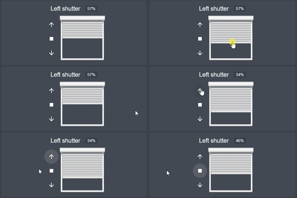
- Visual shutter representation with draggable slider
- Live percentage display while dragging
- Keyboard accessible (arrow keys, Home/End)
- Tilt support for venetian blinds
- Partial close button for quick positioning
- Movement indicators (opening/closing arrows)
- Handles unavailable entities gracefully
- Compatible with Home Assistant themes
| Name | Type | Required | Default | Description |
|---|---|---|---|---|
| type | string | True | - | Must be "custom:shutter-card" |
| title | string | False | - | Title of the card |
| Name | Type | Required | Default | Description |
|---|---|---|---|---|
| entity | string | True | - | The shutter entity ID |
| name | string | False | Friendly name of the entity | Name to display for the shutter |
| buttons_position | string | False | left |
Set buttons on left, right, top or bottom of the shutter |
| title_position | string | False | top |
Set title on top, bottom or hide to hide it entirely |
| invert_percentage | boolean | False | false |
Set it to true if your shutter is 100% when it is closed, and 0% when it is opened |
| can_tilt | boolean | False | false |
Set it to true if your shutters support tilting |
| partial_close_percentage | int | False | 0 |
Set it to a percentage (0-100) if you want to be able to quickly go to this "partially closed" state using a button |
| offset_closed_percentage | int | False | 0 |
Set it to a percentage (0-100) of travel that will still be considered a "closed" state in the visualization |
| always_percentage | boolean | False | false |
If set to true, the end states (opened/closed) will be shown as numbers (0 / 100 %) instead of text |
| shutter_width_px | int | False | 153 |
Set shutter visualization width in px. You can make it thicker or narrower to fit your layout |
| disable_end_buttons | boolean | False | false |
If set to true, the up/down buttons will be disabled when the shutter reaches end positions |
| show_buttons | boolean | False | true |
Set to false to hide the up/down/stop buttons |
| show_slide_percentage | boolean | False | true |
Set to false to hide the floating percentage while dragging the slider |
Remark : you can also just give the entity ID (without to specify entity:) if you don't need to specify the other configurations.
type: 'custom:shutter-card'
title: My shutters
entities:
  - entity: cover.left_living_shutter
    name: Left shutter
    buttons_position: left
    title_position: bottom
  - entity: cover.bedroom_shutter
    can_tilt: true
    show_buttons: false
- cover.garage_doorIf you use HACS, the resources will automatically be configured with the needed file.
If you don't use HACS, you can download js file from latest releases. Drop it then in www folder in your config directory. Next add the following entry in lovelace configuration:
resources:
  - url: /local/hass-shutter-card.js
    type: module