Make your Payload admin panel look custom-built — in 2 lines.
One accent color in, a complete shadcn-style redesign out: dashboard with sparklines and 30-day trends, ⌘K command palette with recents, grouped icon sidebar, split-screen login, sticky document outlines, and a live theme customizer with one-click presets, five typefaces and a copy-paste config generator — light and dark.





Quickstart · Tour · Try the demo · Options

The same panel, one plugin later. Every pixel above ships in this package.
Payload is the best headless CMS in the Node ecosystem — and its admin panel looks like a database UI. Clients notice. Editors notice. payload-theme turns the stock panel into something people screenshot, without forking a single component:
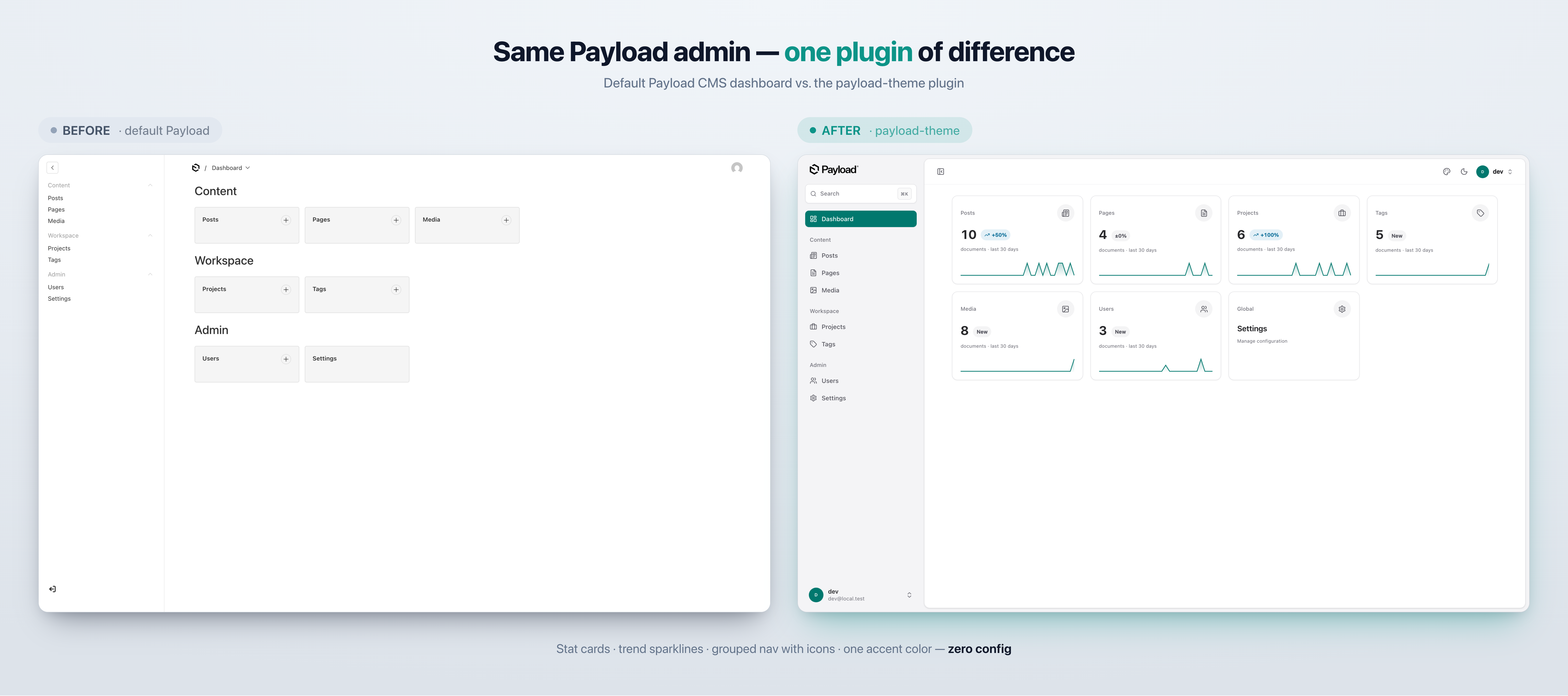
Same panel, same data — the only difference is one plugin.
- 🎨 One accent color drives everything — an 11-step OKLCH scale recolors buttons, focus rings, nav, sparklines, the login glow. Automatic WCAG contrast included.
- 🧱 No forked components, no config surgery — a plugin entry and a CSS import. Remove both lines and you're back to stock.
- 🌗 Dark mode designed, not inverted — every surface sits on a zinc ladder; dark gets its own remapped scale.
- ⚡ Zero runtime cost — color math runs once at startup and lands as CSS custom properties. SSR-safe, no FOUC.
- 📱 A real phone experience — a sliding drawer over a blurred scrim, wrapping bulk actions, aligned cards. Editors approve from the couch.
pnpm add payload-theme
# or: npm i payload-theme / yarn add payload-theme
Line 1 — add the plugin to payload.config.ts:
import { payloadTheme } from 'payload-theme'

export default buildConfig({
  plugins: [
    payloadTheme({ accent: '#0d9488' }),
  ],
})
Line 2 — import the stylesheet in src/app/(payload)/custom.scss (every create-payload-app project already has this file):
@import 'payload-theme/styles.css';Then regenerate the import map and restart:
npx payload generate:importmapOpen the admin panel. That's the whole migration. 🎉
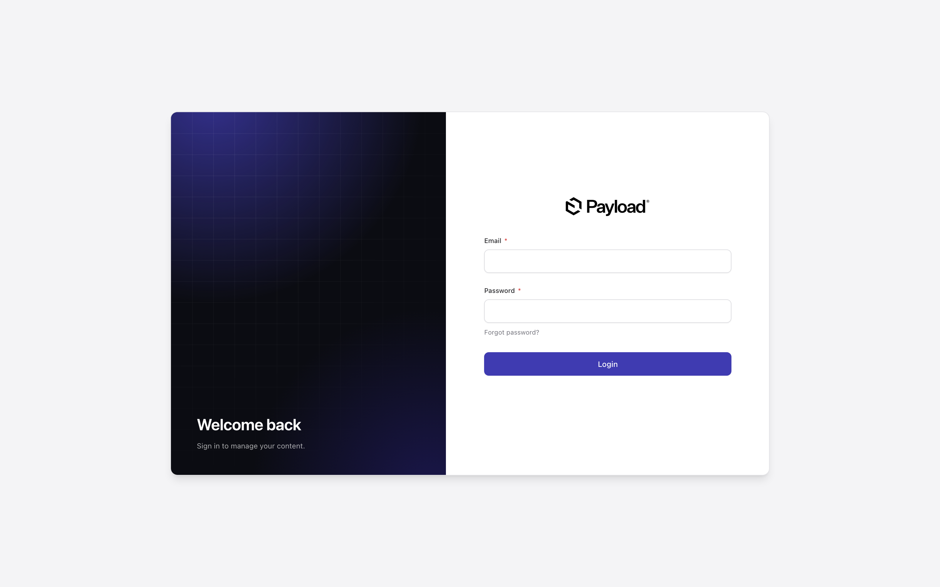
A split card: a permanently-dark brand panel whose glow is painted from your accent, your logo, your copy (login.heading / login.tagline) — and the form beside it.
The default dashboard becomes a widget grid: one stat card per collection with an animated count, a 30-day creation sparkline and a trend chip (+12%, -8% — this month's created docs vs the month before), cards for your globals, and — if you want — your own React widgets below it (docs). Server-rendered through Payload's local API: access control applies, no loading flash.
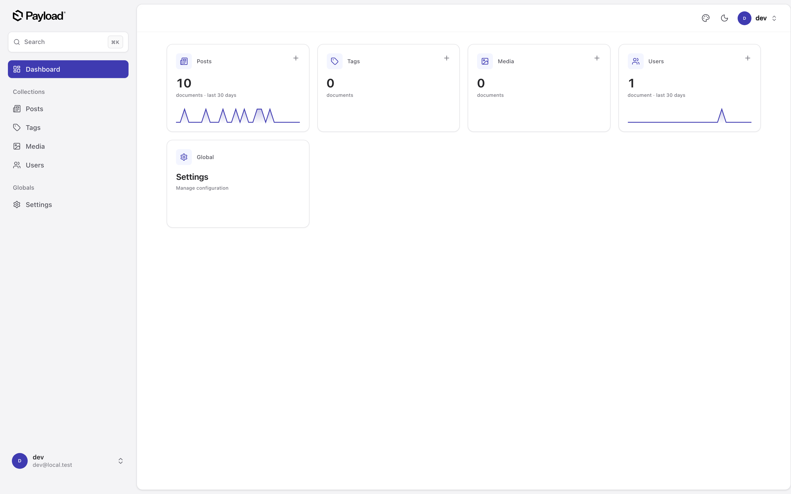
Your logo on top, a ⌘K search pill, grouped collections with lucide icons (admin.group + nav.icons), an accent pill on the active item, and a shadcn-style user block pinned to the bottom — avatar, name, email, and a popup with Account, the locale switcher and Log out. When collections overflow, only the menu scrolls; logo, search and the user block stay put. On desktop, a panel toggle at the header's left collapses the whole sidebar with a smooth grid animation — full-width content one click away.
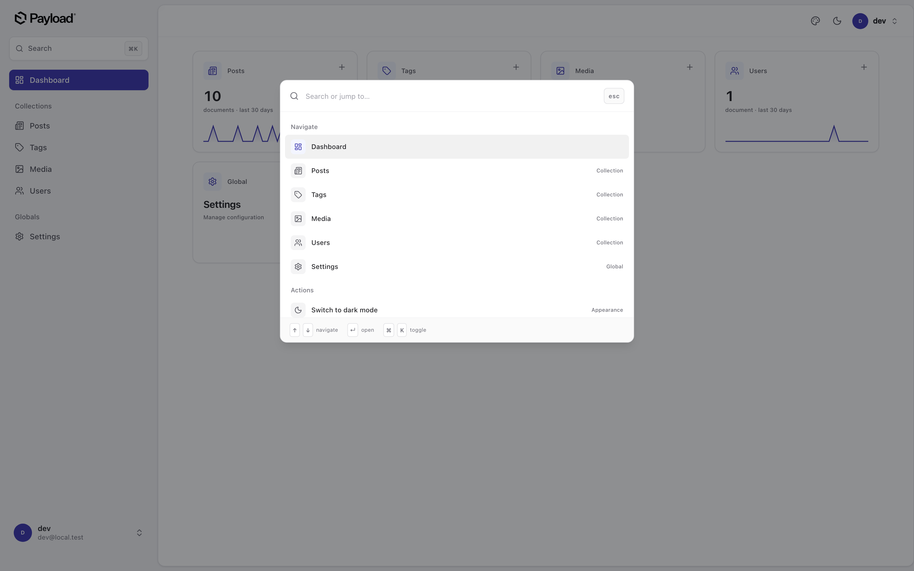
Press ⌘K / Ctrl+K anywhere: your five most recent documents wait at the top, jump to any collection or global, search documents across collections as you type, create a new document in any collection, switch light/dark, or log out. Ships inside the theme — zero extra dependencies. And press ? anywhere for the keyboard-shortcuts cheatsheet.
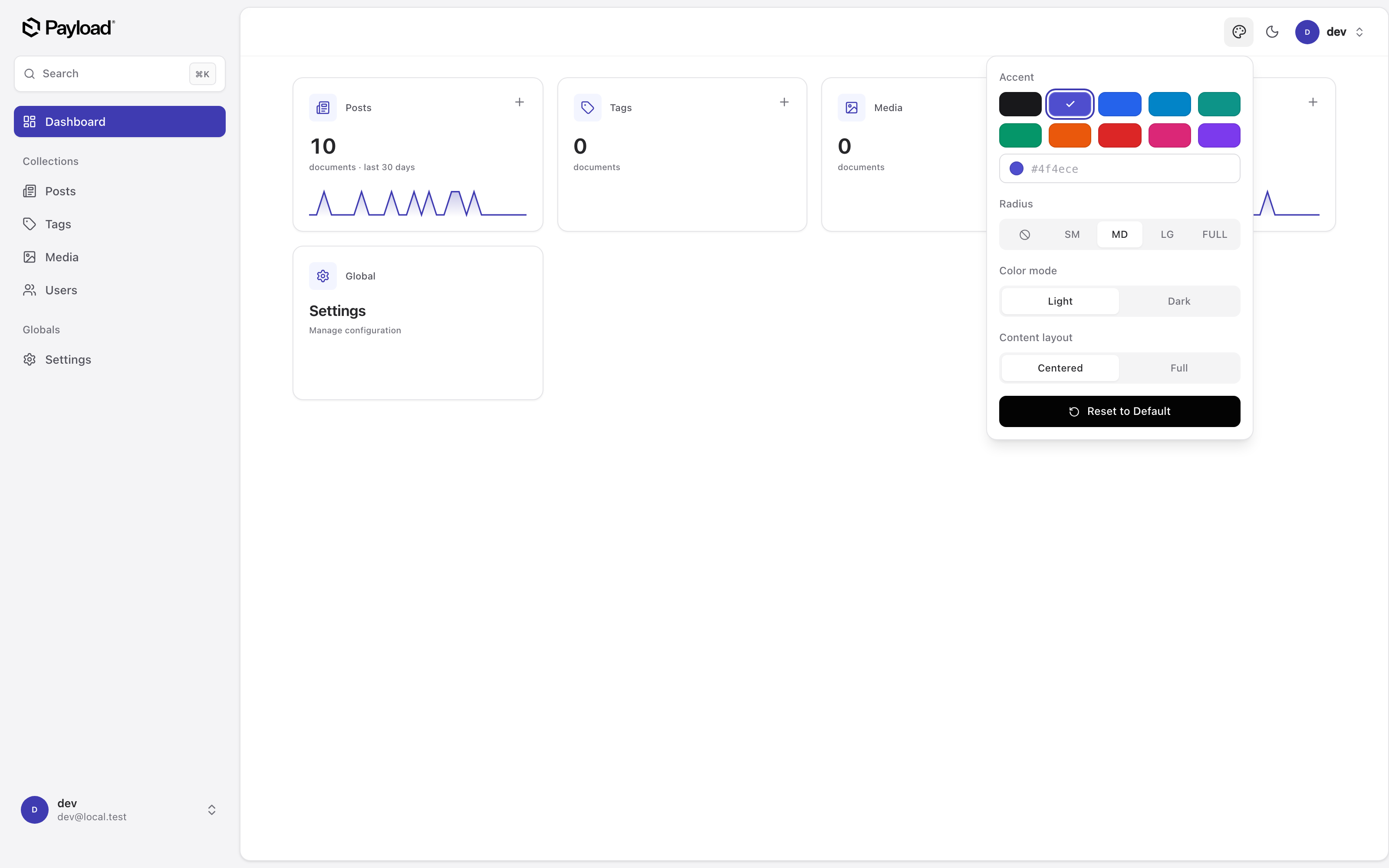
The palette button opens a panel where anyone can restyle the panel at runtime — no rebuild, no deploy:
- Presets — six one-click full themes (Zinc, Ocean, Forest, Sunset, Berry, Swiss), each a coherent accent + radius + typeface identity
- Accent — 10 curated swatches + a free hex field, recoloring the entire panel live through the same OKLCH engine
- Radius — the whole
'none' → 'full'scale - Font — Inter, Geist, Helvetica or the system stack, each button previewing its own face
- Color mode — light/dark, stored in the same preference Payload's Account page uses
- Content layout — centered (~1280px) or full width
Everything persists in the browser; Reset returns to your config — and Copy config turns whatever is on screen into a ready-to-paste payloadTheme({ ... }) snippet, so the customizer doubles as your config generator.
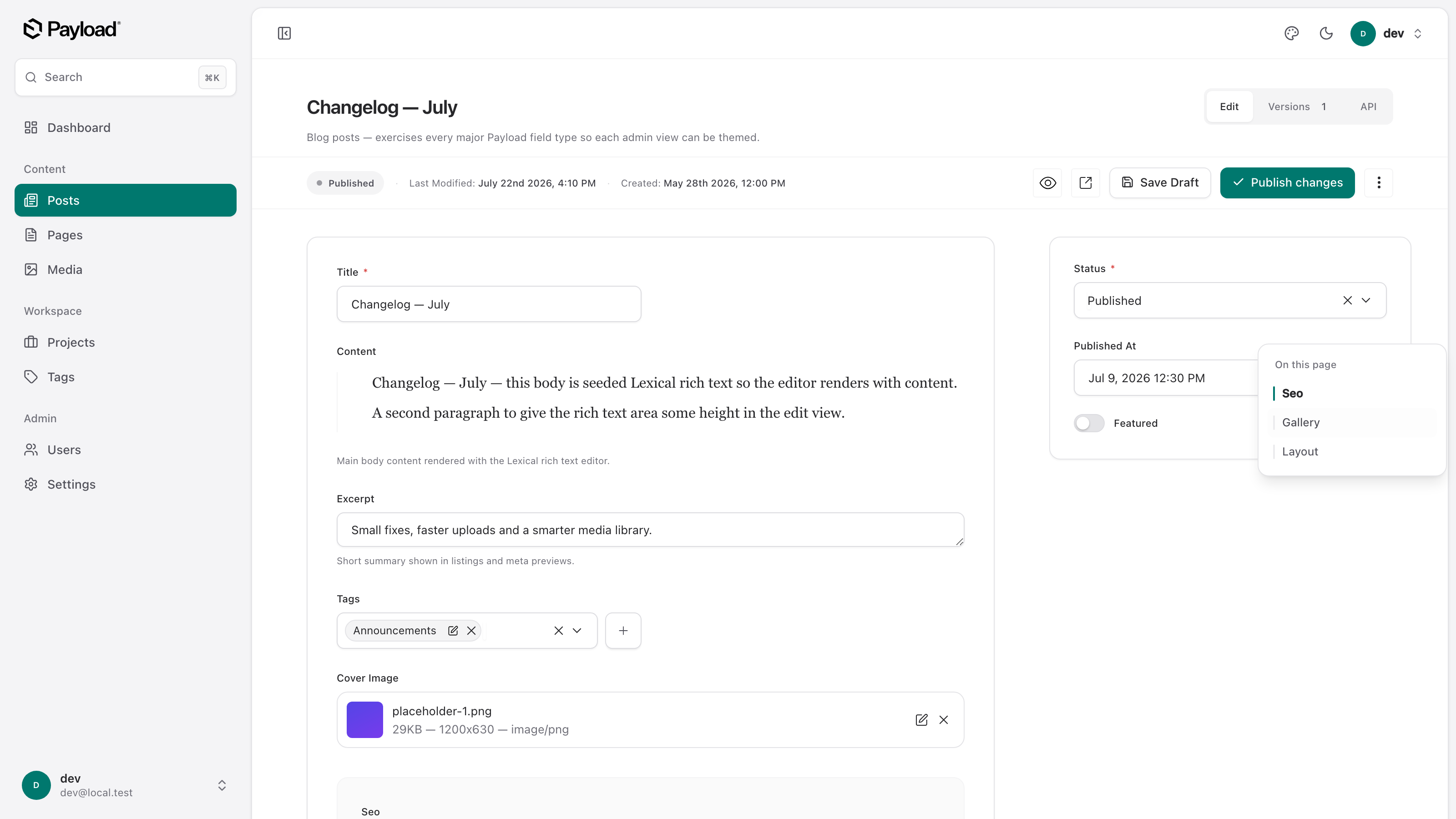
Long edit forms get a sticky "On this page" rail pinned to the right edge of wide viewports: quiet tick bars at rest, a labeled panel on hover. Entries are the form's top-level sections — groups, collapsibles, blocks, arrays, and every tab of a tabs field. Click to scroll (or switch tab); the active section tracks as you read. Renders only when a document has 3+ sections, and never on small screens.
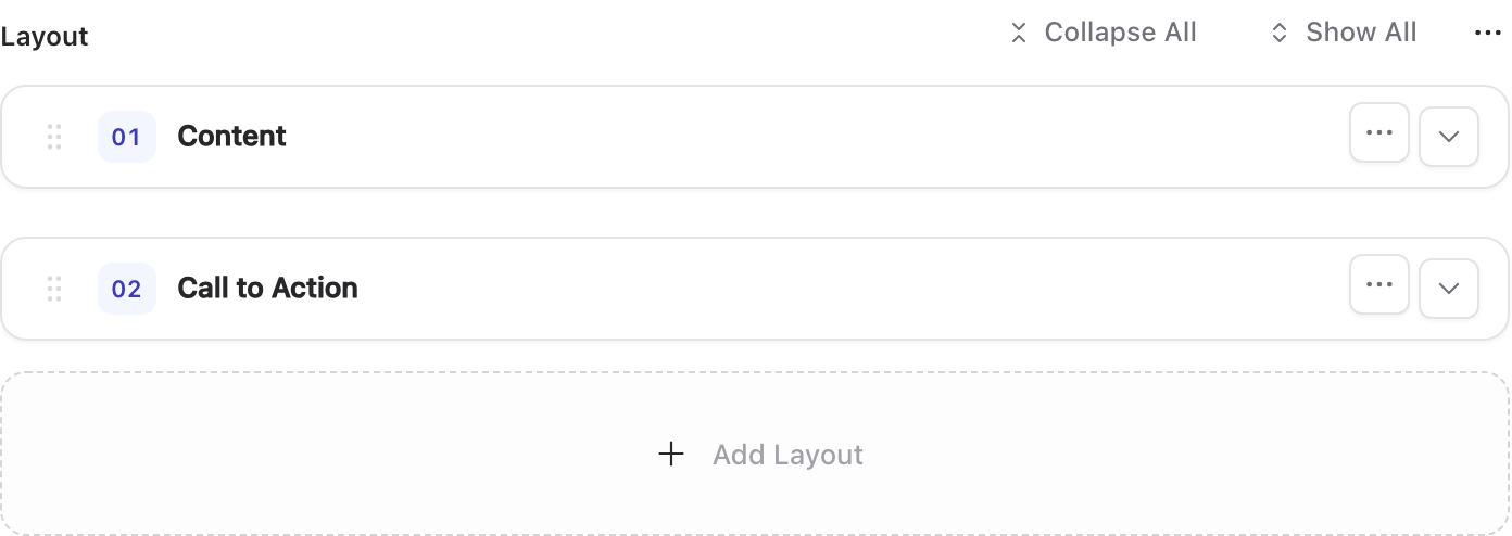
Structured content stops looking like stock Payload. Block and array rows render as one unified list — hairline-divided entries with a muted row number, a per-block-type icon, the block title, and quiet ghost actions. The theme ships icons for common slugs (content, cta, hero); any project block opts in with one CSS custom property:
.blocks-field__block-pill-gallery {
  --pt-block-ico: url("data:image/svg+xml,..."); /* any 24×24 stroke SVG */
}
Adding rows is one consistent gesture everywhere — a full-width dashed bar that lights up in the accent on hover. The block-picker drawer shows shadcn-style cards.
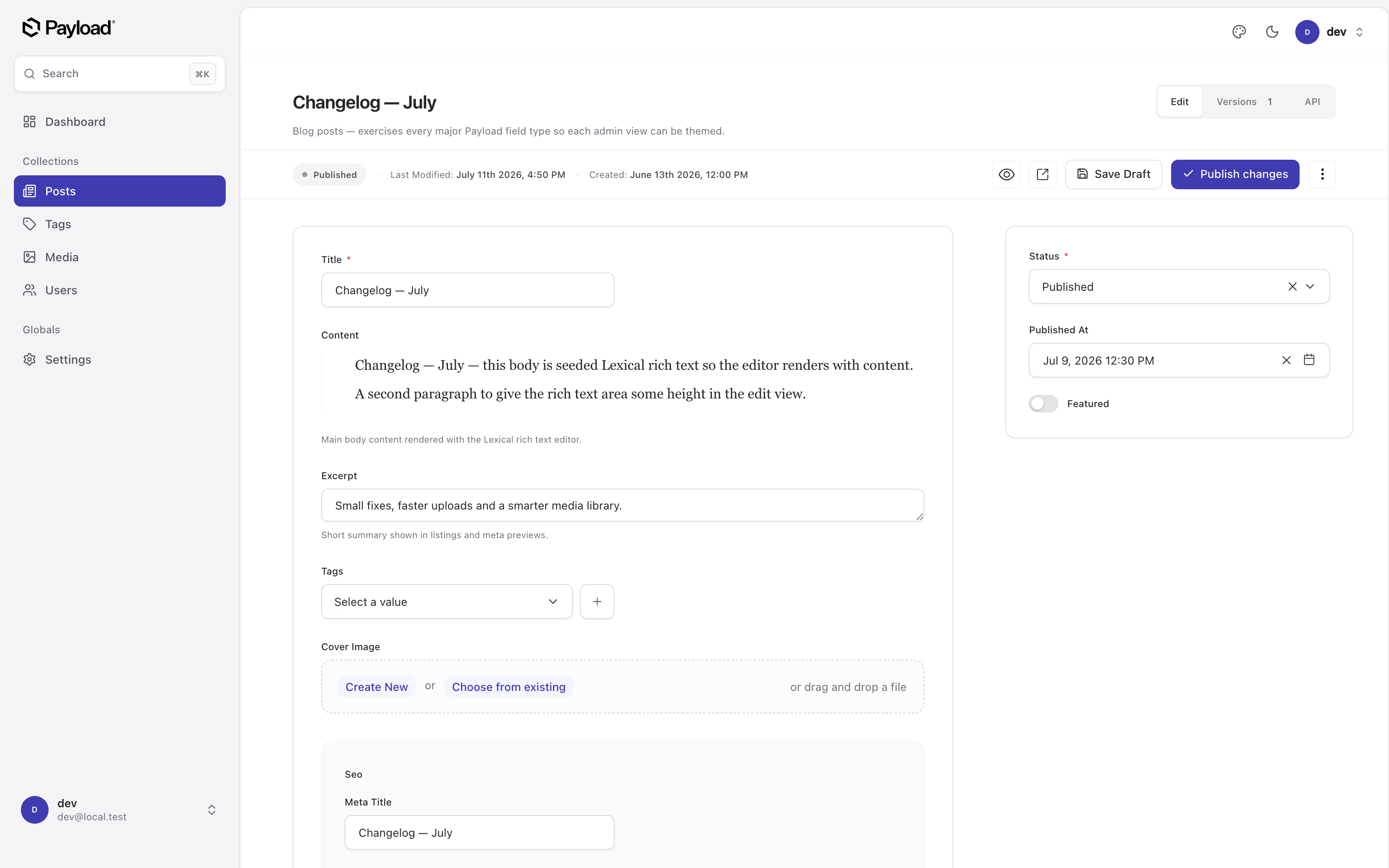
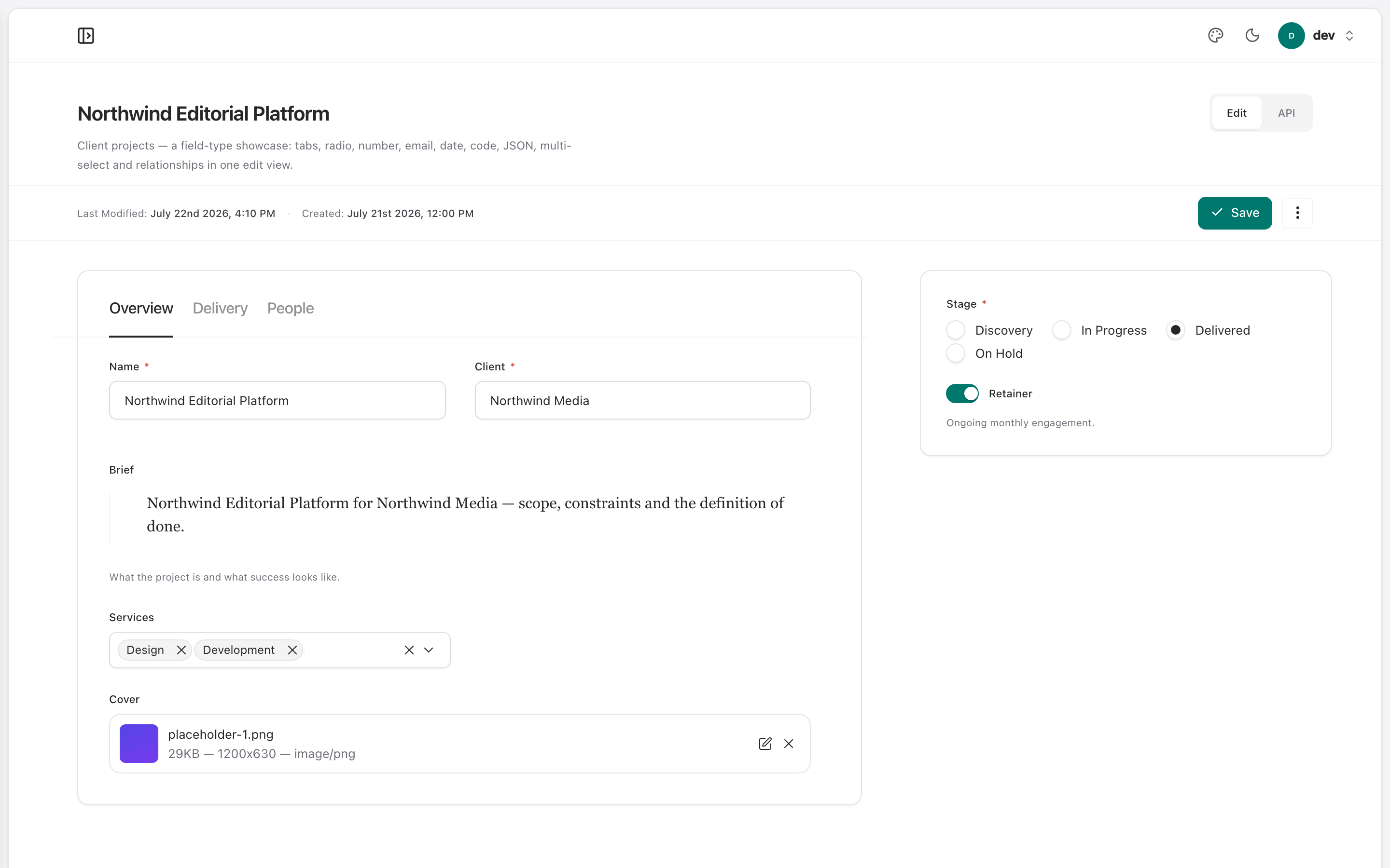
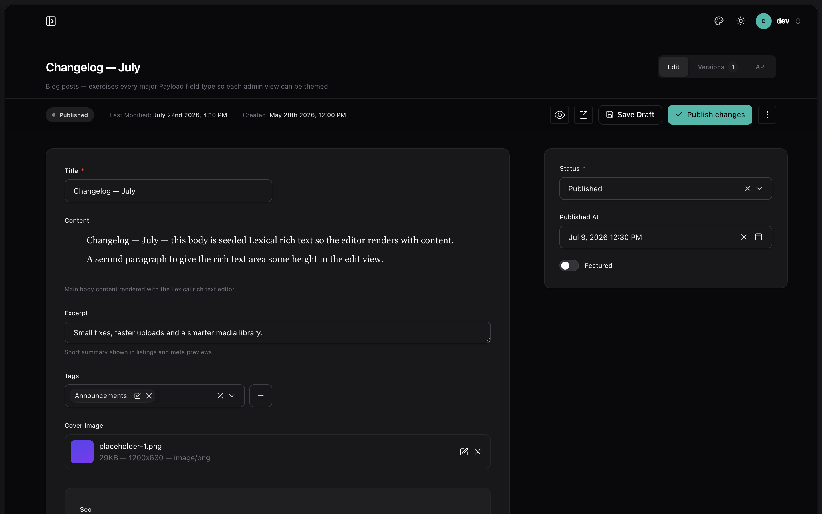
One content card with a two-column field grid: compact fields pair up (Title | Slug), wide surfaces keep the full row, everything stacks below 1024px. Inputs follow the shadcn language (thin borders, accent focus ring), checkboxes render as toggles, top-level groups sit in raised panels, and the sticky action bar — icons on every action — blurs the content scrolling underneath.
Tabs, radio groups, JSON, code editors, date pickers, multi-selects, relationship fields — all themed:
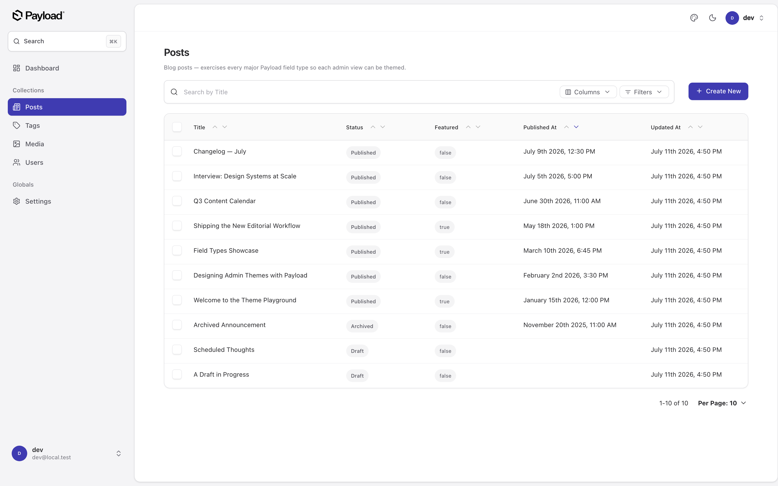
Tables become clean cards under a single-row toolbar — search, Columns/Filters pills and a solid + Create New on one line. Status and boolean values render as always-round neutral badges, and empty collections get an illustrated empty state.
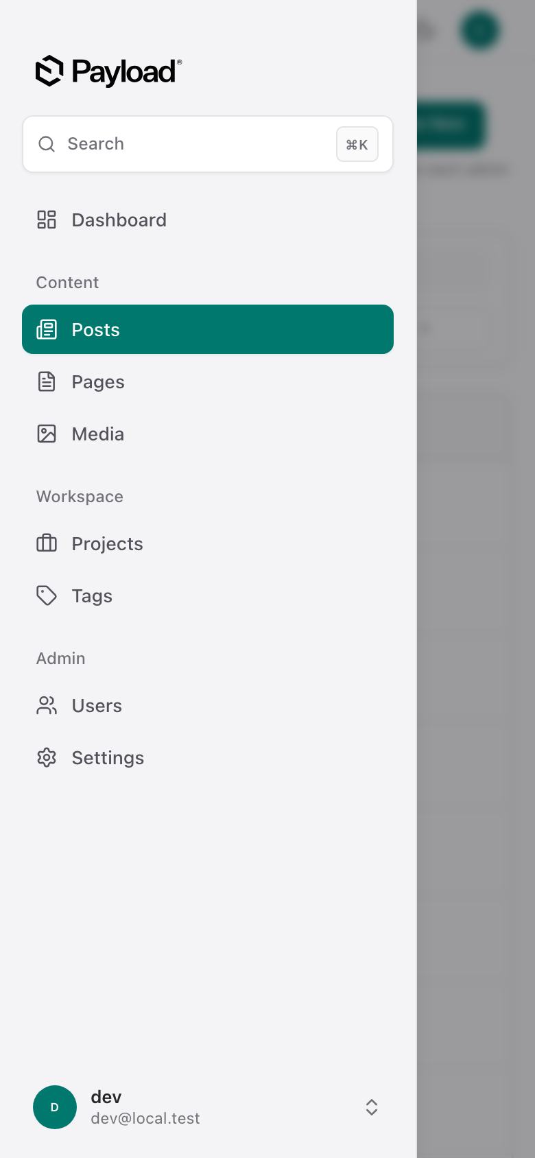
On the phone the panel becomes a product of its own: the sidebar turns into a ~300px drawer sliding over a blurred scrim (tap the scrim to close — no clumsy ✕), the toggler wears the same panel mark as desktop, bulk actions wrap into tidy chip rows, stat cards stack, and edit views keep the exact same card language.
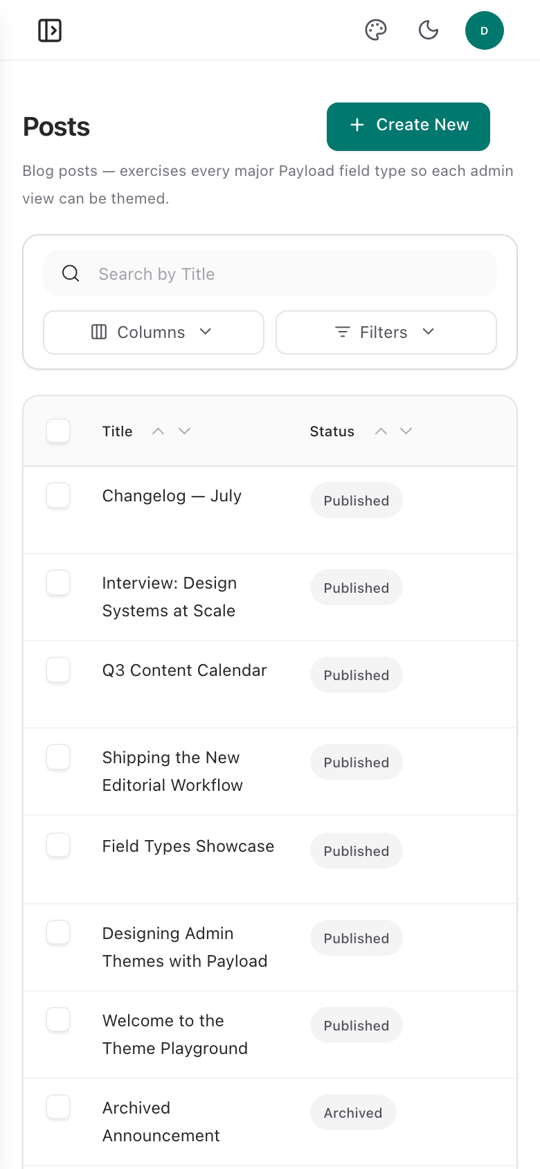
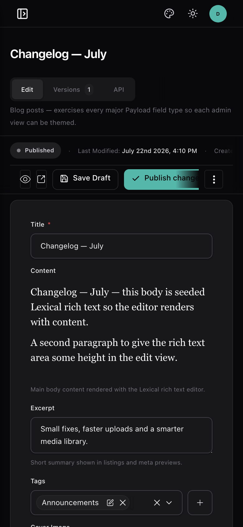
Every surface, badge, card and glow is token-driven. Nested surfaces get lighter as they stack (never darker "wells"), fields inside raised panels sit flat with their borders doing the work, and the accent is remapped so it stays vivid on dark.
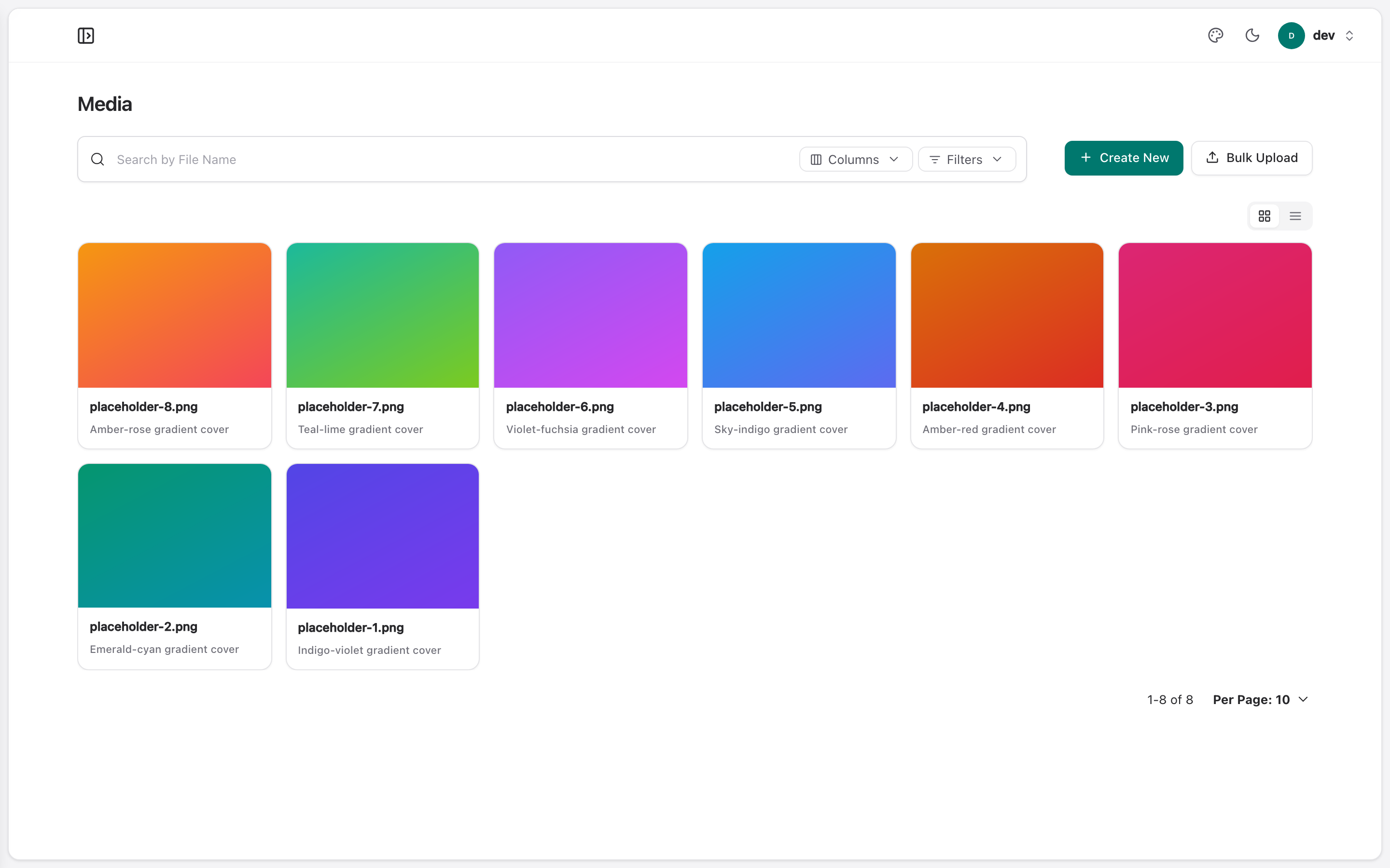
The repo ships a full demo panel — six collections, every field type, block-built pages, a seeded media library:
git clone https://github.com/liderbektas/payload-theme
cd payload-theme && pnpm install && pnpm build
cp dev/.env.example dev/.env
pnpm seed && pnpm dev
Open http://localhost:3000/admin and log in:
| User | Password | Role |
|---|---|---|
dev@local.test |
test1234 |
Admin |
editor@local.test |
test1234 |
Editor |
Play with the header's theme customizer — accent, radius, color mode and layout all apply live.
Everything is optional. This is the full surface:
payloadTheme({
  // The one color that drives everything: buttons, active nav pill,
  // focus rings, selected rows, sparklines, the login glow... Any hex works.
  accent: '#e30613',

  // Corner rounding for the WHOLE panel: 'none' | 'sm' | 'md' | 'lg' | 'full'.
  radius: 'md',

  // Panel typeface: 'inter' | 'geist' (Google Fonts, loaded at runtime),
  // 'helvetica' | 'system' (pure font stacks, no network) — or any custom
  // CSS font-family stack (self-host the @font-face yourself).
  font: 'inter',

  // Your logo — top of the sidebar AND above the login form.
  // A URL, or { light, dark } to swap artwork per color scheme.
  logo: { light: '/logo.svg', dark: '/logo-dark.svg' },

  // Rendered height of the logo: a number in px, or any CSS length.
  logoHeight: 28,

  // Small mark, used as a fallback for the login logo.
  icon: '/mark.svg',

  // Copy on the login brand panel.
  login: {
    heading: 'Welcome back',
    tagline: 'Sign in to manage your content.',
  },

  // Sidebar + dashboard + palette icons per collection/global slug —
  // any icon name from lucide.dev.
  nav: {
    icons: {
      posts: 'newspaper',
      media: 'image',
      users: 'users',
      settings: 'settings',
    },
  },

  // Your own React components below the built-in dashboard content.
  dashboard: {
    widgets: [
      '/components/widgets/StatisticsWidget#StatisticsWidget',
      { component: '/components/widgets/LastLoginWidget#LastLoginWidget', width: 'third' },
    ],
  },

  // Escape hatch: raw --pt-* token overrides, applied last.
  cssVariables: {
    '--pt-radius-card': '10px',
  },
})| Option | Type | Default | What it does |
|---|---|---|---|
accent |
string (hex) |
#4f4ece |
Generates a full 50–950 color scale in OKLCH and colors every interactive element with it. |
radius |
'none' | 'sm' | 'md' | 'lg' | 'full' |
'md' |
Global corner rounding — buttons, inputs, badges, cards, tables, popovers and menu items all follow it. |
font |
'inter' | 'geist' | 'helvetica' | 'system' | string |
Payload's font | Panel typeface. inter/geist load from Google Fonts at runtime; helvetica/system are pure stacks; any other string is used as a custom font-family stack. |
logo |
string | { light, dark } |
Payload logo | Image URL(s) shown at the top of the sidebar and above the login form. |
logoHeight |
number | string |
26 |
Rendered logo height — a number is px, a string is any CSS length. |
icon |
string | { light, dark } |
— | Small mark, used as a login-logo fallback. |
login.heading |
string |
'Welcome back' |
Big heading on the login brand panel. |
login.tagline |
string |
'Sign in to manage your content.' |
Supporting line under the heading. |
nav.icons |
Record<slug, iconName> |
folder icon | Maps collections/globals to lucide icons — sidebar, dashboard cards and palette. |
dashboard.widgets |
DashboardWidget[] |
[] |
Custom components rendered below the built-in dashboard content. |
cssVariables |
Record<string, string> |
— | Escape hatch: override any raw --pt-* token directly. |
The built-in dashboard always renders as-is — widgets are an additional area below it. Point each entry at a React component using Payload's standard import-map path convention:
payloadTheme({
  dashboard: {
    widgets: [
      // string form — 'half' width by default
      '/components/widgets/StatisticsWidget#StatisticsWidget',
      // object form — 'full' | 'half' | 'third'
      { component: '/components/widgets/LastLoginWidget#LastLoginWidget', width: 'third' },
    ],
  },
})
Server components receive the live Payload context as props:
import type { DashboardWidgetServerProps } from 'payload-theme'

export const StatisticsWidget: React.FC<DashboardWidgetServerProps> = async ({ payload, user }) => {
  const drafts = await payload.count({
    collection: 'posts',
    overrideAccess: false,
    user,
    where: { _status: { equals: 'draft' } },
  })
  return <article className="pt-dash__card">…{drafts.totalDocs}…</article>
}
Client components ('use client') receive no props — use Payload's hooks or the REST API. The plugin registers every widget in admin.dependencies, so payload generate:importmap picks them up automatically.
Reuse the theme's card classes (pt-dash__card, pt-dash__card-head, pt-dash__card-label, pt-dash__card-body, pt-dash__card-count, pt-dash__card-caption) if you want your widget to match the built-in stat cards.
- One accent, everywhere — your hex becomes an 11-step OKLCH scale; every interactive element recolors consistently.
- Smart dark mode — the scale is re-mapped for dark (brighter accent step, never a naive inversion).
- Automatic contrast — text on the accent picks black or white by WCAG relative luminance.
- Toggles, not checkboxes — pure CSS; form behavior and accessibility untouched.
- Zero runtime color math — computed once at startup, injected as CSS custom properties. No FOUC, SSR-safe.
- Non-destructive — everything ships in
@layer payload, overriding Payload's defaults without specificity wars or!important. - Zinc foundation — Payload's neutral scale is retargeted to the shadcn zinc ladder, light and dark.
- Icons via CSS masks — glyphs are
currentColormasks; they recolor with every state, accent and scheme. - Runtime restyling — the customizer recomputes the accent scale client-side with the same engine the server uses.
Every token is a plain CSS custom property:
payloadTheme({
  accent: '#0ea5e9',
  cssVariables: {
    '--pt-accent-subtle': 'oklch(0.95 0.03 240)',
  },
})
The important ones: --pt-accent-50 … --pt-accent-950, --pt-accent, --pt-accent-hover, --pt-accent-active, --pt-accent-subtle, --pt-accent-contrast, --pt-accent-ring, plus the radius tokens --pt-radius-ctl, --pt-radius-card, --pt-radius-item, and the per-block icon hook --pt-block-ico.
- Payload 3.x (peer range
^3.0.0; developed and e2e-tested against 3.85) - Next.js 15+, React 19
"Component not found in import map" — run npx payload generate:importmap after installing, then restart the dev server.
Styles not applying — make sure @import 'payload-theme/styles.css'; is in src/app/(payload)/custom.scss.
Theme changes not showing in dev — Turbopack caches aggressively; delete your app's .next folder and restart.
Invalid accent color: '…' — the accent must be a hex string like #7c3aed.
MIT © Lider Bektaş
Found a bug or want a feature? Issues and PRs welcome.
packages/payload-theme   the plugin (published to npm)
dev                      a Payload 3 playground app that consumes it
docs                     README screenshots
pnpm install
pnpm build          # build the plugin
pnpm seed           # seed the playground with demo content
pnpm dev            # start the playground at http://localhost:3000/admin
pnpm test           # unit + integration tests
pnpm lint           # eslint across the repo
pnpm --filter dev test:e2e     # Playwright against the real admin panel
pnpm --filter dev test:visual  # screenshot regression suite
See CONTRIBUTING.md for the full guide and CHANGELOG.md for history.