Restyle the player profile as stacked sections - #1397
Merged
Merged
Conversation


Each group is now a labelled section above a bordered card at every
width, with Game Info's row styling. The duplicate Tier row is gone,
long names truncate, the game-detail panel gets the same padding as its
siblings, and both screens show a matching skeleton while loading.

Co-Authored-By: Claude Opus 5.5 <noreply@anthropic.com>
Claude-Session: https://claude.ai/code/session_01LPurUZYutz4eEQgBrgLwYH

Contributor
Screenshot diff24 screens changed of 276 captured. Each image is three panels left to right: base, this PR, difference. Click to view full size. player-profile__active-build__desktop — 5,897 px (0.576%)player-profile__active-civil-disorder__desktop — 5,897 px (0.576%)player-profile__active-draw-proposal__desktop — 5,897 px (0.576%)player-profile__active-eliminated__desktop — 5,897 px (0.576%)player-profile__active-game-master-chat__desktop — 5,897 px (0.576%)player-profile__active-movement__desktop — 5,897 px (0.576%)player-profile__active-named-coast__desktop — 5,897 px (0.576%)player-profile__active-retreat__desktop — 5,897 px (0.576%)player-profile__active-seat-open__desktop — 5,897 px (0.576%)player-profile__finished-draw__desktop — 5,897 px (0.576%)player-profile__finished-solo__desktop — 5,897 px (0.576%)player-profile__active-build__mobile — 5,892 px (1.79%)player-profile__active-civil-disorder__mobile — 5,892 px (1.79%)player-profile__active-draw-proposal__mobile — 5,892 px (1.79%)player-profile__active-eliminated__mobile — 5,892 px (1.79%)player-profile__active-game-master-chat__mobile — 5,892 px (1.79%)player-profile__active-movement__mobile — 5,892 px (1.79%)player-profile__active-named-coast__mobile — 5,892 px (1.79%)player-profile__active-retreat__mobile — 5,892 px (1.79%)player-profile__active-seat-open__mobile — 5,892 px (1.79%)4 further changed screens
|
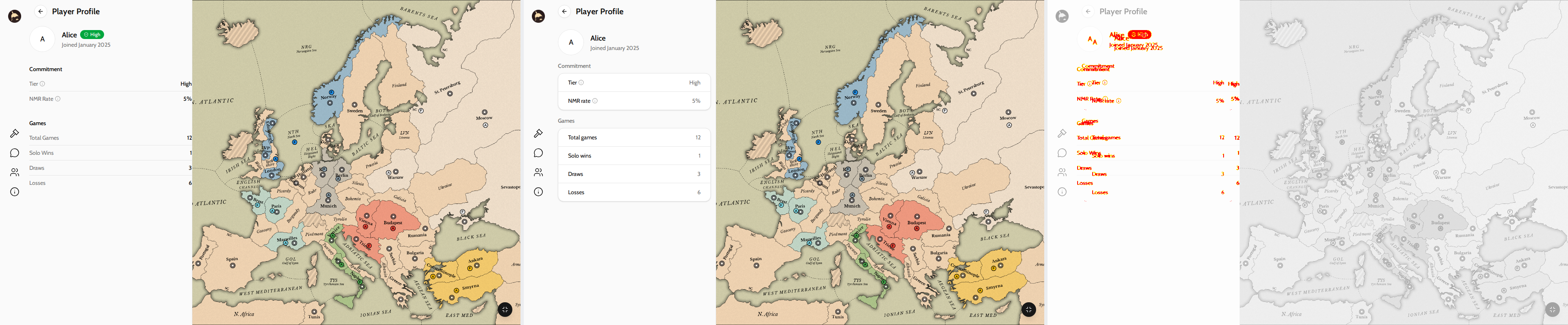
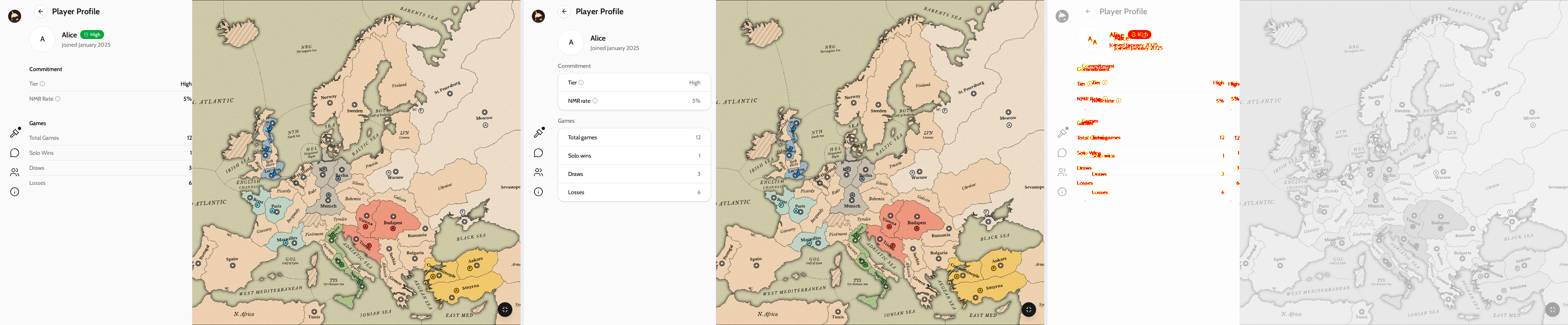
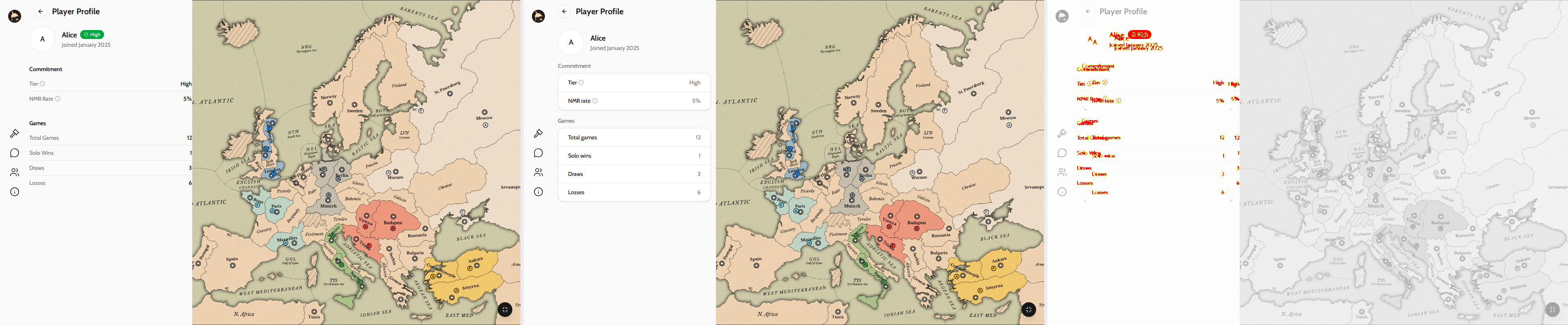
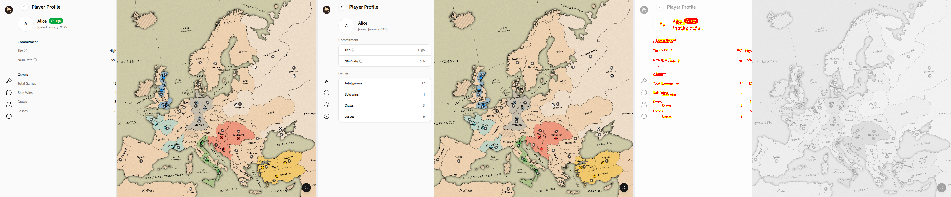
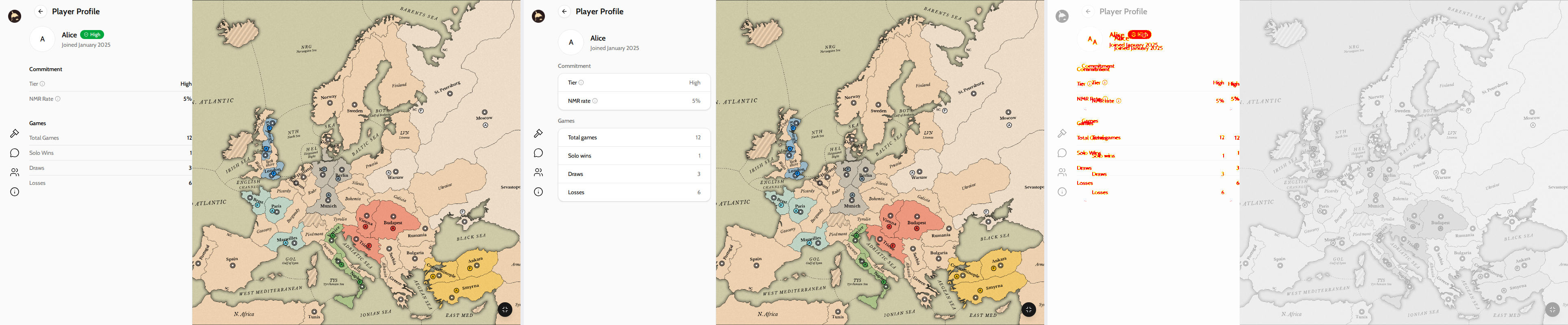
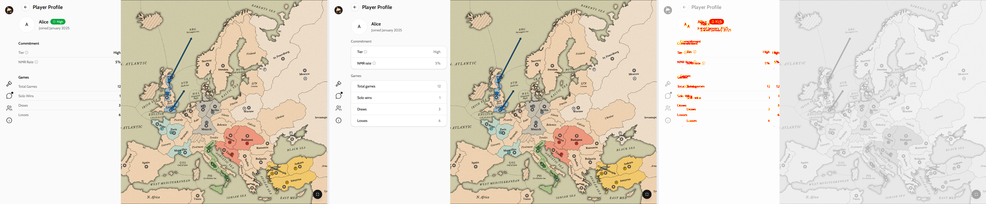
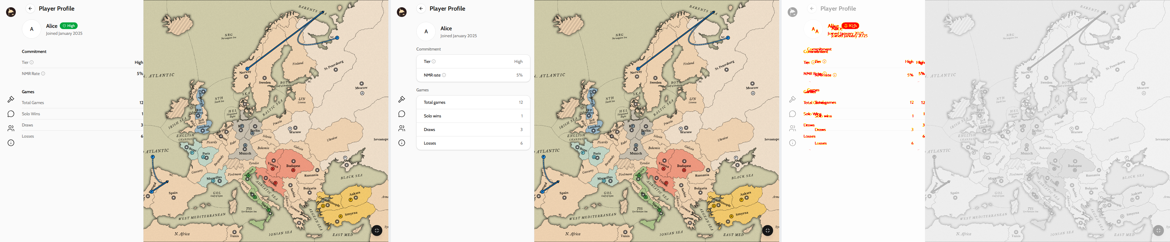
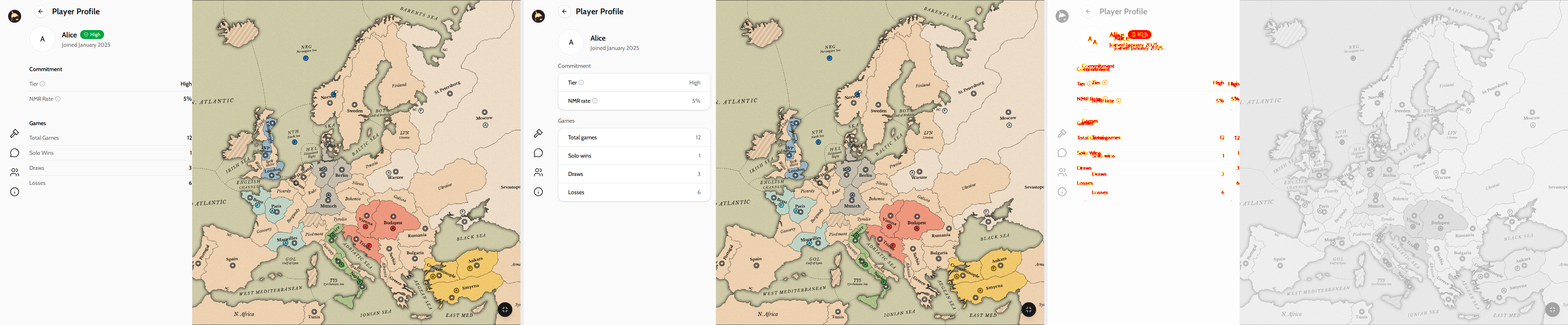
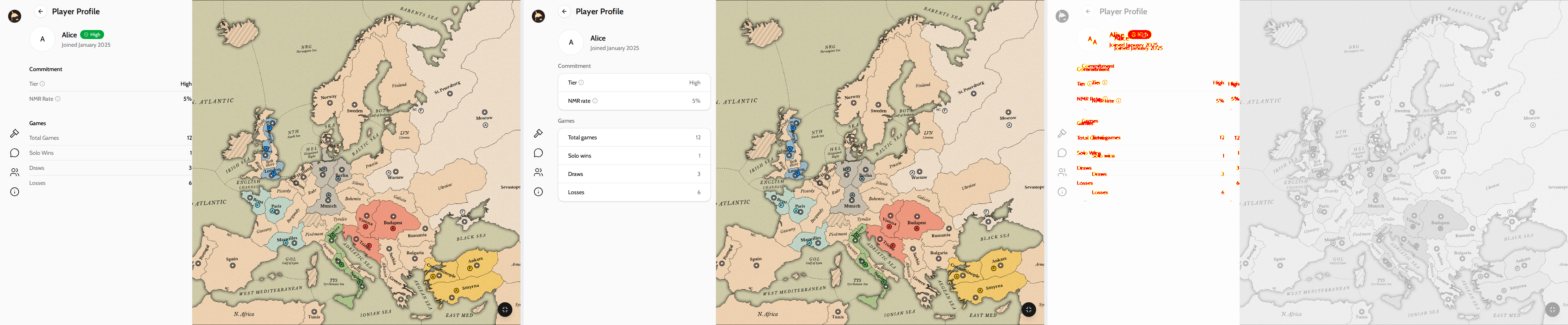
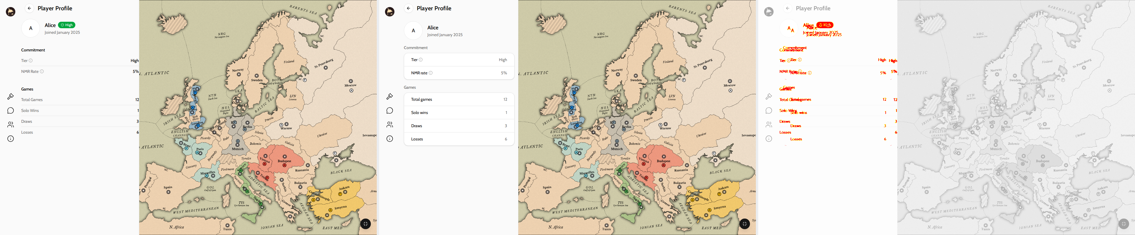
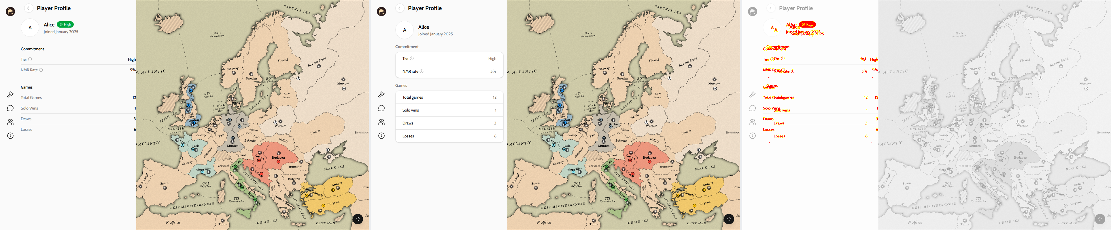
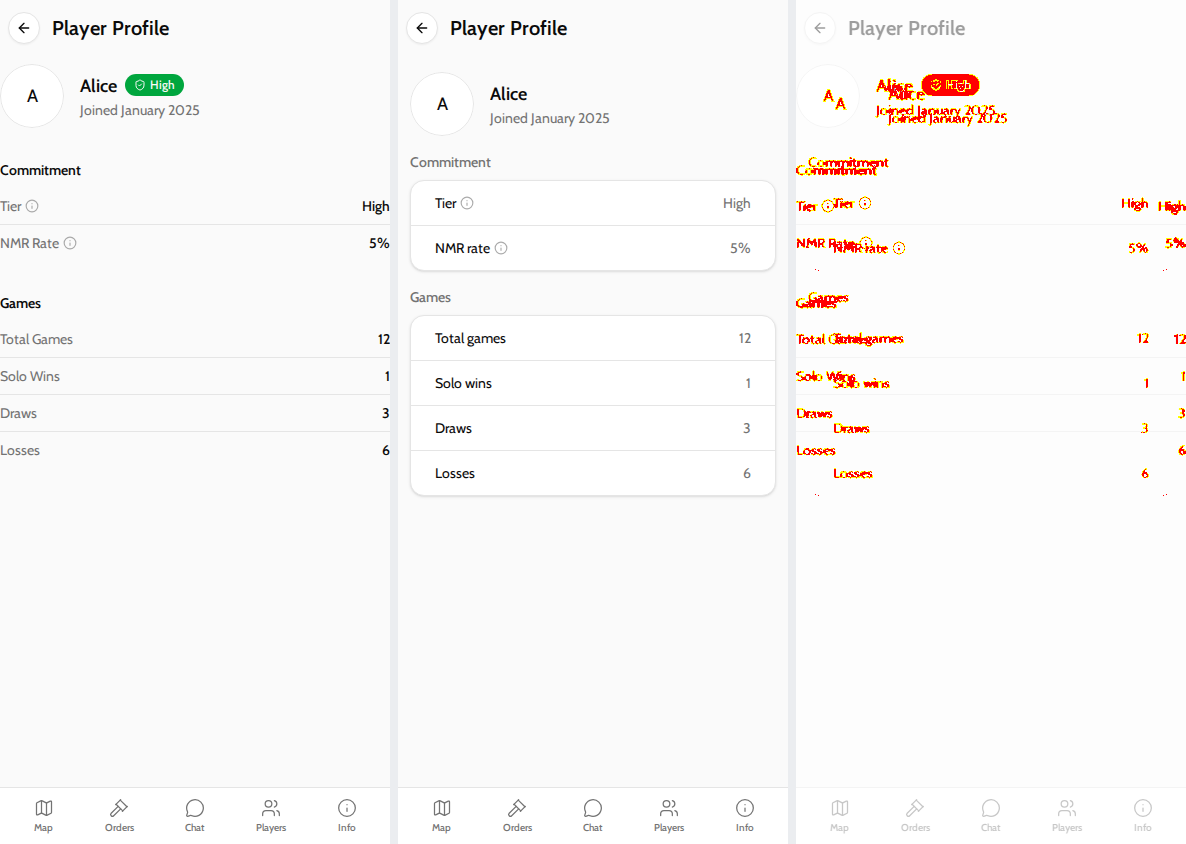
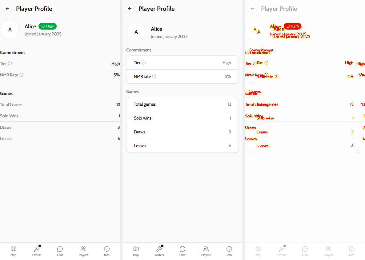
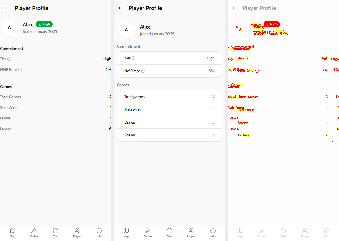
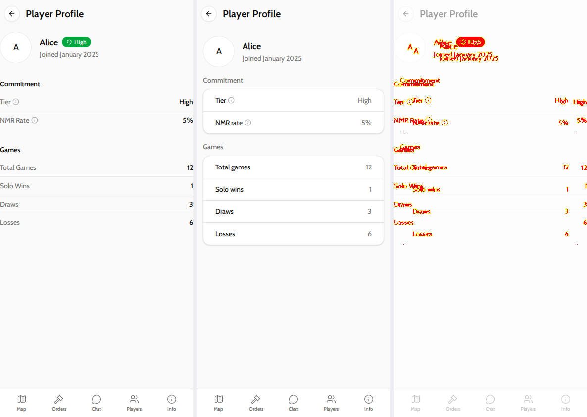
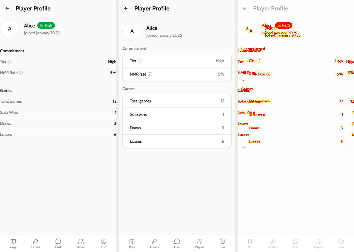
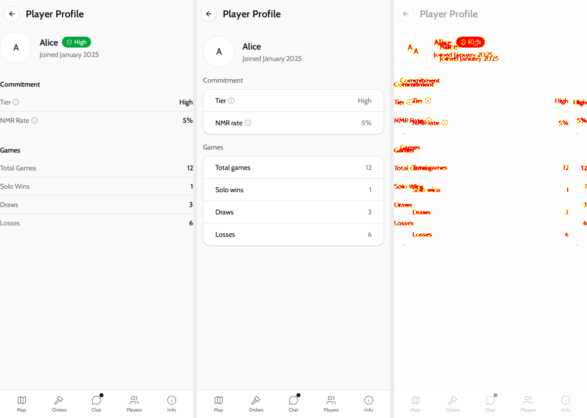
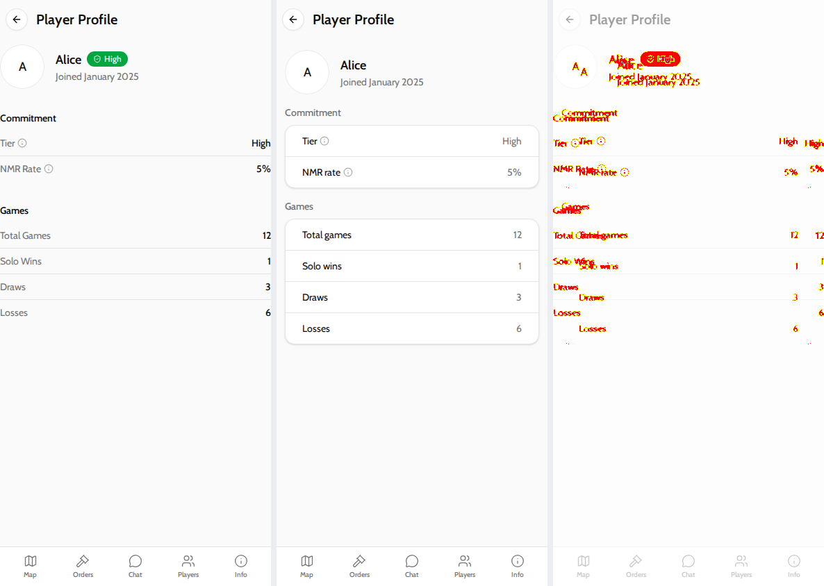
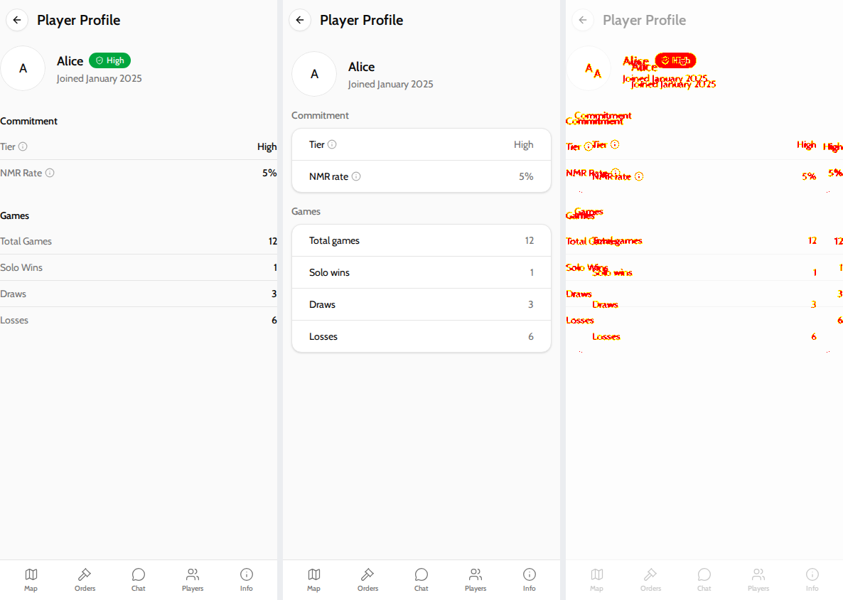
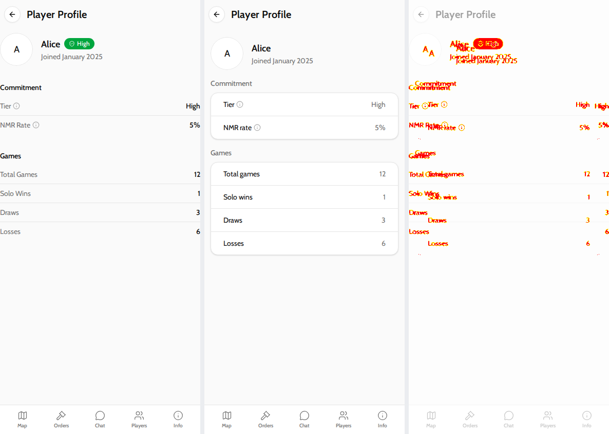
The badge next to the player's name is gone; the tier now sits in the
Commitment card above NMR rate, with an info popover explaining it.
CommitmentBadge had no other callers, so it is removed and the tier
labels are inlined into the profile.

Co-Authored-By: Claude Opus 5.5 <noreply@anthropic.com>
Claude-Session: https://claude.ai/code/session_01LPurUZYutz4eEQgBrgLwYH

This file contains hidden or bidirectional Unicode text that may be interpreted or compiled differently than what appears below. To review, open the file in an editor that reveals hidden Unicode characters.
Learn more about bidirectional Unicode characters
Sign up for free
to join this conversation on GitHub.
Already have an account?
Sign in to comment
2 participants


Add this suggestion to a batch that can be applied as a single commit.This suggestion is invalid because no changes were made to the code.Suggestions cannot be applied while the pull request is closed.Suggestions cannot be applied while viewing a subset of changes.Only one suggestion per line can be applied in a batch.Add this suggestion to a batch that can be applied as a single commit.Applying suggestions on deleted lines is not supported.You must change the existing code in this line in order to create a valid suggestion.Outdated suggestions cannot be applied.This suggestion has been applied or marked resolved.Suggestions cannot be applied from pending reviews.Suggestions cannot be applied on multi-line comments.Suggestions cannot be applied while the pull request is queued to merge.Suggestion cannot be applied right now. Please check back later.
What this PR does
Restyles
PlayerProfileContentto match the stacked-sections pattern from the Game Info prototype. The code is rewritten insidepackages/web; nothing is imported from the playground. Both screens that use it are covered: Home/player/:idand game detail/game/:id/phase/:id/player/:id.<section>with a mutedtext-sm font-mediumlabel above a borderedCard(overflow-hidden py-0/CardContent flex flex-col divide-y p-0). The card has its border at every width, so rows no longer float on the page below 500px the way they did withScreenCard.text-sm text-muted-foreground truncate. This matches Game Info and reverses the old muted-label/bold-value styling. The info button uses-m-2 p-2so it has a bigger tap target. Labels are sentence case ("NMR rate", "Total games"). I didn't add leading icons.undefinedit says the player hasn't played enough rated phases yet.CommitmentBadgehad no other callers, so it and its test are deleted and the tier labels are inlined inPlayerProfileContent.PlayerProfileContentSkeletoninstead of<div></div>. The skeleton uses the sameSection/StatRowstructure. With a 4s delay on the mock, I measured every section and row box before and after the swap: they are identical at 390px and 1280px on both screens. On game detail theSuspensenow wraps only the content, so the app bar stays visible while loading.About the clipped values
I could not reproduce "Hig" / "0%" / "28" on the Home screen. I measured every value's bounding box in headless Chromium at widths from 320 to 1024px, including with mobile emulation, and no value crossed its container. What I did find:
PlayerProfileScreenhad a bare<Panel.Content>with no padding. Its sibling screens usepx-3 py-4(GameInfoScreen.tsx:66,PlayerInfoScreen.tsx:43). The values ended at exactly x=390 of a 390px viewport, and on desktop they ran into the map's border, so any bezel, rounded corner or overlay scrollbar cuts them off. This PR adds the samepx-3 py-4.HomeLayout'spx-2(8px), becauseScreenCardContentispx-0at that width. The new card rows havepx-6inside a bordered card, so values now sit 32px from the edge at every width.If the clipping you saw was in the native app, those two narrow insets are the most likely cause. I haven't verified that on a device.
Screenshots
From the Screenshot Diff run on the latest commit. Each image shows three panels, left to right: base, this PR, difference. The Home screen is
/player/:idand the game-detail screen is/game/:id/phase/:id/player/:id. The game-detail screen changed the same way for every game fixture, so only one fixture is shown here. The full set is in the Screenshot Diff comment.Home, mobile (390px)
<img src="https://pr-1397-36317364663--diplicity-screenshot-diff.netlify.app/player-profile__mobile.png" width="960" alt="player-profile__mobile">Home, desktop
<img src="https://pr-1397-36317364663--diplicity-screenshot-diff.netlify.app/player-profile__desktop.png" width="960" alt="player-profile__desktop">Game detail, mobile (390px)
<img src="https://pr-1397-36317364663--diplicity-screenshot-diff.netlify.app/player-profile__active-movement__mobile.png" width="960" alt="player-profile__active-movement__mobile">Game detail, desktop
<img src="https://pr-1397-36317364663--diplicity-screenshot-diff.netlify.app/player-profile__active-movement__desktop.png" width="960" alt="player-profile__active-movement__desktop">Checklist
/review-pragainst this PR in Claude Code and addressed (or responded to) its findingsPlayerProfileContent.test.tsx(there were no existing tests for this component).npm run lint,npx tsc -b --noEmitandnpm run test(776 tests) all pass.🤖 Generated with Claude Code
https://claude.ai/code/session_01LPurUZYutz4eEQgBrgLwYH
Generated by Claude Code
Generated by Claude Code