

A multi-timezone timeline for React. Render the day as horizontal timelines — one per time zone — and drag a shared time interval across them to plan meetings, hand-offs, or focus blocks that work for everyone.
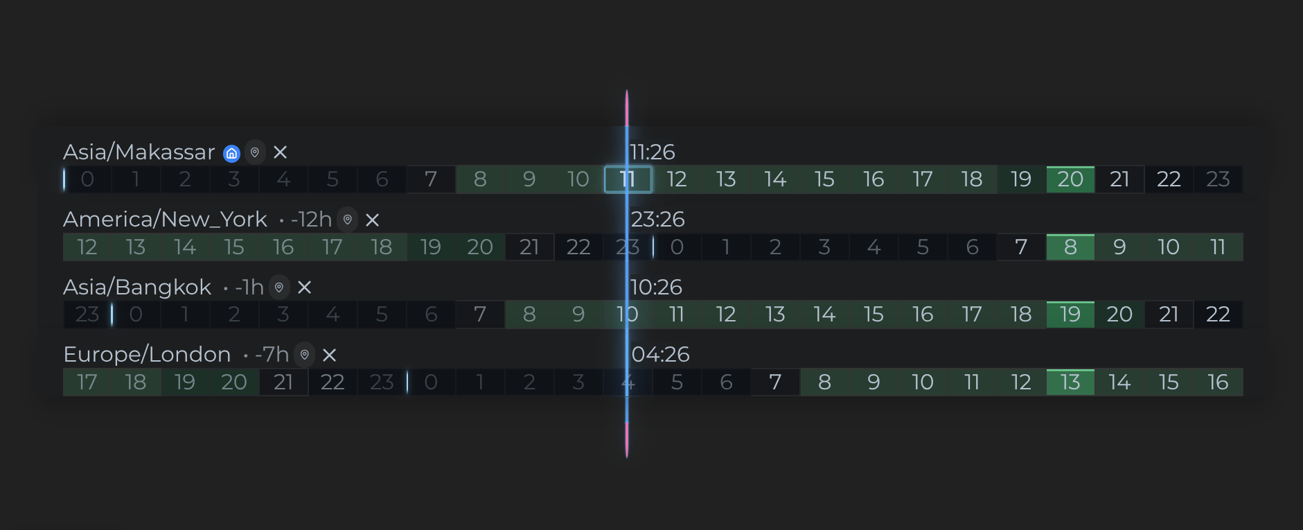
Extracted from (and battle-tested in) SyncContact, where it powers the Time Zones view.
Live demo: https://synccontact.com/timespace · embed sandbox: https://synccontact.com/timespace-embed · or embed it anywhere with one script tag (see Embedding).
- One row per time zone with hour ticks, live clocks, and a glowing "now" hand that moves through the day.
- Drag to scroll through time: grab the hour strip and pan horizontally —
the 24h window scrolls in one-hour steps and stays exactly where you drop
it, across as many days as you like. A floating pill shows the window-start
date and offset (
+3h,-1d 4h) with ‹ › day-align and Today controls; state lives intzState.viewOffsetHours. - Draggable time intervals: resize either endpoint, or drag the duration
arrow to move the whole range. Snapping: default to a configurable step,
Ctrl/Cmdfor 1s,Shiftfor 5 minutes. - Collision-resolved labels: floating clock labels and row names automatically flip sides, stack, and scale so they never overlap — driven by a deterministic, unit-tested collision resolver.
- Row reordering via native HTML5 drag & drop with a ghost preview.
- Time-zone deltas ("+7h" relative to home or local zone), home-zone marker, timezone abbreviations, optional seconds.
- Availability windows on each row, with stronger highlighting wherever the declared windows overlap across time zones.
- Slots for host-app integration: render your own items on a line (contacts, avatars…), your own place picker, and hook interval scheduling into your calendar flow.
- Ships with a default theme and works with no providers beyond its own.
Available on npm: https://www.npmjs.com/package/react-timespace
npm install react-timespaceyarn add react-timespacepnpm add react-timespaceReact 18+ is a peer dependency. Styling uses Emotion (bundled as a regular dependency — your app does not need to use Emotion).
The package ships as ESM only, pre-built and ready for any bundler (Vite,
webpack, Next.js, Rspack, Parcel). Every component is client-side, so the
build carries a "use client" banner for React Server Component setups.
require() works from Node 22.12 on.
TypeScript declarations ship with the package — no @types/… install (see
TypeScript).
import { Timespace, TimespaceProvider, setTimelines } from "react-timespace";
import { useContext, useEffect } from "react";
import { TimeZonesContext } from "react-timespace";

function Zones() {
  const { tzDispatch } = useContext(TimeZonesContext);

  useEffect(() => {
    tzDispatch(
      setTimelines([
        {
          id: "nyc",
          orderId: 0,
          name: "New York",
          timeZone: "America/New_York",
          availability: { start: "08:00", end: "21:00" },
        },
        { id: "berlin", orderId: 1, name: "Berlin", timeZone: "Europe/Berlin" },
        {
          id: "bangkok",
          orderId: 2,
          name: "Bangkok",
          timeZone: "Asia/Bangkok",
        },
      ]),
    );
  }, []);

  return <Timespace />;
}

export default function App() {
  return (
    <TimespaceProvider>
      <div style={{ height: 400 }}>
        <Zones />
      </div>
    </TimespaceProvider>
  );
}
State lives in TimespaceProvider (a plain React context + reducer). Your
app reads and writes it with the exported actions (setTimelines,
addTimeline, updateTimeline, deleteTimeline, addTimeInterval, …)
through tzDispatch from TimeZonesContext.
Add an availability window to any timeline. Times are local to that
timeline's timeZone and use HH:mm (24-hour) notation:
{
  id: "berlin",
  name: "Berlin",
  timeZone: "Europe/Berlin",
  availability: { start: "08:00", end: "21:00" }
}
Multiple windows and overnight windows are supported:
availability: [
  { start: "08:30", end: "12:00" },
  { start: "13:00", end: "17:30" },
  { start: "22:00", end: "02:00" },
];
Each row's available time is shaded green. When two or more rows declare
availability, the instants shared by every declared window receive a stronger
highlight. Timelines without an availability value do not participate in the
overlap calculation.
| Prop | Type | Purpose |
|---|---|---|
renderLineItems(timeLine) |
slot | Render custom content on a row (e.g. people pinned to that zone) |
getLineHighlight(timeLine) |
fn → "focus" | "dim" | null |
Emphasize/de-emphasize rows |
renderPlaceSelector({ timeLine, height, onSelect, onBlur }) |
slot | Replace the built-in time-zone select with your own place search |
handleAddTimelinePlace(timeLine, option) |
callback | Persist a picked place; omit to let the built-in select update state directly |
handleDeleteTimeline(timeLine) |
callback | Row delete button handler |
onSetTimelinesOrder() |
callback | Fires after a reorder drag settles — read the new order from timeLines on the context |
onAddCalendarEvent(timeInterval) |
callback | Show the calendar button on intervals and handle scheduling |
formatDuration(seconds) |
fn → string | Override the "1h 30m" duration formatting (i18n) |
showTimezoneAbbreviation / showSeconds |
bool | Display options (default to localStorage-backed settings) |
deltaBase |
"home" | "local" |
Base zone for the per-row +7h delta labels |
theme (via Emotion ThemeProvider) |
object | Override defaultTimespaceTheme keys (uiScale, mode, color.intervalHandBody, size.*) |
portalContainer |
element | Host element for the row-drag ghost overlay |
recomputeCollisionsKey |
number | Bump to force a collision/layout recompute after external changes |
Three tiers, pick how deep you want to go:
1. Predefined themes — zero setup. Pass a preset name (or a preset/flat theme object) straight to the component:
<Timespace theme="dracula" themeMode="light" />Presets ship in the package: default, dracula, draculaV, terminal,
solarized, solarizedArrakis, monokai, oneDark, gruvbox, nord,
tomorrow, palenight, nightOwl, material, cobalt2. The registry is
exported as themePresets, and resolveTheme(nameOrObject, { mode }) gives
you the flat theme object if you want to feed your own Emotion
ThemeProvider.
2. TimespaceThemeProvider — persisted selection. Wraps your tree in an
Emotion theme composed from the selected preset, the user's saved themes and
the unsaved draft, all persisted in localStorage (themeName, themeMode,
localThemes, newTheme):
import { TimespaceThemeProvider } from "react-timespace";

<TimespaceThemeProvider>
  <Timespace />
</TimespaceThemeProvider>;
Props: themes (extend/override the preset registry), forceThemeMode
("light" | "dark"), defaultFont.
3. Theme configurator — the full editor. An opt-in UI (separate import, never bundled unless you use it) with preset picker + hover preview, light/dark toggle, Google-Font combobox, per-color editors with hex/alpha inputs, timeline sizing sliders, background fill, and save/rename/delete of user themes:
import ThemeConfig from "react-timespace/theme-config";

<TimespaceThemeProvider>
  <Timespace />
  <ThemeConfig />
</TimespaceThemeProvider>;
ThemeConfig props:
| Prop | Purpose |
|---|---|
excludedThemeNames |
Hide presets from the picker |
showTimespaceRenderingControls |
Hide the Time Zones appearance tab (sizing, marker and color controls) |
colorLabels |
Labels for extra color keys your themes carry (unknown keys render with their raw name) |
components |
Host slots: { Select, Input, GradientPicker, ImagePicker } — gradient/image background fills appear only when the matching slot is provided |
The configurator styles itself with --tsc-* design tokens that read your
app's CSS variables first (--text, --background-brand-bold, …) and fall
back to sensible mode-aware defaults, so it drops into any app.
Declarations ship in the package, for both entry points:
import { Timespace, setTimelines } from "react-timespace";
import type { TimeLine, TimeInterval, TimespaceProps } from "react-timespace";
import ThemeConfig from "react-timespace/theme-config";
They resolve under bundler, node16 and nodenext module resolution.
The runtime is JavaScript with prop-types, so the .d.ts files are
hand-written rather than generated. npm run typecheck compiles them against
types/smoke.tsx, which imports every public export the way a consumer would —
so a signature that drifts from the implementation fails the build before
publish.
Exported types cover the resources (TimeLine, TimeInterval,
Availability), the component and slot signatures (TimespaceProps,
PlaceSelectorArgs, LineHighlight, TimeZoneOption), state
(TimeZonesState, TimeZonesContextValue, TimeZonesClockContextValue,
TimeZoneClock), theming (TimespaceTheme, ThemePreset, ThemeMode) and
availability (AvailabilityCell, AvailabilitySegment).
TimeLine and TimeInterval carry an index signature: the reducer stores
resources verbatim, so host apps can hang their own fields off a row without
casting.
Emotion's Theme is deliberately left alone — augment it in your own app if
you want useTheme() to know about the Timespace keys:
import type { TimespaceTheme } from "react-timespace";

declare module "@emotion/react" {
  export interface Theme extends TimespaceTheme {}
}Don't use React? Drop the hosted widget into any page. There's a sandbox at synccontact.com/timespace-embed to play with the attributes below before you paste anything into your own page:
<script
  src="https://synccontact.com/timespace/embed.js"
  data-zones="Europe/Berlin,America/New_York,Asia/Bangkok"
  data-theme="dark"
  defer
></script>
The loader injects an iframe right after the script tag and keeps its height
in sync. Attributes: data-zones (comma-separated IANA ids), data-theme
(light | dark), data-height (initial px height), data-zen (0 to
opt out of Zen mode).
The embed renders in Zen mode: just the timelines, no controls row and no
per-row extras. Dragging intervals and rows still works — it's the chrome
that's gone, on the assumption a widget on someone else's page should look
like part of that page. data-zen="0" restores the add-zone/add-interval
buttons and the drag hint.
The attribution sits in the bottom corner, dimmed until hovered, next to a
small toggle that lets a visitor bring the controls up for themselves. The
toggle is view-only state — a reload returns the embed to whatever data-zen
says.
npm install        # package deps + build/test tooling
npm test           # pure-core unit tests
npm run typecheck  # compile the hand-written .d.ts against types/smoke.tsx
npm run build      # bundle the package into dist/ (what npm publishes)
cd demo && npm install && npm run dev   # local playground on vite
npm run build also copies index.d.ts and theme-config/index.d.ts into
dist/ under the flat names the bundle uses. The other .d.ts files in the
tree type the source-only subpaths (./theming, ./tzOptions, ./state/*)
for linked checkouts; they aren't part of the tarball.
The demo resolves react-timespace to the sources next to it, not to
dist/, so there is no build step between an edit and the playground.
The hosted playground lives at
synccontact.com/timespace; demo/ is
the same experience for local development against your working copy.
The interesting parts — the px ↔ seconds coordinate system, the label
collision resolver, and the drag machinery — are documented in
ARCHITECTURE.md. The pure math lives in core/ and is
unit-tested (npm test).
For the story behind the implementation, including the failed approaches and state-management trade-offs, read I needed a collision engine for a React timeline. Here is how I built it.
Issues and PRs welcome.