🇬🇧 English | 🇷🇺 Русский


@gromlab/svg-sprites is a CLI tool for generating SVG sprites in modern web applications. It combines selected SVG icons into one or more external, cacheable sprites and prepares them for use in the UI.
Each exact mode generates a native typed component for its framework and bundler: Web Component, React, Vue, Svelte, Angular, Astro, Solid, Preact, Qwik, Lit, or Alpine.js. In every case, the SVG remains a separate cacheable asset.
One typed React component is generated for the entire sprite. Choose an icon with the icon prop, and your editor will autocomplete every available name.
<AppIcon icon="search" width={24} height={24} />The component accepts familiar SVG attributes: dimensions, color, className, style, aria-*, and event handlers. If you need an outer container, add wrapped.
<AppIcon icon="search" wrapped className="iconWrapper" />You do not have to work with the sprite directly in your application. Use it like a regular SVG icon while benefiting from a single component, autocomplete, and TypeScript validation for every name.
@gromlab/svg-sprites is designed to work with AI agents from the start. Add the ready-made skill and ask an agent to configure, migrate, or troubleshoot the package without lengthy instructions or manual documentation research.
🇬🇧 Download AI skill (English)
🇷🇺 Download AI skill (Russian)
The main example uses the Next.js App Router and Turbopack.
Create directories for the source icons and the sprite:
assets/
├── app-icons/
│   └── svg-sprite.config.json
└── svg-icons/
    ├── search.svg
    └── settings.svg
Create the sprite configuration:
{
  "mode": "next@app/turbopack",
  "name": "app",
  "input": "../svg-icons/**/*.svg"
}
input supports directory paths, individual SVG files, and glob patterns.
{
  "scripts": {
    "sprites": "npx --yes @gromlab/svg-sprites assets/app-icons/svg-sprite.config.json",
    "predev": "npm run sprites",
    "prebuild": "npm run sprites"
  }
}
Create an entry point for the generated API:
// assets/app-icons/index.ts
export * from './.svg-sprite/index.js'
First run:
npm run spritesThe package will generate AppIcon, TypeScript types, and a separate SVG sprite.
// app/page.tsx
import { AppIcon } from '../assets/app-icons'

export default function SearchButton() {
  return (
    <button type="button">
      <AppIcon icon="search" width={20} height={20} />
      Search
    </button>
  )
}
This is a Server Component. The icon does not require a provider, 'use client', or manual URL construction.
Each sprite gets its own ready-to-use component. The icon prop is derived from the actual SVG names, so your editor shows the exact list of available icons and TypeScript catches typos immediately.
<AppIcon icon="search" />  // available icon
<AppIcon icon="serach" />  // TypeScript error
After you add a new SVG icon and run generation again, its name automatically appears in the types and autocomplete. There is no need to maintain components, union types, or a name registry manually.
Generated components work in Server Components, SSR, and SSG without 'use client'.
Using an icon does not turn the page into a Client Component, require a provider, or create an additional hydration boundary.
The same component can be used in page.tsx, layout.tsx, and both server and client components.
Your project is not limited to a single icon set. Create independent sprites for shared elements, individual pages, and large UI modules.
<AppIcon icon="search" />
<AnalyticsIcon icon="chart" />
<EditorIcon icon="bold" />
Each set gets its own typed component and SVG asset, so application sections do not load icons they do not need.
Each SVG icon is stored once in the source library and can be included in any number of sprites. Shared icons do not need to be copied between pages and modules: a single source updates every set.
search.svg ─┬─→ AppIcon
            ├─→ AnalyticsIcon
            └─→ EditorIcon
Sprites are split for performance, while the source icon library remains unified.
With a standard Vite, Webpack, or Next.js configuration, each sprite is emitted as a separate versioned SVG file.
As long as the icon set does not change, the browser can reuse its cached copy independently of JavaScript application updates.
Changes to React components do not require downloading the geometry of every icon again.
Icon paths remain in external SVG assets and do not add to application chunks.
React code  → JavaScript chunks
SVG icons   → separate SVG assets
JavaScript handles the interface and behavior, while graphics are loaded and cached separately.
During generation, the package automatically prepares source SVG files for use in the UI:
- removes fixed
widthandheightattributes; - preserves the existing
viewBox; - converts
fillandstrokevalues to CSS variables; - adds smooth transitions directly to colored icon elements.
Each transformation can be configured or disabled independently.
During generation, fill and stroke colors are automatically converted to --icon-color-N CSS variables.
A monochrome icon inherits currentColor:
<AppIcon icon="search" color="rebeccapurple" />For a multicolor icon, each color can be changed independently:
<AppIcon
  icon="user"
  style={{
    '--icon-color-1': '#2563eb',
    '--icon-color-2': '#dbeafe',
  }}
/>
Create themes, states, and hover effects without editing the SVG or making additional copies of the icon.
SpriteViewer renders sprites from every supported exact mode in one place. One Web Component owns the visuals, while React also provides a thin bridge to it.
For each icon, you can see the generated CSS variables and their fallback colors. Change the values directly in the Viewer and see the result immediately.
It also provides ready-to-use examples for the manifest's framework, <svg><use>, <img>, and CSS.
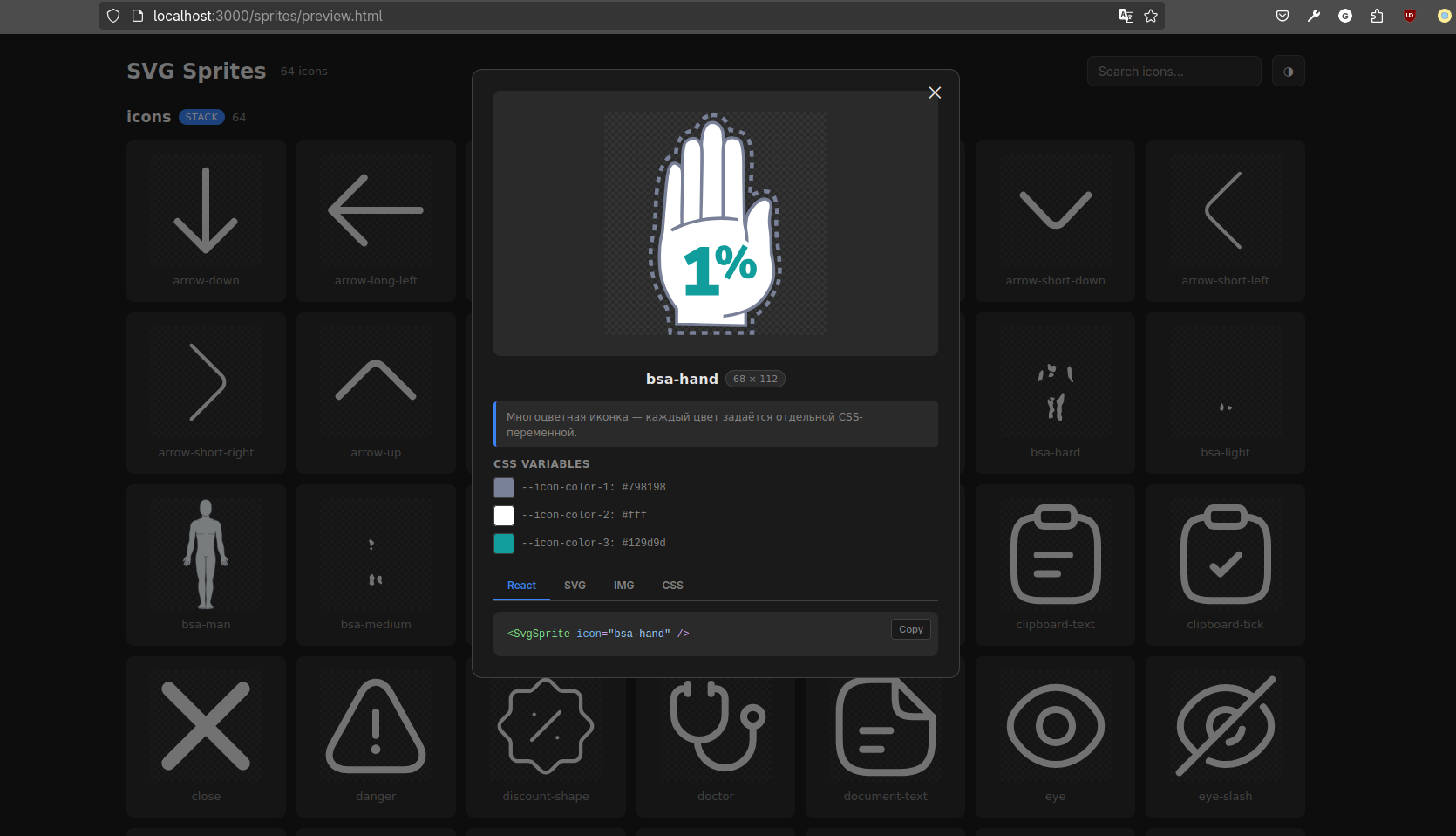
The Viewer is added only to an internal debug page and does not become part of the generated icon components.
With bare standalone, the application loads the Viewer as a browser script and HTML element. Bundler and framework modes use the npm Web Component entry; React and Next.js may instead import the bridge from @gromlab/svg-sprites/react.
The package supports 30 isolated exact modes: standalone@server for server-side generation of a universal SVG sprite and 29 consumer modes for modern frameworks and bundlers.
standalone@server lets you generate an SVG sprite ahead of time on a server or in CI/CD and publish it for shared use. The resulting sprite is not tied to a specific framework or bundler and works with every consumer mode.
The 29 consumer modes cover standalone, React, Next.js, Vue, Nuxt, Svelte, SvelteKit, Angular, Astro, Solid, SolidStart, Preact, Qwik, Lit, and Alpine.js across their supported Vite, Webpack, Turbopack, and application-builder variants.
All 29 consumer modes can work with sprites generated locally in the project or with universal sprites generated ahead of time on the server through standalone@server. The component API and the way icons are used in the application remain the same in both scenarios.
The integration matrix covers all 30 exact modes. A dedicated producer fixture verifies server-side generation of the universal sprite, while each of the 29 consumer applications generates and renders two independent sprites: one local and one remote.
All consumer applications pass a production build and Playwright tests, while typed modes are additionally checked by their framework-native toolchain. Every E2E test confirms that both local and remote sprites load and render, checks for browser errors, and verifies both groups in SpriteViewer.
Bundler and framework modes create a local .gitignore that excludes generated files and keeps them from cluttering project history, pull requests, and the codebase. Bare standalone leaves the repository policy to the application.
In bundler and framework modes, the repository contains the source SVG files, configuration, and .gitignore rule, while sprites, components, and types are regenerated locally and in CI through prebuild.
Generation can run entirely through npx, without adding the package to the project. Install it as a development dependency only when you need the Viewer, config types, or the programmatic API.
Production components use only local generated code, styles, and the external SVG file. The compiler and CLI are not bundled into the client application, while SpriteViewer is imported separately only where a debug page is needed.
This README introduces the project's capabilities and demonstrates the primary use case. For setup, choose the guide for your stack.
- Bare standalone
- Standalone + Vite
- Standalone + Webpack 5
- React + Vite
- React + Webpack 5
- Vue + Vite
- Vue + Webpack
- Nuxt + Vite
- Nuxt + Webpack
- Svelte + Vite
- Svelte + Webpack
- SvelteKit + Vite
- Angular application builder
- Angular + Webpack
- Astro + Vite
- Solid + Vite
- Solid + Webpack
- SolidStart + Vite
- Preact + Vite
- Preact + Webpack
- Qwik + Vite
- Lit + Vite
- Lit + Webpack
- Alpine.js + Vite
- Alpine.js + Webpack
- Next.js App Router + Turbopack
- Next.js App Router + Webpack
- Next.js Pages Router + Turbopack
- Next.js Pages Router + Webpack
MIT