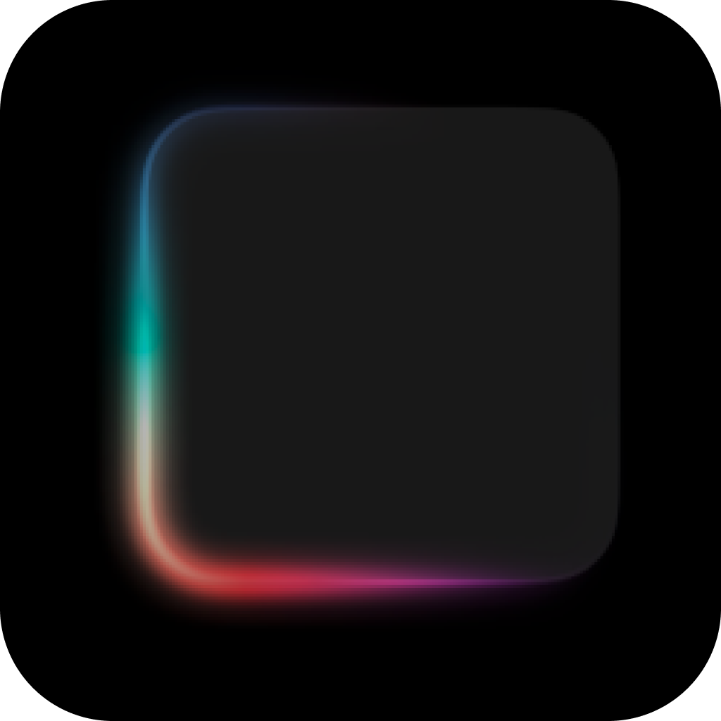
SwiftUI package that provides an animated glow effect backed by a bundled Metal shader.

- iOS 18.0+
- macOS 15.0+
- Swift 6.0+
Add the package with Swift Package Manager and pin it to version 1.1.0:
https://github.com/didisouzacosta/GlowEffectKit.git
If you prefer SSH, use the repository remote:
git@github.com:didisouzacosta/GlowEffectKit.git
In Xcode, choose File > Add Package Dependencies..., paste the repository
URL, set the dependency rule to Exact Version, enter 1.1.0, and add the
GlowEffectKit library product to your app target.
If you manage dependencies in Package.swift, add:
.package(
    url: "https://github.com/didisouzacosta/GlowEffectKit.git",
    exact: "1.1.0"
)
During local DressMatch development, this package can still be linked from a local checkout. For shared or CI builds, prefer the GitHub package URL above with an explicit version.
GlowEffectKit supports the default rounded-rectangle glow and any SwiftUI
Shape. Pass shape: when the glow should follow a custom outline, such as a
star, circle, capsule, or any shape backed by a custom Path.
//
//  ContentView.swift
//  Example
//
//  Created by Didi on 30/06/26.
//

import SwiftUI
import GlowEffectKit

struct ContentView: View {
    var body: some View {
        HStack(spacing: 32) {
            RoboFace()
            Star()
            Buttons()
        }
    }
}

private struct RoboFace: View {

    var body: some View {
        RoundedRectangle(cornerRadius: 32)
            .foregroundStyle(.gray.opacity(0.1))
            .frame(width: 160, height: 160)
            .glowEffect(
                isActive: true,
                lineWidth: 8
            )
            .overlay {
                VStack(spacing: 32) {
                    HStack(spacing: 16) {
                        RoundedRectangle(cornerRadius: 8)
                            .foregroundStyle(.black)
                            .frame(width: 30, height: 30)
                            .glowEffect(
                                isActive: true,
                                cornerRadius: 8,
                                lineWidth: 1
                            )

                        RoundedRectangle(cornerRadius: 8)
                            .foregroundStyle(.black)
                            .frame(width: 30, height: 30)
                            .glowEffect(
                                isActive: true,
                                cornerRadius: 8,
                                lineWidth: 1
                            )
                    }

                    RoundedRectangle(cornerRadius: 8)
                        .foregroundStyle(.black)
                        .frame(width: 100, height: 20)
                        .glowEffect(
                            isActive: true,
                            cornerRadius: 8,
                            lineWidth: 1
                        )
                        .rotationEffect(.radians(-25))
                }
            }
    }
}

private struct Star: View {

    var body: some View {
        StarShape()
            .fill(.clear)
            .frame(width: 160, height: 160)
            .glowEffect(
                isActive: true,
                shape: StarShape(),
                lineWidth: 4
            )
    }

}

private struct Buttons: View {
    var body: some View {
        VStack(spacing: 16) {
            Button(action: {}) {
                Label("Settings", systemImage: "gear")
                    .padding()
                    .frame(width: 200)
            }
            .glowEffect(isActive: true, lineWidth: 2)

            Button(action: {}) {
                Label("Play", systemImage: "play")
                    .padding()
                    .frame(width: 200)
            }
            .glowEffect(isActive: true, cornerRadius: 0, lineWidth: 2)
        }
    }
}

private struct StarShape: Shape {
    var points: Int = 5
    var innerRadiusRatio: CGFloat = 0.42

    func path(in rect: CGRect) -> Path {
        let center = CGPoint(x: rect.midX, y: rect.midY)
        let outerRadius = min(rect.width, rect.height) / 2
        let innerRadius = outerRadius * innerRadiusRatio
        let totalPoints = points * 2

        var path = Path()

        for index in 0..<totalPoints {
            let radius = index.isMultiple(of: 2) ? outerRadius : innerRadius
            let angle = CGFloat(index) * .pi * 2 / CGFloat(totalPoints) - .pi / 2
            let point = CGPoint(
                x: center.x + radius * cos(angle),
                y: center.y + radius * sin(angle)
            )

            if index == 0 {
                path.move(to: point)
            } else {
                path.addLine(to: point)
            }
        }

        path.closeSubpath()

        return path
    }
}

#Preview {
    ContentView()
}
The shape: overload strokes the path produced by the supplied shape. For
images or complex view hierarchies, pass the shape that represents the outline
you want the glow to follow.
Use GlowEffectConfiguration when the caller needs to tune shader amplitude or frame interval:
let configuration = GlowEffectConfiguration(
    peakScale: 1.02,
    duration: 2.0,
    glowOpacity: 0.24,
    amplitude: 2.5,
    minimumTimelineInterval: 1.0 / 30.0
)

content.glowEffect(isActive: isLoading, configuration: configuration)GlowEffectKit is available under the MIT license. See LICENSE for details.