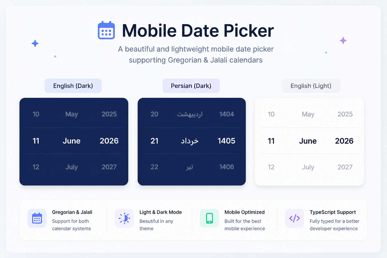
Daliry Mobile Date Picker is a mobile-friendly and customizable date picker component for React with support for both Jalali (Shamsi) and Gregorian calendars.
It is designed for mobile apps, birthdate pickers, and any React project that needs a clean, touch-optimized date selection experience.
As of v1.1.3, the package uses date-fns and date-fns-jalali and supports passing an initial value for both Jalali and Gregorian modes.
- Better performance
- Smaller bundle size
- Native
Dateoutput instead of Moment objects - Initial date selection via
value
If you want to support this project, the best way for now is to:
- Follow me on GitHub
- Star this repository
If you're looking for a React mobile date picker with Jalali (Shamsi) and Gregorian support, Daliry Mobile Date Picker is built for that use case.
- Supports both Jalali and Gregorian calendars
- Optimized for mobile UX
- Easy to integrate into any React project
- Returns both formatted and raw date values
- Uses date-fns and date-fns-jalali
- Better performance in v1.1.3
- Reduced bundle size
- Uses debounced
onDateChangecalls for smoother performance - Supports initial date via
value - No need for an extra Apply button
- Added
valueprop to set an initial selected date - If
valueis provided, the picker shows that exact date - If
valueis not provided:- current date is used by default
- or 18 years ago when
isBirthdateistrue
- Supports
valuein both Gregorian and Jalali modes - Uses date-fns and date-fns-jalali
- Keeps output as native JavaScript
Date
- 📆 Dual calendar support: Jalali (Shamsi) and Gregorian
- 📱 Touch-optimized for mobile and tablet
- ♻️ Reusable and lightweight React component
- 🔧 Easy setup and customization
- ⚡ Debounced date change callback after scrolling stops
- 🎂 Smart birthdate mode with default value set to 18 years ago
- 📤 Output includes full date breakdown in multiple formats
- 🧩 Built with date-fns and date-fns-jalali
- 🎯 Supports controlled initial selection using
value
Install the package with npm or yarn:
npm install daliry-mobile-date-picker

or

bash
yarn add daliry-mobile-date-picker

---

## ✨ Usage

tsx
import MobileDatePicker from "daliry-mobile-date-picker";
import "daliry-mobile-date-picker/dist/index.css";

<MobileDatePicker
  onDateChange={(value) => {
console.log(value);
  }}
  isBirthdate={true}
  isGregorian={false}
/>

---

## ✨ Usage with `value`

### Jalali example

tsx
<MobileDatePicker
  value="1403/04/20"
  isGregorian={false}
  onDateChange={(value) => {
console.log(value);
  }}
/>

### Gregorian example

tsx
<MobileDatePicker
  value="2024-07-10"
  isGregorian={true}
  onDateChange={(value) => {
console.log(value);
  }}
/>

### Using native `Date`

tsx
<MobileDatePicker
  value={new Date()}
  onDateChange={(value) => {
console.log(value);
  }}
/>

---

## 🛠 Props

| Prop | Type | Required | Default | Description |
|------|------|----------|---------|-------------|
| `onDateChange` | `(date: IDate) => void` | Yes | - | Called after the user finishes changing the date |
| `value` | `Date \| string` | No | - | Initial selected date. If provided, it overrides the default current date or birthdate logic |
| `isBirthdate` | `boolean` | No | `false` | If `true`, default date is set to 18 years ago when `value` is not provided |
| `isGregorian` | `boolean` | No | `false` | Switches calendar mode to Gregorian |
| `backgroundColor` | `string` | No | `#f5f5f5` | Background color of picker |
| `textColor` | `string` | No | `#bbb` | Color of non-selected items |
| `selectedColor` | `string` | No | `#333` | Color of selected item |

---

## 📝 `value` Format Notes

The `value` prop supports both `Date` and `string`.

### If `isGregorian={true}`
You can pass:

- a native `Date`
- a Gregorian date string such as:

ts
"2024-07-10"

### If `isGregorian={false}`
You can pass:

- a native `Date`
- a Jalali date string such as:

ts
"1403/04/20"

or

ts
"1403-04-20"

> If `value` is provided, the picker always uses that value first.
> If `value` is missing, it falls back to the current date, or **18 years ago** in birthdate mode.

---

## ⚡ Debounced Date Change

This component does not need an "Apply" button.

When the user scrolls and changes the date, `onDateChange` is triggered automatically after a small **debounce delay**. This reduces unnecessary callback calls during fast scrolling and improves mobile performance.

---

## 📤 Output Format

ts
{
  year: 1403,
  month: 3,
  day: 21,
  formatted: "1403/03/21",
  date: "2024-06-10",
  gDate: "2024-06-10",
  dateObj: Date
}

---

## 📘 Output Fields

- `year`: selected year
- `month`: selected month
- `day`: selected day
- `formatted`: formatted date based on the selected calendar
- `date`: formatted date string
- `gDate`: Gregorian date in `yyyy-MM-dd`
- `dateObj`: native JavaScript `Date` object

---

## 🔄 Migration Guide

If you are upgrading from older versions, note that **Moment.js has been removed** from the output.

### Before

ts
{
  year,
  month,
  day,
  formatted,
  date,
  gDate,
  moment
}

### After

ts
{
  year,
  month,
  day,
  formatted,
  date,
  gDate,
  dateObj
}

### Migration Example

Before:

ts
console.log(value.moment.format("YYYY-MM-DD"));

After:

ts
console.log(value.gDate);
console.log(value.dateObj);

If you need custom formatting, use `date-fns`:

ts
import { format } from "date-fns";

console.log(format(value.dateObj, "yyyy-MM-dd"));

---

## ✅ Notes

- Supports both **Jalali** and **Gregorian** calendars
- Built using **date-fns** and **date-fns-jalali**
- Supports initial value via `value`
- Improved performance and reduced bundle size
- Make sure to import the CSS file:

tsx
import "daliry-mobile-date-picker/dist/index.css";

- Designed for a smooth mobile scrolling experience
- Optimized selected-item visual behavior for better stability

---

## 📜 Keywords

react, react date picker, mobile date picker, pwa date picker, jalali date picker, persian date picker, gregorian date picker, shamsi calendar, mobile calendar, birthdate picker, touch date picker, date-fns, date-fns-jalali

---

## 📜 License

MIT