

The premium, plug-and-play onboarding wizard for React.
Turn your new user experience into a polished, professional tour in minutes. onstage provides a beautiful, responsive, and fully customizable modal wizard with zero friction.
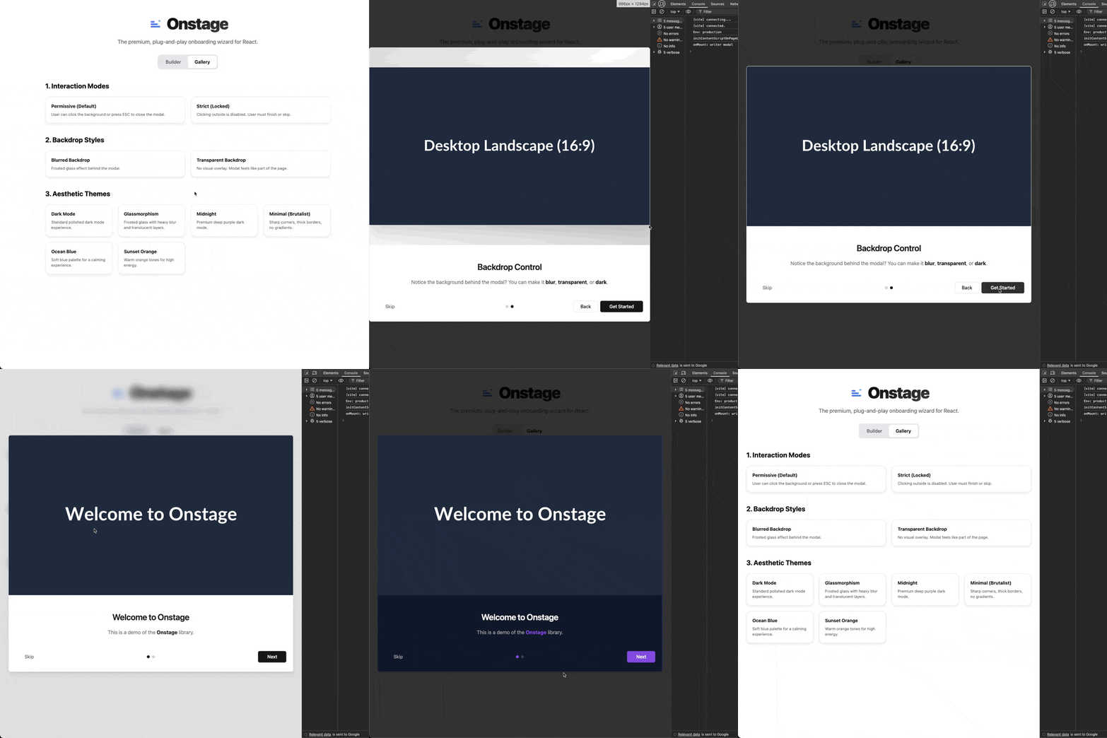
Try the Interactive Builder & Gallery
Design your modal in real-time and copy the code.
- 🎨 7 Pre-built Themes: From "Glassmorphism" to "Midnight" dark mode.
- 📱 Fully Responsive: Adapts visuals for Mobile, Tablet, and Desktop automatically.
- 🔌 Plug & Play: Just pass an array of steps and it renders.
- 🌫️ Backdrop Control: Choose between dark, blurred, or transparent overlays.
- 🎮 Flexible Control: Strict mode (force completion) or Permissive (click outside to close).
- 💅 Granular Styling: Override any part of the UI with Tailwind classes or CSS variables.
npm install onstage
# or
pnpm add onstage
# or
yarn add onstageAdd this once to your root file (e.g., main.tsx or App.tsx):
import "onstage/styles.css";Wrap your app (or just the section you need) with the Provider and place the Modal.
import { OnboardingProvider, OnboardingModal } from "onstage";

const steps = [
  {
    title: "Welcome! 👋",
    description: "We are **thrilled** to have you here.",
    image: "/images/welcome-desktop.png"
  },
  {
    title: "Features",
    description: "Explore our new dashboard.",
    image: "/images/dashboard.png"
  }
];

export default function App() {
  return (
    <OnboardingProvider steps={steps} defaultOpen={true}>
      <YourApp />
      <OnboardingModal />
    </OnboardingProvider>
  );
}onstage comes with professional presets so you don't have to design from scratch.
Pass the theme prop to switch styles instantly.
// 🌑 Professional Dark Mode
<OnboardingModal theme="dark" />

// 🪟 Frosted Glass Effect
<OnboardingModal theme="glass" />

// 🌌 Deep Purple "Midnight"
<OnboardingModal theme="midnight" />

// 📐 Minimalist (Brutalist / Sharp)
<OnboardingModal theme="minimal" />
Available Themes:
light(Default)darkglassmidnightminimaloceansunset
Control the overlay behind the modal.
// 🌫️ Frosted background
<OnboardingModal backdrop="blur" />

// 👻 Invisible overlay (content visible but not clickable)
<OnboardingModal backdrop="transparent" />Don't serve a desktop screenshot on a mobile phone. onstage lets you define specific images for different devices. It automatically adjusts the aspect ratio (4:5 mobile, 4:3 tablet, 16:9 desktop) to fit the modal perfectly.
const steps = [
  {
    title: "Responsive Magic",
    description: "Resize your browser to see the image change!",
    image: {
      mobile: "/img/hero-portrait.png",  // < 640px (4:5 Ratio)
      tablet: "/img/hero-square.png",    // < 1024px (4:3 Ratio)
      desktop: "/img/hero-landscape.png" // > 1024px (16:9 Ratio)
    }
  }
];Decide if users must complete the onboarding or if they can dismiss it easily.
// 🔓 Permissive Mode (Default)
// Users can click the background or press ESC to dismiss.
<OnboardingModal allowClickOutside={true} />

// 🔒 Strict Mode
// Users MUST finish the steps or click "Skip". Background click is disabled.
<OnboardingModal allowClickOutside={false} />Control the wizard from anywhere in your app using the hook.
import { useOnboarding } from "onstage";

function SettingsPage() {
  const { resetOnboarding } = useOnboarding();

  return (
    <button onClick={resetOnboarding}>
      Show Tutorial Again
    </button>
  );
}
Available Hook Methods:
resetOnboarding(): Opens modal at step 0.setIsOpen(boolean): Manually toggle visibility.skipOnboarding(): Closes modal and triggersonSkip.finishOnboarding(): Closes modal and triggersonFinish.
Tweak the branding colors globally or inline.
<OnboardingModal
  style={{
    '--primary': '262 80% 50%', // Custom Purple
    '--radius': '1rem'          // Rounder corners
  } as React.CSSProperties}
/>Need to style just the "Next" button? Use classNames (supports Tailwind) or styles to target specific elements.
<OnboardingModal
  classNames={{
    // Add red background to next button
    nextButton: "bg-red-500 hover:bg-red-600 font-bold",
    // Make title blue
    title: "text-blue-600 underline",
    // Custom overlay
    overlay: "bg-slate-900/90"
  }}
/>
Targetable Elements: overlay, content, imageContainer, image, header, title, description, footer, stepIndicators, nextButton, prevButton, skipButton, finishButton.
| Prop | Type | Default | Description |
|---|---|---|---|
theme |
string |
"light" |
light, dark, glass, minimal, midnight, ocean, sunset |
backdrop |
string |
"default" |
default (dark), blur, transparent |
allowClickOutside |
boolean |
true |
If true, clicking overlay closes the modal. |
gradient |
string |
"animated" |
animated, static, none |
className |
string |
- |
Class for the main modal container. |
classNames |
object |
{} |
Target specific elements (see above). |
style |
CSSProperties |
{} |
Inline styles for the root. |
| Prop | Type | Default | Description |
|---|---|---|---|
steps |
OnboardingStep[] |
Required | Array of step data. |
defaultOpen |
boolean |
false |
If true, opens immediately on mount. |
onFinish |
() => void |
- |
Callback when user finishes all steps. |
onSkip |
() => void |
- |
Callback when user clicks "Skip". |
MIT © Asad Ullah Khalid