
Markdown-as-PDF document viewer for React Native: an immutable document with animated page-turning, zoom, persistent highlights, text-to-speech with synchronized word highlighting and a light/dark theme. No third-party libraries for the content (own parser and renderer); the storage, the document source and the speech engine are injectable.
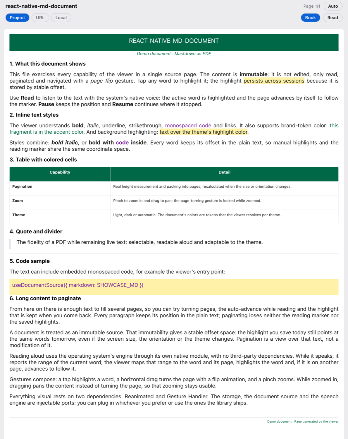
Demo document (example/) in light and dark themes: banner with brand tokens, inline styles,
highlights and per-theme color adaptation.
| Light | Dark |
|---|---|
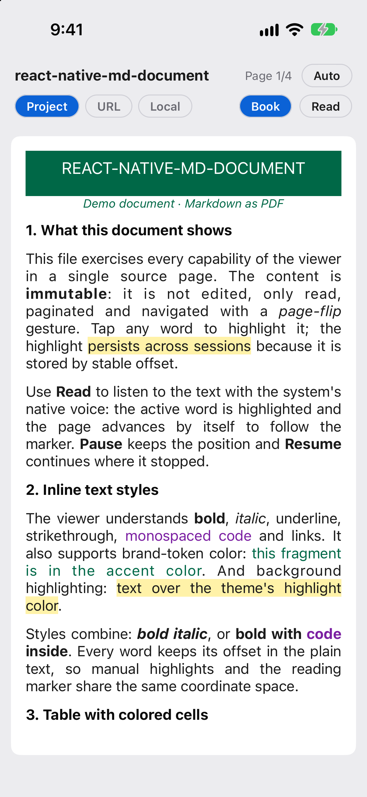 |
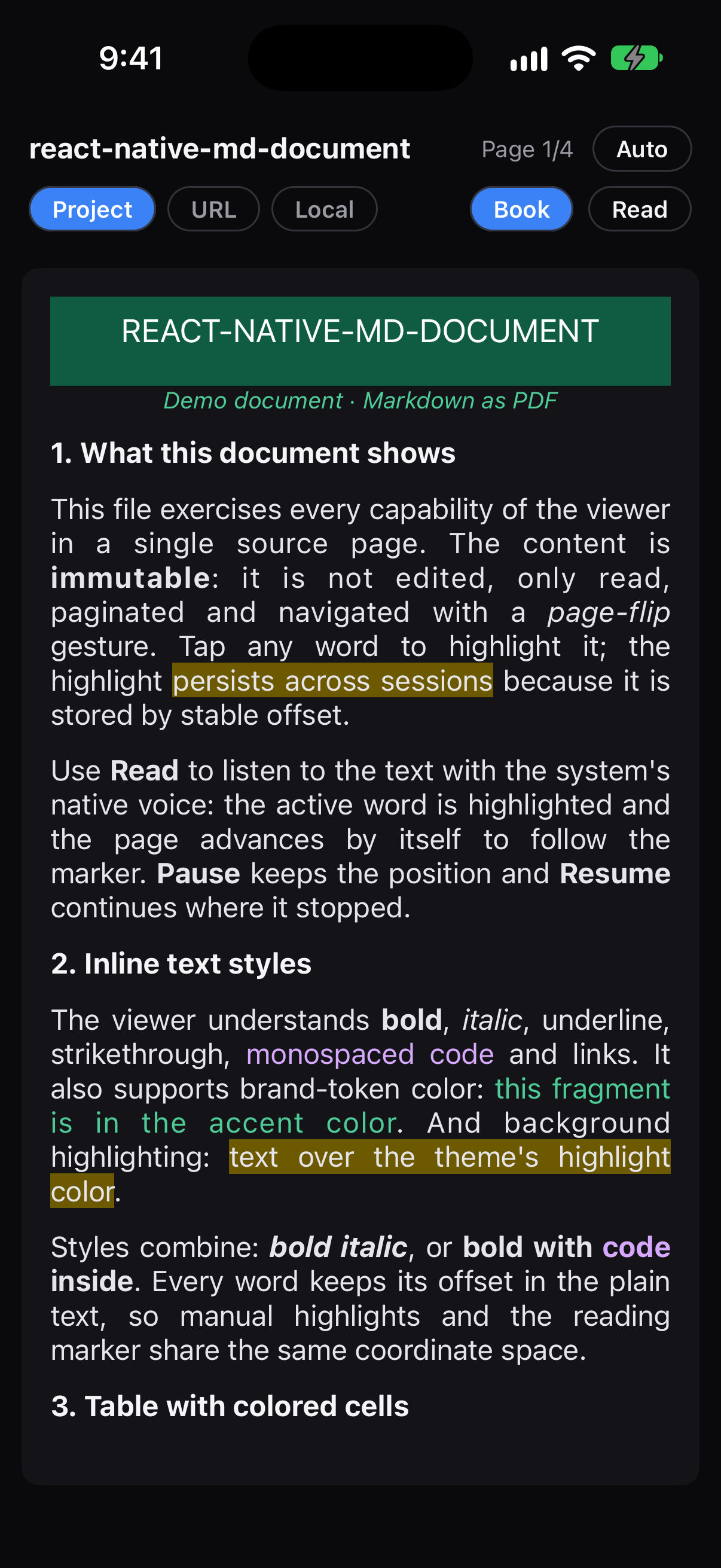 |
- Markdown + embedded HTML: headings, paragraphs, lists, blockquotes, code,
hr, inline styles (bold, italic, code, strikethrough, links), tables and HTML with inline styles (color, background, centering, sizes, column widths). - Animated page turning (Reanimated + Gesture Handler), one gesture = one page.
- Zoom with pinch + drag, composed with the flip and the tap.
- Per-word highlights, persistent across sessions (injectable storage).
- Text-to-speech with the spoken word highlighted (even inside tables), pause/resume, speed, and automatic page advance that follows the reading.
- Light/dark theme (
autofollows the OS) with color tokens that adapt per theme. - Sources: remote URL, local device path, bundled project file.
- Portrait and landscape orientation (re-paginates on rotation).
- Book mode: on tablets and foldables in landscape it shows two pages side by side, with
the page turning from the spine. On by default; turn it off with
dualPage={false}. - Accessible: screen readers (VoiceOver, TalkBack) hear the current page, can turn pages with a swipe up/down, and skip the pages hidden behind the flip animation.
| Platform | Minimum | Note |
|---|---|---|
| iOS | 13.0 | Deployment target of the native module (react-native-md-document.podspec). TTS with per-word highlighting included. |
| Android | 7.0 (API 24) | The module's minSdkVersion. TTS speaks on API 24+, but the per-word highlighting while reading uses onRangeStart, which requires Android 8.0 (API 26). |
| React Native | 0.76 | Tested with RN 0.76.5 / Expo SDK 52. |
| Peer deps | react-native-reanimated ≥ 3.16 and < 4 · react-native-gesture-handler ≥ 2.20 and < 3 |
The only visual dependencies. Reanimated 4 and Gesture Handler 3 are not supported yet. |
Compatible. react-native-md-document ships no compiled native code (.so): the
DocumentSpeech module is plain Kotlin and is compiled into the app's dex. Since it adds no
binaries, none of our libraries can be misaligned — the library meets Android 15's 16 KB
requirement (Google Play, targetSdk 35) by construction, on any page size.
# npm
npm install @acertijosapps/react-native-md-document react-native-gesture-handler react-native-reanimated

# yarn
yarn add @acertijosapps/react-native-md-document react-native-gesture-handler react-native-reanimated
react-native-reanimated requires its Babel plugin (last in the list):
// babel.config.js
module.exports = {
    presets: ['babel-preset-expo'],
    plugins: ['react-native-reanimated/plugin'],
};
The app must wrap its root in GestureHandlerRootView:
import { GestureHandlerRootView } from 'react-native-gesture-handler';

export default function App() {
    return <GestureHandlerRootView style={{ flex: 1 }}>{/* … */}</GestureHandlerRootView>;
}
For native text-to-speech, the DocumentSpeech module is autolinked like any RN package:
npx pod-install          # iOS (or: cd ios && pod install)
# Android: Gradle autolinking, no extra steps- Highlight storage: the library does not depend on
@react-native-async-storage/async-storage. The store is injectable (getItem/setItem, sync or async): AsyncStorage, MMKV, SQLite or your own will do. Install it only if you want to persist highlights with that option; for in-memory highlights usecreateMemoryHighlightStore(), and if you don't highlight you need nothing. See Persistent highlights.
The only required dependencies are react-native-reanimated and
react-native-gesture-handler (the peers).
import { DocumentViewer, parse } from '@acertijosapps/react-native-md-document';

const doc = parse('# Hello\n\nA **Markdown** document.');

export function Viewer() {
    return <DocumentViewer document={doc} />;
}
DocumentViewer measures the content, paginates it to the viewport size and enables flip +
zoom. A heading is never left alone at the bottom of a page: it moves to the next page together
with the block that follows it. parse(source) returns an immutable MDDocument with plainText (the text projection
that highlights and TTS rely on).
useDocumentSource covers the three sources:
import { DocumentViewer, useDocumentSource } from '@acertijosapps/react-native-md-document';

function Screen() {
    // Project (bundled): string or { markdown }
    const { document, isLoading, error, reload } = useDocumentSource({ markdown: MD_STRING });
    // Remote URL: built-in fetch
    // useDocumentSource({ uri: 'https://example.com/doc.md' })
    // Local device path
    // useDocumentSource({ uri: 'file:///…/doc.md' })

    if (!document) {
        return null; // isLoading / error / reload are available
    }
    return <DocumentViewer document={document} />;
}
String detection: a string starting with http(s)://, file:, content:, asset: or / is
treated as a URI; any other string is raw Markdown.
If you don't want to wire the hook by hand, pass source straight to DocumentViewer: it
loads on its own and exposes the loading states.
<DocumentViewer
    source={{ uri: 'https://example.com/doc.md' }}
    onLoadComplete={(doc) => console.log('ready', doc.length)}
    onLoadError={(err) => console.warn(err.message)}
    renderLoading={() => <ActivityIndicator />}
    renderError={(err, retry) => (
        <View>
            <Text>{err.message}</Text>
            <Button title="Retry" onPress={retry} />
        </View>
    )}
/>
Use document (full control: highlights/TTS need document.plainText before rendering) or
source (the viewer manages the loading). The four props above only apply with source.
For sources that fetch doesn't cover (a bundled asset, file:// on Android) you inject a
reader — the library does not force expo-file-system or expo-asset:
import * as FileSystem from 'expo-file-system';

useDocumentSource(
    { uri: 'file:///…/doc.md' },
    { readUri: (uri) => FileSystem.readAsStringAsync(uri) },
);import { DocumentViewer, createKeyValueHighlightStore, useHighlights } from '@acertijosapps/react-native-md-document';
import AsyncStorage from '@react-native-async-storage/async-storage';
const store = createKeyValueHighlightStore(AsyncStorage); // works with AsyncStorage/MMKV
function Screen({ document }) {
const { highlights, toggleWordAt, remove, clear, isLoaded } = useHighlights({
docId: 'doc-1',
plainText: document.plainText,
store, // no store: in memory only
});
return (
<DocumentViewer
document={document}
highlights={highlights}
onWordPress={toggleWordAt} // tap a word to highlight / remove it
/>
);
}Each highlight is { id, start, end, color? } in the projection's offset space. Because the
document is immutable, that space is stable across sessions, screen sizes and re-renders.
createMemoryHighlightStore() is handy for tests/demos.
import {
    DocumentViewer,
    createNativeSpeechEngine,
    createMockSpeechEngine,
    useTextToSpeech,
} from '@acertijosapps/react-native-md-document';

// Own native engine (iOS AVSpeechSynthesizer / Android TextToSpeech).
// Falls back to the mock (timer-based, no audio) if the native module isn't linked.
function makeEngine() {
    try {
        return createNativeSpeechEngine();
    } catch {
        return createMockSpeechEngine({ wordsPerMinute: 200 });
    }
}
const engine = makeEngine();

function Screen({ document }) {
    const [pageStart, setPageStart] = React.useState(0);
    const tts = useTextToSpeech({
        plainText: document.plainText,
        engine,
        options: { rate: 1 }, // speed multiplier
    });

    const onPress = () => {
        if (tts.status === 'speaking') tts.pause();
        else if (tts.status === 'paused') tts.resume();
        else tts.play(pageStart); // starts at the beginning of the current page
    };

    return (
        <>
            <DocumentViewer
                document={document}
                active={tts.activeRange} // highlights the spoken word and auto-advances the page
                onPageChange={(index, count, startOffset) => setPageStart(startOffset)}
            />
            <Button
                title={tts.status === 'speaking' ? 'Pause' : tts.status === 'paused' ? 'Resume' : 'Read'}
                onPress={onPress}
            />
        </>
    );
}useTextToSpeechreturns{ status, activeRange, index, count, play, pause, resume, stop }.statusis'idle' | 'speaking' | 'paused'.play(fromOffset?)starts at the utterance that covers that offset (usepageStartOffsetfromonPageChangeto read from the current page).pause/resumekeep the position (native: mid-utterance).stopresets.activeRangeis the spoken word in projection offsets; the viewer highlights it withcolors.activeWordand auto-advances the page to follow the reading.options.rateis a multiplier (1 = normal). Android applies it directly; iOS uses a curve over the defaultAVSpeechUtterancerate.- The engine is injectable (
SpeechEngine): the built-in native one, the mock, or your own (speak,stop, optionalpause/resume).
<DocumentViewer
    document={doc}
    colorScheme="auto" // 'auto' (default, follows the OS) | 'light' | 'dark'
    theme={{ colors: { link: '#c026d3' } }} // partial override over the active mode's palette
/>
useDocTheme(colorScheme, override, colorTokens?), useColorMode(colorScheme), lightTheme,
darkTheme and mergeTheme are exported so you can tint your own chrome with the same
resolution.
A .md with embedded HTML that hardcodes colors (background:#FFFFFF, color:#006847) does
not change in dark mode. The sub-standard: the file uses var(--token) tokens instead
of literals, and the viewer resolves them against the active palette. Mixing literals and
tokens is valid (backwards compatible).
<div style="background: var(--accent); color: var(--on-accent);">…banner…</div>
<p style="color: var(--accent-text); font-style: italic;">…note…</p>
<p style="color: var(--text);">…body…</p>
Two kinds of token:
- Base — defined by the library (its own light/dark palette, no guessing):
--page-bg,--text,--heading,--rule,--link,--code,--highlight. - Brand/custom — provided by the consumer through the
colorTokensprop, with per-mode values:
<DocumentViewer
    document={doc}
    colorScheme="auto"
    colorTokens={{
        light: { accent: '#006847', 'on-accent': '#ffffff', 'accent-text': '#006847' },
        dark: { accent: '#0f5c43', 'on-accent': '#ffffff', 'accent-text': '#4ecb96' },
    }}
/>
A token that is not a base token and is not in the active mode's colorTokens is
omitted (the library never invents colors). The page background and the text always come
from the base palette, so a document without brand tokens already respects light/dark.
- Horizontal swipe → turns the page (flip). One gesture = one page.
- Pinch → zoom; while zoomed, dragging moves the page (the flip is locked). Prop
maxScale(default 3). - Tap on a word →
onWordPress(offset).
The pan only captures a real drag (threshold), letting the tap through.
The viewer works with VoiceOver (iOS) and TalkBack (Android) out of the box:
- An invisible adjustable control at the top of the viewer announces the position ("Page 3 of 12", or "Pages 3 and 4 of 12" in book mode). Swipe up or down on it (or use the actions menu) to go to the next or previous page.
- The pages stacked behind the current one for the flip animation are hidden from the accessibility tree, so the screen reader only reads what is visible.
- Headings are exposed with the
headerrole.
The spoken strings are in English; override any of them with accessibilityLabels:
<DocumentViewer
    document={doc}
    accessibilityLabels={{
        control: 'Páginas del documento',
        pages: (first, last, total) =>
            first === last ? `Página ${first} de ${total}` : `Páginas ${first} y ${last} de ${total}`,
        nextPage: 'Página siguiente',
        previousPage: 'Página anterior',
    }}
/>The viewer is size-driven: on rotation it measures the new size and re-paginates by
itself. Enable landscape in your app's native config (Expo: app.json orientation: "default"; bare RN: UISupportedInterfaceOrientations on iOS and android:screenOrientation
on Android). In landscape, use SafeAreaProvider from react-native-safe-area-context with
initialMetrics={initialWindowMetrics} for correct insets from the first frame. On tablets
and foldables, landscape turns on book mode.
On tablets and foldables in landscape, the viewer splits the area into two pages and turns
them like an open book. It is on by default; turn it off with dualPage={false}.
| Landscape · light | Landscape · dark |
|---|---|
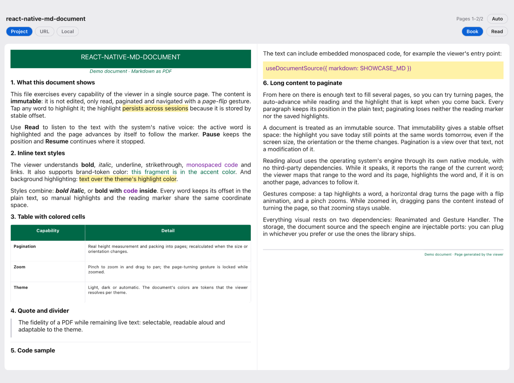 |
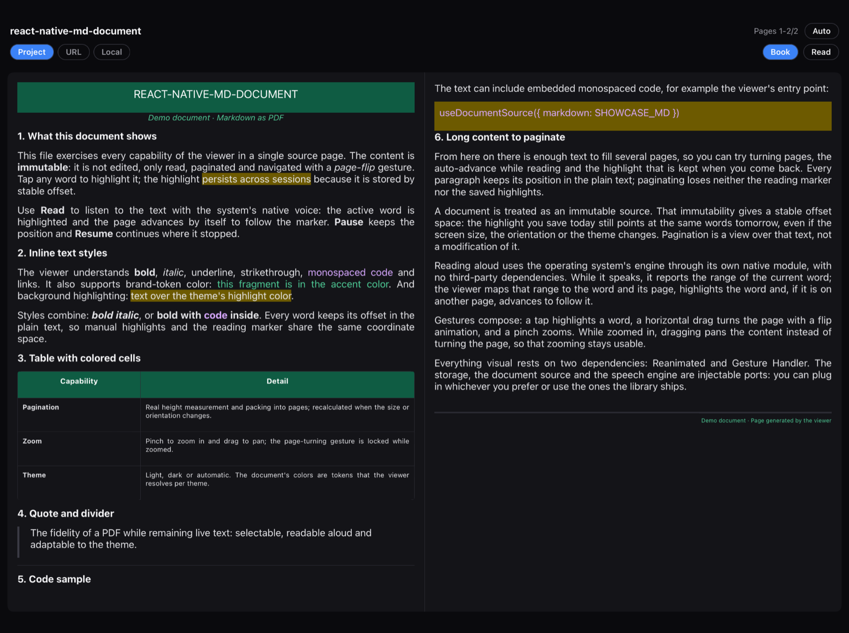 |
In portrait it keeps a single full page, just like on a phone:
It only turns on when all three conditions hold:
- The screen is tablet or foldable sized: the window's short side is at least 600 dp (the
same
sw600dpcriterion Android uses). A phone, even in landscape, keeps a single page. - The viewer is wider than tall (landscape).
- The viewer is at least
dualPageMinWidthdp wide (600 by default).
The decision uses the viewer's real size, not the device model, so it also applies to unfolded foldables and split-screen. On rotation the viewer switches mode by itself and keeps your reading position.
| Prop | Type | Default | Description |
|---|---|---|---|
dualPage? |
boolean |
true |
Turns on book mode. false always forces a single page |
dualPageMinWidth? |
number |
600 |
Minimum viewer width (dp) to show two pages |
spreadGap? |
number |
0 |
Space (dp) between the two pages; use it to reserve a foldable's hinge |
// Always a single page, also on tablets
<DocumentViewer document={doc} dualPage={false} />- One gesture turns one spread (two pages). The right page rotates from the spine when going forward, and the left one when going back. Pinch zoom and drag act on the whole spread.
- Pagination: it is computed with the width of one page, so the document has more pages than in portrait. When the mode changes, the text you were reading is preserved.
onPageChange(pageIndex, pageCount, pageStartOffset, pagesPerView): in book modepageIndexis the spread's left page andpagesPerViewis2(on a single page,1). Use it to show "Pages 1-2 of N".- Text-to-speech: the reading advances to the spread that contains the active word.
- Highlights: unchanged; they keep using the same text offsets.
An unfolded, flat foldable behaves like a tablet: in landscape it shows two pages, with no extra setup.
When the device is half-open in book posture (vertical hinge), the hinge sits between the
two halves of the screen. To keep either page from being drawn over the crease, pass its width
in spreadGap: the gap is centered between the pages.
The library does not detect the hinge and does not depend on any foldable library. If your
app uses @acertijosapps/react-native-fold,
connect them like this:
Warning
Hinge detection on iOS requires iOS 27.1 or later and building the app with Xcode 27.1 or
later (iOS 27.1 SDK). With an older Xcode the app builds, but the hinge APIs are skipped
and useFold() always returns null on iOS, even on an iPhone Duo. react-native-fold
also requires React Native ≥ 0.80 with the New Architecture and React ≥ 19.1. These
requirements apply to your app only if you install that library; react-native-md-document
does not require them.
import { FoldProvider, useFold } from '@acertijosapps/react-native-fold';
import { DocumentViewer } from '@acertijosapps/react-native-md-document';

function Reader({ doc }) {
    const fold = useFold();
    const gap = fold?.orientation === 'vertical' ? fold.bounds.width : 0;

    return (
        <DocumentViewer
            document={doc}
            spreadGap={gap}
        />
    );
}

export default function App() {
    return (
        <FoldProvider>
            <Reader doc={doc} />
        </FoldProvider>
    );
}
Notes:
useFold()returnsnulloutside a folded posture (outer display, devices without a hinge, or iOS older than 27.1); with?.and a default of0the viewer behaves like on a regular tablet.bounds.widthis already in dp: on Android it is the fold line, and on iOS it includes the margins the system reserves (about 40 pt on the iPhone Duo).- The gap is centered between the two pages. It works when the viewer takes the full window width; if you constrain it with side panels, the hinge may not line up with the viewer's center.
- If you don't use foldables or don't install
react-native-fold, you need none of this: book mode works the same on tablets and unfolded foldables.
Markdown: ATX headings (#…######), paragraphs, ordered/unordered lists (nested),
blockquotes, code fences, horizontal rules, GFM tables, and the inline styles **bold**,
*italic*, `code`, ~~strikethrough~~, [link](url).
Embedded HTML: if the document starts with block-level HTML, it is parsed as an HTML subset
(div, p, h1..6, table/tr/td/col, strong, em, span, …) honoring the style
attribute: text-align, color, background, font-size, font-weight, font-style,
text-transform, border-top, margin-top, <col> widths. Useful for high-fidelity
docx→HTML conversions. Adaptive colors use tokens (see above).
Limits (v1): no images or navigation links; a block taller than the page scrolls inside
its sheet; HTML is a subset (no colspan, images or external CSS).
| Export | Type | Description |
|---|---|---|
parse(source) |
fn | Markdown/HTML → MDDocument (with plainText) |
DocumentViewer |
component | Full viewer: pagination + flip + zoom |
MarkdownView |
component | Simple scrolling render (no pagination) |
PaginatedDocument |
component | Controlled pagination (pageIndex) without flip |
useDocumentSource(source, opts?) |
hook | Loads URL / local / project (readUri injectable) |
useHighlights(params) |
hook | { highlights, toggleWordAt, add, remove, clear, isLoaded } |
createKeyValueHighlightStore(kv) · createMemoryHighlightStore() |
fn | Highlight stores |
useTextToSpeech(params) |
hook | { status, activeRange, play, pause, resume, stop, index, count } |
createNativeSpeechEngine() · createMockSpeechEngine(opts?) |
fn | Speech engines |
useDocTheme · useColorMode · lightTheme · darkTheme · mergeTheme · resolveThemeColor |
theme | Resolution, palettes and tokens |
| Prop | Type | Default | Description |
|---|---|---|---|
document? |
MDDocument |
— | Document already parsed with parse(...). Required if you don't pass source |
source? |
DocumentSource |
— | Source to load internally ({ markdown } / { uri } / string). The viewer manages the loading and exposes the callbacks/render props below |
readUri? |
ReadUri |
fetch |
Injectable reader for a source with uri (e.g. expo-file-system for file://) |
colorScheme? |
'auto' | 'light' | 'dark' |
'auto' |
Theme; auto follows the OS |
theme? |
Partial<DocTheme> |
the mode's palette | Partial override of colors/sizes |
colorTokens? |
{ light?: Record<string,string>; dark?: Record<string,string> } |
— | Brand tokens per mode, for var(--token) |
highlights? |
Highlight[] |
[] |
Highlights to paint ({ id, start, end, color? }) |
active? |
ActiveRange | null |
null |
Word spoken by the TTS; it is highlighted and the page auto-advances |
onWordPress? |
(offset: number) => void |
— | Tap on a word (to highlight/remove it) |
onPageChange? |
(pageIndex: number, pageCount: number, pageStartOffset: number, pagesPerView: number) => void |
— | Notifies a page change. In book mode pageIndex is the left page and pagesPerView is 2 |
maxScale? |
number |
3 |
Maximum pinch zoom |
dualPage? |
boolean |
true |
Shows two pages in landscape when the viewer is wide enough. false forces a single page |
dualPageMinWidth? |
number |
600 |
Minimum viewer width (dp) to turn on book mode |
spreadGap? |
number |
0 |
Space (dp) between the two pages, e.g. the width of a foldable's hinge |
accessibilityLabels? |
Partial<ViewerAccessibilityLabels> |
English | Strings spoken by screen readers: control, pages(first, last, total), nextPage, previousPage |
onLoadComplete? |
(document: MDDocument) => void |
— | Fires when loading the source succeeds |
onLoadError? |
(error: Error) => void |
— | Fires when loading the source fails |
renderLoading? |
() => React.ReactNode |
— | Component to show while the source loads |
renderError? |
(error: Error, retry: () => void) => React.ReactNode |
— | Component to show if loading fails; retry tries again |
Pass document (already parsed, full control over loading/highlights/TTS) or
source (the viewer loads on its own and uses onLoadComplete / onLoadError /
renderLoading / renderError). The callbacks and render props only apply with source.
MarkdownView and PaginatedDocument share theme / colorScheme / colorTokens /
highlights / active / onWordPress; PaginatedDocument adds pageIndex and
onPagesChange?(count).
The key piece is the projection MDDocument.plainText: the concatenation of all the
visible text in reading order. Every text token carries [start, end) in that space, with the
invariant token.text === plainText.slice(start, end). Persistent highlights and the TTS
highlighting are built on it.
Internal modules: parser, render, pagination, flip, highlights, source, speech.
npm install
npm test          # parser, pagination, highlights, source, speech, theme, accessibility
npm run typecheck
npm run lint
npm run format
The runnable example is in example/ (Expo): it exercises sources, light/dark theme with
tokens, persistent highlights and TTS.
cd example
npm install
npx pod-install ios   # first time / after changing native deps
npm run ios           # or: npm run android
See CONTRIBUTING.md for the branching model and the release process.
MIT