Repository navigation
Recent Activity: FILE and USERS columns overlap and filename wraps one character per line on narrow viewports #217
Description

analyzed and written with Claude Sonnet 5.5
Description
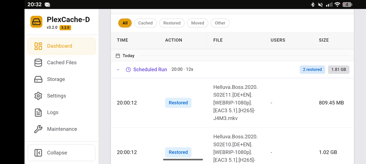
On the Dashboard, the Recent Activity table breaks on narrow viewports. The FILE and USERS column headers overlap, and the filename in the expanded run rows (e.g. under "Scheduled Run") is rendered with a single character per line, so the row becomes extremely tall (see the "H-e-l-l-u-v-a-.-B-o-s-s" screenshot). Environment: PlexCache-D Web UI v0.3.0, Android phone with Chrome (accessed via the LAN IP on port 5757), and Chrome on Windows with browser zoom.
Observations
On Windows at 160% zoom, the desktop layout with the fixed sidebar is still active. The available content width is too small, and the FILE column gets squeezed and wraps per character. Collapsing the sidebar frees up enough width to improve this (filenames wrap normally again), although it's still cramped. At 170% zoom and above, the layout switches to the mobile layout with the sidebar as an overlay menu, and the table renders correctly. There is no overlap and no per-character wrapping.
On the smartphone, the mobile layout is active (sidebar hidden behind the hamburger menu, opening as an overlay), and there is no collapse button. Despite that, the table is broken in exactly the way it is on Windows at 160% with the sidebar expanded: FILE and USERS headers overlap and the filename wraps one character per line. So the mobile layout itself doesn't fix the problem on the phone, whereas the same mobile layout at 170% zoom on Windows does. The difference is probably the actual viewport width. The phone is much narrower than the Windows viewport at 170%, so the table columns (TIME, ACTION, USERS, SIZE) presumably take up all the width and leave the FILE column with almost none.
Expected behavior
The FILE column should keep a sensible minimum width, and the filename should wrap at dots or hyphens, or break only as a last resort. On narrow screens, the table should either scroll horizontally inside its container or switch to a stacked/card layout for each entry. The column headers shouldn't overlap.
Possible fix (untested guess, I could not inspect the exact markup)
The Recent Activity table shouldn't be locked to the width of the screen. It should be allowed to scroll horizontally, like the file list in the Cached Files tab, so the simplest fix is probably to reuse whatever scroll wrapper that table already uses. The one-character-per-line wrapping suggests the FILE cell currently allows breaking at any character (for example via word-break: break-all or overflow-wrap: anywhere in web/static/css/custom.css), which lets the column shrink to almost zero width. Switching that cell to overflow-wrap: break-word and giving the FILE column a min-width (around 12–15rem) inside a container with overflow-x: auto would keep the columns from being squeezed, stop the FILE and USERS headers from overlapping, and let users swipe sideways on narrow screens. Optionally, below roughly 600px, the USERS column could be hidden or merged, or each row could be rendered as a card with the filename on its own line.
Screenshots
Phone view showing the overlapping headers and the vertical filename and widescreen on Phone where menü is fixed and issue has gone.

Activity
DeLo1585 commentedon Sep 30, 2026
Just a note: I know the zoom behavior depends on the device, screen size and DPI, so 160% isn't the same viewport width for everyone, and the exact percentage where it breaks will vary. The zoom and phone tests are only meant to show that the problem appears whenever the content area gets narrow enough. The core issue is that the FILE and USERS columns overlap and the filename collapses to one character per line.
I also noticed that horizontal scrolling is missing in the Recent Activity table, while other views like the Cached Files tab do have horizontal scrolling for the file list. So the Recent Activity table is probably missing the same scroll container, which would let it scroll sideways instead of squeezing the FILE column until it breaks.
Suggested fix: The Recent Activity table shouldn't be locked to the width of the screen. It should be allowed to scroll horizontally, like the file list in the Cached Files tab. Wrapping the table in a container with
overflow-x: autoand giving the FILE column a reasonable minimum width would keep the columns from being squeezed together. On narrow screens the user could then swipe sideways to see all columns instead of the FILE and USERS headers overlapping and the filename breaking into one character per line.DeLo1585 commentedon Sep 30, 2026
FIX IS DONE AND TESTET
DeLo1585 commentedon Sep 30, 2026
@StudioNirin Your welcome 😁
Possible fix: only a single file needs to change (
web/static/css/custom.css, the Recent Activity table rules).Root cause:
.recent-activity-tableusestable-layout: fixedwith 500px of fixed-width columns (TIME, ACTION, USERS, SIZE), so theautoFILE column only gets whatever is left. On a phone in portrait (and at high browser zoom) that is 0px. On top of that,.activity-file-colhasword-break: break-word(an alias ofoverflow-wrap: anywhere) andmin-width: 0, so the cell may collapse completely and wraps one character per line. The table does scroll sideways, but only over those 500px where FILE has no width.Fix: give the table a
min-width, useoverflow-wrap: break-wordfor the filename cell, and use slightly tighter columns when the card is narrow. The run header is kept sticky so its badges don't end up off-screen after scrolling sideways. Tested by me on my phone (Chrome and Firefox, portrait and landscape - See Screenshots #217 (comment) ) and in desktop Chrome at high zoom, running the patchedcustom.cssin my own container. In addition, Claude Sonnet 5.5 compared the old and new CSS in headless Chromium at viewport widths of 360 / 412 / 800 / 1200 px in dark and light theme: from a card width of 720px up the rendering is unchanged, and below that the FILE column keeps a usable width and the table scrolls sideways.Note: this change is independent of #215 (already in
main) and PR #218. It only touches the Recent Activity rules (lines ~154–228 inmain), while those touch other sections of the file (banner/pill and header layout, from line ~445 on). A three-way merge of all three shows no conflicts, and the patch applies cleanly onmain(3a8207c) as well as on top of #218, so it doesn't matter which one is merged first. Only the line offsets of the other hunks shift, which git handles automatically.+34 / −2 lines
StudioNirin commentedon Oct 1, 2026
@Brandon-Haney Does this have any interactions with any of your layouts for those tables?
Brandon-Haney commentedon Oct 1, 2026
@StudioNirin No, it doesn't touch anything I built. The Recent Activity table only lives on the Dashboard, and the patch only changes its own CSS rules. The run grouping and expand/collapse logic aren't affected, and neither are the Cached Files tables.
@DeLo1585 the diagnosis makes sense. The fixed-width columns add up to 500px, so on a phone the filename column is left with almost nothing, and
word-break: break-wordlets it collapse to one character per line. The core of the fix looks right to me: amin-widthon the table, horizontal scroll on the container, and switching tooverflow-wrap: break-word.I'm less sure about the other two parts. The tighter column widths under the container query might be more than the bug needs, since once the table scrolls sideways the original widths should be fine. The sticky run header is the one I'd want to see in action, because sticky positioning inside a table cell with a
cqwwidth can behave differently across browsers.Could you open it as a PR? Then we can pull it, try it on our own setups and decide from there. Happy to be proven wrong on those two if they hold up.
DeLo1585 commentedon Oct 1, 2026
Thanks for the review, Brandon, and for the hint about the two optional parts. I'll open the PR now.
I posted the change as a plain diff first because I still have #218 open and didn't want to stack a second PR on top of it or create conflicts with it. The diff only touches the Recent Activity rules in
custom.css(lines ~154–254), while #218 changes other sections of the file (from line ~445 on). I checked with a three-way merge againstmain(3a8207c) and against the #218 version: no conflicts, so the order of merging doesn't matter. Since that's confirmed and you asked for a PR so you can try it yourselves, there's no reason to wait any longer.One change compared to the diff I posted above: I lowered the
min-widthin the container query from560pxto520px. At 160% browser zoom with the sidebar expanded, my card was only 533px wide, so the 560px table overflowed by 27px and cut off the SIZE column ("222.02 M…"). With 520px the table fits (scrollWidthequals the container width) and the FILE column still has at least ~154px on a phone. Cards of 720px and wider are unchanged.The PR is split into three commits so you can take them separately: 1) the core fix (table
min-width, horizontal scroll,overflow-wrap: break-word), which on its own removes the one-character-per-line wrapping; 2) tighter columns under the container query; 3) the sticky run header. You're right that 2 isn't needed for the bug itself, it just brings the FILE column into view without having to swipe first on a ~360px phone. I tested on my phone in portrait and on desktop (Firefox, 160% zoom, sidebar expanded and collapsed). Happy to drop 2 and 3 if they don't hold up on your setups.DeLo1585 commentedon Oct 1, 2026
Thanks for the review, @Brandon-Haney @StudioNirin. The PR is up: #219.
It is split into three commits: 1 is the actual fix, 2 (tighter columns on narrow cards) is a usability improvement on top, and 3 (sticky run header) builds on 2. If 2 and 3 are more than you want, just drop them. The write-up with the root cause, the tests and the reasoning behind the two optional commits is in a comment on the PR.
Fix Recent Activity table collapsing FILE column on narrow screens (#217
Optional: tighter Recent Activity columns on narrow cards (#217)
Optional: keep Recent Activity run header visible while scrolling sid…
Merge pull request #219 from DeLo1585/fix/217-recent-activity-mobile