
'Omnifood' is a study project I'm did on 'Build Responsive Real-World Websites with HTML and CSS' course by Jonas Schmedtmann.
LIVE DEMO : https://schemingcate.github.io/omnifood/
- HTML (semantic HTML);
- CSS (flexbox, grid);
- JavaScript (DOM-manipulation basics)
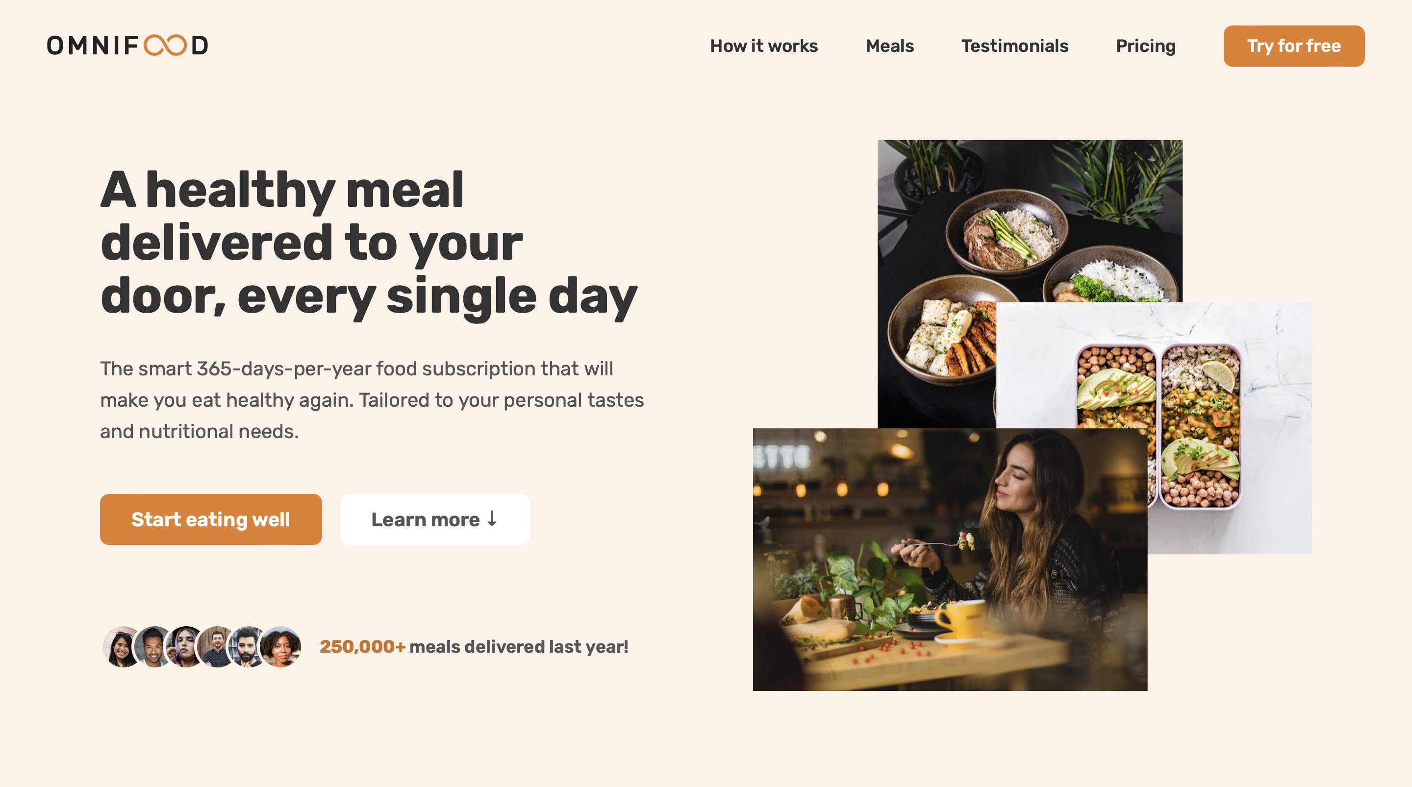
'Omnifood' is a landing page for a food subscription service. The page tells the user about the service and its benefits and encourages to try it by filling out a simple subscription form. The website is responsive and looks good on most screen sizes - from small phones to large desktop monitors. The project is written on HTML and pure CSS, with a couple lines of JavaScript code for finishing touches.
The HTML markup of the page is using modern semantic tags:
<header>,<main>and<footer>;<nav>for navigation in the header as well as in the footer;<address>for contact info;- the main content divided into sections (
<section>) each with individual heading; <figure>for illustrating the food Omnifood makes and testimonials; Go to testimonials section<blockquote>for the text of clients' testimonials etc.
The markup has no errors and is valid, according to https://validator.w3.org/:

//TODO readme - sticky footer - (demo and mentioning js)
//TODO readme - animations (demo)
//TODO readme - form
//TODO readme - media q
//TODO readme - mobile menu
Every img has a descriptive alt text, aria-label is used where it is necessary. All buttons and links are focusable with tab and have bold but beautiful custom focus, suitable for the page's design:

//TODO readme - favicon