This full stack web application (MERN Stack), was built to service the Santa Clara University Senior Design engineering project: A Hardware Solution to Wireless Beehive Monitoring
The frontend is built using React, Redux, and Axios; the backend is built using Express and Node; and the database is managed in MongoDB. The frontend heavily utilizes the open-source React component library, Material UI for styling and design. The backend utilizes Mongoose for database modeling and management.
This project aims to rely solely on open-source technologies to ensure its reliability and longevity for beekeepers around the world.
- Beehive Monitor Web Application
- Table of Contents
- Basic Information
- Backend
- Config
- Server
- Middleware
- Models
- Routes
- Controllers
- Frontend
App.jsindex.jsindex.csstheme.jsstore.js- Components
AboutCardReact ComponentAddApiaryCardReact ComponentAddDeviceCardReact ComponentAddUserCardReact ComponentApiaryCardReact ComponentAutocompleteMapsTypescript ComponentCustomTooltipReact ComponentDeviceCardReact ComponentFAQCardReact ComponentGraphReact ComponentLoadingReact ComponentOverviewReact ComponentSelectApiaryReact ComponentSidebarReact ComponentTopbarReact ComponentUserCardReact Component
- Features
- Pages
- Deployment
- Testing
- License
- Acknowledgments
- Appendix
- Screenshots
- Video Demo
- Contact
Table of contents generated with markdown-toc
To install the necessary dependencies for the frontend and backend, run the following command in the main directory:
npm run yayayaTo install the necessary dependencies for the backend only, run the following command in the main directory:
npm installTo install the necessary dependencies for the frontend only, run the following command in the ./frontend directory:
npm installIf you run into funding errors, try adding --force to the end of your command, and/or running the installations separately.
Use the template .env file to setup necessary configurations such as the MongoDB URI, JWT secret, Google Maps Locations API, and port. For those continuing this project, please contact cpaiz@scu.edu or paizcollin@gmail.com for details or assistance.
To start the frontend and backend, run the following command in the main directory:
npm run devTo start the backend only, run the following command in the main directory:
npm run serverTo start the frontend only, run the following command in the main directory:
npm run clientThe frontend will run on port 3000, and the backend will run on port 5000., by default.
Using the Web Application is simple. The user will be greeted with a login page. If the user has an account, they can login with their credentials. If the user does not have an account, they can register for one. Once logged in, the user will be greeted with a dashboard. The dashboard will display the user's beehives, and the user can use the dropdown to select an apiary and subsequent beehive device to view more information about that specific hive. The user can also add, delete, and update apiaries, each of which is a small organization that contains its own set of devices (hives) that can be added, deleted, and updated. Users may also be added to apiaries to help manage them; members of apiaries can be granted different privileges, with the creator of the apiary having full control of the apiary and its hives. The user can also view the FAQ page, which will display frequently asked questions about the application, as well as the about page, which will display information about the application and its creators. The user can also logout of the application.
The backend is neatly organized into individual modules, each of which is responsible for a specific set of tasks. The modules are as follows: config, server, middleware, models, routes, and server. Each module is described in detail below.
The config module is responsible for setting up the MongoDB connection using Mongoose and the ATLAS_URI provided by the MongoDB database.
This file is responsible for connecting the application to the MongoDB database using the ATLAS_URI provided by the MongoDB database. The ATLAS_URI is stored in the .env file, which is not included in the repository for security reasons. The ATLAS_URI is a string that contains the username, password, and database name for the MongoDB database. The db.js file uses the ATLAS_URI to connect to the database using the mongoose.connect() method.
const connectDB = require("./connectDB");

// Call the function
connectDB();
In this example, the connectDB function is imported from the db.js file and called. This will connect your application to the database using the MongoDB URI provided in the .env file.
The server is responsible for setting up the server and connecting to the MongoDB database. The server is also responsible for listening on the port specified in the .env file.
This Node.js sets up an HTTP server using the Express framework. It exports a single function that starts the server and listens for incoming requests.
const startServer = require("./server");

// Call the function
startServer();
In this example, the startServer function is imported from the server.js file and called. This will start the server and listen for incoming requests.
The middleware module is responsible for setting up the middleware for the application.
This is a middleware function that adds authentication to a Node.js/Express application. The protect function checks for a valid JSON Web Token (JWT) in the Authorization header of incoming HTTP requests. If a valid token is found, the function decodes the token and sets the authenticated user in the request object. If a valid token is not found, the function returns a 401 Unauthorized response.
The protect function can be used as a middleware function in any Express route that requires authentication. Here's an example of how to use the protect middleware function in an Express route:
const express = require("express");
const protect = require("../middleware/protect");

const router = express.Router();

router.get("/", protect, (req, res) => {
  res.json({ user: req.user });
});
In this example, the protect middleware function is used as the second argument in the router.get() method. This means that the protect function will be called before the route handler function. If the JWT is valid and the user is found, the req.user property will be set to the user object without the password field, and the route handler function will be called. If the JWT is not valid or not provided, a 401 Unauthorized response will be returned.
| Parameter | Description |
|---|---|
req |
The incoming HTTP request object. |
res |
The outgoing HTTP response object. |
next |
A function that passes control to the next middleware function in the request-response cycle. |
The protect function follows this flow:
- Check if the
Authorizationheader exists and starts with the word "Bearer". - If the header exists and starts with "Bearer", try to verify the JWT.
- If the JWT is valid, get the user ID from the token payload and find the user in the database.
- If the user is found, set the
req.userproperty to the user object without the password field, and call thenext()function to pass control to the next middleware. - If the JWT is not valid, return a 401 Unauthorized response with an error message.
- If the
Authorizationheader does not exist or does not start with "Bearer", return a 401 Unauthorized response with an error message.
This is a middleware function that adds error handling to a Node.js/Express application. The errorHandler function catches any errors that occur in the application and sends an appropriate error response to the client.
The errorHandler function should be used as the last middleware function in the middleware stack of an Express application. Here's an example of how to use the errorHandler middleware function in an Express application:
const express = require("express");
const errorHandler = require("../middleware/errorHandler");

const app = express();

// Set up middleware functions
app.use(express.json());
app.use(cors());

// Set up routes
app.get("/", (req, res) => {
  res.send("Hello, world!");
});

// Set up error handler middleware
app.use(errorHandler);

// Start server
app.listen(3000, () => {
  console.log("Server started on port 3000");
});
In this example, the errorHandler middleware function is added to the middleware stack using the app.use() method. This means that the errorHandler function will be called if any middleware or route handler functions before it throw an error. The errorHandler function sends an error response with the error message and stack trace (if in development mode) to the client.
| Parameter | Description |
|---|---|
err |
The error object that was thrown by a previous middleware or route handler function. |
req |
The incoming HTTP request object. |
res |
The outgoing HTTP response object. |
next |
A function that passes control to the next middleware function in the request-response cycle. |
The errorHandler function follows this flow:
- Get the status code from the
resobject. If the status code is not set, default to 500 (Internal Server Error). - Set the HTTP status code of the response to the status code obtained in the previous step.
- Send a JSON response to the client with the error message and stack trace (if in development mode).
The errorHandler function is itself an error handling middleware function, and its purpose is to catch errors thrown by previous middleware or route handler functions. If an error is thrown by a previous function, the errorHandler function will catch the error and send an appropriate error response to the client. The error message is sent as the message property of the JSON response, and the stack trace (if in development mode) is sent as the stack property of the JSON response.
The three models used in the application are the User, Apiary, and Data models. The User model is used to store user data in the database, the Apiary model is used to store apiary data in the database. and the Data model is used to store data from the devices in the database.
This is a schema definition for the user model in a Node.js/Express application using Mongoose. The userSchema defines the structure and validation rules for user documents that will be stored in a MongoDB database.
| Field | Type | Required | Unique | Example Value | Description |
|---|---|---|---|---|---|
| name | String |
Yes | No | "John Doe" | The user's name. |
String |
Yes | Yes | "johndoe@example.com" | The user's email address. Must be unique. | |
| password | String |
Yes | No | "$2a$10$V7X9I...jMx7" | The user's password. |
| createdAt | Date |
No | No | "2023-04-25T12:34:56Z" | The timestamp for when the user was created |
| updatedAt | Date |
No | No | "2023-04-25T12:34:56Z" | The timestamp for when the user was last updated |
Note that the createdAt and updatedAt fields are of type Date and are automatically generated by Mongoose using the timestamps option set to true in the schema.
{
  "_id": "6153db097a880f72a2d6c853",
  "name": "John Doe",
  "email": "johndoe@example.com",
  "password": "$2a$10$YSiN2VK/OdtZ5N5c5S5S5OAmQ2IyHz.gxCGKdDw.Ggchc20OaG1Ia",
  "createdAt": "2021-09-28T05:45:29.586Z",
  "updatedAt": "2021-09-28T05:45:29.586Z"
}
Note that the password field is encrypted using bcrypt, so the value shown is just an example of an encrypted password hash. The actual value would be a long string of random characters.
This is a schema definition for the apiary.model in a Node.js/Express application using Mongoose. The apiarySchema defines the structure and validation rules for apiary documents that will be stored in a MongoDB database. This model consists of a geoSchema which defines a location, a memberSchema which defines a list of users, a deviceSchema which defines a list of devices, and an apiarySchema which defines an apiary.
| Field | Type | Required | Unique | Example Value | Description |
|---|---|---|---|---|---|
| type | String |
No | No | "Point" | The type of the location data. Default value is "Point". |
| coordinates | Array of Number |
No | No | [-73.9857, 40.7484] |
An array of longitude and latitude coordinates in that order. Indexed as a 2dsphere to enable location-based queries. |
| formattedAddress | String |
No | No | "123 Main St, New York, NY" | The formatted address of the location. |
| placeID | String |
No | No | "ChIJd8BlQ2BZwokRAFUEcm_qrcA" | The place ID of the location. |
| Field | Type | Required | Unique | Example Value | Description |
|---|---|---|---|---|---|
| user | ObjectId |
Yes | No | "61579f9a53e7e8f2916d47b1" | References a user object associated with the member |
| role | String |
No | No | "USER" | The role of the member, must be one of "USER", "ADMIN", or "CREATOR" |
| Field | Type | Required | Unique | Example Value | Description |
|---|---|---|---|---|---|
| serial | String |
Yes | Yes | "ABC123" | The serial number of the device |
| name | String |
Yes | No | "Device 1" | The name of the device |
| remote | String |
Yes | Yes | "https://remote.it/ABC123" | The remote.it URL of the device |
| data | ObjectId |
No | No | "6154353e7eb3aa3b1886d051" | The ID of the data object associated with the device |
| createdAt | Date |
No | No | "2022-01-01T00:00:00.000Z" | The date and time when the device was created |
| updatedAt | Date |
No | No | "2022-01-02T00:00:00.000Z" | The date and time when the device was last updated |
| Field | Type | Required | Unique | Example Value | Description |
|---|---|---|---|---|---|
| name | String | No | No | "My Apiary" | The name of the Apiary |
| location | Object of type geoSchema |
No | No | See geoSchema |
The coordinates of the Apiary |
| members | Array of Objects of type memberSchema |
Yes | No | See memberSchema |
An array of members associated with the Apiary |
| devices | Array of Objects of type deviceSchema |
No | No | See deviceSchema |
An array of devices associated with the Apiary |
| createdAt | Date | No | No | - | The date when the Apiary was created |
| updatedAt | Date | No | No | - | The date when the Apiary was last updated |
{
  "_id": "61701a1d45c5556f37e18f22",
  "name": "My Apiary",
  "location": {
    "type": "Point",
    "coordinates": [50.1234, -120.5678],
    "formattedAddress": "123 Main Street, Vancouver, BC, Canada",
    "placeID": "ChIJ2-3w3EXyhlQRugc5uVrXQ8o"
  },
  "members": [
    {
      "_id": "61701a1d45c5556f37e18f23",
      "user": "616f5c5dc5be5e8b5fabc123",
      "role": "ADMIN"
    },
    {
      "_id": "61701a1d45c5556f37e18f24",
      "user": "616f5c5dc5be5e8b5fabc456",
      "role": "USER"
    }
  ],
  "devices": [
    {
      "_id": "61701a1d45c5556f37e18f25",
      "serial": "ABC123",
      "name": "Sensor 1",
      "remote": "https://example.com/ABC123",
      "data": "61701a1d45c5556f37e18f26",
      "createdAt": "2022-10-19T12:34:56.789Z",
      "updatedAt": "2022-10-19T12:34:56.789Z"
    },
    {
      "_id": "61701a1d45c5556f37e18f27",
      "serial": "DEF456",
      "name": "Sensor 2",
      "remote": "https://example.com/DEF456",
      "data": null,
      "createdAt": "2022-10-19T12:34:56.789Z",
      "updatedAt": "2022-10-19T12:34:56.789Z"
    }
  ],
  "createdAt": "2022-10-19T12:34:56.789Z",
  "updatedAt": "2022-10-19T12:34:56.789Z"
}This is a schema definition for a data.model in a Node.js/Express application using Mongoose. The dataSchema defines the structure and validation rules for data documents that will be stored in a MongoDB database. This model consists of a dataPointSchema which defines the structure of an individual data point, and a dataSchema which defines a list of datapoints.
The dataPointSchema defines the schema for an individual data point. It consists of the following fields:
| Field | Type | Required | Unique | Example Value | Description |
|---|---|---|---|---|---|
| time | Date |
No | No | Date.now | The time the data point was recorded |
| raw_activity.x | Number |
Yes | No | 5.2 | The x coordinate of the raw activity data |
| raw_activity.y | Number |
Yes | No | 3.8 | The y coordinate of the raw activity data |
| weather.temp | Number |
Yes | No | 25.4 | The temperature in Celsius at the time of recording |
| weather.humidity | Number |
Yes | No | 70.2 | The humidity in percent at the time of recording |
| weather.windspeed | Number |
Yes | No | 10.3 | The wind speed in meters per second at the time of recording |
| prediction_activity.x | Number |
Yes | No | 2.1 | The x coordinate of the predicted activity data |
| prediction_activity.y | Number |
Yes | No | 1.5 | The y coordinate of the predicted activity data |
| last_prediction_deviation | Number |
No | No | 0.7 | The deviation between the raw and predicted activity data at the time of recording |
The dataSchema defines the schema for a collection of data points. It consists of the following fields:
| Field | Type | Required | Unique | Example Value | Description |
|---|---|---|---|---|---|
| apiary | ObjectId |
No | No | "6154353e7eb3aa3b1886d051" | Reference to the Apiary model |
| serial | String |
Yes | Yes | "ABC123" | Unique identifier of the device sending the data |
| datapoints | Array of dataPointSchema |
No | No | See dataPointSchema |
Array containing the data points sent by the device |
{
  "_id": "60934c7a2a58581ed82b8d96",
  "apiary": "6051902568f4a4dbd4f1c0e5",
  "serial": "XYZ123",
  "datapoints": [
    {
      "time": "2022-04-26T12:00:00.000Z",
      "raw_activity": { "x": 10, "y": 20 },
      "weather": { "temp": 25, "humidity": 80, "windspeed": 10 },
      "prediction_activity": { "x": 12, "y": 22 },
      "last_prediction_deviation": 2.5
    },
    {
      "time": "2022-04-26T12:05:00.000Z",
      "raw_activity": { "x": 11, "y": 21 },
      "weather": { "temp": 26, "humidity": 81, "windspeed": 11 },
      "prediction_activity": { "x": 13, "y": 23 },
      "last_prediction_deviation": 2.0
    }
  ],
  "createdAt": "2021-05-06T00:00:00.000Z",
  "updatedAt": "2021-05-06T00:00:00.000Z"
}The routes module contains the route definitions for the Node.js/Express application. The routes are organized into separate files based on their purpose. The user.routes file contains the routes for user authentication and authorization, the apiary.routes file contains the routes for the apiary endpoints, and the data.routes file contains the routes for the data endpoints.
This file defines the routes for user authentication and authorization. The routes are protected by authentication middleware to ensure that only authenticated users can access them.
| Endpoint | Request Type | Authentication | Description |
|---|---|---|---|
/api/users/register |
POST |
- | Registers a new user with the provided credentials |
/api/users/login |
POST |
- | Logs in a user with the provided credentials |
/api/users/me |
GET |
Protect | Gets the current user |
This file defines the routes for the apiary related endpoints. The routes are protected by authentication middleware to ensure that only authenticated users can access them.
| Endpoint | Request Type | Authentication | Description |
|---|---|---|---|
/api/apiaries |
GET |
Protect |
Returns all apiaries associated with the authenticated user. (no data) |
/api/apiaries/filter/:filterid |
GET |
Protect |
Returns all apiaries associated with the authenticated user. (includes device data filtered by time range; limited to 1000 datapoints for request efficiency) |
/api/apiaries |
POST |
Protect |
Creates a new apiary associated with the authenticated user. |
/api/apiaries/apiary/:apiary_id |
PUT |
Protect |
Updates the specified apiary associated with the authenticated user. |
/api/apiaries/apiary/:apiary_id |
DELETE |
Protect |
Deletes the specified apiary associated with the authenticated user. |
/api/apiaries/apiary/:apiary_id/setdevice |
PUT |
Protect |
Sets a new device for the specified apiary associated with the authenticated user. |
/api/apiaries/apiary/:apiary_id/device/:device_id/updatedevice |
PUT |
Protect |
Updates the specified device for the specified apiary associated with the authenticated user. |
/api/apiaries/apiary/:apiary_id/device/:device_id/serial/:serial/deletedevice |
PUT |
Protect |
Deletes the specified device for the specified apiary associated with the authenticated user. |
/api/apiaries/apiary/:apiary_id/setmember |
PUT |
Protect |
Sets a new member for the specified apiary associated with the authenticated user. |
/api/apiaries/apiary/:apiary_id/user/:user_id/updatemember |
PUT |
Protect |
Updates the specified member for the specified apiary associated with the authenticated user. |
/api/apiaries/apiary/:apiary_id/user/:user_id/deletemember |
PUT |
Protect |
Deletes the specified member for the specified apiary associated with the authenticated user. |
This file defines the routes for the data related endpoints.
The controllers directory contains the functions that handle the logic for each route.
| Endpoint | Request Type | Authentication | Description |
|---|---|---|---|
/api/data/serial/:serial |
PUT |
None | Puts the data from the device with the specified serial number into the database. |
This file handles user-related routes and requests.
| Function | Route | Access | Description |
|---|---|---|---|
| registerUser | POST /api/users |
Public | Registers a new user. |
| loginUser | POST /api/users/login |
Public | Authenticates a user and generates a JSON Web Token (JWT) for authorization. |
| getMe | GET /api/users/me |
Private | Gets user data based on the ID of the authenticated user. |
| generateToken | - | - | Generates a JSON Web Token (JWT) for authorization. |
This file handles apiary-related routes and requests, including creating, updating, and deleting apiaries; setting, updating, and deleting devices; and setting, updating, and deleting members.
Here is the updated table with the new GET request:
| Function | Route | Access | Description |
|---|---|---|---|
| checkUserToApiary | - | Private; apiary admins | Checks if the logged-in user is a member of the specified apiary and has admin privileges. |
| getApiaries | GET /api/apiaries |
Private; all users | Retrieves all apiaries associated with the currently logged-in user. |
| getApiaryWithDeviceData | GET /api/apiaries/filter/:filter |
Private; all users | Retrieves apiaries with device data based on the specified date filter. Data is limited to 1000 datapoints for speed and efficiency. |
| setApiary | POST /api/apiaries |
Private; all users | Creates a new apiary. |
| updateApiary | PUT /api/apiaries/apiary/:apiary_id |
Private; apiary admins | Updates the specified apiary's name and location. |
| deleteApiary | DELETE /api/apiaries/apiary/:apiary_id |
Private; apiary creator | Deletes the specified apiary and all associated data. |
| setDevice | PUT /api/apiaries/apiary/:apiary_id/setdevice |
Private; apiary admins | Sets a new device to an apiary. |
| updateDevice | PUT /api/apiaries/apiary/:apiary_id/device/:device_id/updatedevice |
Private; apiary admins | Updates an existing device in an apiary. |
| deleteDevice | PUT /api/apiaries/apiary/:apiary_id/device/:device_id/serial/:serial/deletedevice |
Private; apiary admins | Deletes an existing device from an apiary. |
| setMember | PUT /api/apiaries/apiary/:apiary_id/setmember |
Private; apiary admins | Updates the user's role in the apiary to Editor. |
| updateMember | PUT /api/apiaries/apiary/:apiary_id/user/:user_id/updatemember |
Private; apiary admins | Updates the user's role in the apiary to Owner. |
| deleteMember | PUT /api/apiaries/apiary/:apiary_id/user/:user_id/deletemember |
Private; apiary admins | Deletes the specified user from the apiary. |
This file handles data-related routes and requests. It includes uploading data points to the database.
| Function | Route | Access | Description |
|---|---|---|---|
| putData | POST /api/data/serial/:serial |
Needs protection (ML team authorized only) | Uploads a data point to the database based on the provided serial number. |
The frontend of the application is built using React. The src directory contains the source code for the frontend, including the components, pages, stylsheets, and features.
The App.js component is the root component of the application. It is responsible for rendering the application's navigation bar and routing the user to the appropriate page based on the URL.
The index file is the entry point of the application. It renders the App component and wraps it in a BrowserRouter component to enable routing.
The index.css file contains the global styles for the application.
This stylesheet imports the "Poppins" font family from Google Fonts with three weights - 400 (regular), 600 (semi-bold), and 700 (bold) - and the display property set to "swap".
@import url("https://fonts.googleapis.com/css2?family=Poppins:wght@400;600;700&display=swap");The stylesheet applies 100% height and width to the html, body, #root, .app, and .content selectors, and uses the "Poppins" font family as the default font for these elements.
html,
body,
#root,
.app,
.content {
  height: 100%;
  width: 100%;
  font-family: "Poppins", sans-serif;
}The .app selector has its display set to "flex" and position set to "relative".
.app {
  display: flex;
  position: relative;
}The stylesheet applies custom styling to the scrollbar using the WebKit CSS scrollbar pseudo-elements. The width of the scrollbar is set to 10px, the track color is set to #e0e0e0, and the handle color is set to #888. On hover, the track color changes to #555.
::-webkit-scrollbar {
  width: 10px;
}

/* Track */
::-webkit-scrollbar-track {
  background: #e0e0e0;
}

/* Handle */
::-webkit-scrollbar-thumb {
  background: #888;
}

/* Handle on Hover */
::-webkit-scrollbar-track:hover {
  background: #555;
}The fieldset selector has its border and outline set to "none" to remove any default styling applied to the element.
fieldset {
  border: none !important;
  outline: none !important;
}
That's it! This is a basic documentation of the CSS stylesheet provided.
The theme file contains the color design tokens and MUI theme settings for the application. It exports two functions, tokens and themeSettings, which can be used to retrieve the color design tokens and MUI theme settings for the specified mode.
The tokens function accepts a single argument, mode, which can either be "light" or "dark", and returns an object containing the color design tokens for the specified mode.
import { tokens } from "./theme";

const darkModeTokens = tokens("dark");
const lightModeTokens = tokens("light");The themeSettings function accepts a single argument, mode, which can either be "light" or "dark", and returns an object containing the MUI theme settings for the specified mode.
import { createTheme } from "@mui/material/styles";
import { themeSettings } from "./theme";

const darkTheme = createTheme(themeSettings("dark"));
const lightTheme = createTheme(themeSettings("light"));The store file configures a Redux store using @reduxjs/toolkit. It uses two slices, auth and apiary, to manage state related to user authentication and the application's apiary feature.
The AboutCard component is a reusable component that displays an information card with a title, avatar, and expandable content. It is used in the About page to display information regarding the project.
| Name | Type | Required | Description |
|---|---|---|---|
| faq | List of Strings |
Yes | An array of two strings: the title of the card and the content to display when the card is expanded. |
| Name | Type | Description |
|---|---|---|
| expand | Boolean |
Determines whether the card is expanded or collapsed. |
The AboutCard component does not define any methods.
The AboutCard component does not define any handlers.
| Name | Package | Description |
|---|---|---|
| ArrowDropDownOutlinedIcon | @mui/icons-material |
An icon component that represents a downward-pointing arrow |
| Avatar | @mui/material |
A component that represents a user or entity |
| Box | @mui/material |
A component that provides a flexible container for content |
| Card | @mui/material |
A container component that displays information |
| CardActions | @mui/material |
A component that provides space for buttons or icons |
| CardHeader | @mui/material |
A component that displays a header for a card |
| Collapse | @mui/material |
A component that animates the expansion or collapse of content |
| Grid | @mui/material |
A layout component that helps to organize content in a grid |
| IconButton | @mui/material |
A button component that displays an icon |
| InfoOutlinedIcon | @mui/icons-material |
An icon component that represents an information icon |
| Typography | @mui/material |
A component that displays text content |
| tokens | Custom function | A function that returns color tokens based on the current theme |
| useTheme | @mui/material |
A hook that provides access to the current theme |
| useState | react |
A hook that adds state to a functional component |
import AboutCard from "./AboutCard";

const ExampleComponent = () => {
  const faq = ["Title", "Content"];

  return <AboutCard faq={faq} />;
};
In this example, we import the AboutCard component and render it with an array of two strings that will be displayed as the title and content of the card. When the user clicks on the arrow button in the card header, the content of the card will expand or collapse.
The AddApiaryCard component is a form card used to create a new apiary in a React application. It includes a name input field, a location input field powered by the GoogleMaps component, and a button to submit the form data.
The AddApiaryCard component does not accept any props.
| Name | Type | Description |
|---|---|---|
| value | Object |
The selected location value from the GoogleMaps component. |
| expand | Boolean |
Whether or not the card is expanded. |
| formData | Object |
The form data to be submitted, including the apiary name and location information. |
The AddApiaryCard component does not define any methods.
| Name | Parameters | Description |
|---|---|---|
| onChange | e: Event |
Updates the form data when input fields are changed. |
| onSubmit | e: Event |
Submits the form data to the Redux store via the setApiary action. |
| Name | Package | Description |
|---|---|---|
| AddOutlinedIcon | @mui/icons-material |
A material design add icon. |
| Autocomplete | @mui/material |
A component to create an input field with autocomplete functionality. |
| Avatar | @mui/material |
A component to display user profile pictures or icons. |
| Box | @mui/material |
A layout component to create a box container. |
| Button | @mui/material |
A material design button component. |
| Card | @mui/material |
A material design card component. |
| CardActions | @mui/material |
A component to create a row of actions for a Card component. |
| Collapse | @mui/material |
A component to collapse content based on a boolean state variable. |
| debounce | lodash |
A function to debounce input field changes. |
| GoogleMaps | ./AutocompleteMaps.tsx |
A custom component to display a Google Maps autocomplete input field. |
| Grid | @mui/material |
A layout component to create a grid of items. |
| IconButton | @mui/material |
A component to create clickable icons. |
| parse | autosuggest-highlight/parse |
A function to parse and highlight text in an autocomplete input. |
| TextField | @mui/material |
A material design input component. |
| useTheme | @mui/material |
A hook to access the current theme. |
| useDispatch | react-redux |
A hook to dispatch actions to the Redux store. |
| useState | react |
A hook to manage state variables in a functional component. |
import AddApiaryCard from "./AddApiaryCard";

const ParentComponent = () => {
  return (
    <div>
      <AddApiaryCard />
    </div>
  );
};

export default ParentComponent;
In this example, when the form is submitted, the data is sent to the Redux store via the setApiary action. This data includes the apiary name and location information provided by the GoogleMaps component.
This component renders a card with a form to add a new device to an apiary. The form includes an input field for the device name, a select field for the device type, and a button to submit the form data.
| Name | Type | Required | Description |
|---|---|---|---|
| apiary | Object |
Yes | An object with data for the apiary where the device is added |
| userRole | String |
Yes | A string with the user role, either "USER" or "ADMIN" |
| Name | Type | Description |
|---|---|---|
| expand | Boolean |
A boolean indicating whether the card is expanded or not |
| formData | Object |
An object containing the values of the form inputs |
The AddDeviceCard component does not define any methods.
| Name | Parameters | Description |
|---|---|---|
| onChange | e: Event |
A function to handle the onChange event of the form inputs |
| onSubmit | e: Event |
A function to handle the onSubmit event of the form |
| Name | Package | Description |
|---|---|---|
| AddOutlinedIcon | @mui/icons-material |
An icon component that displays a plus symbol. |
| Avatar | @mui/material |
A component for displaying a circular image or icon. |
| Box | @mui/material |
A component for wrapping and styling its children. |
| Button | @mui/material |
A component for displaying a clickable button. |
| Card | @mui/material |
A container component for displaying content and actions related to a single subject. |
| CardActions | @mui/material |
A container component for grouping action buttons in a card. |
| Collapse | @mui/material |
A component that allows for collapsing and expanding its children. |
| Grid | @mui/material |
A layout component for arranging its children in a grid. |
| IconButton | @mui/material |
A button component that displays an icon. |
| TextField | @mui/material |
A component for displaying and inputting text. |
| useDispatch | react-redux |
A hook for dispatching actions to the Redux store. |
| useSelector | react-redux |
A hook for accessing state from the Redux store. |
| useNavigate | react-router-dom |
A hook for navigating to different routes in a React application. |
| useTheme | @mui/material |
A hook that provides access to the MUI theme. |
| useState | React |
A hook for managing state in functional components. |
import React from "react";
import AddDeviceCard from "./AddDeviceCard";

const MyComponent = () => {
  return (
    <AddDeviceCard
      apiary={{ _id: "apiaryId", name: "apiaryName" }}
      userRole="ADMIN"
    />
  );
};

export default MyComponent;
In this example, MyComponent renders the AddDeviceCard component passing the required props apiary and userRole. The apiary prop is an object with the data for the apiary where the device will be added, and the userRole prop is a string indicating the role of the user, either "USER" or "ADMIN".
The AddUserCard component is a React component that displays a card with a button to expand a form to add a new user to an apiary. It takes in two props: apiary and userRole.
| Name | Type | Required | Description |
|---|---|---|---|
| apiary | Object |
Yes | An object containing data for the APIary. |
| userRole | String |
Yes | The role of the user creating the new user. |
| Name | Type | Description |
|---|---|---|
| expand | Boolean |
Determines whether the form to add a new user is expanded. |
| formData | Object |
An object containing the email and role of the new user. |
The AddUserCard component does not define any methods.
| Name | Parameters | Description |
|---|---|---|
| onChange | e: Event |
Updates the formData state with the input value of the form. |
| onSubmit | e: Event |
Dispatches an action to add a new member to the APIary with the email and role provided in the formData state. |
| Name | Package | Description |
|---|---|---|
| Avatar | @mui/material |
Displays an avatar with an icon. |
| Box | @mui/material |
A layout component that allows for flexible box sizing. |
| Button | @mui/material |
A button component with customizable styling. |
| Card | @mui/material |
A component that displays a card with a shadow effect. |
| CardActions | @mui/material |
A layout component that displays a set of buttons below the card content. |
| Checkbox | @mui/material |
A component that displays a checkbox. |
| Collapse | @mui/material |
A component that animates the expanding and collapsing of its children. |
| FormControlLabel | @mui/material |
A component that combines a label with a form control, such as a checkbox or radio button. |
| Grid | @mui/material |
A layout component that displays its children in a grid. |
| IconButton | @mui/material |
A button component that displays an icon. |
| TextField | @mui/material |
A component that displays an input field for text. |
import AddUserCard from "./AddUserCard";

const MyComponent = () => {
  const apiary = { _id: "12345", name: "My APIary" };
  const userRole = "ADMIN";

  return <AddUserCard apiary={apiary} userRole={userRole} />;
};
In this example, the MyComponent component renders the AddUserCard component with an apiary object and a userRole string. The AddUserCard component displays a card with a button to expand a form to add a new user to the APIary.
The ApiaryCard component is a reusable component in a React application that displays information about an apiary such as its name, location and other details. It allows users to edit, delete and update the apiary information. This component utilizes Material-UI library.
The following table lists the props that can be passed to ApiaryCard component:
| Name | Type | Required | Description |
|---|---|---|---|
| apiary | Object |
Yes | An object containing apiary information |
The ApiaryCard component has the following states:
| Name | Type | Description |
|---|---|---|
| expand | Boolean |
Tracks whether the form for editing the apiary should expand |
| formData | Object |
Tracks the form data entered by the user for updating |
The ApiaryCard component does not define any methods.
| Name | Parameters | Description |
|---|---|---|
| onChange | e: Event |
Updates the formData state on form input change |
| onSubmit | e: Event |
Submits the form data to update the apiary |
| onDelete | e: Event |
Deletes the apiary from the application |
| Name | Package | Description |
|---|---|---|
| AddDeviceCard | ./AddDeviceCard |
A form for adding a new device to the apiary. |
| AddUserCard | ./AddUserCard |
A form for adding a new user to the apiary. |
| Avatar | @mui/material |
A component for displaying a user's avatar. |
| Box | @mui/material |
A layout component that displays child components in a box. |
| Button | @mui/material |
A component for displaying a button. |
| Card | @mui/material |
A component that displays a card. |
| CardActions | @mui/material |
A component for displaying actions in a card. |
| CardHeader | @mui/material |
A component for displaying a header in a card. |
| Collapse | @mui/material |
A component for animating the expansion and collapse of a card's content. |
| DeviceCard | ./DeviceCard |
A card displaying details of a device in the apiary. |
| DeviceHubOutlinedIcon | @mui/icons-material |
An icon component representing a device hub. |
| EditOutlinedIcon | @mui/icons-material |
An icon component representing an edit button. |
| Grid | @mui/material |
A layout component that displays child components in a grid. |
| GroupOutlinedIcon | @mui/icons-material |
An icon component representing a group. |
| IconButton | @mui/material |
A component for displaying an icon that can be clicked. |
| TextField | @mui/material |
A component for displaying a text field that can be used for user input. |
| Typography | @mui/material |
A component for displaying text. |
| useDispatch | react-redux |
A hook that returns the Redux store's dispatch function. |
| useState | react |
A hook that allows functional components to use component-level state. |
import { ApiaryCard } from "./components";

const apiary = {
  _id: 1,
  name: "My Apiary",
  location: {
    latitude: 43.6532,
    longitude: -79.3832,
    formattedAddress: "Toronto, ON, Canada",
  },
  devices: [
    {
      _id: 1,
      name: "Device 1",
      macAddress: "00:00:00:00:00:01",
    },
    {
      _id: 2,
      name: "Device 2",
      macAddress: "00:00:00:00:00:02",
    },
  ],
  members: [
    {
      user: {
        _id: 1,
        name: "User 1",
        email: "user1@example.com",
      },
      role: "CREATOR",
    },
    {
      user: {
        _id: 2,
        name: "User 2",
        email: "user2@example.com",
      },
      role: "USER",
    },
  ],
};

const App = () => {
  return <ApiaryCard apiary={apiary} />;
};
In this example, we will render an ApiaryCard component with the provided apiary object. Users can edit, delete and update the apiary details by expanding the form using the dropdown arrow button.
This component is a wrapper around the Autocomplete component from MUI that provides an autocomplete feature for locations using Google Maps API. The component suggests location results as the user types and selects a location from the options.
| Name | Type | Required | Description |
|---|---|---|---|
| value | PlaceType |
Yes | The selected location value. |
| setValue | function |
Yes | A function to set the selected location value. |
| Name | Type | Description |
|---|---|---|
| inputValue | String |
The current input value of the Autocomplete component. |
| options | readonly PlaceType[] |
An array of location options fetched from Google Maps API. |
| loaded | Boolean |
Indicates whether the Google Maps API script has loaded or not. |
The AutocompleteMaps component does not define any methods.
The AutocompleteMaps component does not define any handlers.
| Name | Type | Description |
|---|---|---|
| MainTextMatchedSubstrings | interface |
An interface representing the matched substrings in the main text of a location. |
| StructuredFormatting | interface |
An interface representing the structured formatting of a location. |
| PlaceType | interface |
An interface representing a location. |
| Component | Package | Description |
|---|---|---|
| Autocomplete | @mui/material |
A component that provides an input field with an autocomplete dropdown, which displays a list of options based on user input. |
| Box | @mui/material |
A component used for creating layout containers that can contain other components. |
| Grid | @mui/material |
A component used for creating grid-based layouts. |
| LocationOnIcon | @mui/icons-material |
An icon component used for indicating a location. |
| TextField | @mui/material |
An input field component used for accepting user input. |
| Typography | @mui/material |
A component used for displaying text with different styles and variations. |
import GoogleMaps from "./AutocompleteMaps.tsx";

function MyComponent() {
  const [value, setValue] = React.useState(null);

  return <GoogleMaps value={value} setValue={setValue} />;
}
In this example, the value prop is the currently selected place, and the setValue prop is a function that gets called with the selected place object when a new place is selected. You can pass these props to the GoogleMaps component and it will handle the rest.
Note that you'll need to obtain a Google Maps API key and enable the Places API in order to use this component. You can do this by following the instructions in the Google Maps JavaScript API documentation.
The CustomTooltip component is a custom tooltip component used for displaying additional information when hovering over a Rechart element. It receives active, payload, and label as props and renders the tooltip content accordingly, based on what metrics the Recharts graph is currently populated with.
| Name | Type | Required | Description |
|---|---|---|---|
| active | Boolean |
Yes | Determines whether the tooltip should be displayed or not. |
| payload | Array |
Yes | An array of data points representing the values of the chart. |
| label | String |
Yes | The label of the current data point being hovered. |
The CustomTooltip component does not define any state.
The CustomTooltip component does not define any methods.
The CustomTooltip component does not define any handlers.
| Name | Package | Description |
|---|---|---|
| Box | @mui/material |
A layout component for creating boxes. |
| Typography | @mui/material |
A component for displaying text. |
import CustomTooltip from "./CustomTooltip";

const Chart = () => {
  // Chart component logic

  return (
    <div>
      {/* Chart components */}
      <CustomTooltip active={true} payload={data} label={dateLabel} />
      {/* Other components */}
    </div>
  );
};

export default Chart;
In this example, the CustomTooltip component is imported and rendered within a Chart component. The CustomTooltip component is given the active, payload, and label props, which represent the tooltip's visibility, data points, and label information, respectively. The CustomTooltip component will be displayed when active is true and there are valid payload and label values. This component can be used within a chart component to provide customized tooltip functionality.
The DeviceCard component is a React component that displays information about a device in a card format. The card displays basic information about the device, including its name, serial number, and a remote link. Users with the appropriate access level can edit or delete the device using the provided buttons.
| Name | Type | Required | Description |
|---|---|---|---|
| device | Object |
Yes | An object containing information about the device. |
| apiary | Object |
Yes | An object containing information about the apiary that the device belongs to. |
| userRole | String |
Yes | A string representing the user's role in the system. |
| Name | Type | Description |
|---|---|---|
| expand | Boolean |
A boolean value indicating whether the form for editing the device is expanded. |
| formData | Object |
An object containing the current form data for editing the device. |
The DeviceCard component does not define any methods.
| Name | Parameters | Description |
|---|---|---|
| onChange | e: Event |
A handler function to update the formData state when form fields change. |
| onSubmit | e: Event |
A handler function to submit the form for updating the device information. |
| onDelete | e: Event |
A handler function to delete the device. |
| Name | Package | Description |
|---|---|---|
| Avatar | @mui/material |
Displays a circular image or icon that represents a user or entity. |
| Box | @mui/material |
A container component that can be used to group and space out elements. |
| Button | @mui/material |
A component for user interaction, such as triggering an action or event. |
| Card | @mui/material |
A container component that is used to group related content. |
| CardActions | @mui/material |
A container component for buttons and other action elements that are placed after the main content of a card. |
| CardHeader | @mui/material |
A container component for displaying a header in a Card. |
| Collapse | @mui/material |
A component that enables a content to be shown or hidden based on its visibility. |
| EditOutlinedIcon | @mui/icons-material |
An icon that represents the edit action. |
| Grid | @mui/material |
A responsive grid container used for laying out and aligning elements in a grid system. |
| IconButton | @mui/material |
A clickable button that contains an icon. |
| TextField | @mui/material |
A component for getting user input from the keyboard. |
| Typography | @mui/material |
A component for displaying text. |
| useDispatch | react-redux |
A hook that returns a reference to the dispatch function that allows you to dispatch actions to the store. |
| useState | react |
A hook that adds state to functional components. |
| useTheme | @mui/material |
A hook that returns the current theme used by the application. |
import React from "react";
import { DeviceCard } from "./components";

const MyComponent = () => {
  const device = {
    name: "Device 1",
    serial: "123456789",
    remote: "https://example.com/device1",
    _id: "abc123",
  };

  const apiary = {
    name: "My Apiary",
    _id: "def456",
  };

  const userRole = "ADMIN";

  return (
    <div>
      <DeviceCard device={device} apiary={apiary} userRole={userRole} />
    </div>
  );
};
In this example, we import the DeviceCard component and pass in an object with device information, an object with apiary information, and the current userRole. The component will render the device information in a card format, and the user can click the "Edit" button to expand the form for editing the device information or the "Delete" button to delete the device.
The FAQCard component renders a card with an FAQ (Frequently Asked Questions) question and an expandable answer section. The answer section can be toggled by clicking on an arrow icon.
| Name | Type | Required | Description |
|---|---|---|---|
| faq | List of List of Strings |
Yes | An array that contains the question and the answer of the FAQ item. The first element is the question and the second element is the answer. |
| Name | Type | Description |
|---|---|---|
| expand | Boolean |
Indicates whether the answer section is expanded or not. |
The FAQCard component does not define any methods.
The FAQCard component does not define any event handlers.
| Name | Package | Description |
|---|---|---|
| Avatar | @mui/material |
An avatar component used for displaying an icon. |
| Box | @mui/material |
A component for grouping and organizing content. |
| Card | @mui/material |
A card component that displays the FAQ question and answer. |
| CardActions | @mui/material |
A component that holds the action buttons in the card header. |
| CardHeader | @mui/material |
A component that holds the card title and avatar. |
| Collapse | @mui/material |
A component that displays the answer section when expanded. |
| Grid | @mui/material |
A grid component used for layout. |
| IconButton | @mui/material |
An icon button component used for toggling the answer section. |
| Typography | @mui/material |
A component for displaying text. |
| useTheme | @mui/material |
A hook that provides access to the current theme object. |
import FAQCard from "./components/FAQCard";

const App = () => {
  const faqList = [
    [
      "What is React?",
      "React is a JavaScript library for building user interfaces.",
    ],
    [
      "What is JSX?",
      "JSX is a syntax extension for JavaScript that allows you to write HTML-like code in your JavaScript files.",
    ],
  ];

  return (
    <div>
      {faqList.map((faq, index) => (
        <FAQCard key={index} faq={faq} />
      ))}
    </div>
  );
};
In this example, we pass a list of FAQs to the FAQCard component as a prop. The component renders a Card for each FAQ, displaying the question as the title and an expand/collapse button. When the button is clicked, the answer is displayed in the Collapse component.
The Graph component displays a Recharts graph with data visualization. It utilizes the Recharts library for rendering the chart and includes various customization options for visualizing different data points. The component receives props to determine the data to be displayed and allows toggling the visibility of different data series.
| Name | Type | Required | Description |
|---|---|---|---|
| device | Object |
Yes | The device object containing the data to be displayed on the graph. |
| selectedFilter | Object |
Yes | The selected filter options for the graph. |
| setSelectedFilter | Function |
Yes | A function to update the selected filter options. |
| filterOptions | Array |
Yes | An array of filter options to be displayed as buttons for the graph. |
| Name | Type | Description |
|---|---|---|
| visible | Object |
An object representing the visibility state of different data series on the graph. |
| displayedDates | Array |
An array of dates that have been displayed on the X-axis of the graph. Used for date formatting. |
The Graph component does not define any methods.
| Name | Parameters | Description |
|---|---|---|
| toggleVisibility | e: (Event) |
Toggles the visibility of a data series on the graph. |
| Name | Package | Description |
|---|---|---|
| CustomTooltip | ./CustomTooltip |
A custom tooltip component for displaying additional information. |
import { Graph } from "./components/Graph";

const App = () => {
  const device = {
    // ... device data object
  };

  const selectedFilter = {
    // ... selected filter options object
  };

  const filterOptions = [
    // ... array of filter options
  ];

  const setSelectedFilter = (filter) => {
    // ... function to update selected filter options
  };

  return (
    <div>
      {/* ... */}
      <Graph
        device={device}
        selectedFilter={selectedFilter}
        setSelectedFilter={setSelectedFilter}
        filterOptions={filterOptions}
      />
      {/* ... */}
    </div>
  );
};

export default App;
In this example, the Graph component is imported and rendered within the App component. The necessary props, such as device, selectedFilter, setSelectedFilter, and filterOptions, are passed to the Graph component to determine the data and options for the graph.
The Loading component displays a circular progress indicator from the Material-UI library.
The Loading component does not accept any props.
The Loading component does not use any internal state.
The Loading component does not define any methods.
The Loading component does not define any handlers.
The Loading component does not have any child components.
import React from "react";
import Loading from "./Loading";

function MyComponent() {
  return (
    <div>
      <h1>Loading Example</h1>
      <Loading />
    </div>
  );
}

export default MyComponent;
In this example, the Loading component is used to display a loading spinner.
The Overview component displays an overview of a selected device's information, such as its online status and activity within the last 24 hours. It receives the device prop to determine which device to display the overview for. Online status is determined by seeing if the device has sent a data point within the last 3 hours. The Overview component also displays the time duration that the device has been offline, if applicable.
| Name | Type | Required | Description |
|---|---|---|---|
| device | Object |
Yes | The device object for which to display the overview. |
| Name | Type | Description |
|---|---|---|
| isOnline | Boolean |
Represents whether the device is currently online. |
| offlineTime | Number |
The time duration in seconds that the device has been offline, if applicable. |
| Name | Parameters | Description |
|---|---|---|
| getAccumulatedActivity | device |
Retrieves the accumulated activity of the device in the last 24 hours based on its data points. |
| formatOfflineTime | offlineTime |
Formats the offline time duration into a readable format (e.g., "2 days, 3 hours, 15 minutes"). |
| Name | Package | Description |
|---|---|---|
| Typography | @mui/material |
A component for displaying text in various styles and variants. |
| Avatar | @mui/material |
A component for displaying images or icons representing a user or object. |
| Box | @mui/material |
A component for creating layout containers and boxes with custom styles. |
| Card | @mui/material |
A component for displaying cards with various content and styles. |
| CardHeader | @mui/material |
A component for displaying headers within a card with customizable content. |
| Fade | @mui/material |
A component for animating the entering and exiting of elements. |
| Backdrop | @mui/material |
A component that provides a backdrop overlay for other components. |
| CheckCircleOutlineOutlinedIcon | @mui/icons-material/CheckCircleOutlineOutlined |
An icon component for displaying a checkmark circle outline. |
| CancelOutlinedIcon | @mui/icons-material/CancelOutlined |
An icon component for displaying a cancel symbol. |
| AddCircleOutlineOutlinedIcon | @mui/icons-material/AddCircleOutlineOutlined |
An icon component for displaying a plus circle outline. |
| RemoveCircleOutlineOutlinedIcon | @mui/icons-material/RemoveCircleOutlineOutlined |
An icon component for displaying a minus circle outline. |
| useSelector | react-redux |
A React Redux hook for accessing the Redux store's state. |
| Loading | Custom component | A custom component for displaying a loading animation. |
import React, { useEffect, useState } from "react";
import Overview from "./Overview";

const Dashboard = () => {
  const [selectedDevice, setSelectedDevice] = useState(null);

  // Simulated data fetching and selection
  useEffect(() => {
    const fetchDevices = async () => {
      // Fetch the list of devices from an API
      const devices = await fetchDevicesFromAPI();

      // Select the first device by default
      if (devices.length > 0) {
        setSelectedDevice(devices[0]);
      }
    };

    fetchDevices();
  }, []);

  return (
    <div>
      {/* Render device selection UI */}
      <DeviceSelection devices={devices} onSelect={setSelectedDevice} />

      {/* Render Overview component */}
      <Overview device={selectedDevice} />
    </div>
  );
};

export default Dashboard;
In this example, the Dashboard component fetches a list of devices from an API and renders a UI for device selection. The Overview component is then rendered with the selected device passed as the device prop. The Overview component displays the overview information for the selected device, including its online status and activity within the last 24 hours.
The SelectApiary component is used for selecting an apiary and device. It receives several props and renders two select dropdowns for choosing an apiary and device.
| Name | Type | Required | Description |
|---|---|---|---|
| apiaries | Array |
Yes | An array of apiaries from which the user can choose. |
| apiary | Object |
Yes | The currently selected apiary. |
| device | Object |
Yes | The currently selected device. |
| setApiary | Function |
Yes | A callback function for updating the selected apiary. |
| setDevice | Function |
Yes | A callback function for updating the selected device. |
| setSelectedFilter | Function |
Yes | A callback function for updating the selected filter. |
| selectedFilter | Object |
Yes | The currently selected filter. |
| filterOptions | Array |
Yes | An array of options for the filter dropdown. |
The SelectApiary component does not have any internal state.
| Name | Parameters | Description |
|---|---|---|
| onChange | e: Event |
A function called when the apiary select dropdown value changes. |
| onChange2 | e: Event |
A function called when the device select dropdown value changes. |
The SelectApiary component does not define any handlers.
| Name | Package | Description |
|---|---|---|
| Box | @mui/material |
A layout component for creating boxes. |
| useTheme | @mui/material |
A hook for accessing the MUI theme. |
| Select | @mui/material |
A component for selecting options from a dropdown. |
| FormControl | @mui/material |
A component for wrapping form controls. |
| InputLabel | @mui/material |
A component for displaying labels for form controls. |
| MenuItem | @mui/material |
A component representing an item within a dropdown menu. |
import SelectApiary from "./SelectApiary";

const Dashboard = () => {
  // Dashboard component logic

  return (
    <div>
      {/* Other components */}
      <SelectApiary
        apiaries={apiaries}
        apiary={selectedApiary}
        device={selectedDevice}
        setApiary={setSelectedApiary}
        setDevice={setSelectedDevice}
        setSelectedFilter={setSelectedFilter}
        selectedFilter={selectedFilter}
        filterOptions={filterOptions}
      />
      {/* Other components */}
    </div>
  );
};

export default Dashboard;
In this example, the SelectApiary component is imported and rendered within a Dashboard component. The SelectApiary component is provided with the necessary props to manage the selection of an apiary and device. This component can be used within a larger dashboard interface to allow users to select an apiary and device for further data visualization and analysis.
The Sidebar component implements a sidebar for navigation. It uses the react-pro-sidebar and @mui/material packages. The sidebar consists of a menu with several items and submenus, and it displays information related to the user's apiaries and devices.
The Sidebar component does not accept any props.
| Name | Type | Description |
|---|---|---|
| isCollapsed | Boolean |
Controls whether the sidebar is collapsed or expanded. |
| selected | String |
The name of the currently selected item. |
The Sidebar component does not define any methods.
| Name | Parameters | Description |
|---|---|---|
| setIsCollapsed | Boolean |
Updates the isCollapsed state. |
| setSelected | String |
Updates the selected state. |
| Name | Package | Description |
|---|---|---|
Avatar |
@mui/material |
A component that displays an avatar image. |
Backdrop |
@mui/material |
A component that provides a dark overlay behind the content to indicate that the content is disabled or not available. |
Box |
@mui/material |
A layout component that can be used to create a container with a specified width, height, padding, and margin. |
createTheme |
@mui/material/styles |
A function that creates a custom theme for the application. |
HelpOutlineOutlinedIcon |
@mui/icons-material |
An icon component that displays a help icon. |
HomeOutlinedIcon |
@mui/icons-material |
An icon component that displays a home icon. |
HiveOutlinedIcon |
@mui/icons-material |
An icon component that displays a hive icon. |
IconButton |
@mui/material |
A button component that displays an icon. |
InfoOutlinedIcon |
@mui/icons-material |
An icon component that displays an info icon. |
Menu |
react-pro-sidebar |
A component that renders a menu in the sidebar. |
MenuItem |
react-pro-sidebar |
A clickable menu item in the sidebar. |
MenuOutlinedIcon |
@mui/icons-material |
An icon component that displays a menu icon. |
ProSidebar |
react-pro-sidebar |
A sidebar component that provides a layout for the sidebar. It can be collapsed or expanded by the user. |
SettingsOutlinedIcon |
@mui/icons-material |
An icon component that displays a settings icon. |
SidebarContent |
react-pro-sidebar |
A component that displays the content of the sidebar. |
SidebarFooter |
react-pro-sidebar |
A component that displays a footer at the bottom of the sidebar. |
SidebarHeader |
react-pro-sidebar |
A component that displays a header at the top of the sidebar. |
SubMenu |
react-pro-sidebar |
A submenu that displays nested menus in the sidebar. |
Typography |
@mui/material |
A component that displays text. |
useDispatch |
react-redux |
A hook that returns a reference to the dispatch function of the Redux store. |
useSelector |
react-redux |
A hook that returns a selected value from the Redux store. |
useTheme |
@mui/material/styles |
A hook that returns the current theme of the application. |
import { Sidebar } from "./components";

const App = () => {
  return (
    <div>
      <Sidebar />
    </div>
  );
};
In this example, the Sidebar component is imported and used within a parent component. When rendered, it will display a sidebar with several menu items and submenus. The user's apiaries and devices will be shown in the corresponding submenus, which can be clicked to navigate to the corresponding pages. The sidebar can be collapsed and expanded by clicking on the button in the top left corner.
The Topbar component is a customizable top navigation bar that can be used in a React application. It includes icons for toggling between light and dark mode, viewing notifications (no implementation), accessing settings, and logging out. The component can display the title of the page or section it represents.
| Name | Type | Required | Description |
|---|---|---|---|
| title | String |
no | The title of the page or section to display |
The Topbar component does not define any state.
The Topbar component does not define any methods.
| Name | Parameters | Description |
|---|---|---|
| onLogout | e: Event |
Logs out the current user and redirects to login page |
| colorMode | e: Event |
Toggles the color mode between light and dark mode |
| Name | Package | Description |
|---|---|---|
| Avatar | @mui/material |
A component that displays a user's profile picture or initials. |
| Box | @mui/material |
A basic layout component that provides a flexible container for grouping and arranging other components. |
| ColorModeContext | ../theme |
A context object that provides the current color mode and a method to toggle the color mode. |
| DarkModeOutlinedIcon | @mui/material |
An icon component that displays an outline of a light bulb for switching to dark mode. |
| IconButton | @mui/material |
A button component that displays an icon. |
| LightModeOutlinedIcon | @mui/material |
An icon component that displays an outline of a light bulb for switching to light mode. |
| logout | ../features/auth/auth.slice.js |
An action creator that dispatches an action to log out the user. |
| LogoutOutlinedIcon | @mui/material |
An icon component that displays a door with an arrow icon for logging out. |
| NotificationsOutlinedIcon | @mui/material |
An icon component that displays a bell icon for showing notifications. |
| reset | ../features/auth/auth.slice.js |
An action creator that dispatches an action to reset the auth state. |
| useContext | react |
A hook that provides access to a context object. |
| useDispatch | react-redux |
A hook that returns a reference to the dispatch function from the Redux store. |
| useSelector | react-redux |
A hook that returns selected parts of the state from the Redux store. |
| SettingsOutlinedIcon | @mui/material |
An icon component that displays a gear icon for opening the settings. |
| Typography | @mui/material |
A component that renders text in various styles and sizes. |
| useNavigate | react-router-dom |
A hook that returns a navigate function for programmatic navigation. |
| useTheme | @mui/material |
A hook that returns the current theme object. |
import Topbar from "./Topbar";

function MyPage() {
  return (
    <div>
      <Topbar title="My Page Title" />
      <p>This is the content of the page.</p>
    </div>
  );
}
In this example, the Topbar component is displayed at the top of the MyPage component with the title "My Page Title". The p tag below it represents the rest of the page content. The Topbar component can be customized with CSS styling or MUI theming.
The UserCard component is a card component that displays user information and allows for editing user roles and deleting users.
| Name | Type | Required | Description |
|---|---|---|---|
| user | Object |
Yes | The user object to be displayed. |
| apiary | Object |
Yes | The apiary object the user belongs to. |
| Name | Type | Description |
|---|---|---|
| expand | Boolean |
A state variable that determines if the card should be expanded or not. |
| formData | Object |
A state variable that holds the user's data to be edited. |
The UserCard component does not define any methods.
| Name | Parameters | Description |
|---|---|---|
| onChange | e: Event |
A function that handles form data changes. |
| onSubmit | e: Event |
A function that handles the form submission for updating user data. |
| onDelete | e: Event |
A function that handles the form submission for deleting a user. |
| Name | Package | Description |
|---|---|---|
| Avatar | @mui/material |
Displays the user's avatar. |
| Box | @mui/material |
Wraps the forms and aligns the editing menu. |
| Button | @mui/material |
Submits the form for saving changes or deleting the user. |
| Card | @mui/material |
Wraps the user's information. |
| CardActions | @mui/material |
Displays the edit icon to open the editing menu. |
| CardHeader | @mui/material |
Displays the user's name, email, and avatar. |
| Checkbox | @mui/material |
Allows for toggling between user roles. |
| Collapse | @mui/material |
Collapses the editing menu. |
| FormControlLabel | @mui/material |
Displays a label for the Checkbox. |
| Grid | @mui/material |
Wraps the edit icon for proper alignment. |
| IconButton | @mui/material |
The button component for the edit icon. |
| Typography | @mui/material |
Displays the user's name and email. |
import UserCard from "./components/UserCard";

const MyComponent = () => {
  const apiary = {
    _id: "1",
    name: "My Apiary",
    members: [
      {
        user: {
          _id: "2",
          name: "John Doe",
          email: "johndoe@example.com",
        },
        role: "ADMIN",
      },
      {
        user: {
          _id: "3",
          name: "Jane Smith",
          email: "janesmith@example.com",
        },
        role: "USER",
      },
    ],
  };

  return (
    <div>
      <UserCard user={apiary.members[0]} apiary={apiary} />
      <UserCard user={apiary.members[1]} apiary={apiary} />
    </div>
  );
};
In this example, the UserCard component is used to display user information for two different members of the same apiary. The component is passed the user object and apiary object as props. When the edit icon is clicked, the editing menu is displayed, allowing the user's role to be changed or the user to be deleted.
This Redux slice file manages the state related to Apiaries. The file contains a set of initial states, action creators and their respective reducer cases to handle the apiaries CRUD operations. The file also integrates with the apiaryService module to perform the actual API calls.
| Name | Type | Description |
|---|---|---|
| apiaries | Array |
A list of objects representing the user's apiaries. |
| isError | Boolean |
Indicates if an error occurred while processing a request. |
| isSuccess | Boolean |
Indicates if a request was processed successfully. |
| isLoading | Boolean |
Indicates if a request is in progress. |
| message | String |
A message that provides additional information about the status of a request. |
| Name | Description |
|---|---|
| getApiaries | This action creator dispatches an API call to retrieve a list of user apiaries without populating the devices' data |
| getApiariesWithDeviceData | This action creator dispatches an API call to retrieve a list of user apiaries with populating the devices' data |
| setApiary | This action creator dispatches an API call to create a new apiary for the user. |
| updateApiary | This action creator dispatches an API call to update an existing apiary. |
| deleteApiary | This action creator dispatches an API call to delete an existing apiary. |
| setDevice | This action creator dispatches an API call to create a new device for an apiary. |
| updateDevice | This action creator dispatches an API call to update an existing device of an apiary. |
| deleteDevice | This action creator dispatches an API call to delete an existing device of an apiary. |
| setMember | This action creator dispatches an API call to create a new member for an apiary. |
| updateMember | This action creator dispatches an API call to update an existing member of an apiary. |
| Case | apiaries | isError | isSuccess | isLoading | message |
|---|---|---|---|---|---|
| getApiaries.pending | - | false |
false |
true |
"Loading" |
| getApiaries.fulfilled | Action payload (apiaries) | false |
true |
false |
"Loaded successfully" |
| getApiaries.rejected | - | true |
false |
false |
"Error while loading" |
| getApiariesWithDeviceData.pending | - | false |
false |
true |
"Loading" |
| getApiariesWithDeviceData.fulfilled | Action payload (apiaries) | false |
true |
false |
"Loaded successfully" |
| getApiariesWithDeviceData.rejected | - | true |
false |
false |
"Error while loading" |
| setApiary.pending | - | false |
false |
true |
"Creating new apiary" |
| setApiary.fulfilled | - | false |
true |
false |
"Apiary created successfully" |
| setApiary.rejected | - | true |
false |
false |
"Error while creating apiary" |
| updateApiary.pending | - | false |
false |
true |
"Updating apiary" |
| updateApiary.fulfilled | - | false |
true |
false |
"Apiary updated successfully" |
| updateApiary.rejected | - | true |
false |
false |
"Error while updating apiary" |
| deleteApiary.pending | - | false |
false |
true |
"Deleting apiary" |
| deleteApiary.fulfilled | - | false |
true |
false |
"Apiary deleted successfully" |
| deleteApiary.rejected | - | true |
false |
false |
"Error while deleting apiary" |
| setDevice.pending | - | false |
false |
true |
"Creating new device" |
| setDevice.fulfilled | - | false |
true |
false |
"Device created successfully" |
| setDevice.rejected | - | true |
false |
false |
"Error while creating device" |
| updateDevice.pending | - | false |
false |
true |
"Updating device" |
| updateDevice.fulfilled | - | false |
true |
false |
"Device updated successfully" |
| updateDevice.rejected | - | true |
false |
false |
"Error while updating device" |
| deleteDevice.pending | - | false |
false |
true |
"Deleting device" |
| deleteDevice.fulfilled | - | false |
true |
false |
"Device deleted successfully" |
| deleteDevice.rejected | - | true |
false |
false |
"Error while deleting device" |
This Redux service file contains a set of functions that perform the actual API calls to the backend. The file also contains a set of functions that handle the response of the API calls and dispatch the appropriate actions to update the state of the apiary.slice file.
| Function | Parameters | Description |
|---|---|---|
| getApiaries | token |
Retrieves the list of Apiaries (without populating the devices' data) associated with the authenticated user's token. |
| getApiariesWithDeviceData | data, token |
Retrieves the list of Apiaries (with populating the devices' data) associated with the authenticated user's token. |
| setApiary | apiaryData, token |
Creates a new Apiary with the given data and token. |
| updateApiary | apiaryData, token |
Updates an existing Apiary with the given data and token. |
| deleteApiary | apiaryData, token |
Deletes an Apiary with the given data and token. |
| setDevice | apiaryData, token |
Sets a new device for an existing Apiary with the given data and token. |
| updateDevice | apiaryData, token |
Updates an existing device for an existing Apiary with the given data and token. |
| deleteDevice | apiaryData, token |
Deletes an existing device for an existing Apiary with the given data and token. |
| setMember | userData, token |
Sets a new member for an existing Apiary with the given data and token. |
| updateMember | userData, token |
Updates an existing member for an existing Apiary with the given data and token. |
| deleteMember | userData, token |
Deletes an existing member for an existing Apiary with the given data and token. |
This Redux slice file defines the auth slice for managing authentication-related state. It uses the createSlice and createAsyncThunk functions from the @reduxjs/toolkit package to define the initial state, actions, and reducer cases.
| Name | Type | Description |
|---|---|---|
| user | Object or Null |
The currently logged in user, retrieved from local storage. |
| isError | Boolean |
Indicates whether an error occurred during an async operation. |
| isSuccess | Boolean |
Indicates whether an async operation was successful. |
| isLoading | Boolean |
Indicates whether an async operation is currently in progress. |
| message | String |
An error message or success message associated with an async operation. |
| Name | Description |
|---|---|
| register | Async action that registers a user. |
| login | Async action that logs in a user. |
| logout | Async action that logs out the current user. |
| reset | Action that resets the authentication state. |
| Case | User | Error | Success | Loading | Message |
|---|---|---|---|---|---|
| register.pending | - | - | - | true |
- |
| register.fulfilled | Action payload (user) | - | true |
false |
- |
| register.rejected | - | Action payload (error message) | - | false |
Action payload (error message) |
| login.pending | - | - | - | true |
- |
| login.fulfilled | Action payload (user) | - | true |
false |
- |
| login.rejected | - | Action payload (error message) | - | false |
Action payload (error message) |
| logout.fulfilled | - | - | - | - | - |
Note: In the reducer cases table, the Action payload column refers to the value returned by the corresponding async action.
This Redux service file contains a set of functions that perform the actual API calls to the backend. The file also contains a set of functions that handle the response of the API calls and dispatch the appropriate actions to update the state of the auth.slice file.
| Function | Parameters | Description |
|---|---|---|
| register | userData |
Registers a new user with the provided user data. The userData parameter should be an object that includes the user's email, username, and password. If the registration is successful, the user's information will be saved to local storage. Returns the response data from the server. |
| login | userData |
Authenticates a user with the provided user data. The userData parameter should be an object that includes the user's email and password. If the user has selected the "Remember Me" checkbox, their information will be saved to local storage. Returns the response data from the server. |
| logout | - | Removes the user's information from local storage, effectively logging them out. |
The About Page displays information about the project and the team behind it.
The About component does not receive any props.
The About component does not have any state.
The About component does not define any methods.
The About component does not define any handlers.
| Component Name | Package | Description |
|---|---|---|
| AboutCard | ../components/AboutCard |
A custom component that displays a statement and its description in a card format. |
| Avatar | @mui/material |
A circular component that represents a user or object. It can display an image, icon, or text. |
| Backdrop | @mui/material |
A component that provides a dark overlay behind other components. It is often used to indicate that a process is running in the background. |
| Box | @mui/material |
A container component that can contain other MUI components or HTML elements. It provides various layout options such as flexbox and grid. |
| Fade | @mui/material |
A transition component that animates the appearance of an element by gradually fading it in or out. |
| Grid | @mui/material |
A responsive grid container that can hold other MUI components or HTML elements. It allows for customization of column and row spacing for different screen sizes. |
| Grow | @mui/material |
A transition component that animates the appearance of an element by gradually increasing its size. |
| InfoOutlinedIcon | @mui/material |
An MUI icon component that displays an "info" icon. |
| tokens | ../theme |
An object that provides color values based on the current theme. It is used to customize the styling of non-MUI components. |
| Typography | @mui/material |
A component for displaying text. It supports various typography styles such as headings, body text, and captions. |
| useDispatch | react-redux |
A hook that provides access to the dispatch function of the Redux store. It can be used to dispatch actions to update the state. |
| useEffect | react |
A hook that runs a side effect after rendering. It is used to perform actions such as updating the state or making API requests. |
| useNavigate | react-router-dom |
A hook that provides access to the navigation object. It can be used to navigate to different pages in the application. |
| useSelector | react-redux |
A hook that provides access to the state of the Redux store. It can be used to retrieve data from the store. |
| useTheme | @mui/material |
A hook that provides access to the current theme object. It can be used to customize the styling of MUI components. |
import About from "../pages/About";

const App = () => {
  return (
    <div>
      <About />
    </div>
  );
};
In this example, the renders the About component which displays information about the project and the team behind it.
The Dashboard component represents a dashboard page that displays various data visualizations and overviews. It utilizes several child components and props to provide a comprehensive view of the user's data for each of their devices. Using the SelectApiary component, the user can select an apiary and a corresponding device to then populate the dashboard (Recharts graph and overview) with the data from that device. The Dashboard component also provides a filtering component that allows the user to filter the data by date range, as well as select which metrics to populate the graph with.
The Dashboard component does not receive any props.
| Name | Type | Description |
|---|---|---|
| apiary | String |
Stores the selected apiary. |
| device | String |
Stores the selected device. |
| ovDevice | String |
Stores the overview device. |
| selectedFilter | Object |
Stores the selected filter option. |
The Dashboard component does not define any methods.
The Dashboard component does not define any handlers.
| Name | Package | Description |
|---|---|---|
| Box | @mui/material |
A layout component for creating boxes. |
| Typography | @mui/material |
A component for displaying text. |
| useTheme | @mui/material |
A hook for accessing the theme object. |
| Grid | @mui/material |
A component for creating a responsive grid layout. |
| useDispatch | react-redux |
A hook for accessing the Redux dispatch function. |
| useSelector | react-redux |
A hook for accessing the Redux store state. |
| useState | react |
A hook for managing component state. |
| useEffect | react |
A hook for handling side effects in functional components. |
| useNavigate | react-router-dom |
A hook for accessing the navigation object in React Router. |
| getApiariesWithDeviceData | ../features/apiary/apiary.slice |
A Redux action for fetching apiaries with device data. |
| reset | ../features/apiary/apiary.slice |
A Redux action for resetting apiary data. |
| toast | react-toastify |
A function for displaying toast notifications. |
| Graph | ../components/Graph |
A custom graph component. |
| Overview | ../components/Overview |
A custom overview component. |
| SelectApiary | ../components/SelectApiary |
A component for selecting an apiary. |
import Dashboard from "./Dashboard";

const App = () => {
  return (
    <div>
      {/* Other components */}
      <Dashboard />
      {/* Other components */}
    </div>
  );
};

export default App;
In this example bove, the Dashboard component is imported and rendered within the App component. This allows the Dashboard to be displayed as a part of the larger application. Other components can be added before and after the Dashboard to create a complete user interface.
The FAQ page renders a frequently asked questions page. It displays a list of FAQ cards, each with a questions and their corresponding answer.
The FAQ page does not receive any props.
The FAQ page does not have any state.
The FAQ page does not define any methods.
The FAQ page does not define any handlers.
| Name | Package | Description |
|---|---|---|
| Box | @mui/material |
A container component used for grouping and spacing elements |
| Grid | @mui/material |
A responsive layout component used for aligning and distributing elements |
| Typography | @mui/material |
A component for displaying text with customizable typography |
| Avatar | @mui/material |
A component for displaying user avatars or icons |
| useTheme | @mui/material |
A hook that provides access to the MUI theme object |
| HiveOutlinedIcon | @mui/icons-material |
An icon component for displaying a hive outline |
| tokens | ../theme |
A module that exports a function returning theme tokens |
| Loading | ../components/Loading |
A component for displaying a loading animation |
| useDispatch | react-redux |
A hook that returns the Redux store's dispatch method |
| useSelector | react-redux |
A hook that returns selected state from the Redux store |
| useEffect | react |
A hook that allows performing side effects in function components |
| useNavigate | react-router-dom |
A hook that returns a navigate function to use for programmatic navigation |
| HelpOutlineOutlinedIcon | @mui/icons-material |
An icon component for displaying a help outline |
| FAQCard | ../components/FAQCard |
A component that displays a question and answer card |
| toast | react-toastify |
A module for displaying toast notifications |
| Grow | @mui/material |
A component for animating element growth |
| Fade | @mui/material |
A component for animating element opacity |
| Backdrop | @mui/material |
A component for displaying a translucent background overlay |
The Login page allows users to log into an application. The component receives user inputs of email, password, and isChecked. It dispatches a login action with the input data to authenticate users via the auth.slice.js module. It also displays a loading spinner while the authentication is in progress. If the authentication fails, it displays an error message. The user is prompted to enter their email and password. The user can also select the Remember me checkbox to save their login credentials.
The Login component does not accept any props.
| Name | Type | Description |
|---|---|---|
trans |
Boolean |
A state variable that determines whether to transition to another view. |
formData |
Object |
A state variable that stores the user's input data, including email, password, and isChecked. |
The Login page does not define any methods.
| Name | Parameters | Description |
|---|---|---|
| handleTrans | - | A function that toggles the trans state to transition to another view. |
| onChange | e: Event |
A function that updates the formData state with the new user input data. |
| onSubmit | e: Event |
A function that dispatches the login action with the formData state data to authenticate the user. |
| Name | Package | Description |
|---|---|---|
| Loading | ../components |
A spinner that displays while the authentication is in progress. |
import React from "react";
import Login from "./Login";

const App = () => {
  return <Login />;
};

export default App;
In this example, we import the Login component and render it in the App component. This will display the login form to the user.
The Manage page allows users to manage their apiaries. It displays a list of existing apiaries that the user has access to, and allows the user to create new apiaries, edit existing apiaries, and delete apiaries. Within each apiary card, the user can view the apiary's devices/members, add new devices/members, edit existing devices/members, and delete devices/members.
The Manage component does not receive any props.
The Manage component does not have any state.
The Manage component does not define any methods.
The Manage component does not define any handlers.
| Name | Package | Description |
|---|---|---|
| Loading | ../components/Loading |
Displays a loading spinner while data is being fetched from the server. |
| UserCard | ../components/UserCard |
Displays information about the user. |
| DeviceCard | ../components/DeviceCard |
Displays information about a device. |
| ApiaryCard | ../components/ApiaryCard |
Displays information about an apiary. |
| AddApiaryCard | ../components/AddApiaryCard |
Displays a form for adding a new apiary. |
import Manage from "./Manage";

function MyComponent() {
  return (
    <div>
      <Manage />
    </div>
  );
}
In this example, the Manage component will display a list of existing apiaries, along with a form for adding a new apiary. If the user is not logged in, they will be redirected to the login page. If there is an error fetching data from the server, an error message will be displayed. If data is being fetched from the server, a loading spinner will be displayed.
The Register component is a form that allows users to register for a new account. This component is built using React and various components from the Material UI library. It relies on the Redux store to handle user authentication and makes use of React Router DOM to handle navigation. The user is prompted to enter their name, email, password, and confirm password.The user can then submit the form to register for a new account. If the registration is successful, the user is redirected to the dashboard. If the registration fails, an error message is displayed.
The Register component does not accept any props.
| Name | Type | Description |
|---|---|---|
| formData | Object |
An object containing the form data for registration |
| trans | Boolean |
A boolean value indicating whether the component should be displayed or hidden. |
| Name | Parameters | Description |
|---|---|---|
| onChange | e: Event |
A callback function that updates the state with the new form data. |
| onSubmit | e: Event |
A callback function that submits the registration form to the server. |
The Register component does not define any handlers.
| Name | Package | Description |
|---|---|---|
| Avatar | @mui/material |
A Material UI component used to display an avatar icon. |
| Backdrop | @mui/material |
A Material UI component used to create a backdrop. |
| Box | @mui/material |
A Material UI component used to create a layout container. |
| Button | @mui/material |
A Material UI component used to render the "Sign Up" button. |
| Container | @mui/material |
A Material UI component used to create a responsive container. |
| CssBaseline | @mui/material |
A Material UI component used to reset the CSS styles to a consistent baseline. |
| Fade | @mui/material |
A Material UI component used to create a fade transition. |
| FilledInput | @mui/material |
A Material UI component used to create an input with filled background. |
| Grid | @mui/material |
A Material UI component used to create a responsive grid. |
| Grow | @mui/material |
A Material UI component used to create a grow transition. |
| Link | @mui/material |
A Material UI component used to render a link to the login page. |
| LockOutlinedIcon | @mui/icons-material |
A Material UI component used to display a lock icon. |
| Loading | ../components |
A component that displays a loading spinner when the registration form is submitted. |
| TextField | @mui/material |
A Material UI component used to display and handle text input. |
| ThemeProvider | @mui/material |
A Material UI component used to provide a theme to the application. |
| toast | react-toastify |
A third-party library used to display toast notifications. |
| Typography | @mui/material |
A Material UI component used to display text. |
import React from "react";
import Register from "./components/Register";

const App = () => {
  return <Register />;
};

export default App;
In this example, the Register component is imported and rendered in the main App component. When the user navigates to the "/register" route, the Register component will be displayed, allowing them to create a new account.
- Heroku CLI
- Install the Heroku CLI
- Login to Heroku
- Create a new Heroku app
- Set up the environment variables in the Heroku app
- Add the Heroku remote to the local git repository
- Push the local git repository to the Heroku remote
If you encounter errors when deploying to Heroku, try running the following:
- Clear the Heroku build cache
$ heroku config:set NODE_MODULES_CACHE=false- Ensure the
scriptssection of thepackage.jsonfile contains the following: (Note: the--legacy-peer-depsflag is required for Heroku to install the dependencies correctly)
"scripts": {
    "start": "node backend/server.js",
    "server": "nodemon backend/server.js",
    "client": "npm start --prefix frontend",
    "dev": "concurrently \"npm run server\" \"npm run client\"",
    "frontend": "npm install --prefix frontend",
    "yayaya": "concurrently \"npm install\" \"npm run frontend\"",
    "preinstall": "npx npm-force-resolutions",
    "heroku-postbuild": "NPM_CONFIG_PRODUCTION=false npm install --prefix frontend --legacy-peer-deps && npm run build --prefix frontend --legacy-peer-deps"
  },
Testing has been manual. Consider implementing a testing framework using Jest and Enzyme.
Property of Santa Clara University under SCU's Senior Design Program
Special thanks to Kian Nikzad, Wendy Mather, and Gerhard and Lisa Eschelbeck for their continued support on this project's creative direction and design decisions.
Include any additional information or resources, such as troubleshooting tips or frequently asked questions.


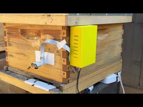
- Any questions regarding the web application, please contact cpaiz@scu.edu or paizcollin@gmail.com
- Any questions regarding deployment, please contact cpaiz@scu.edu or paizcollin@gmail.com or jstock@scu.edu
- Any questions regarding hardware, please contact ewrysinski@scu.edu and dblanc@scu.edu