

One set of widgets that feels native on both phones — Material on Android, Cupertino on
iOS — without a single Platform.isIOS check in your own code.
You write PlatformButton once. Android users get a real Material button, iOS users get a real
CupertinoButton, and neither group feels like they wandered into the other platform's app. When a
platform genuinely needs special treatment, there's a typed knob for it — used only when you reach
for one.
- Why you'd want it
- How it compares
- Getting started
- See it live
- Widget catalog
- Customizing per platform
- Compile-time platform pruning, verified
- Coming from flutter_platform_widgets?
- Contributing
- Contributors
- Authors
- Used By
Flutter ships both Material and Cupertino widgets, but it leaves the choosing to you. So apps tend to
drift one of two ways: all-Material everywhere (which looks a little off on iOS), or a slowly growing
tangle of if (Platform.isIOS) branches you'll be maintaining for years.
This package makes that call for you, one widget at a time. Each PlatformXxx checks the platform and
builds the right native widget underneath, so your tree stays readable and the branching lives in one
tested place instead of sprinkled across the codebase.
Two things it goes out of its way to avoid:
- Lock-in. The shared parts (your callbacks, values, controllers) sit right on the widget.
Anything platform-specific goes in optional
MaterialXxxData/CupertinoXxxDatarecords you can happily ignore until you actually want to tweak one side. - Dead weight. Release builds leave behind the platform you're not on: no Cupertino code tags along on Android, no Material code on iOS. And that isn't wishful thinking — CI checks it on every PR.
// The usual way: branch by hand, and remember to do it everywhere.
Widget build(BuildContext context) {
  if (defaultTargetPlatform == TargetPlatform.iOS) {
    return CupertinoButton(onPressed: _save, child: const Text('Save'));
  }
  return ElevatedButton(onPressed: _save, child: const Text('Save'));
}

// With this package: one widget, the right look on each platform.
PlatformButton(onPressed: _save, child: const Text('Save'));These packages all fill the same gap — Flutter ships Material and Cupertino but won't choose between them for you. They fall into two camps: pure-Dart dispatch (render Flutter's own Material/Cupertino widgets per platform) and native bridging (embed real platform UI through platform views + channels). This package is firmly pure-Dart.
Landscape as of June 2026 — pub.dev moves fast; check each package for its current state.
| Package | How it adapts | Status & notes |
|---|---|---|
platform_adaptive_widgets (this) |
Pure-Dart PlatformXxx dispatch on defaultTargetPlatform; *Data per-platform overrides; release builds AOT-prune the unused platform (CI-verified) |
Active · Android + iOS |
flutter_platform_widgets |
Same pure-Dart PlatformXxx idea — the spiritual predecessor |
Discontinued — retired when Flutter split Material/Cupertino into separate packages, the very split this package is built on |
adaptive_platform_ui |
Renders real UIKit via UiKitView + platform channels for iOS 26 Liquid Glass; pure-Dart Cupertino as the ≤ iOS 18 fallback |
Pre-1.0 · needs native iOS setup · some native components flagged experimental |
Flutter SDK .adaptive constructors |
First-party: Switch.adaptive, Slider.adaptive, showAdaptiveDialog, … |
Stable, but only a handful of widgets — no app / scaffold / navigation level |
The real fork is adaptive_platform_ui, and it's a difference in philosophy rather than
better-or-worse. It reaches through to native UIKit, so you get pixel-authentic iOS 26 Liquid Glass
that Flutter's Cupertino widgets can't reproduce today — at the cost of platform-view compositing,
method-channel round-trips, an iOS-version gate, required native setup, and a native dependency that
can't be tree-shaken. platform_adaptive_widgets takes the opposite trade: it renders Flutter's
Cupertino (not real UIKit) and stays pure Dart — no channels, no native setup, and the unused
platform pruned out of your binary. Want the latest native iOS chrome? Go native. Want a light,
no-bridge, prunable adaptive layer across a broad widget set? That's this.
flutter pub add platform_adaptive_widgetsWrap your app in a PlatformApp and start using PlatformXxx widgets anywhere you'd normally reach
for a Material or Cupertino one:
import 'package:flutter/widgets.dart';
import 'package:platform_adaptive_widgets/platform_adaptive_widgets.dart';

void main() => runApp(const MyApp());

class MyApp extends StatelessWidget {
  const MyApp({super.key});

  @override
  Widget build(BuildContext context) => PlatformApp(
    title: 'Adaptive Demo',
    home: PlatformScaffold(
      appBarData: const PlatformAppBar(title: Text('Adaptive Demo')),
      body: Center(
        child: PlatformButton(
          onPressed: () {},
          child: const Text('Tap me'),
        ),
      ),
    ),
  );
}
Run that on an Android phone, and it's Material from top to bottom. Run the exact same code on an iPhone and it's Cupertino. That's the whole trick.
Heads up: this one's for Android and iOS. Web and desktop are out of scope on purpose —
APPENDIX.mdhas the reasoning.
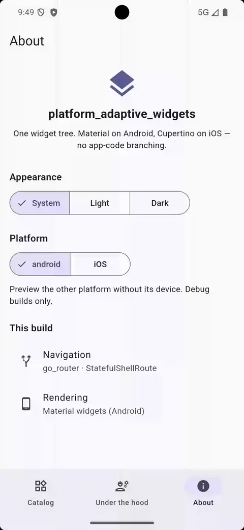
Honestly, the quickest way to get a feel for it is to play with it. The example/ app is
a little interactive catalog: every widget gets its own card, and most come with a built-in
property editor so you can flip isEnabled, drag a slider, or pick a color and watch the widget
react right there on the device. There's also an About tab that swaps the rendered platform and
theme on the fly, which makes it easy to hold Material and Cupertino up next to each other without
ever rebuilding.
| Material (Android) | Cupertino (iOS) |
|---|---|
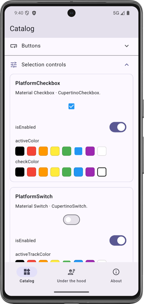 |
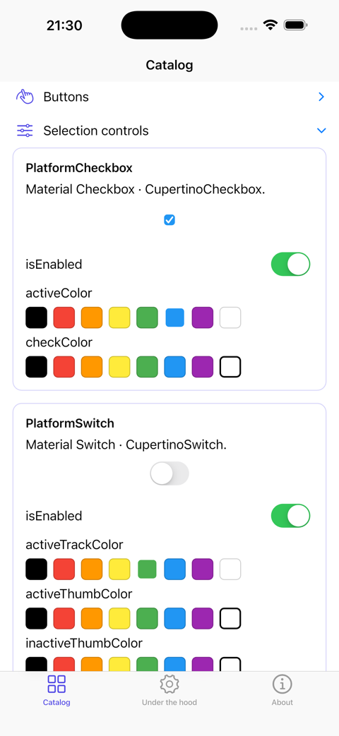 |
cd example
flutter run
It comes with two entry points, depending on how you like to route:
lib/main.dart for plain navigator routing, and
lib/main_go_router.dart for the declarative router.
Here's everything in the box. Each widget renders the native counterpart listed, and the *Data
column shows what you can pass to tune each side — see
Customizing per platform for how those work.
| Widget / Function | Material | Cupertino | Data Classes |
|---|---|---|---|
showPlatformDatePicker() |
showDatePicker |
CupertinoDatePicker + showCupertinoModalPopup |
MaterialDatePickerData, CupertinoDatePickerData |
showPlatformTimePicker() |
showTimePicker |
CupertinoDatePicker (time mode) + showCupertinoModalPopup |
MaterialTimePickerData, CupertinoDatePickerData |
PlatformMenuPicker<T> |
DropdownMenu + DropdownMenuEntry |
CupertinoMenuAnchor + CupertinoMenuItem (≤5 items) or CupertinoPicker + showCupertinoModalPopup (>5 items) |
MaterialMenuPickerData, CupertinoMenuPickerData |
showPlatformDialog<T>() |
showDialog + Dialog |
showCupertinoDialog + CupertinoPopupSurface |
MaterialDialogData |
showPlatformFullscreenDialog<T>() |
showDialog + Dialog.fullscreen |
showCupertinoDialog + CupertinoPopupSurface (no native iOS fullscreen-dialog concept) |
MaterialFullscreenDialogData |
showPlatformAlertDialog<T>() + PlatformDialogAction |
AlertDialog + TextButton |
CupertinoAlertDialog + CupertinoDialogAction |
MaterialAlertDialogData, CupertinoAlertDialogData |
showPlatformRawDialog<T>() |
showDialog (no surface wrap) |
showCupertinoDialog (no surface wrap) |
— (caller owns the surface) |
showPlatformModalBottomSheet<T>() |
showModalBottomSheet |
showCupertinoModalPopup + CupertinoPopupSurface |
MaterialModalBottomSheetData, CupertinoModalPopupData |
showPlatformRawModalBottomSheet<T>() |
showModalBottomSheet (native Material) |
showCupertinoModalPopup (no surface wrap) |
MaterialModalBottomSheetData, CupertinoModalPopupData |
showPlatformToast() |
SnackBar via ScaffoldMessenger |
Custom HUD-style banner overlay (built in the package — iOS has no native toast) | MaterialToastData, CupertinoToastData |
showPlatformAcknowledge() |
AlertDialog + single OK action |
CupertinoAlertDialog + single OK action |
MaterialAlertDialogData, CupertinoAlertDialogData |
| Widget | Material | Cupertino | Data Classes |
|---|---|---|---|
PlatformButton |
TextButton, ElevatedButton, OutlinedButton, FilledButton, FilledButton.tonal (via MaterialButtonVariant) — .icon factories selected by PlatformButton.icon |
CupertinoButton, CupertinoButton.filled, CupertinoButton.tinted (via CupertinoButtonVariant) — PlatformButton.icon wraps the icon + label in a Row |
MaterialButtonData, CupertinoButtonData |
PlatformCheckbox |
Checkbox (.tristate constructor → tristate: true) |
CupertinoCheckbox |
MaterialCheckboxData, CupertinoCheckboxData |
PlatformExpansionTile |
ExpansionTile |
CupertinoExpansionTile |
MaterialExpansionTileData, CupertinoExpansionTileData |
PlatformRadio<T> |
Radio |
CupertinoRadio |
MaterialRadioData, CupertinoRadioData |
PlatformRadioGroupBuilder<T> |
RadioGroup + Wrap (convenience layout) |
same | — (flat params; no data classes) |
PlatformScrollbar |
Scrollbar |
CupertinoScrollbar |
MaterialScrollbarData, CupertinoScrollbarData |
PlatformSearchBar |
SearchBar |
CupertinoSearchTextField |
MaterialSearchBarData, CupertinoSearchBarData |
PlatformSegmentButton<T> |
SegmentedButton + ButtonSegment |
CupertinoSlidingSegmentedControl |
MaterialSegmentButtonData, CupertinoSegmentButtonData<T> |
PlatformSlider |
Slider |
CupertinoSlider |
MaterialSliderData, CupertinoSliderData |
PlatformSwitch |
Switch |
CupertinoSwitch |
MaterialSwitchData, CupertinoSwitchData |
PlatformTextField |
TextField |
CupertinoTextField |
MaterialTextFieldData, CupertinoTextFieldData |
| Widget | Material | Cupertino | Data Classes |
|---|---|---|---|
PlatformApp / PlatformApp.router |
MaterialApp / MaterialApp.router |
CupertinoApp / CupertinoApp.router |
MaterialAppData, CupertinoAppData (shared config is flat on the widget) |
PlatformAppBar |
AppBar |
CupertinoNavigationBar |
MaterialAppBarData, CupertinoNavigationBarData |
PlatformScaffold |
Scaffold |
CupertinoPageScaffold |
MaterialScaffoldData, CupertinoScaffoldData |
PlatformTabScaffold |
Scaffold + NavigationBar + NavigationDestination |
CupertinoTabScaffold + CupertinoTabBar + CupertinoTabView |
MaterialTabScaffoldData, TabDestination |
| Widget | Material | Cupertino | Data Classes |
|---|---|---|---|
PlatformListTile |
ListTile |
CupertinoListTile / CupertinoListTile.notched |
MaterialListTileData, CupertinoListTileData |
PlatformProgressIndicator |
CircularProgressIndicator |
CupertinoActivityIndicator |
MaterialProgressIndicatorData, CupertinoProgressIndicatorData |
Utilities — generic platform widgets, theme access, value selectors, extensions, and models
| Widget | Description |
|---|---|
PlatformWidget |
Takes materialBuilder and cupertinoBuilder callbacks to render any custom widget per platform. |
PlatformWidgetBuilder |
Same as PlatformWidget but also passes a shared child widget to both builders. |
PlatformTheme.of(context) — provides unified access to theme properties across platforms:
| Property | Material | Cupertino |
|---|---|---|
barBackgroundColor |
Theme.of(context).appBarTheme.backgroundColor |
CupertinoTheme.of(context).barBackgroundColor |
primaryColor |
Theme.of(context).primaryColor |
CupertinoTheme.of(context).primaryColor |
primaryContrastingColor |
Theme.of(context).colorScheme.onPrimary |
CupertinoTheme.of(context).primaryContrastingColor |
scaffoldBackgroundColor |
Theme.of(context).scaffoldBackgroundColor |
CupertinoTheme.of(context).scaffoldBackgroundColor |
selectionHandleColor |
Theme.of(context).colorScheme.onSurface |
CupertinoTheme.of(context).selectionHandleColor |
The value selectors are top-level functions (no BuildContext); platformIcon
is a BuildContext extension. The selectors evaluate the unused-platform arm
too, so its code is not tree-shaken from release builds (empirically
≈342 KB for one Cupertino widget) — prefer an inline switch (defaultTargetPlatform) when an arm builds a platform-specific widget:
| Helper | Description |
|---|---|
platformValue<T>(material:, cupertino:) |
Returns the value matching the current platform. |
platformValueNullable<T>(material:, cupertino:) |
Nullable variant of platformValue. |
platformLazyValue<T>(material:, cupertino:) |
Lazily evaluates only the callback for the current platform. |
platformLazyNullable<T>(material:, cupertino:) |
Nullable variant of platformLazyValue. |
platformIcon(material:, cupertino:) |
BuildContext extension for platform-specific IconData. |
| Extension | Description |
|---|---|
DateTimeExtensions.toDate() |
Converts DateTime → Date. |
TimeOfDayExtensions.toDateTime() |
Converts TimeOfDay → DateTime. |
| Model | Description |
|---|---|
Date |
An immutable gregorian calendar date (year, month, day) with comparison, arithmetic, and conversion utilities. |
PlatformAdaptiveIcons |
A class that provides adaptive icons based on the current platform. |
The mental model is short. Whatever both platforms share — your callbacks, values, controllers, plus
the odd visual that genuinely means the same thing on each side (a tint color, say) — lives right on
the widget, so there's one source of truth and nothing to keep in sync. Whatever is truly
platform-specific lives in optional typed records: hand a MaterialXxxData to the Android branch, a
CupertinoXxxData to the iOS one. For most widgets, most of the time, you'll touch neither — they're
there for the moments you want one platform to behave a little differently.
PlatformButton.icon(
  onPressed: _add,
  icon: const Icon(Icons.add),
  label: const Text('Add'),
  materialButtonVariant: .filled,   // Android: FilledButton.icon
  cupertinoButtonVariant: .filled,  // iOS: CupertinoButton.filled
  cupertinoButtonData: const CupertinoButtonData(pressedOpacity: 0.6), // iOS-only tuning
)
If you're ever unsure where a given property belongs,
APPENDIX.md spells out the rule the package follows.
All platform widgets extend one of these base classes, which use compile-time defaultTargetPlatform resolution:
| Base Class | Description |
|---|---|
PlatformWidgetBase |
Core abstract StatelessWidget with buildMaterial() and buildCupertino(). |
PlatformWidgetKeyedBase |
Adds an optional widgetKey for the underlying platform widget. |
PlatformWidgetBuilderBase |
Adds a required child widget passed through to the platform builder. |
PlatformWidgetKeyedBuilderBase |
Combines both widgetKey and child. |
This is the part people tend not to believe at first: the platform you're not on actually disappears
from your release build. Under AOT, defaultTargetPlatform is a compile-time constant, so on Android
the Cupertino branches are simply dead code that the compiler tree-shakes away — and the same in
reverse on iOS.
Since "trust me" is a weak engineering argument, two CI checks keep it honest on every PR:
- a static AST guard
(
test/aot_pruning_regression_test.dart) that fails the build if anyone reintroduces the closure-style dispatch that quietly defeats pruning, and - a real size benchmark
(
tool/check_size_regression.dart) that compiles an Android-only app with--analyze-sizeand trips if any Cupertino-pathed bytes slip past a calibrated budget.
Want the full mechanism and the actual byte counts? They're in
APPENDIX.md#aot-pruning-rules.
You'll feel right at home. This package is a spiritual continuation of
flutter_platform_widgets, and the PlatformXxx
naming carries straight over. What's changed is mostly under the hood: per-platform tweaks now go
through typed MaterialXxxData / CupertinoXxxData records (see
Customizing per platform), the scope is intentionally Android + iOS, and
the AOT-pruning promise is checked by CI rather than taken on faith. Skim the
widget catalog to find the equivalent of whatever you're using today.
Issues and PRs welcome at
https://github.com/LahaLuhem/platform_adaptive_widgets. Before sending a
non-trivial change, read CODESTYLE.md for the house style,
.ai/AGENTS.md for the hard rules and contributor / AI-agent
guidelines, and APPENDIX.md for the design rationale.
The canonical text for AGENTS.md and CLAUDE.md lives under .ai/. The repo root
holds gitignored symlinks (AGENTS.md → .ai/AGENTS.md,
CLAUDE.md → .ai/CLAUDE.md, example/AGENTS.md → example/.ai/AGENTS.md) so coding
agents that auto-discover root-level guidance files (Claude Code, Codex, Cursor,
Copilot, …) find them without polluting the file tree with two extra Markdown files at
each level. The arrangement is opt-in per contributor:
-
If you use a coding agent, set the symlinks up once from the repo root:
ln -s .ai/AGENTS.md AGENTS.md
ln -s .ai/CLAUDE.md CLAUDE.md
ln -s .ai/AGENTS.md example/AGENTS.md
-
If you don't use one, skip the step entirely. The canonical files under
.ai/are committed; nothing in the build, lint, or test pipeline depends on the symlinks existing. -
If you want different agent guidance for your own workflow, drop a real
AGENTS.mdorCLAUDE.mdat the repo root. A real file beats the symlink convention — your agent reads the root file you put there instead of the canonical one under.ai/. The committed.ai/copies remain the project default for everyone else.
The CODESTYLE.md files are not symlinked — they sit directly at the repo root and at
example/, since style serves humans and agents alike and is not AI-specific. See
APPENDIX.md for the rationale
behind the .ai/ arrangement.
Made with contrib.rocks.
This project is used by the following companies:
- Didata Automatisering B.V
- Dimerce B.V