In this challenge, I was provided with an API and the following(below) instructions and style guide. This project was developed by me with the mentoring of a veteran work colleague (thank you so much, Lucas!!!). We aimed exercising the use of git in a professional capacity, according with a project's specific flow and documentation, more than that, the development of generic components and a grid system were my favorite parts.
Made with:
- React
- Styled Components
- Axios
- React Router v6
See the project live here: https://country-flags-api.herokuapp.com/
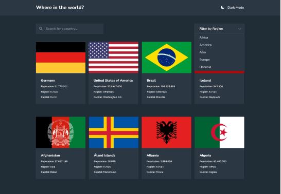
Your challenge is to integrate with our Countries API to pull country data and display it like in the designs.
You can use React or Vue. You also have complete control over which packages you use to do things like make HTTP requests or style your project.
Your users should be able to:
- See all countries from the API on the homepage
- Search for a country using an
inputfield - Filter countries by region
- Click on a country to see more detailed information on a separate page
- Click through to the border countries on the detail page
- Toggle the color scheme between light and dark mode
- Persist the active color scheme theme using localStorage (optional)
Your task is to build out the project using the following designs on Figma.
In this challenge, you will find mobile and desktop designs in light and dark mode color schemes for both pages.
There are no assets for this challenge, as the country flags will be pulled from the Countries API and you can use an icon font library for the icons.
There is a style-guide.md file, which contains the information you'll need, such as color palette and fonts.
Good luck! 🚀
The designs were created to the following widths:
- Mobile: 375px
- Desktop: 1440px
- Dark Blue (Dark Mode Elements): hsl(209, 23%, 22%)
- Very Dark Blue (Dark Mode Background): hsl(207, 26%, 17%)
- Very Dark Blue (Light Mode Text): hsl(200, 15%, 8%)
- Dark Gray (Light Mode Input): hsl(0, 0%, 52%)
- Very Light Gray (Light Mode Background): hsl(0, 0%, 98%)
- White (Dark Mode Text & Light Mode Elements): hsl(0, 0%, 100%)
- Homepage Items: 14px
- Detail Page: 16px
- Family: Nunito Sans
- Weights: 300, 600, 800
For the icons, you can use a font icon library. Don't worry if the icons that you choose don't look exactly like they do on the design.
Some suggestions can be found below: