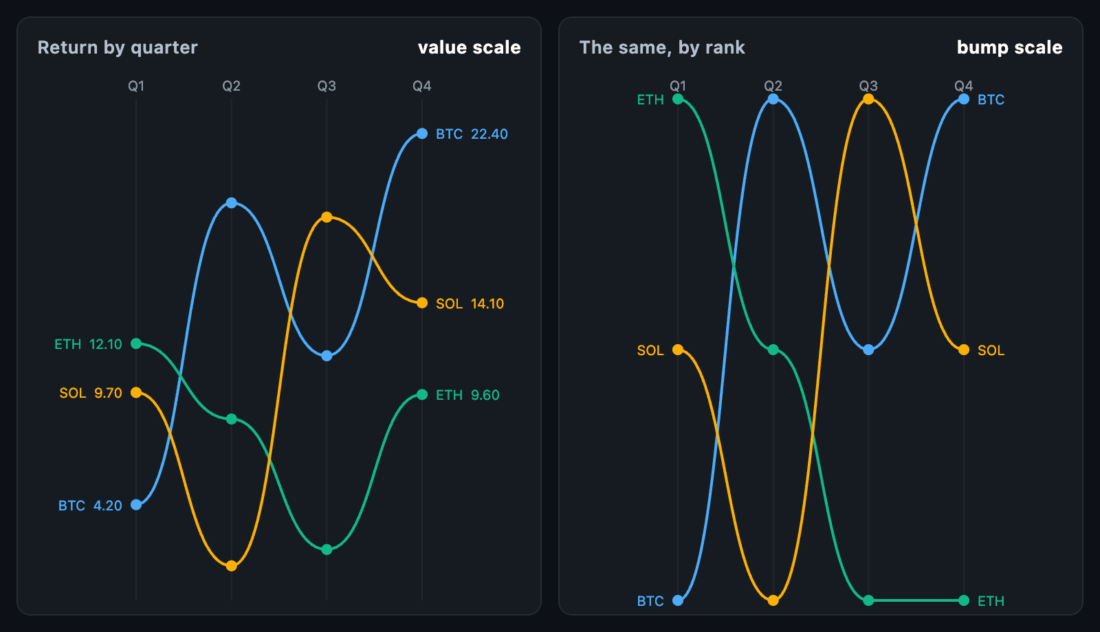
SlopeChart shows how things moved between periods. With two periods it is a
slope chart: one line each, and what matters is which way they lean. With more
periods on a rank scale it is a bump chart: places changing hands, which is far
easier to follow than the same lines crossing on a value scale.
SlopeChart(
  periodLabels: const ['Q1', 'Q2', 'Q3'],
  scale: SlopeScale.rank,
  series: const [
    SlopeSeries(label: 'BTC', values: [4.2, 19.0, 11.5]),
    SlopeSeries(label: 'ETH', values: [12.1, 8.4, 2.0]),
    SlopeSeries(label: 'SOL', values: [9.7, 1.2, 6.3]),
  ],
);
The chart fills its constraints. In a box with no height it takes
defaultHeight.
A SlopeSeries is a label and one value per period, in the chart's period
order. A null value is a period the series was not in, and its line breaks
there rather than jumping across the gap.
periods is how many columns are drawn; left out, it is the longest series or
the number of periodLabels, whichever is larger. periodLabels are written
across the top in headerHeight of room.
scale |
What the vertical axis is |
|---|---|
SlopeScale.value (default) |
The values themselves, on one shared scale |
SlopeScale.rank |
The rank at each period, 1 at the top |
rankValues(values, ascending:) does the ranking on its own: 1 is the largest
unless ascending is set, ties share a place and the next place skips, the way
places in a table do, and a missing value has no rank.
On a value scale, min and max set the ends; left out, the chart takes the
smallest and largest with a little air. On a rank scale the ends are the ranks
themselves, so first place sits exactly on the top edge.
Lines are curved by default, with horizontal control points, so a line leaves
one period and arrives at the next level — a crossing reads as a swap rather
than a corner. dotRadius puts a dot at each period; 0 draws none.
showLabels writes each series' name at both ends of its line, in the line's
own colour, in labelWidth of room either side, and showValues adds the
first and last value after the name.
Series that name no color take one from palette by position.
layOutSlope(series, size:, periods:, ...) is the layout on its own, without a
widget. It returns a SlopeLayout with the plotRect, the columnX of each
period, the min and max of the axis, and a SlopeSeriesLayout per series
holding an Offset? per period — null where the series has no value there —
plus its firstPoint and lastPoint.
layout.columnAt(x) finds the nearest period and layout.seriesAt(point) the
nearest line in it: nearest column first, then nearest line, because picking
the closest dot outright would jump to a neighbouring period whenever the
finger sat between two columns. progress reveals the columns left to right,
for a draw-in animation.
onSeriesTap is called with a series when its line is touched or dragged over,
and with null when the touch leaves. The other lines fade while one is held,
unless fadeUntouched is off. A card names the series and its value at the
period nearest the finger; tooltipBuilder replaces it.
| Field | Default |
|---|---|
palette |
Eight colours, handed out by position |
lineWidth, dotRadius |
2 and 4 |
columnColor |
A faint line under each period |
headerHeight, headerStyle, labelStyle |
The two sets of labels |
animationDuration, animationCurve, animateOnMount |
The draw-in |
semanticLabel is what a screen reader announces for the chart.