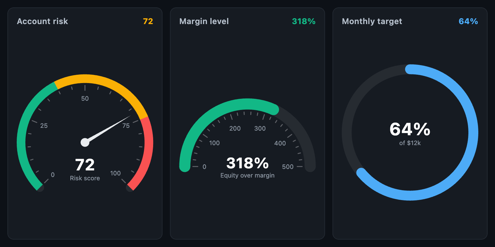
GaugeChart displays a single value against a range on a dial. Typical uses
include KPIs, margin level, risk scores and sentiment indices.
GaugeChart(
  value: 72,
  ranges: const [
    GaugeRange(from: 0, to: 40, color: Color(0xFF2F9E44)),
    GaugeRange(from: 40, to: 75, color: Color(0xFFF59F00)),
    GaugeRange(from: 75, to: 100, color: Color(0xFFE03131)),
  ],
  needle: const GaugeNeedle(),
  label: 'Risk',
  animationDuration: const Duration(milliseconds: 600),
);
The gauge fills its constraints while keeping its shape. When unconstrained, it
is a square of defaultSize.
| Parameter | Description |
|---|---|
min, max |
Value range (default 0–100) |
startAngle |
Start of the arc, in degrees clockwise from 12 o'clock (default -135) |
sweepAngle |
Length of the arc in degrees: 270 for a dial (default), 180 for a semicircle |
thickness |
Track width |
roundCaps |
Rounded ends on the track and value bar |
padding |
Space around the gauge |
The arc is fitted to the available space based on its actual extent, so a semicircle gauge fills a box twice as wide as it is tall.
trackColorsets the background track.rangesdraws coloured bands, such as safe, warning and critical zones.rangeThicknesscan make them thinner than the track.- With
showValueBar(default), the track fills fromminto the value, usingvalueColoror, if unset, the colour of the range containing the value.
For a band-only gauge, set showValueBar: false and add a needle.
GaugeNeedle configures the pointer:
| Field | Description |
|---|---|
color |
Needle colour |
length |
Length as a fraction of the radius (default 0.78) |
width |
Width at the base |
knobRadius, knobColor |
Centre knob; knobRadius: 0 hides it |
When a needle is shown, the value text is placed below the knob.
GaugeTicks configures tick marks and labels. Pass GaugeTicks.none to hide
them.
| Field | Description |
|---|---|
interval |
Value between major ticks; if null, the range is divided into count parts |
count |
Number of divisions when interval is null (default 5) |
minorPerMajor |
Minor ticks between major ticks |
majorLength, minorLength, width, color |
Tick appearance |
gap |
Space between track and ticks |
showLabels, labelStyle, formatter, labelGap |
Major tick labels |
showValuedraws the value, formatted byvalueFormatterand styled byvalueStyle. Text size scales with the gauge.labeladds a caption below the value, styled bylabelStyle.centerChildreplaces both with a custom widget.
The gauge announces label (or semanticLabel) and the formatted value to
screen readers.
When animationDuration is set, the needle and value bar animate to each new
value, continuing from the current position if the value changes mid-animation.
With animateOnMount (default), the first build animates up from min.
GaugeLayout is public for positioning custom widgets on the dial:
final layout = GaugeLayout.fit(
  const Rect.fromLTWH(0, 0, 200, 200),
  min: 0,
  max: 100,
);
final at = layout.pointAt(75, layout.radius + 12); // just outside the 75 mark