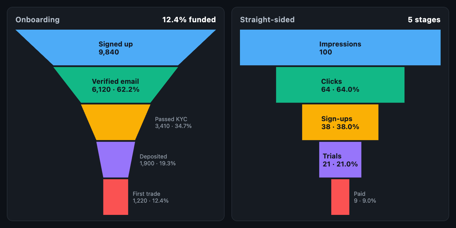
FunnelChart shows how a quantity decreases through sequential stages, making
drop-off between steps easy to see. Typical uses include sign-up and onboarding
conversion, sales pipelines and KYC completion.
FunnelChart(
  stages: const [
    FunnelStage(value: 12000, label: 'Visited'),
    FunnelStage(value: 4800, label: 'Signed up'),
    FunnelStage(value: 2100, label: 'Verified'),
    FunnelStage(value: 900, label: 'Deposited'),
  ],
);
The chart fills its constraints. When the height is unbounded, it uses
defaultHeight.
| Field | Description |
|---|---|
value |
Count at this stage |
label |
Stage name |
color |
Fixed colour; otherwise taken from palette in order |
data |
Arbitrary app data, returned on touch |
Each stage's width is proportional to its value relative to the largest stage. Stages share the available height equally.
| Parameter | Description |
|---|---|
shape |
FunnelShape.tapered (default) narrows each stage to the width of the next; FunnelShape.stepped draws centred bars |
gap |
Space between stages |
minWidthFraction |
Minimum stage width as a fraction of the chart width (default 0.08), so very small stages remain visible |
padding |
Space around the chart |
By default, each stage shows its name, value and — from the second stage on — its percentage of the first stage.
labelBuilderreturns custom text for aFunnelSegment. Line breaks are supported.valueFormatterformats values in the default label (default: thousands separators).labelStylestyles labels inside a stage; without it, text is black or white based on stage brightness.- Labels that do not fit inside a stage are drawn to its right using
sideLabelStyle, or omitted if there is no room.
Each FunnelSegment provides ofFirst (overall conversion from the first stage)
and ofPrevious (conversion from the preceding stage) for custom labels:
FunnelChart(
  stages: stages,
  labelBuilder: (s) =>
      '${s.stage.label}\n${(s.ofPrevious * 100).toStringAsFixed(0)}% of previous',
);
Touch or mouse hover identifies the stage under the pointer, using its actual
trapezoid shape. hoverBorder outlines it, onTouch reports a
FunnelTouchDetails (or null when the touch ends), and tooltipBuilder shows a
widget beside it.
layOutFunnel and funnelSegmentAt are public. Each FunnelSegment exposes its
band rect, topWidth, bottomWidth, trapezoid path and contains.
When animationDuration is set, stages widen from the centre on first build and
whenever stages changes.