React Native native body-metric rulers built for the New Architecture on both platforms — a vertical HeightRuler (cm ⇄ ft) and a horizontal arc WeightRuler (kg ⇄ lb) — plus an optional UnitSwitcher (JavaScript / Reanimated) shared by both. Drop them into your screen, compose them with your own chrome, and keep the values reactive through ref-based snapshots.
HeightRuler— native iOS (UIView) / Android custom view with snap scrolling, glass “pill”, haptics-oriented behaviour. Source of truth: centimetres.WeightRuler— native iOS (UIView) / Android custom view shaped as a horizontal kitchen-scale arc with the same snap / glass / haptics feel. Source of truth: kilograms (lb mode just relabels the scale;100 kg → switch to lb → ~220 lb → back to kg → 100 kgis lossless).UnitSwitcher— segmented control styling (thumb spring, drag) powered byreact-native-reanimated. One component with avariant:'height'(cm/ft) or'weight'(kg/lbs).- Values are emitted as canonical decimal strings —
HeightRuler→ cm (e.g."175.00"),WeightRuler→ kg (e.g."100.00"). Theunitprop on each ruler only affects the on-screen scale. - Imperative
refAPI per ruler —getSnapshot(),getValueCm()/getValueKg(),subscribe()— plus reactive hooks:useHeightRulerSnapshot()anduseWeightRulerSnapshot(). - TypeScript typings for every exported component, prop, snapshot, and helper.
- Accessible labels (snap position uses native a11y value ranges).
Your app needs the following — install and configure them before or with this library:
| Package | Notes |
|---|---|
react |
>= 18. |
react-native |
New Architecture enabled (tested against >= 0.74). Gradle / Xcode configs must enable the Fabric / native-modules stack your RN version expects. |
react-native-reanimated |
Declare it even if you only use the rulers: UnitSwitcher is implemented with Reanimated, and package.json still expects the peer to resolve cleanly. Configure Reanimated per its install docs. |
Expo: the package works with Expo apps that include custom native code (development builds with expo-dev-client, EAS Build, expo prebuild, etc.). It does not work in Expo Go, because Expo Go ships a fixed native binary that cannot load these rulers’ native views.
npm install react-native-body-metrics-picker
# or: yarn add react-native-body-metrics-pickeriOS: from ios/, run pod install (Codegen picks specs from node_modules). Android: Gradle autolinking + New Architecture settings consistent with your app.
Expo: if you do not maintain a local ios/ / android/ tree (managed workflow, builds via EAS or expo prebuild), you do not run pod install (or manual Gradle steps) yourself — those run when the native project is generated or on the build server.
Minimum iOS: the pod declares IPHONEOS_DEPLOYMENT_TARGET 15.1. Your Expo Podfile.properties.json ios.deploymentTarget (or Xcode project) must be ≥ 15.1 — otherwise CocoaPods reports that the pod “requires a higher minimum deployment target”.
HeightRuler has no onUnitChange prop — controlled unit + UnitSwitcher.onUnitChange live in your screen state:
import { useCallback, useRef, useState } from 'react';
import { View } from 'react-native';
import {
  HeightRuler,
  UnitSwitcher,
  useHeightRulerSnapshot,
  type HeightRulerHandle,
  type HeightUnit,
} from 'react-native-body-metrics-picker';

function HeightScreen() {
  const rulerRef = useRef<HeightRulerHandle>(null);
  const [unit, setUnit] = useState<HeightUnit>('cm');
  const { valueString } = useHeightRulerSnapshot(rulerRef, unit);

  const handleValue = useCallback((cm: string) => {
    // cm is source of truth, e.g. "175.00"
    console.log(cm);
  }, []);

  return (
    <View style={{ height: 320 }}>
      <UnitSwitcher unit={unit} onUnitChange={setUnit} />
      <HeightRuler
        ref={rulerRef}
        key={unit}
        unit={unit}
        initialValue={175}
        onValueChange={handleValue}
      />
    </View>
  );
}
Give the View wrapping HeightRuler a real height (or flex: 1 under a bounded parent). The ruler applies a minHeight (~240 dp) so it stays usable in scroll views.
WeightRuler is always controlled by canonical kilograms. Pass variant="weight" to UnitSwitcher — the ruler does not need to be remounted on unit change, the JS wrapper hands the new display window to the native view itself:
import { useCallback, useRef, useState } from 'react';
import { View } from 'react-native';
import {
  UnitSwitcher,
  WeightRuler,
  useWeightRulerSnapshot,
  weightRulerDisplayFromKg,
  type WeightRulerHandle,
  type WeightUnit,
} from 'react-native-body-metrics-picker';

function WeightScreen() {
  const rulerRef = useRef<WeightRulerHandle>(null);
  const [unit, setUnit] = useState<WeightUnit>('kg');
  const { valueKg } = useWeightRulerSnapshot(rulerRef, unit);

  const displayValue = Math.round(weightRulerDisplayFromKg(valueKg, unit));

  const handleValue = useCallback((kg: string) => {
    // kg is source of truth, e.g. "100.00"
    console.log(kg);
  }, []);

  return (
    <View style={{ height: 220 }}>
      <UnitSwitcher variant="weight" unit={unit} onUnitChange={setUnit} />
      <WeightRuler
        ref={rulerRef}
        unit={unit}
        initialValue={78}
        onValueChange={handleValue}
      />
    </View>
  );
}
The arc renders inside its parent — give the wrapping View a height (the component applies a minHeight (~180 dp) as a floor). initialValue is always in kilograms regardless of the current display unit.
Native ruler view on both platforms (New Architecture). Android-only props are omitted on iOS by the JS wrapper so the host never receives them.
| Prop | Type | Default | iOS | Android | Description |
|---|---|---|---|---|---|
unit |
'cm' | 'ft' |
(required) | Yes | Yes | Display scale for labels and ticks; emitted values stay cm. |
initialValue |
number |
(required) | Yes | Yes | Centimetres; initial scroll position (not continuously synced from props). |
onValueChange |
(value: string) => void |
— | Yes | Yes | Cm as decimal string (e.g. "175.00"). |
formatValue |
(cm: number) => string |
— | Yes | Yes | Feeds optional accessibility announced value. |
onScrollBegin |
() => void |
— | Yes | Yes | |
onScrollEnd |
() => void |
— | Yes | Yes | |
fontFamily |
string |
— | Yes | Yes | iOS: PostScript name; Android: Typeface.create. |
tickSpacing |
number |
15 |
Yes | Yes | |
minorTickHeight |
number |
18 |
Yes | Yes | |
midTickHeight |
number |
28 |
Yes | Yes | |
majorTickHeight |
number |
40 |
Yes | Yes | |
tickWidth |
number |
1.5 |
Yes | Yes | |
tickColor |
string |
iOS #D1D5DB; Android '' |
Yes | Yes | Android empty ⇒ theme tertiary. |
midTickColor |
string |
iOS #6B7280; Android '' |
Yes | Yes | Android empty ⇒ theme secondary. |
majorTickColor |
string |
iOS #374151; Android '' |
Yes | Yes | Android empty ⇒ textColorPrimary; blends into label ink. |
glassActiveTickColor |
string |
iOS #FFD60A; Android '' |
Yes | Yes | Android empty ⇒ colorPrimary. |
glassActiveNeighborTickColor |
string |
iOS rgba(255,214,10,0.72); Android '' |
Yes | Yes | Android empty ⇒ derived from primary. |
glassCenterLabelColor |
string |
'' |
Yes | Yes | Snapped value under the glass; #, rgb(), rgba(). Empty ⇒ blend from major/mid (and pill contrast on Android). |
glassPillBackgroundColor |
string |
— | Ignored | Yes | Pill fill behind ticks. |
glassPillBorderRadius |
number |
— | Ignored | Yes | Corner radius dp; 0 uses native default (~16). |
style |
ViewStyle |
— | Yes | Yes | Applied to the outer JS View around the native ruler. |
Colour strings are parsed natively: #RGB / #RRGGBB / #RRGGBBAA, rgb(), rgba() (unsupported forms fall back to a neutral grey).
The wrapper also forwards codegen-only fields (rangeMin, rangeMax, step, …) that the component spec requires; native code ignores them and clamps the band to 100–250 cm.
Native horizontal arc (kitchen-scale) ruler on both platforms (New Architecture). State is canonical kilograms; unit only relabels the visible scale (lb mode covers the same physical band as kg mode, so unit flips never lose the live value). iOS uses a fixed frosted-glass overlay; Android uses a solid coloured pill (translucent glass reads as a render bug on most Android themes).
| Prop | Type | Default | iOS | Android | Description |
|---|---|---|---|---|---|
unit |
'kg' | 'lb' |
(required) | Yes | Yes | Display scale for labels and ticks; emitted values stay kg. |
initialValue |
number |
(required) | Yes | Yes | Kilograms; initial scroll position (not continuously synced from props after mount, but a new value re-syncs the native band). |
onValueChange |
(valueKg: string) => void |
— | Yes | Yes | Snapped weight as a decimal kg string (e.g. "100.00"). |
formatValue |
(valueKg: number) => string |
— | Yes | Yes | Feeds the optional accessibility announced value. |
onScrollBegin |
() => void |
— | Yes | Yes | |
onScrollEnd |
() => void |
— | Yes | Yes | |
fontFamily |
string |
— | Yes | Yes | iOS: PostScript / Expo font key; Android: ReactFontManager key. |
tickSpacing |
number |
12 |
Yes | Yes | Distance (dp/pt) along the arc between adjacent ticks. |
minorTickHeight |
number |
14 |
Yes | Yes | |
midTickHeight |
number |
22 |
Yes | Yes | |
majorTickHeight |
number |
32 |
Yes | Yes | |
tickWidth |
number |
1.5 |
Yes | Yes | |
arcCenterOffset |
number |
240 |
Yes | Yes | Vertical distance (dp/pt) from the bottom of the view to the arc center. Larger = flatter arc (closer to a straight line). |
tickColor |
string |
iOS #D1D5DB; Android '' |
Yes | Yes | Android empty ⇒ theme tertiary. |
midTickColor |
string |
iOS #6B7280; Android '' |
Yes | Yes | Android empty ⇒ theme secondary. |
majorTickColor |
string |
iOS #111827; Android '' |
Yes | Yes | Android empty ⇒ textColorPrimary. |
activeTickColor |
string |
iOS #FFD60A; Android '' |
Yes | Yes | Centered (snapped) tick under the glass. Android empty ⇒ colorPrimary. |
activeNeighborTickColor |
string |
iOS rgba(255,214,10,0.72); Android '' |
Yes | Yes | ±1 ticks under the glass. Android empty ⇒ derived from primary. |
glassCenterLabelColor |
string |
'' |
Yes | Yes | Snapped value rendered under the glass overlay. Empty ⇒ inherits from activeTickColor. |
glassBackgroundColor |
string |
iOS fixed material; Android #F1F5F9 |
Ignored | Yes | Solid fill of the Android pill (iOS uses a fixed UIVisualEffect material). |
glassBorderColor |
string |
iOS fixed; Android #CBD5E1 |
Ignored | Yes | Stroke colour of the Android pill border. |
glassArcHalfAngle |
number |
0 |
Yes | Yes | Half angular span (radians) of the glass arc band. 0 = derive from tickSpacing so the band stays clearly horizontal (~3 labels + overhang). |
glassOuterPadding |
number |
10 |
Yes | Yes | Extra distance (dp/pt) above the labels where the outer edge of the glass band sits. |
glassLabelArea |
number |
22 |
Yes | Yes | Vertical room (dp/pt) for the labels rendered above the tick tips, under the glass. |
glassLabelFontSize |
number |
18 |
Yes | Yes | Font size for the labels visible under the glass overlay. |
trackColor |
string |
'' |
Yes | Yes | Background fill behind the arc ('transparent' to skip). |
style |
ViewStyle |
— | Yes | Yes | Applied to the outer JS View around the native ruler. |
Colour strings parse exactly like HeightRuler (above). The wrapper forwards rangeMin / rangeMax / step to the codegen spec for unit-aware tick rendering — internally the canonical band is always 50–250 kg.
Implemented in JavaScript with Reanimated; usable on iOS and Android. The component is discriminated by the variant prop ('height' or 'weight').
| Prop | Type | Default |
|---|---|---|
variant |
'height' | 'weight' |
'height' (omit for cm/ft) |
unit |
'cm' | 'ft' (height)'kg' | 'lb' (weight) |
(required) |
onUnitChange |
(unit) => void (matches variant) |
— |
trackColor |
string |
Android #E8EAED, iOS #F3F4F6 |
thumbColor |
string |
#FFFFFF |
activeTextColor |
string |
Android #1C1B1F, iOS #111827 |
inactiveTextColor |
string |
Android #49454F, iOS #6B7280 |
thumbSheenColor |
string |
#FFFFFF |
thumbGlassBorderColor |
string |
Android transparent, iOS rgba(60,60,67,0.16) |
fontFamily |
string |
— |
labelFontSize |
number |
16 |
style |
StyleProp<ViewStyle> |
— |
Weight mode displays kg / lbs labels and emits 'kg' | 'lb'; height mode displays cm / ft and emits 'cm' | 'ft'.
HeightRuler— both platforms internally clamp to100 cm…250 cm. TherangeMin/rangeMaxvalues on the native component exist for codegen only.WeightRuler— canonical band is50 kg…250 kg. In lb mode the native tick grid runs from110 lbto551 lb(rounded to whole pounds) — i.e. the same physical extent — so swapping units never moves the live value.
Height for both rulers is driven by parent layout, not by a viewport prop. Wrap in a sized container or use flex: 1 under a bounded parent. Each ruler ships a sensible minHeight floor (HeightRuler ≈ 240 dp, WeightRuler ≈ 180 dp) so they stay usable inside scroll views.
Exported from the package root:
- Height —
formatHeightRulerCmString,nativeRulerBoundsForUnit,CM_PER_FOOT,NATIVE_RULER_CM_MIN,NATIVE_RULER_CM_MAX. - Weight —
formatWeightRulerString,weightRulerBoundsForUnit,weightRulerDisplayFromKg,weightRulerKgFromDisplay,KG_PER_LB,LB_PER_KG,WEIGHT_RULER_KG_MIN,WEIGHT_RULER_KG_MAX,WEIGHT_RULER_STEP.
The weight conversion helpers use the exact NIST factor (1 lb = 0.45359237 kg), so any kg ⇄ lb round-trip via weightRulerDisplayFromKg / weightRulerKgFromDisplay is lossless to within float precision.
HeightRuler,useHeightRulerSnapshot, typesHeightRulerProps,HeightRulerHandle,HeightRulerLiveSnapshotWeightRuler,useWeightRulerSnapshot, typesWeightRulerProps,WeightRulerHandle,WeightRulerLiveSnapshotUnitSwitcher,UnitSwitcherProps,UnitSwitcherHeightProps,UnitSwitcherWeightProps- Height helpers:
formatHeightRulerCmString,nativeRulerBoundsForUnit,CM_PER_FOOT,NATIVE_RULER_CM_MIN,NATIVE_RULER_CM_MAX - Weight helpers:
formatWeightRulerString,weightRulerBoundsForUnit,weightRulerDisplayFromKg,weightRulerKgFromDisplay,KG_PER_LB,LB_PER_KG,WEIGHT_RULER_KG_MIN,WEIGHT_RULER_KG_MAX,WEIGHT_RULER_STEP - Shared types:
HeightUnit,WeightUnit,UnitSystem,HeightValue,WeightValue, etc.
cd example
yarn install
npx expo run:ios
# or npx expo run:android
See example/src/app/index.tsx for the HeightRuler demos and example/src/app/weight.tsx for the WeightRuler demos (both showcase the same hero / dark / aurora variants under the New Architecture).
Still frames are clickable (open the MP4 in the browser): Android · iOS.
| Android | iOS |
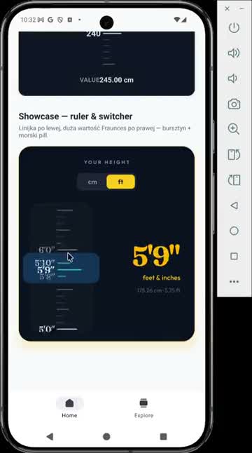
|
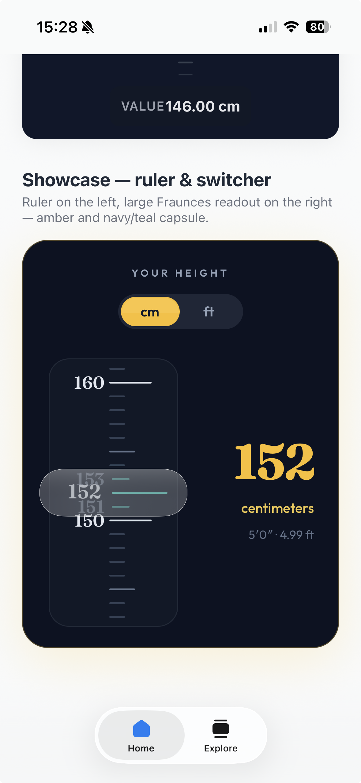
|
Branching, issue expectations, PR checklist, and changelog rules live in CONTRIBUTING.md. Release notes follow Keep a Changelog in CHANGELOG.md.
If Xcode fails compiling RCTHeightRulerView.mm or RCTWeightRulerView.mm with react/utils/fnf1a.h or folly/dynamic.h file not found, the CocoaPods target was missing RN’s bundled Folly / React Native dependency headers. This library’s install_modules_dependencies(s) (from react_native_pods.rb) lines the pod up with the New Architecture codegen and native view stack. After updating the podspec, pod install and a clean build.
If you fork the podspec, do not recreate dependencies by hand with a minimal pod list — rely on install_modules_dependencies so codegen, Folly search paths, and view-manager headers stay in sync with your React Native version.
Native rulers not implemented yet (API and behaviour TBD):
AgeRuler— age picking on a vertical scale (bounds, step, and display format to be defined).
Ships today: HeightRuler, WeightRuler, and UnitSwitcher.
MIT