Simple CV (= Curriculum Vitae) Visualisation Timeline Plugin based on D3.js
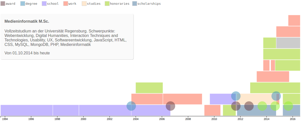
Coming soon
d3cv can handle continous and momentary data. At least some continous data should be provided since the size of the chart is calculated using the periodData.
The data should be formated like this:
var periodData = [{
  startDate: "1993-09-01T00:00:00.000Z", // mandatory
  endDate: "1997-08-31T00:00:00.000Z", // mandatory
  type: "school", // optional
  title: "Primary School", // optional
  desc: "Some additional description" // optional
},{
  startDate: "2005-12-14T00:00:00.000Z",
  endDate: "2007-02-06T00:00:00.000Z",
  type: "work",
  title: "CEO at some fancy company",
  desc: "Some additional description"
},
{
  // ...
}];

var momentData = [{
  startDate: "2004-02-14T00:00:00.000Z", // mandatory
  type: "award", // optional
  title: "Pulitzer Price", // optional
  desc: "Some additional description" // optional
},{
  startDate: "2005-12-14T00:00:00.000Z",
  type: "degree",
  title: "Master's Degree in Computer Science",
  desc: "Some additional description"
},
{
  // ...
}];
For continous (=period) data you need to provide at least startDate and endDate. The date strings will be passed to new Date(), so you can use whatever string fits as a parameter for this.
For momentary data only the startDate is mandatory since it mostly occured on a specific day. Exceptions from this are described below.
d3.cv({
  periodData: periodData, // mandatory if no momentData is passed
  momentData: momentData, // mandatory if no periodData is passed
  chartSelector: "#cv" // optional
  // some more options as described below
});
A minimal initialization consists of passing an options parameter with periodData and/or momentData. Some other options and default values are described below.
You can set some options to individualize your cv if you are not satisfied with the default values. Some more options will come in future releases.
// available options with default values
d3.cv({
  periodData: [], // array with period data
  momentData: [], // array with moment data
  chartSelector: "body" // the element to append the chart to
  chartMargin = {
    top: 20,
    right: 40,
    bottom: 20,
    left: 20
  }, // obviously the margins in all directions
  tickFormat = "%Y", // data format for the xAxis. Default is YYYY
  periodThreshold = 28, // in days. If a period event is shorter in time than the threshold, it's treated as a moment event
  showTooltips = true, // set if tooltips with title, description and duration of the events are shown on mouseover. Can be styled via CSS.
  transitionDuration = 1000, // duration in ms for the animations
  stringToday = "heute", // will be shown as string for endDate if it's an ongoing process. Default is german since it's my mother tongue ;-)
  circleRadius = options.circleRadius || 20,
  showLegend = options.showLegend || true; // the legend will be shown in the upper left corner of the chart, using the type properties as names. Styling the bars and circles via CSS will be required as described below
});The type property of your data is used to add CSS classes. PeriodData is rendered as rectangles, momentData as circles. So if you have some periodData with types "school" and "work" and momentData with types "degree" and "award" you can do this:
.bar {
  fill: red; /* default for all bars */
}

.circle {
  fill: yellow; /* default for all circles */
}

.school {
  fill: orange;
}

.work {
  fill: blue;
}

.degree {
  fill: black;
}

.award {
  fill: green;
}
Be aware that we have to handle svg so we must use e.g. fill: red; to set the background color.
To add some fancy pulsing effect for the circles, just add the following code or customize it beforehand.
.circle {
  transform: scale(0.8);
  transform-origin: 50% 50%;
}

.pulse {
  animation-name: pulsar;
  animation-duration: 1s;
  animation-iteration-count: infinite;
  animation-direction: alternate;
}

@keyframes pulsar {
    from {}
    to {
        transform: scale(1, 1);
    }
}You can style the tooltips if you want to use them.
/* example styling for tooltips. They will appear in the upper left corner of your chart
  but not a little below the top because the legend will be on top by default */
.tooltip {
  position: absolute;
  top: 50px;
  padding: 0 1em;
  left: 0;
  max-width: 500px;
  background: #fafafa;
  border-radius: 5px;
  box-shadow: 1px 1px 1px 0 #ccc;
  color: #666;
}

.tooltip-title {
  /* ... */
}

.tooltip-content {
  /* ... */
}