The css for this appears to mess with other default text fields. In this image the title text actually says "123456" but is being cropped off screen:
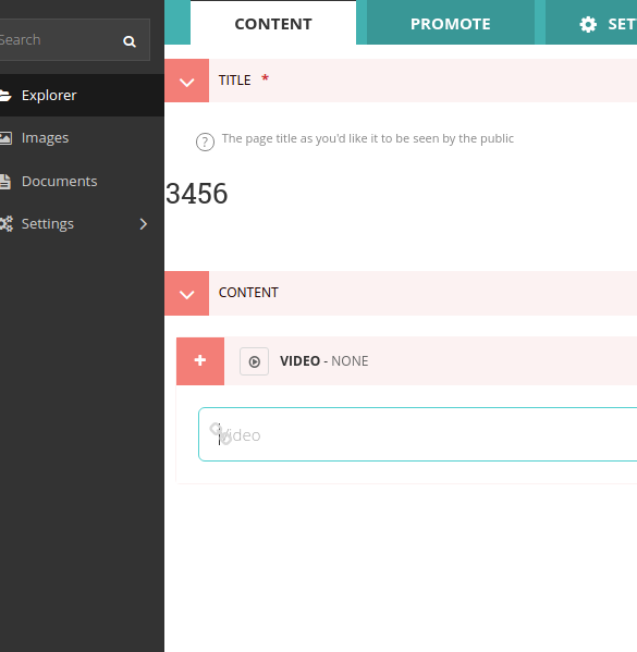
Also in that image you can see that the 'video' text is hidden under the link icon.
I would also suggest finding either a better way to delineate the end of a block (and nested blocks), or change the colour of the border because your salmon-light colour isn't noticeable enough.
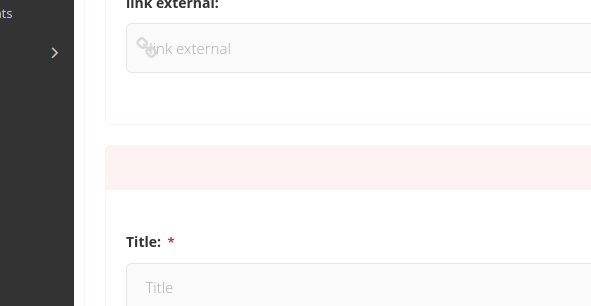
Here is it barely visible at all:

Another relatively minor, but annoying little issue is that the top level streamfield menu connects and touches the blocks. This isn't so bad when they are open, but when they are collapsed it looks like you are adding to the block rather than adding a new one:
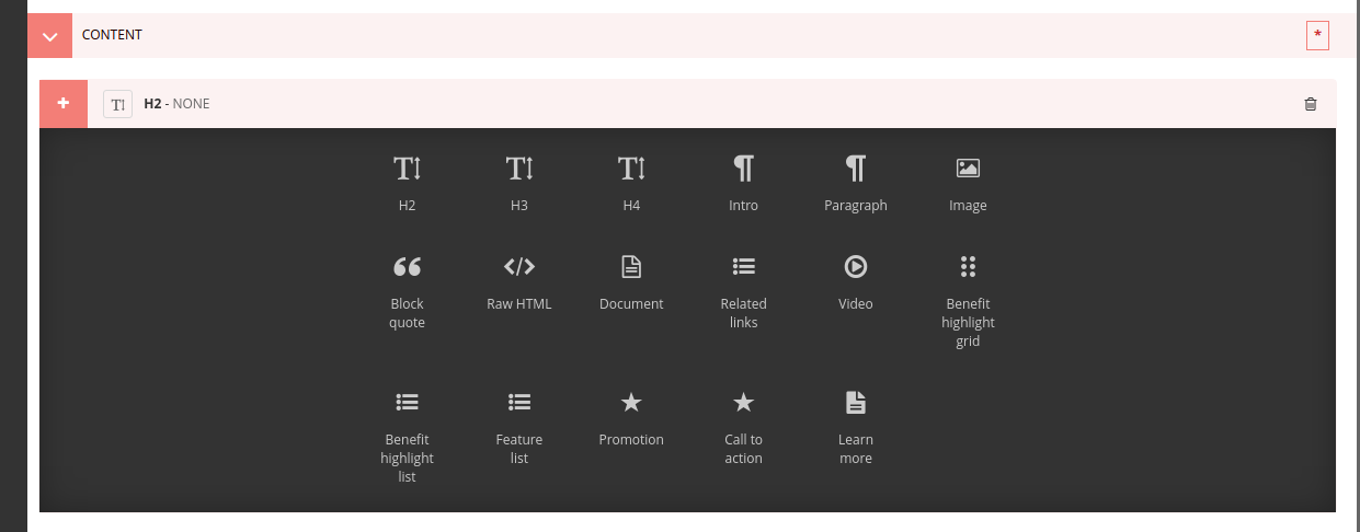
Also, while not entirely in the scope for this, if you can do some better styling for ListBlocks within ClearStreams, that would make life much nicer, because the current list styling is also hard to read.
Beyond that, this is a much better direction! Thanks so much do this work. :)
The css for this appears to mess with other default text fields. In this image the title text actually says "123456" but is being cropped off screen:

Also in that image you can see that the 'video' text is hidden under the link icon.
I would also suggest finding either a better way to delineate the end of a block (and nested blocks), or change the colour of the border because your salmon-light colour isn't noticeable enough.

Here is it barely visible at all:

Another relatively minor, but annoying little issue is that the top level streamfield menu connects and touches the blocks. This isn't so bad when they are open, but when they are collapsed it looks like you are adding to the block rather than adding a new one:

Also, while not entirely in the scope for this, if you can do some better styling for ListBlocks within ClearStreams, that would make life much nicer, because the current list styling is also hard to read.
Beyond that, this is a much better direction! Thanks so much do this work. :)