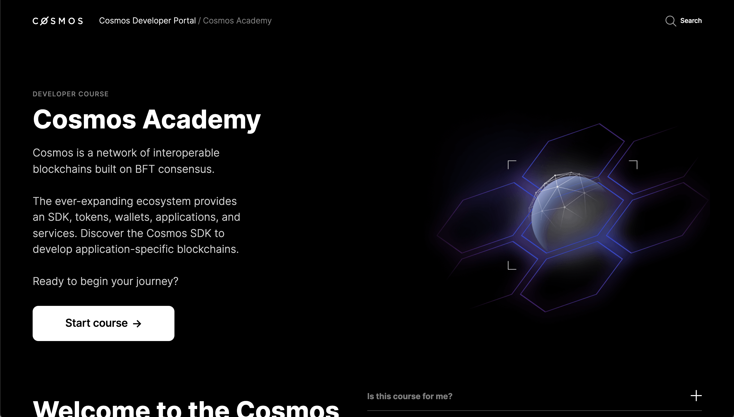
If we take a look at the figma reference screens at 1440px, we have a higher side margin on the content, matching the layout on the cosmos.network website for a more seamless transition between the two platforms. Would be great if we could try to align the current dev portal grid to the cosmos.network one. Not something critical as it will not prevent people from browsing the platform, but it will make sections like the 'tools' on the dev. portal landing page, or 'course modules' in the academy page feel more proportional on the screen.
I'll leave a comparison below:

If we take a look at the figma reference screens at 1440px, we have a higher side margin on the content, matching the layout on the cosmos.network website for a more seamless transition between the two platforms. Would be great if we could try to align the current dev portal grid to the cosmos.network one. Not something critical as it will not prevent people from browsing the platform, but it will make sections like the 'tools' on the dev. portal landing page, or 'course modules' in the academy page feel more proportional on the screen.
I'll leave a comparison below:

