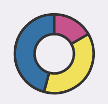
Currently the logo and favicon show color slices that mismatch the chart orientation, where the slices start at noon and go clockwise from largest percentage to smallest percentage. The logo and favicon should be changed to match the chart.
Currently:
Should be:
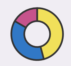
Currently the logo and favicon show color slices that mismatch the chart orientation, where the slices start at noon and go clockwise from largest percentage to smallest percentage. The logo and favicon should be changed to match the chart.
Currently:

Should be:
