A layout mode which is used to position elements along a given axis (row or column).
display: flex; will:
- make an element block-level.
- change the element's children's layout.
Flex behavior is mirrored between each axis.
| Row | Column | |
|---|---|---|
| Primary Axis | horizontal | vertical |
| Cross Axis | vertical | horizontal |
justify-contentcontrols content along the primary axis.flex-startputs elements at the start of the axis.flex-endputs elements at the end of the axis.centerputs elements in the middle of the axis.space-betweenputs equal space between elements and puts the first element at the start of the axis and the last element at the end of the axis.space-aroundputs even space around each element which means the space between elements is double the space of the start and end of the axis (first and last elements).space-evenlyis similar tospace-aroundbut the space at the start and end of the axis is the same as the space between elements.
align-itemscontrols content along the cross axis.stretchmakes the children take up the full space along the axis.flex-startputs the children at the start of the axis and lets them take up as much space as they need to display their content.flex-endputs the children at the end of the axis and lets them take up as much space as they need to display their content.centeraligns the children with the center of the axis.baselinealigns the children along the baseline which can be useful to keep text aligned properly (as though it were written on a piece of paper).
align-selfcan be used on a child element to override thealign-itemsproperty on a case by case basis.
- Flex children have a minimum size which for row layouts is effectively
width: minimum-content;. - Flex children have a hypothetical size which is the default size a child would be if no other CSS properties were influencing its size.
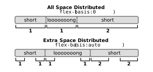
flex-basiscan be used to set the hypothetical size the same wayheightandwidthcan be used.- It acts differently depending on if working with a flex row (width) or flex column (height).
- It always takes precedence over
widthorheight. - It can't scale an element below its minimum content size (width can).
flex-growcan be used to make a child take up the remaining white space. If there is no free white space then it effectively does nothing.flex-shrinkcontrols the rate at which a child element shrinks in size as the flex container (parent) gets smaller.- It only has an effect on a child element while it's larger than its minimum content size.
- Setting this to
0will disable shrinking for the child element.
flex-growandflex-shrinktake unit-less values that represent a ratio relative to the other children.- The
flex: 1;shorthand can be used to make child elements the same size by doing the following:flex-grow: 1;flex-shrink: 1;(this is the default)flex-basis: 0%;- If this is set for all children then all the space is available to distribute via
flex-grow. - See how the flex algorithm distributes space.
- If this is set for all children then all the space is available to distribute via
max-width,max-height,min-widthandmin-heightcan be used with flex to enforce constraints.flex-wrap: wrap;can be used to make elements wrap to the next line instead of introducing a horizontal scroll bar.align-contentcan be used withflex-wrapto move a group (e.g. multiple rows due to wrapping) the same way thatalign-itemsis used.- Setting
margin: auto;to one side of a child element will cause the other child elements to shift to the other end of the axis.<div style="display:flex;"> <div style="margin-right: auto;">I'm on the left</div> <div>I'm on the right</div> </div>
gapcan be used to add space between children.
- Using
flex-directionwithrow-reverseorcolumn-reversecan flip the order of the children visually. orderis similar toz-index.order: 2;comes afterorder: 1;but beforeorder: 5;.flex-wrap: wrap-reverse;makes elements wrap up instead of down.
- A child with
Positioned Layout(exceptposition: relative;) will be ignored by its flex container. - A stacking context is created if a flex container child has a
z-indexset to anything butauto.