Forced Migration Visualization Tool
Explore the interactive visualization here
Technical Overview This data visualization tool provides an interactive exploration of forced migration patterns from 1950 to present. Built with D3.js, it features three complementary visualizations that dynamically respond to user interactions and filtering.
Core Visualizations
Chord Diagram: Migration Relationships
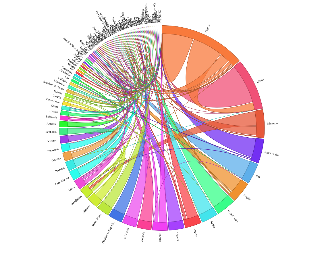 Visualizes bilateral migration flows between countries using curved ribbons. Node arc size represents total migration volume per country, ribbon width indicates flow magnitude between pairs.
Sankey Diagram: Country-Specific Flows
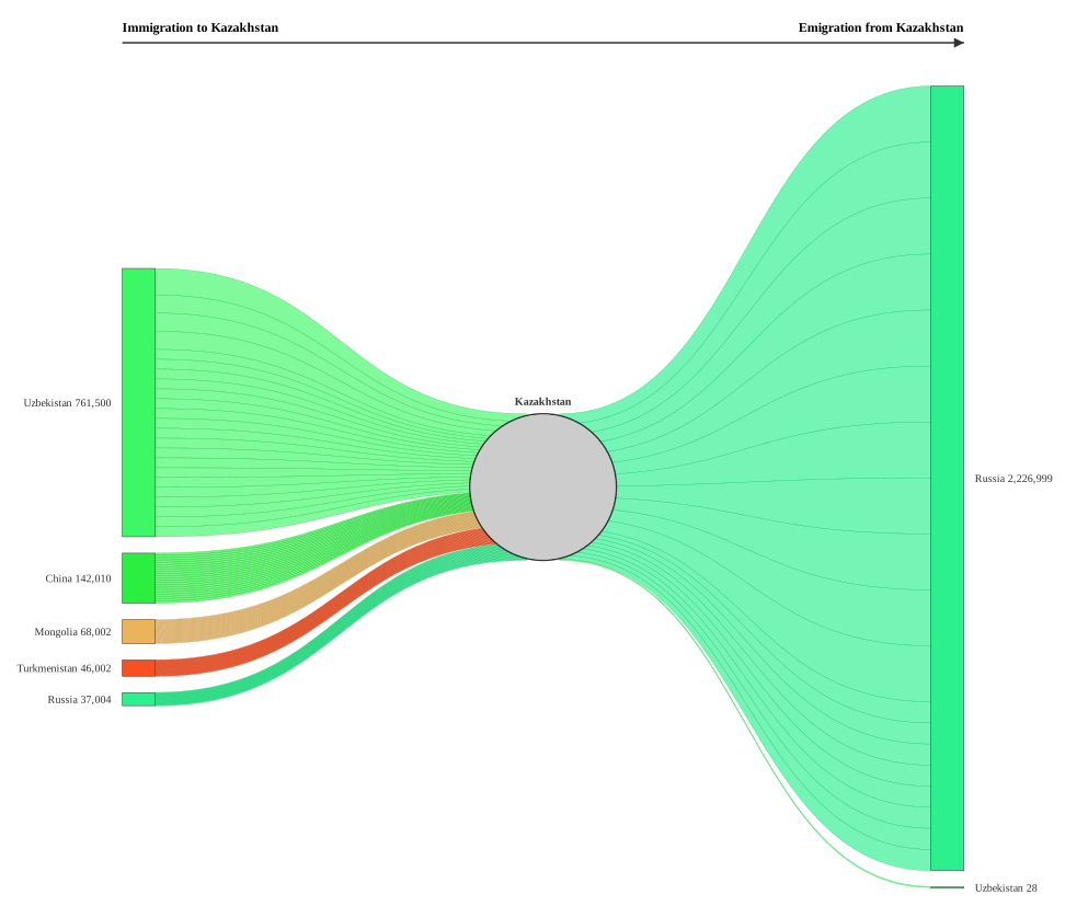 Shows detailed migration flows for a selected country. Left column represents origin countries (immigration sources), right column shows destination countries (emigration targets). Flow width corresponds to migrant volume.
Temporal Trend Analysis
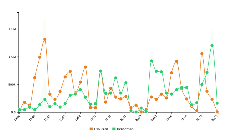 Displays migration trends over time. Points represent median estimates, shaded areas show uncertainty ranges. Automatically updates based on country selection and filters.